Showing posts with label paste(). Show all posts
Showing posts with label paste(). Show all posts
Tuesday, June 5, 2012
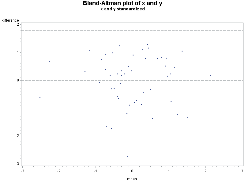
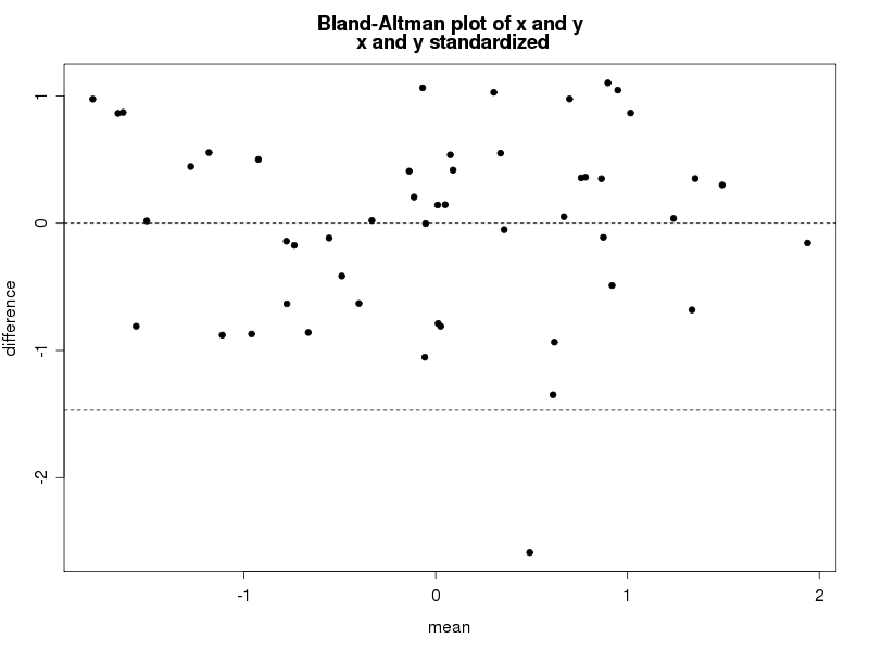
Example 9.34: Bland-Altman type plot
[フレーム]
The Bland-Altman plot is a visual aid for assessing differences between two ways of measuring something. For example, one might compare two scales this way, or two devices for measuring particulate matter.
The plot simply displays the difference between the measures against their average. Rather than a statistical test, it is intended to demonstrate both typical differences between the measures and any patterns such differences may take. The utility of the plot, as compared with linear regression or sample correlation is that the plot is not affected by the range, while the sample correlation will typically increase with the range. In contrast, linear regression shows the strength of the linear association but not how closely the two measures agree. The Bland-Altman plot allows the user to focus on differences between the measures, perhaps focusing on the clinical relevance of these differences.
A peer reviewer recently asked a colleague to consider a Bland-Altman plot for two methods of assessing fatness: the familiar BMI (kg/m^2) and the actual fat mass measured by a sophisticated DXA machine. These are obviously not measures of the same thing, so a Bland-Altman plot is not exactly appropriate. But since the BMI is so simple to calculate and the DXA machine is so expensive, it would be nice if the BMI could be substituted for DXA fat mass.
For this purpose, we'll generate a modified Bland-Altman plot in which each measure is first standardized to have mean 0 and standard deviation 1. The resulting plot should be assessed for pattern as usual, but typical differences must be considered on the standardized scale-- that is, differences of a unit should be considered large, and good agreement might require typical differences of 0.2 or less.
SAS
Since this is a job we might want to repeat, we'll build a SAS macro to do it. This will also demonstrate some useful features. The macro accepts a data set name and the names of two variables as input. We'll comment on interesting features in code comments. If you're an R coder, note that SAS macro variables are merely text, not objects. We have to manually assign "values" (i.e., numbers represented as text strings) to newly created macro variables.
%macro baplot(datain=,x=x,y=y);

/* proc standard standardizes the variables and saves the results in the
 same variable names in the output data set. This means we can continue
 using the input variable names throughout. */
proc standard data = &datain out=ba_std mean=0 std=1;
var &x &y;
run;

/* calculate differences and averages */
data ba;
set ba_std;
bamean = (&x + &y)/2;;
badiff = &y-&x;
run;

ods output summary=basumm;
ods select none;
proc means data = ba mean std;
var badiff;
run;
ods select all;

/* In the following, we take values calculated from a data set for the
 confidence limits and store them in macro variables. That's the
 only way to use them later in code.
 The syntax is: call symput('varname', value);
 Note that 'bias' is purely nominal, as the standardization means that
 the mean difference is 0. */
data lines;
set basumm;
call symput('bias',badiff_mean);
call symput('hici',badiff_mean+(1.96 * badiff_stddev));
call symput('loci',badiff_mean-(1.96 * badiff_stddev));
run;

/* We use the macro variables just created in the vref= option below;
 vref draws reference line(s) on the vertical axis. lvref specifies
 a line type. */
symbol1 i = none v = dot h = .5;
title "Bland-Altman type plot of &x and &y";
title2 "&x and &y standardized";
proc gplot data=ba;
plot badiff * bamean / vref = &bias &hici &loci lvref=3;
label badiff = "difference" bamean="mean";
run;
%mend baplot;
Here is a fake sample data set, with the plot resulting from the macro shown above. An analysis would suggest that despite the correlation of 0.59 and p-value for the linear association < .0001, that these two measures don't agree too well.
data fake;
do i = 1 to 50;
/* the "42" in the code below sets the seed for the pseudo-RNG
 for this and later calls. See section 1.10.9. */
 x = normal(42);
 y = x + normal(0);
 output;
 end;
run;

%baplot(datain=fake, x=x, y=y);
R
Paralleling SAS, we'll write a small function to draw the plot, annotating within to highlight some details. If you're primarily a SAS coder, note the syntax needed to find the name of an object submitted to a function. In contrast, assigning values to new objects created with the function is entirely natural. The resulting plot is shown below.
# set seed, for replicability
set.seed(42)
x = rnorm(50)
y = x + rnorm(50)

baplot = function(x,y){
 xstd = (x - mean(x))/sd(x)
 ystd = (y - mean(y))/sd(y)

 bamean = (xstd+ystd)/2
 badiff = (ystd-xstd)

 plot(badiff~bamean, pch=20, xlab="mean", ylab="difference")
# in the following, the deparse(substitute(varname)) is what retrieves the
# name of the argument as data
 title(main=paste("Bland-Altman plot of x and y\n",
 deparse(substitute(x)), "and", deparse(substitute(y)),
 "standardized"), adj=".5")
#construct the reference lines on the fly: no need to save the values in new
# variable names
 abline(h = c(mean(badiff), mean(badiff)+1.96 * sd(badiff),
 mean(badiff)-1.96 * sd(badiff)), lty=2)
}

baplot(x,y)
An unrelated note about aggregators:We love aggregators! Aggregators collect blogs that have similar coverage for the convenience of readers, and for blog authors they offer a way to reach new audiences. SAS and R is aggregated by R-bloggers, PROC-X, and statsblogs with our permission, and by at least 2 other aggregating services which have never contacted us. If you read this on an aggregator that does not credit the blogs it incorporates, please come visit us at SAS and R. We answer comments there and offer direct subscriptions if you like our content. In addition, no one is allowed to profit by this work under our license; if you see advertisements on this page, the aggregator is violating the terms by which we publish our work.
Thursday, February 23, 2012
Example 9.21: The birthday "problem" re-examined
[フレーム]
The so-called birthday paradox or birthday problem is simply the counter-intutitive discovery that the probability of (at least) two people in a group sharing a birthday goes up surprisingly fast as the group size increases. If the group is only 23 people, there is a 50% chance that two of them share a birthday, and with 40 people it's about 90%. There is an excellent wikipedia page discussing this.
However, this analytically derived probability is based on the assumption that births are equally likely on any day of the year. (It also ignores the occasional February 29th, and any social factors that lead people born at the same time of year to seek like spouses, and so forth.) But this assumption does not appear to be true, as laid out anecdotally and in press.
As noted in the latter link, any disparity in the probability of birth between days will improve the chances of a match. But how much? An analytic solution seems quite complex, even if we approximate the true daily distribution with a constant birth probability per month. Simulation will be simpler. While we're at it, we'll include leap days as well, since February 29th approaches.
SAS
Our approach here is based on the observation that the probability of at least one match among N people is equal to the sum of the probabilities of exactly one match in 2,...,N people. In addition, rather than simulating groups of 2, estimating the probability of a match, and repeating for groups of 3,...,N, we'll keep adding people to a group until we have a match, finding the probability of a match in all group sizes at once.
Here we use arrays (section 1.11.5) to keep track of the number of days in a month and of the people in our group. To reduce computation, we'll check for matches as we add people to the group, and only generate their birthdays if there is not yet a match. We also demonstrate the useful hyphen tool for referring to ranges of variables (1.11.4).
data bd1;
array daysmo [12] _temporary_ (31 28.25 31 30 31 30 31 31 30 31 30 31);
array dob [367] dob1 - dob367; * these variables will hold the birthdays
 * the hyphen includes all the variables in the
 * sequence

do group = 1 to 10000000; * simulate this many groups;
 match = 0; * initialize whether there's a match in this
 group, yet;
 do i = 1 to 367; * loop through up to 367 subjects... the maximum
 possible, obviously;
 month = rantbl(0, 31*.0026123, 28*.0026785, 31*.0026838, 30*.0026426,
 31*.0026702, 30*.0027424, 31*.0028655, 31*.0028954, 30*.0029407,
 31*.0027705, 30*.0026842);
 * choose a month of birth, by probabilities reported
 in the Science News link, which are daily by month;
 day = ceil((4 * daysmo[month] * uniform(0))/4);
 * choose a day within the month,
 note the trick used to get Leap Days;
 dob[i] = mdy(month, day, 1960);
 * convert month and day into a day in the year--
 1960 is a convenient leap year;
 do j = 1 to (i-1) until (match gt 0);
 * compare each old person to the new one;
 if dob[j] = dob[i] then match = i;
 * if there was a match, we needed i people in the
 group to make it;
 end;
 if match gt 0 then leave;
 * no need to generate the other 367-i people;
 end;
 output;
end;
run;
We note here that while we allow up to 367 birthdays before a match, the probability of more than 150 is so infinitesimal that we could save the space and speed up processing time by ignoring it. Now that the groups have been simulated, we just need to summarize and present them. We tabulate how many cases of groups of size N were recorded, generate the simple analytic answer, and merge them.
proc freq data = bd1;
tables match / out=bd2 outcum; * the bd2 data set has the results;
run;

data simpreal;
set bd2;
prob = 1 - ((fact(match) * comb (365,match)) / 365**match);
realprob = cum_freq/10000000;
diff = realprob-prob;
diffpct = 100 * (diff)/prob;
run;
It's easiest to interpret the results by way of a plot. We'll plot the absolute and the relative difference on the same image with two different axes. The axis and symbol statements will make it slightly prettier, and allow us to make 0 appear at the same point on both axes.
axis1 order = (-.75 to .75 by .25) minor = none;
axis2 order = (-.00025 to .00025 by .00005) minor = none;
symbol1 v = dot h = .75 c = blue;
symbol2 font=marker v = U h = .5 c = red;

proc gplot data= simpreal (obs = 89);
plot diffpct * match / vref = 0 vaxis=axis1 legend;
plot2 diff *match/ vaxis = axis2 legend;
run; quit;
The results, shown below, are very clear-- leap day and the disequilibrium in birth month probability does increase the probability of at least one match in any group of a given size, relative to the uniform distribution across days assumed in the analytic solution. But the difference is miniscule in both the absolute and relative scale.
R
Here we mimic the approach used above, but use the apply() function family in place of some of the looping.
dayprobs = c(.0026123,.0026785,.0026838,.0026426,.0026702,.0027424,.0028655,
 .0028954,.0029407,.0027705,.0026842,.0026864)
daysmo = c(31,28,31,30,31,30,31,31,30,31,30,31)
daysmo2 = c(31,28.25,31,30,31,30,31,31,30,31,30,31)
# need both: the former is how the probs are reported,
# while the latter allows leap days

moprob = daysmo * dayprobs
With the monthly probabilities established, we can sample a birth month for everyone, and then choose a birth day within month. We use the same trick as above to allow birth days of February 29th. Here we show code for 10,000 groups; with the simple cloud R this code was developed on, more caused a crash.
We've stopped referencing our book exhaustively, and doing so here would be tedious. Instead, we'll just comment that the tools we use here can be found in sections 1.4.5, 1.4.15, 1.4.16, 1.5.2, 1.8.3, 1.8.4, 1.9.1, 1.11.1, 5.2.1, 5.6.1, B.5.2, and probably others.
mob = sample(1:12,10000 * 367,rep=TRUE,prob=moprob)
dob = sapply(mob,function(x) ceiling(sample((4*daysmo2[x]),1)/4) )
# The ceiling() function isn't vectorized, so we make the equivalent
# using sapply().

mobdob = paste(mob,dob)
# concatenate the month and day to make a single variable to compare
# between people. The ISOdate() function would approximate the SAS mdy()
# function but would be much longer, and we don't need it.

# convert the vector into a matrix with the maximum
# group size as the number of columns
# as noted above, this could safely be truncated, with great savings
mdmat = matrix(mobdob, ncol=367, nrow=10000)
To find duplicate birthdays in each row of the matrix, we'll write a function to compare the number of unique values with the length of the vector, then call it repeatedly in a for() loop until there is a difference. Then, to save (a lot) of computations, we'll break out of the loop and report the number needed to make the match. Finally, we'll call this vector-based function using apply() to perform it on each row of the birthday matrix.
matchn = function(x) {
 for (i in 1:367){
 if (length(unique(x[1:i])) != i) break
 }
 return(i)
}

groups = apply(mdmat, 1, matchn)

bdprobs = cumsum(table(groups)/10000)
# find the N with each group number, divide by number of groups
# and get the cumulative sum

rgroups = as.numeric(names(bdprobs))
# extract the group sizes from the table
probs = 1 - ((factorial(rgroups) * choose(365,rgroups)) / 365**rgroups)
# calculate the analytic answer, for any group size
# for which there was an observed simulated value

diffs = bdprobs - probs
diffpcts = diffs/probs
To plot the differences and percent differences in probabilities, we modify (slightly) the functions for a multiple-axis scatterplot we show in our book in section 5.6.1. You can find the code for this and all the book examples on the book web site.
addsecondy <- function(x, y, origy, yname="Y2") {
 prevlimits <- range(origy)
 axislimits <- range(y)
 axis(side=4, at=prevlimits[1] + diff(prevlimits)*c(0:5)/5,
 labels=round(axislimits[1] + diff(axislimits)*c(0:5)/5, 3))
 mtext(yname, side=4)
 newy <- (y-axislimits[1])/(diff(axislimits)/diff(prevlimits)) +
 prevlimits[1]
 points(x, newy, pch=2)
 abline(h=(-axislimits[1])/(diff(axislimits)/diff(prevlimits)) +
 prevlimits[1])
}

plottwoy <- function(x, y1, y2, xname="X", y1name="Y1", y2name="Y2")
{
 plot(x, y1, ylab=y1name, xlab=xname)
 abline(h=0)
 addsecondy(x, y2, y1, yname=y2name)
}

plottwoy(rgroups, diffs, diffpcts, xname="Number in group",
 y1name="Diff in prob", y2name="Diff in percent")
legend(80, .0013, pch=1:2, legend=c("Diffs", "Pcts"))
The resulting plot, (which is based on 100,000 groups, tolerable compute time on a laptop) is shown at the top. Aligning the 0 on each axis was more of a hassle than seemed worth it for today. However, the message is equally clear-- a clearly larger probability with the observed birth distribution, but not a meaningful difference.
Tuesday, April 19, 2011
Example 8.35: Grab true (not pseudo) random numbers; passing API URLs to functions or macros
[フレーム]
Usually, we're content to use a pseudo-random number generator. But sometimes we may want numbers that are actually random-- an example might be for randomizing treatment status in a randomized controlled trial.The site Random.org provides truly random numbers based on radio static. For long simulations, its quota system may prevent its use. But for small to moderate needs, it can be used to provide truly random numbers. In addition, you can purchase larger quotas if need be.
The site provides APIs for several types of information. We'll write functions to use these to pull vectors of uniform (0,1) random numbers (of 10^(-9) precision) and to check the quota. To generate random variates from other distributions, you can use the inverse probability integral transform (section 1.10.8).
The coding challenge here comes in integrating quotation marks and special characters with function and macro calls.
SAS
In SAS, the challenging bit is to pass the desired number of random numbers off to the API, though the macro system. This is hard because the API includes the special characters ?, ", and especially &. The ampersand is used by the macro system to denote the start of a macro variable, and is used in APIs to indicate that an additional parameter follows.
To avoid processing these characters as part of the macro syntax, we have to enclose them within the macro quoting function %nrstr. We use this approach twice, for the fixed pieces of the API, and between them insert the macro variable that contains the number of random numbers desired. Also note that the sequence %" is used to produce the quotation mark. Then, to unmask the resulting character string and use it as intended, we %unquote it. Note that the line break shown in the filename statement must be removed for the code to work.
Finally, we read data from the URL (section 1.1.6) and transform the data to take values between 0 and 1.
%macro rands (outds=ds, nrands=);
filename randsite url %unquote(%nrstr(%"http://www.random.org/integers/?num=)
 &nrands%nrstr(&min=0&max=1000000000&col=1&base=10&format=plain&rnd=new%"));
proc import datafile=randsite out = &outds dbms = dlm replace;
 getnames = no;
run;

data &outds;
set &outds;
 var1 = var1 / 1000000000;
run;
%mend rands;

/* an example macro call */
%rands(nrands=25, outds=myrs);
The companion macro to find the quota is slightly simpler, since we don't need to insert the number of random numbers in the middle of the URL. Here, we show the quota in the SAS log; the file print syntax, shown in Example 8.34, can be used to send it to the output instead.
%macro quotacheck;
filename randsite url %unquote(%nrstr(%"http://www.random.org/quota/?format=plain%"));
proc import datafile=randsite out = __qc dbms = dlm replace;
getnames = no;
run;

data _null_;
set __qc;
put "Remaining quota is " var1 "bytes";
run;
%mend quotacheck;

/* an example macro call */
%quotacheck;
R
Two R functions are shown below. While the problem isn't as difficult as in SAS, it is necessary to enclose the character string for the URL in the as.character() function (section 1.4.1).
truerand = function(numrand) {
 read.table(as.character(paste("http://www.random.org/integers/?num=",
 numrand, "&min=0&max=1000000000&col=1&base=10&format=plain&rnd=new",
 sep="")))/1000000000
}

quotacheck = function() {
 line = as.numeric(readLines("http://www.random.org/quota/?format=plain"))
 return(line)
}
Subscribe to:
Comments (Atom)