Showing posts with label matplot(). Show all posts
Showing posts with label matplot(). Show all posts
Monday, May 7, 2012
Example 9.30: addressing multiple comparisons
[フレーム]
We've been more sensitive to accounting for multiple comparisons recently, in part due to work that Nick and colleagues published on the topic.
In this entry, we consider results from a randomized trial (Kypri et al., 2009) to reduce problem drinking in Australian university students.
Seven outcomes were pre-specified: three designated as primary and four as secondary. No adjustment for multiple comparisons was undertaken. The p-values were given as 0.001, 0.001 for the primary outcomes and 0.02 and .001, .22, .59 and .87 for the secondary outcomes.
In this entry, we detail how to adjust for multiplicity using R and SAS.
R
The p.adjust() function in R calculates a variety of different approaches for multiplicity adjustments given a vector of p-values. These include the Bonferroni procedure (where the alpha is divided by the number of tests or equivalently the p-value is multiplied by that number, and truncated back to 1 if the result is not a probability). Other, less conservative corrections are also included (these are Holm (1979), Hochberg (1988), Hommel (1988), Benjamini and Hochberg (1995) and Benjamini and Yekutieli (2001)). The first four methods provide strong control for the family-wise error rate and all dominate the Bonferroni procedure. Here we compare the results from the unadjusted, Benjamini and Hochberg method="BH" and Bonferroni procedure for the Kypri et al. study.
pvals = c(.001, .001, .001, .02, .22, .59, .87)
BONF = p.adjust(pvals, "bonferroni")
BH = p.adjust(pvals, "BH")
res = cbind(pvals, BH=round(BH, 3), BONF=round(BONF, 3))
This yields the following results:
 pvals BH BONF
[1,] 0.001 0.002 0.007
[2,] 0.001 0.002 0.007
[3,] 0.001 0.002 0.007
[4,] 0.020 0.035 0.140
[5,] 0.220 0.308 1.000
[6,] 0.590 0.688 1.000
[7,] 0.870 0.870 1.000
The only substantive difference between the three sets of unadjusted and adjusted p-values is seen for the 4th most significant outcome, which remains statistically significant at the alpha=0.05 level for all but the Bonferroni procedure.
It is straightforward to graphically display these results (as seen above):
matplot(res, ylab="p-values", xlab="sorted outcomes")
abline(h=0.05, lty=2)
matlines(res)
legend(1, .9, legend=c("Bonferroni", "Benjamini-Hochberg", "Unadjusted"),
 col=c(3, 2, 1), lty=c(3, 2, 1), cex=0.7)
It bears mentioning here that the Benjamini-Hochberg procedure really only make sense in the gestalt. That is, it would probably be incorrect to take the adjusted p-values from above and remove them from the context of the 7 tests performed here. The correct use (as with all tests) is to pre-specify the alpha level, and reject tests with p-values that are smaller. What p.adjust() reports is the smallest family-wise alpha error under which each of the tests would result in a rejection of the null hypothesis. But the nature of the Benjamini-Hochberg procedure is that this value may well depend on the other observed p-values. We will explore this further in a later entry.
SAS
The multtest procedure will perform a number of multiple testing procedures. It works with raw data for ANOVA models, and can also accept a list of p-values as shown here. (Note that "FDR" (false discovery rate) is the name that Benjamini and Hochberg give to their procedure and that this nomenclature is used by SAS.) Various other procedures can do some adjustment through, e.g., the estimate statement, but multtest is the most flexible. A plot similar to that created in R is shown below.
data a;
 input Test$ Raw_P @@;
 datalines;
test01 0.001 test02 0.001 test03 0.001
test04 0.02 test05 0.22 test06 0.59
test07 0.87
;

proc multtest inpvalues=a bon fdr plots=adjusted(unpack);
run;
 False
 Discovery
 Test Raw Bonferroni Rate

 1 0.0010 0.0070 0.0023
 2 0.0010 0.0070 0.0023
 3 0.0010 0.0070 0.0023
 4 0.0200 0.1400 0.0350
 5 0.2200 1.0000 0.3080
 6 0.5900 1.0000 0.6883
 7 0.8700 1.0000 0.8700
An unrelated note about aggregators:We love aggregators! Aggregators collect blogs that have similar coverage for the convenience of readers, and for blog authors they offer a way to reach new audiences. SAS and R is aggregated by R-bloggers and PROC-X with our permission, and by at least 2 other aggregating services which have never contacted us. If you read this on an aggregator that does not credit the blogs it incorporates, please come visit us at SAS and R. We answer comments there and offer direct subscriptions if you like our content. In addition, no one is allowed to profit by this work under our license; if you see advertisements on this page, the aggregator is violating the terms by which we publish our work.
Monday, April 16, 2012
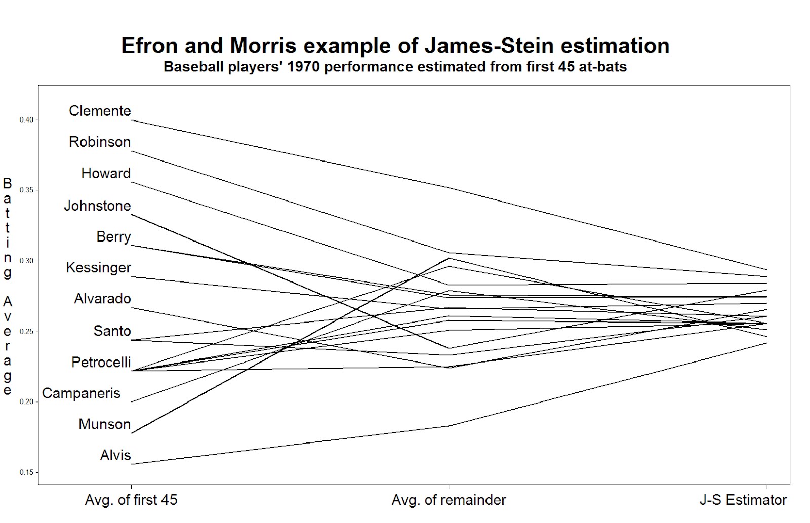
Example 9.27: Baseball and shrinkage
[フレーム]
To celebrate the beginning of the professional baseball season here in the US and Canada, we revisit a famous example of using baseball data to demonstrate statistical properties.
In 1977, Bradley Efron and Carl Morris published a paper about the James-Stein estimator-- the shrinkage estimator that has better mean squared error than the simple average. Their prime example was the batting averages of 18 player in the 1970 season: they considered trying to estimate the players' average over the remainder of the season, based on their first 45 at-bats. The paper is a pleasure to read, and can be downloaded here. The data are available here, on the pages of Statistician Phil Everson, of Swarthmore College.
Today we'll review plotting the data, and intend to look at some other shrinkage estimators in a later entry.
SAS
We begin by reading in the data for Everson's page. (Note the long address would need to be on one line, or you could could use a URL shortener like TinyURL.com. To read the data, we use the infile statement to indicate a tab-delimited file and to say that the data begin in row 2. The informat statement helps read in the variable-length last names.
filename bb url "http://www.swarthmore.edu/NatSci/peverso1/Sports%20Data/
 JamesSteinData/Efron-Morris%20Baseball/EfronMorrisBB.txt";

data bball;
infile bb delimiter='09'x MISSOVER DSD lrecl=32767 firstobs=2 ;
informat firstname 7ドル. lastname 10ドル.;
input FirstName $ LastName $ AtBats Hits BattingAverage RemainingAtBats
 RemainingAverage SeasonAtBats SeasonHits SeasonAverage;
run;

data bballjs;
set bball;
js = .212 * battingaverage + .788 * .265;

avg = battingaverage; time = 1;
 if lastname not in("Scott","Williams", "Rodriguez", "Unser","Swaboda","Spencer")
 then name = lastname; else name = '';
output;
avg = seasonaverage; name = ''; time = 2; output;
avg = js; time = 3; name = ''; output;
run;
In the second data step, we calculate the James-Stein estimator according to the values reported in the paper. Then, to facilitate plotting, we convert the data to the "long" format, with three rows for each player, using the explicit output statement. The average in the first 45 at-bats, the average in the remainder of the season, and the James-Stein estimator are recorded in the same variable in each of the three rows, respectively. To distinguish between the rows, we assign a different value of time: this will be used to order the values on the graphic. We also record the last name of (most of) the players in a new variable, but only in one of the rows. This will be plotted in the graphic-- some players' names can't be shown without plotting over the data or other players' names.
Now we can generate the plot. Many features shown here have been demonstrated in several entries. We call out 1) the h option, which increases the text size in the titles and labels, 2) the offset option, which moves the data away from the edge of the plot frame, 3) the value option in the axis statement, which replaces the values of "time" with descriptive labels, and 4) the handy a*b=c syntax which replicates the plot for each player.
title h=3 "Efron and Morris example of James-Stein estimation";
title2 h=2 "Baseball players' 1970 performance estimated from first 45 at-bats";
axis1 offset = (4cm,1cm) minor=none label=none
 value = (h = 2 "Avg. of first 45" "Avg. of remainder" "J-S Estimator");
axis2 order = (.150 to .400 by .050) minor=none offset=(0.5cm,1.5cm)
 label = (h =2 r=90 a = 270 "Batting Average");
symbol1 i = j v = none l = 1 c = black r = 20 w=3
 pointlabel = (h=2 j=l position = middle "#name");

proc gplot data = bballjs;
 plot avg * time = lastname / haxis = axis1 vaxis = axis2 nolegend;
run; quit;
To read the plot (shown at the top) consider approaching the nominal true probability of a hit, as represented by the average over the remainder of the season, in the center. If you begin on the left, you see the difference associated with using the simple average of the first 45 at-bats as the estimator. Coming from the right, you see the difference associated withe using the James-Stein shrinkage estimator. The improvement associated with the James-Stein estimator is reflected in the generally shallower slopes when coming from the left. With the exception of Pirates great Roberto Clemente and declining third-baseman Max Alvis, most every line has a shallower slope from the left; James' and Stein's theoretical work proved that overall the lines must be shallower from the right.
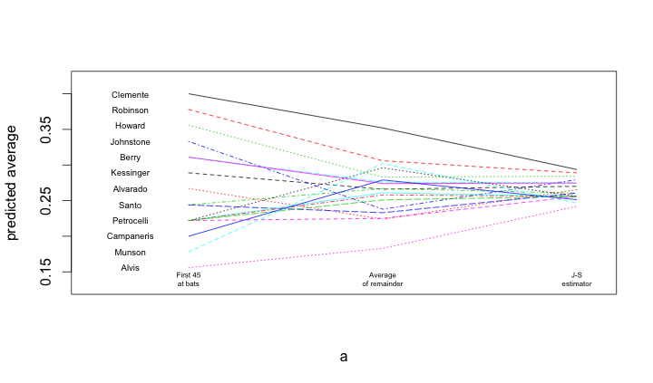
R
A similar process is undertaken within R. Once the data are loaded, and a subset of the names are blanked out (to improve the readability of the figure), the matplot() and matlines() functions are used to create the lines.
bball = read.table("http://www.swarthmore.edu/NatSci/peverso1/Sports%20Data/JamesSteinData/Efron-Morris%20Baseball/EfronMorrisBB.txt",
 header=TRUE, stringsAsFactors=FALSE)
bball$js = bball$BattingAverage * .212 + .788 * (0.265)
bball$LastName[!is.na(match(bball$LastName,
 c("Scott","Williams", "Rodriguez", "Unser","Swaboda","Spencer")))] = ""

a = matrix(rep(1:3, nrow(bball)), 3, nrow(bball))
b = matrix(c(bball$BattingAverage, bball$SeasonAverage, bball$js),
 3, nrow(bball), byrow=TRUE)
matplot(a, b, pch=" ", ylab="predicted average", xaxt="n", xlim=c(0.5, 3.1), ylim=c(0.13, 0.42))
matlines(a, b)
text(rep(0.7, nrow(bball)), bball$BattingAverage, bball$LastName, cex=0.6)
text(1, 0.14, "First 45\nat bats", cex=0.5)
text(2, 0.14, "Average\nof remainder", cex=0.5)
text(3, 0.14, "J-S\nestimator", cex=0.5)
Subscribe to:
Comments (Atom)