Scale your design systems across products and brands with shared foundations, automated token pipelines, and adoption tracking across your portfolio. AI helps maintain quality and connects your system into modern product workflows — so teams move faster while staying consistent.
Build once, theme for each product. Shared components and tokens with product-specific styling. Stop duplicating work while keeping each product's identity distinct.
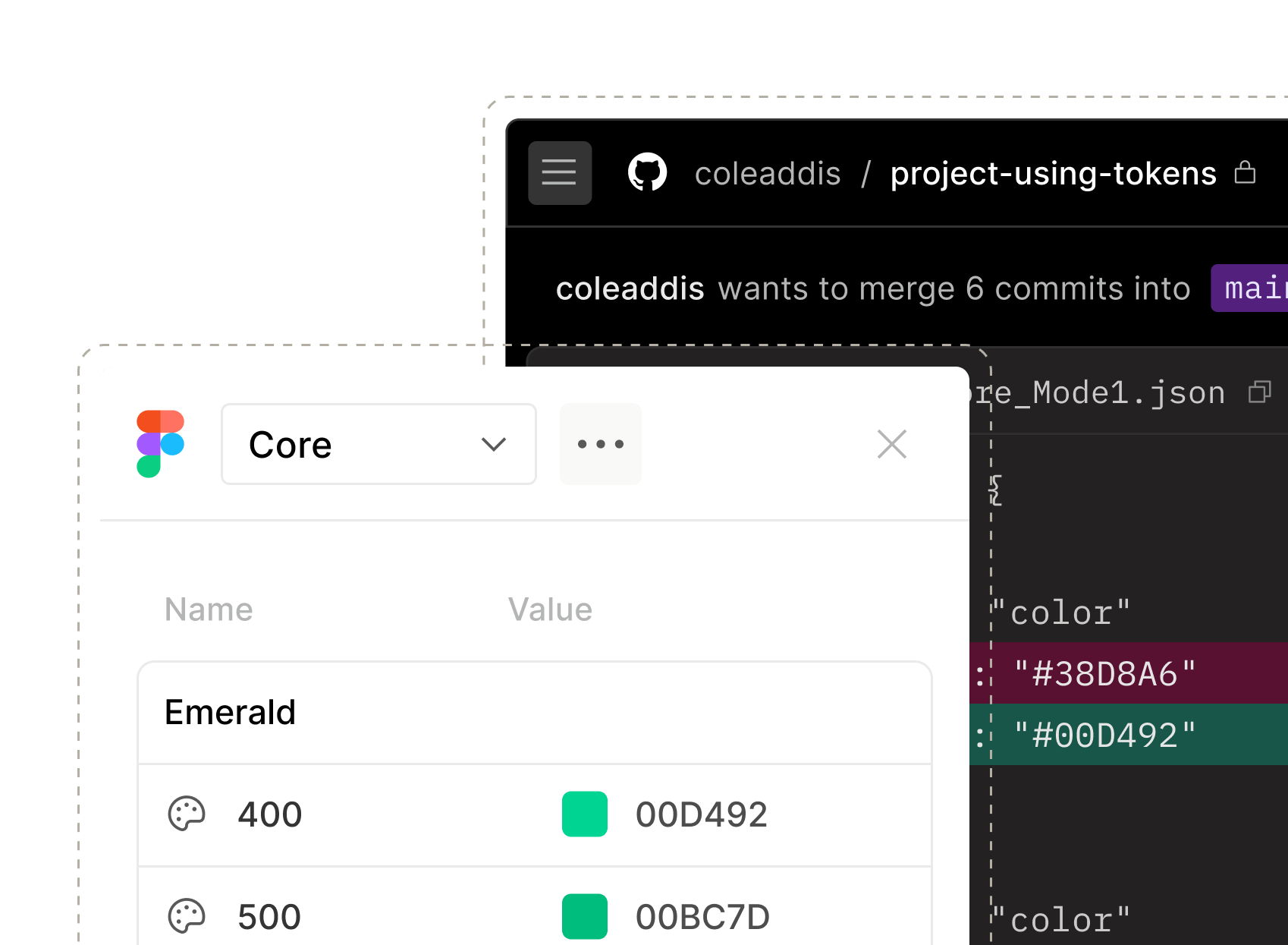
Roll out changes across your product portfolio in hours, not weeks. Automated token pipelines and shared documentation mean one update reaches every product.
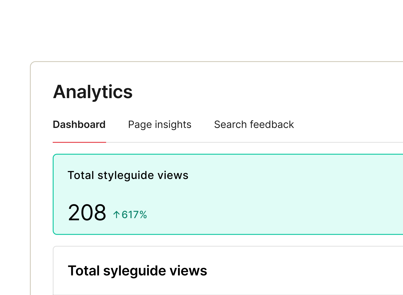
See which products use which components, spot inconsistencies between products, and prove ROI across your entire portfolio. Know where your design system delivers value and where components or products are drifting.
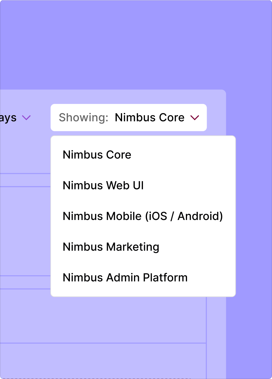
Manage global systems, parent and child relationships, or independent brand systems — all in one place. Share foundations like tokens and core components while keeping each brand’s unique identity. Add new products or acquisitions without starting from scratch.
From documenting to delivering and measuring, zeroheight gives you full visibility and control – so nothing slips through the cracks and your design system keeps working like... well, a system.
Connect design to code with clarity. Automations streamline workflows, while documented components, tokens, and adoption insights speed delivery and alignment.
Gain clarity and control with dashboards showing system health and adoption, guiding governance and resource investment where impact matters most.
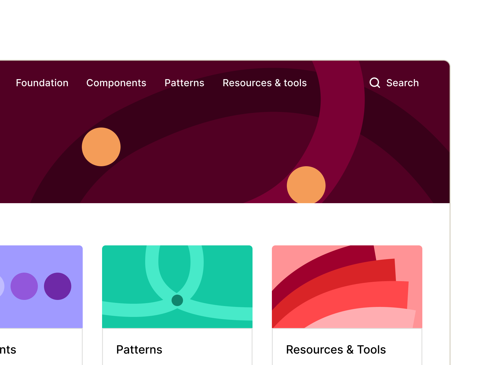
Stay consistent and move faster with reusable components, templates, and automations that simplify handoff and scaling.
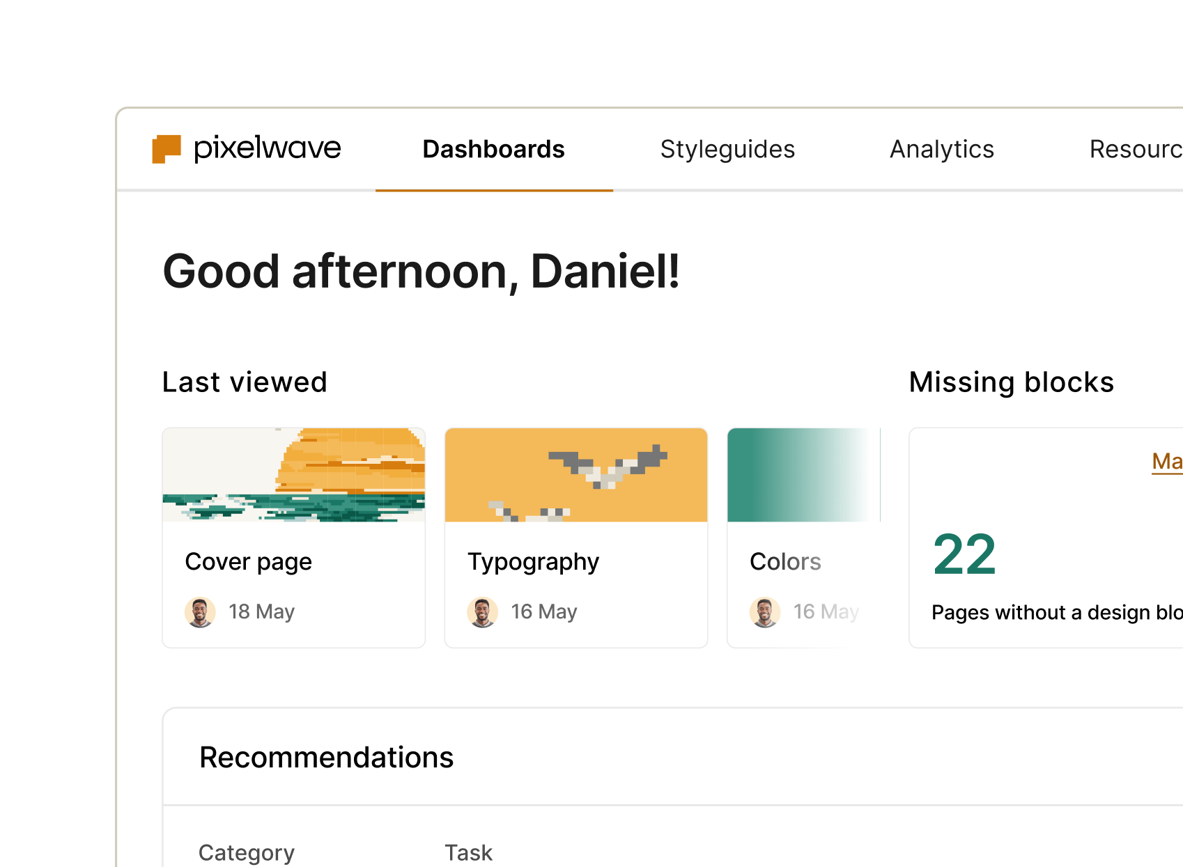
Scale without chaos. Keep components consistent, docs current, and adoption measurable across products, teams, and complexity.