Launch fast, ship faster. Build with templates, generate pages with AI, sync your tools, and automate workflows. Get docs live in days, drive adoption quickly, and keep your team focused on building product — not recreating components.
Import from Figma, use templates and AI to document once, then reuse everywhere. Get new team members productive in hours, not weeks.
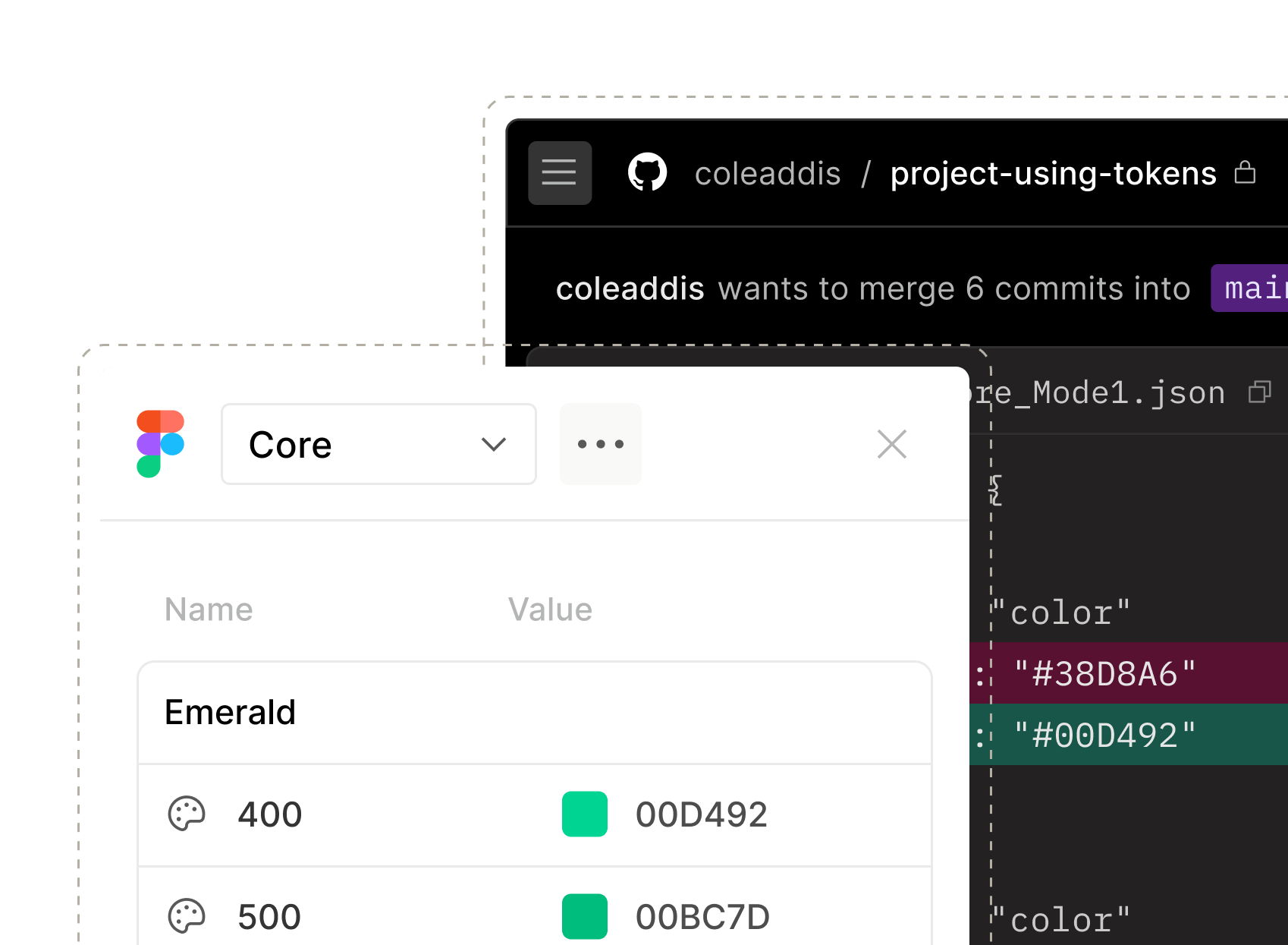
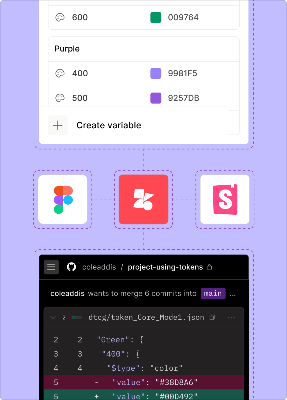
Sync between Storybook and repositories, automate tokens, keep design and dev aligned. Move fast now without creating the inconsistencies you'll spend months fixing later.
New hires get up to speed in days, not weeks — they see what components exist and how to use them. As you grow, you're not creating inconsistency and rework. Just more people building the right way.
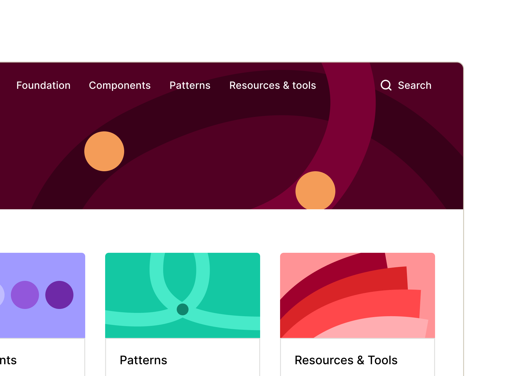
Launch a documented design system in days that shows everyone what exists and how to use it. Cut inefficiency, onboard new hires faster, and ship without creating the chaos that’ll hurt later.
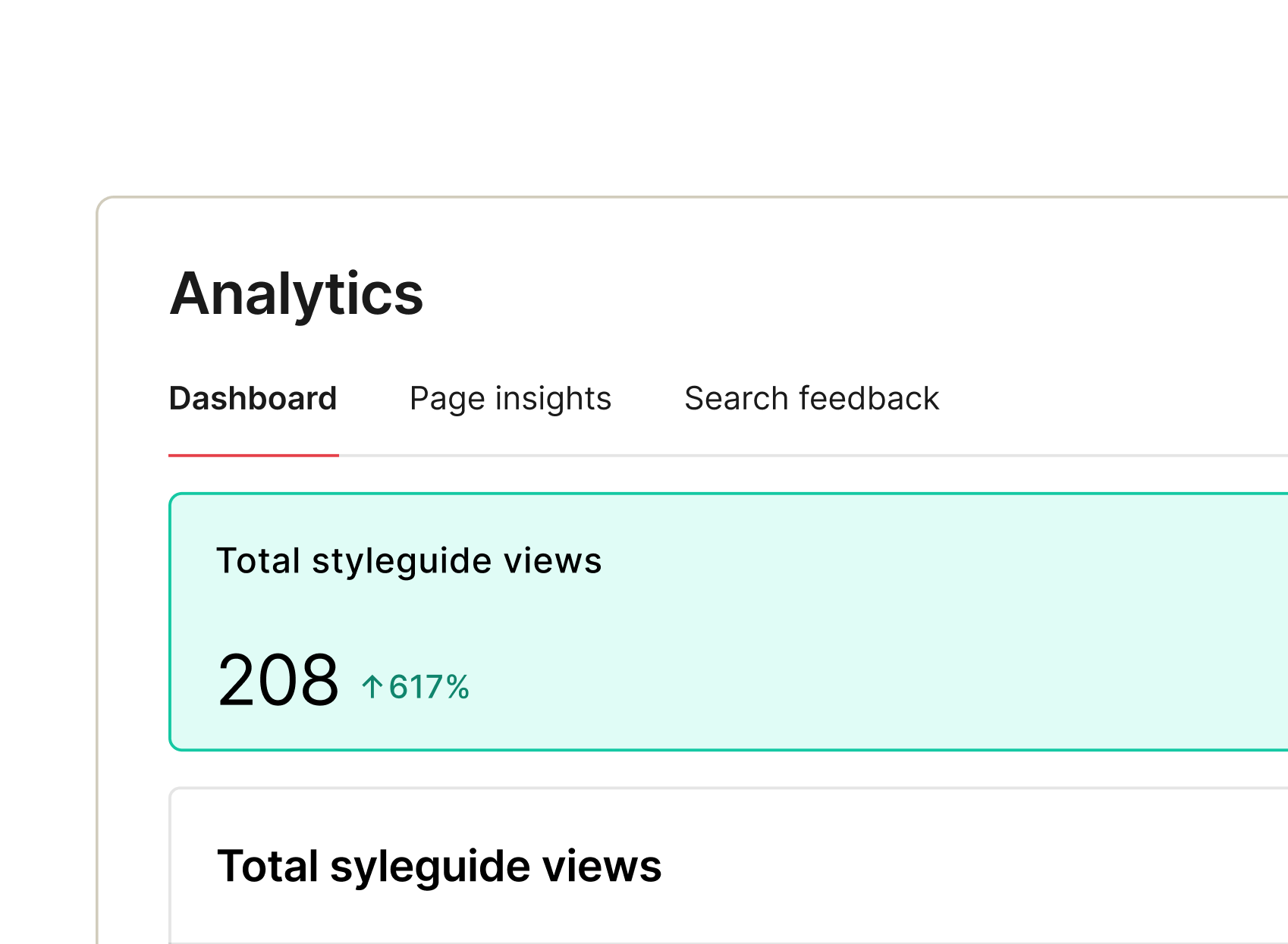
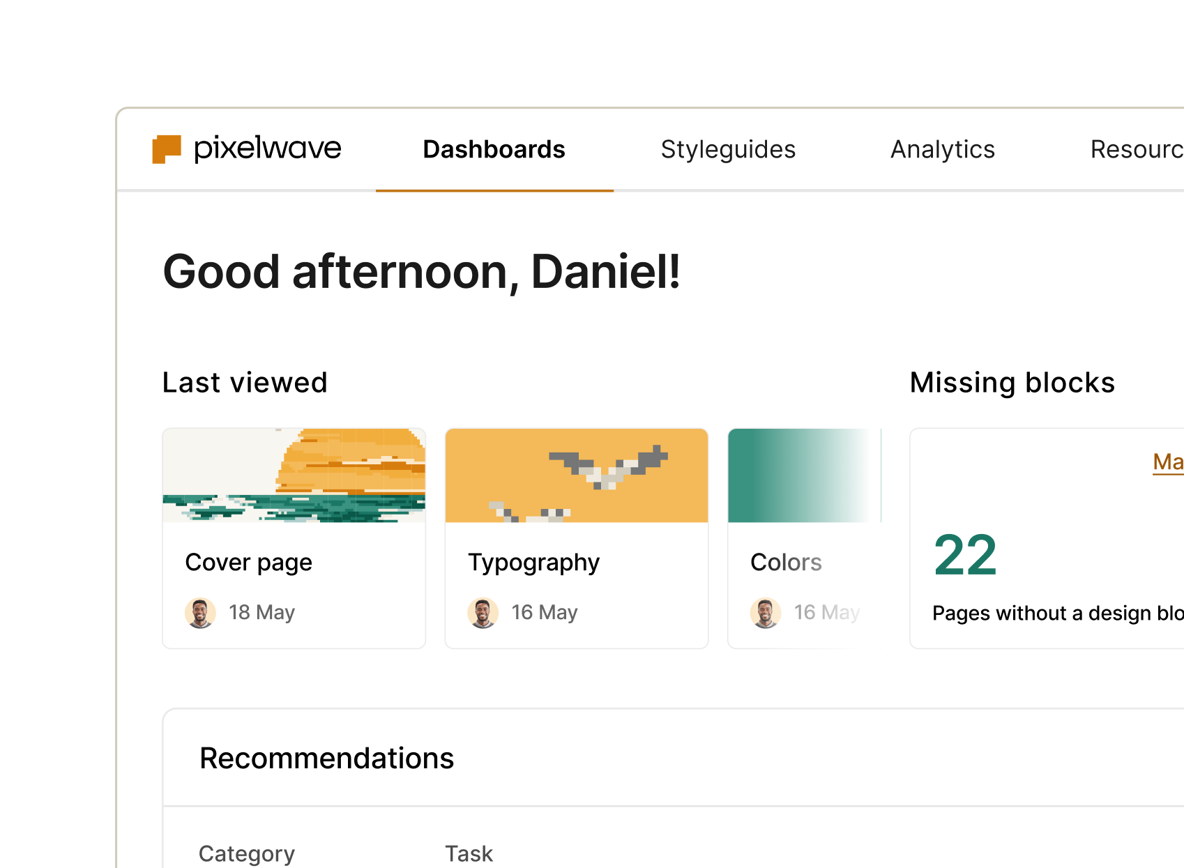
From documenting to delivering and measuring, zeroheight gives you full visibility and control – so nothing slips through the cracks and your design system keeps working like... well, a system.
Connect design to code with clarity. Automations streamline workflows, while documented components, tokens, and adoption insights speed delivery and alignment.
Gain clarity and control with dashboards showing system health and adoption, guiding governance and resource investment where impact matters most.
Stay consistent and move faster with reusable components, templates, and automations that simplify handoff and scaling.
Scale without chaos. Keep components consistent, docs current, and adoption measurable across products, teams, and complexity.