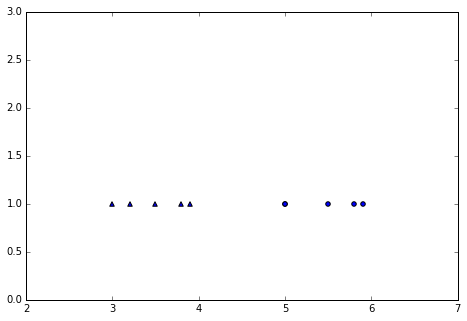
I created a plot on which the y value is visible with the marker. What's your opinion ? I wonder if I could have done something simpler.
(code should run in a Jupyter notebook)
%matplotlib inline
fig = plt.figure()
axes = fig.add_axes((1,1,1,1))
X = np.array([3,3.2,3.5,3.8,3.9,5,5.5,5.8,5.9,5])
y = np.array([1,1,1,1,1,2,2,2,2,2])
markers = ['^', 'o']
for k, m in enumerate(markers):
 i = (y == k+1)
 flat = [1 for val in y[i]]
 axes.scatter(X[i], flat, marker=m)
axes.set_xlim([2,7])
axes.set_ylim([0,3])
The result:
1 Answer 1
First of all some style comments:
- Please use spaces after commas and around operators – It is hard to read your sequence of values for the
Xandylists when they are all compressed. And the same applies for the([2,7])when setting limits. It reads a lot better with[3, 3.2, 3.5, ..., 5.8, 5.9, 5]and([2, 7]) - Choose better names for variables – Why have you used uppercase
Xand then lowercasey? What doesi,k, andmsignify? General recommendation is to use variable names meaning something, longer than one character long. For loop counters there is an exception fori,j,k, in that sequence. - Strange combination of
iandk– When I read code havingiandk, by convention I'm assuming there to be anjsomewhere. This is missing. In addition theiis not a loop counter, but some predicate function for use with numpy's boolean arrays. Try finding a better name fori, possibly something likemarker_range_predicate.
And then some considerations regarding your coding algorithm:
First of all I don't quite understand why you want to hide the
y-value and replace it with a flat value of1, and then use markers to denote the few distinct y-values. To me, intuitively, it would make more sense to add markers for given y-ranges, and interconnect markers of a given style with lines. This would show corresponding x-ranges and y-ranges of valuesLimit the range of the plot – Your example plot has loads of empty space, which makes the entire plot look almost empty. If you use
minandmax, you can limit the plot better. If you want to avoid having the min and max values on the axes, you could cheat a little and subtract/add0.5to those values. (An even better version would be to calculate the range, and add/subtract a percentage of that range to be used as limits)Separate x-ranges with different y-values for each marker – In a comment you state that you want to see if the values are linearly separable. To me that read as you might have overlapping x-ranges for different x-values, and you want to visualize this.
In your current code, if you switch the fourth element to
y=2, the markers would overlap, so I suggest changing the1when you setflatto be the current marker index, i.e.k. This way you would easily see the line of a current marker, but can also see if they are overlapping.Change size of markers – If adding a parameter,
s, to your call toscatter, you can change the marker size, and make them a little more prominent. I found200to a somewhat good size.Adding more markers? – I don't know if it's an alternative for you to use even more markers, but I tried adding some more and extended your data array with two extra x-values with a y-value of 2.
Refactored code
import numpy as np
import matplotlib.pyplot as plt
%%matplotlib inline
fig = plt.figure()

axes = fig.add_axes((1, 1, 1, 1))

x = np.array([3, 3.2, 3.5, 3.7, 3.8, 3.9, 5, 5.5, 5.8, 5.9, 5, 5.8])
y = np.array([1, 1, 1, 3, 2, 1, 2, 2, 2, 1, 2, 3])

markers = ['^', 'o', 's', 'v', 'p']
for idx, marker in enumerate(markers):
 i = (y == idx + 1)
 flat = [idx + 1 for val in y[i]]
 axes.scatter(x[i], flat, marker=marker, s=200)
 axes.set_xlim([min(x) - 0.5, max(x) + 0.5])
 axes.set_ylim([min(y) - 0.5, max(y) + 0.5])
This resulted in the following figure:
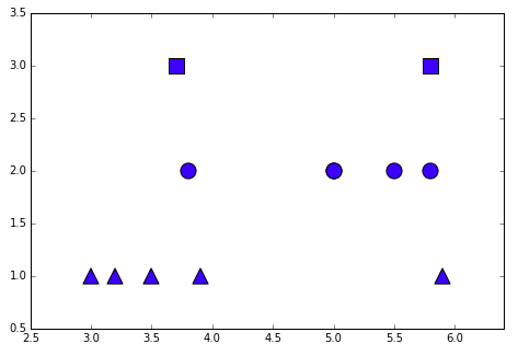
As you can see there is a lot more empty space, bigger markers, and even easier to see that in my slightly changed base data the x-ranges are not totally separable.
-
1\$\begingroup\$ Isn't it possible to just use
y[i]instead offlat, then? Also you might want to remove indentation onaxes.set_?lim. \$\endgroup\$301_Moved_Permanently– 301_Moved_Permanently2015年12月22日 09:43:31 +00:00Commented Dec 22, 2015 at 9:43 -
\$\begingroup\$ @MathiasEttinger, That is possible. I left it in, as it might be useful to match a range of Y-values or similar... \$\endgroup\$holroy– holroy2015年12月23日 02:18:37 +00:00Commented Dec 23, 2015 at 2:18
import numpy as npandimport matplotlib.pyplot as plt. \$\endgroup\$