I am trying to make a 3D grid plot in Python using Matplotlib. The grid consists of hexahedral cells (with qudrilateral surfaces). The surfaces should be colored according to their height, that is: the z coordinate. A colorbar should accompany the plot.
Here is an example plotting three surfaces:
from matplotlib import pyplot as plt
from matplotlib import cm
from mpl_toolkits.mplot3d.art3d import Poly3DCollection
import numpy as np
def getFaceMidpointsZ(pc):
 a=[]
 for i in pc:
 v=0
 for j in i:
 v=v+j[2]
 v=v/4.
 a.append(v)
 return a
def getColors(m,a):
 b=m.to_rgba(a)
 return [(i[0],i[1],i[2]) for i in b]
fig = plt.figure()
ax = plt.axes(projection='3d')
P=[(0,0,0),(2,0,0),(2,2,0),(0,2,0),(0,2,2),(2,2,2),(0,0,2)]
F=[[0,1,2,3],[2,3,4,5],[0,3,4,6]]
x = [t[0] for t in P]
y = [t[1] for t in P]
z = [t[2] for t in P]
pc=[[P[i] for i in f] for f in F]
fz=getFaceMidpointsZ(pc)
q = Poly3DCollection(pc, linewidths=1)
m = cm.ScalarMappable(cmap=cm.jet)
m.set_array([min(z),max(z)])
m.set_clim(vmin=min(z),vmax=max(z))
q.set_facecolor(getColors(m,fz))
ax.add_collection3d(q)
fig.colorbar(m)
ax.set_xlabel('x')
ax.set_ylabel('y')
ax.set_zlabel('z')
ax.set_xlim(min(x),max(x))
ax.set_ylim(min(y),max(y))
ax.set_zlim(min(z),max(z))
ax.view_init(elev=18., azim=-43.)
plt.show()
I am starting to learn Python and Matplotlib, so any comments would be appreciated.
enter image description here
2 Answers 2
Coding style
There is an official coding style guide for Python called PEP8. Give it a good read and follow it. For example, the most glaring violations:
- Spacing around operators: instead of
v=v+j[2], write asv = v + j[2] - For function names,
snake_caseis preferred overcamelCase - Put exactly two blank lines before each function definition
Coding practices
Don't put code in the global namespace, put inside a function. This protects you from bad practices like using global variables, whether intentionally or by accident.
For example, you could move all the code current code in the global namespace inside a main function:
def main():
 fig = plt.figure()
 ax = plt.axes(projection='3d')
 P = [(0, 0, 0), (2, 0, 0), (2, 2, 0), (0, 2, 0), (0, 2, 2), (2, 2, 2), (0, 0, 2)]
 F = [[0, 1, 2, 3], [2, 3, 4, 5], [0, 3, 4, 6]]
 # ...
And call the main function like this:
if __name__ == '__main__':
 main()
Avoid unused imports:
import numpy as np
Naming
The biggest issue with this code is the naming of variables. You're overusing single-letter or very short variable names, and it's hard to guess what is what without searching for where they come from and how they are used.
Simplify
You have many expressions that can be simplified, for example:
# instead of: v = v + j[2]
v += j[2]
# instead of: v = v / 4.
v /= 4.
-
\$\begingroup\$ You're welcome, meister of
awk;-) Btw, it's ok to wait for more comments and accept later, you know... \$\endgroup\$janos– janos2014年09月07日 11:21:23 +00:00Commented Sep 7, 2014 at 11:21 -
\$\begingroup\$ Thanks Janos, but I am not using
awkso much now.. I am moving on to Perl and Python. And I think it is amazing :) \$\endgroup\$Håkon Hægland– Håkon Hægland2014年09月07日 11:26:11 +00:00Commented Sep 7, 2014 at 11:26 -
\$\begingroup\$ Yup, see it in your questions ;-) Glad you like it! Small piece of advice: better
PythonthanPerl! \$\endgroup\$janos– janos2014年09月07日 11:27:57 +00:00Commented Sep 7, 2014 at 11:27
The surfaces should be colored according to their height, that is: the z coordinate.
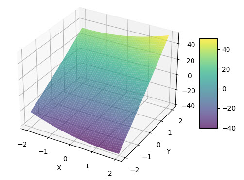
to add colorbar see exomple code & use cmap param, like this:
import numpy as np
import matplotlib.pyplot as plt
from matplotlib import cm
##from matplotlib.ticker import LinearLocator
# Create 3D plot of the data points and the fitted curve
fig = plt.figure()
ax = fig.add_subplot(111, projection='3d')
# JUST E.G.
# coords of plain fitted
x_range = np.linspace(-2, 2, 100)
y_range = np.linspace(-2, 2,100)
X, Y = np.meshgrid(x_range, y_range)
Z = 1.41564 * X**2 + 0.37892 * Y**2 + 2.31836 * X * Y + 0.10939 * X + 18.55000 * Y + -1.82745
# plot plain
surf = ax.plot_surface(X, Y, Z, color='red', alpha=0.7, cmap=cm.viridis,) # <<<<<<
ax.set_xlabel('X')
ax.set_ylabel('Y')
ax.set_zlabel('Z')
# Add a color bar which maps values to colors.
fig.colorbar(surf, shrink=0.5, aspect=5) # <<<<<<
plt.show()
-
1\$\begingroup\$ You have presented an alternative solution, but haven't reviewed the code. Please edit to show what aspects of the question code prompted you to write this version, and in what ways it's an improvement over the original. It may be worth (re-)reading How to Answer. \$\endgroup\$Toby Speight– Toby Speight2024年01月04日 08:05:23 +00:00Commented Jan 4, 2024 at 8:05