I'm new to data science. I wrote this script for plotting all different kinds of iris data set scatter plot. trying not to plot something with itself . how can I optimize my code ?
 from sklearn.datasets import load_iris
 import matplotlib.pyplot as plt
 import numpy as np

 import pandas as pd

 iris=load_iris()

 list1=[]

 fig, ax =plt.subplots(nrows=3,ncols=2,figsize=(10,10))

 for ii in range(4):
 for jj in range(1,4):
 if ii==jj:
 break
 if ii*jj not in list1[1::2]:
 list1.extend((ii+jj,ii*jj))
 elif ii+jj in list1[::2]:
 break
 a=ii
 b=jj
 x_index=ii
 y_index=jj
 colors=['blue','red','green']
 if ii==0:
 b=b-1
 elif jj==1:
 a=a-2
 b,a=a,b
 elif ii==3:
 a=a-1
 b=b-1
 a,b=b,a
 for label , color in zip(range(len(iris.target_names)),colors):
 ax[b,a].scatter(iris.data[iris.target==label,x_index]
 , iris.data[iris.target==label,y_index]
 , label=iris.target_names[label]
 , color=color)

 ax[b,a].set_xlabel(iris.feature_names[x_index])
 ax[b,a].set_ylabel(iris.feature_names[y_index])
 ax[b,a].legend(loc="upper right")
 fig.tight_layout()
 fig.show()
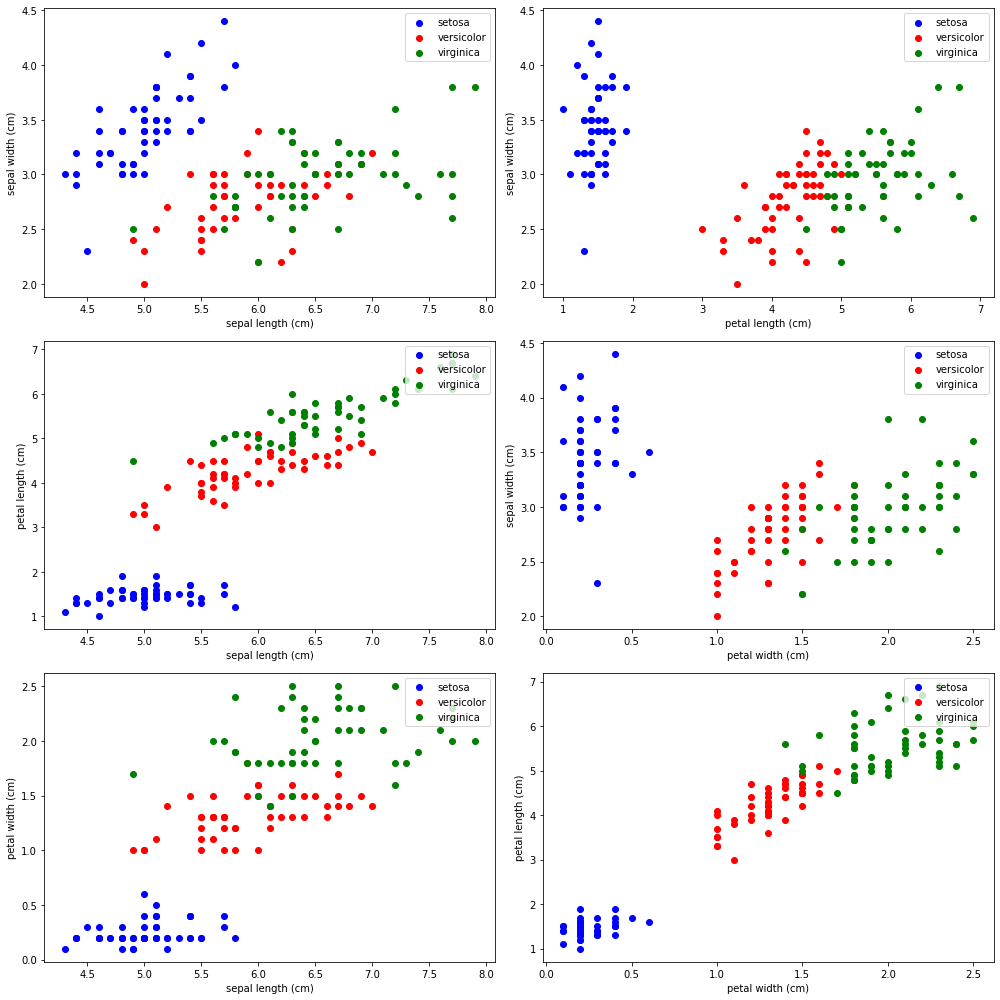
enter image description here this is the output
how would you write it if it was you?
I appreciate any help.
1 Answer 1
Two remarks on your code:
There seems to be an indentation error in your code, everything before your first for loop has too much indentation.
In general, it is a good idea to use telling names for variables. For example,
columnandrowinstead ofaandb.
Following is my version of the code. It is not an exact reproduction of your plot, but the way I would approach an analysis like this:
from sklearn.datasets import load_iris
import pandas as pd
import seaborn as sns
iris = load_iris()
# convert dataset to pandas DataFrame
iris_df = pd.DataFrame(iris['data'])
iris_df.columns = iris['feature_names']
iris_df['species'] = iris['target']
iris_df['species'] = iris_df['species'].replace([0, 1, 2], iris['target_names'])
# alternative: load dataset from seaborn library (they use slightly different column names)
# iris_df = sns.load_dataset('iris')
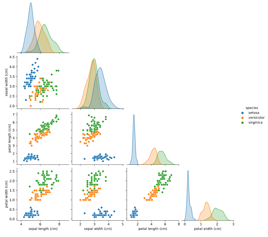
sns.pairplot(data=iris_df, corner=True, hue='species')
This produces the following plot: enter image description here
As you can see, the code has become much shorter and the resulting figure still contains all the plots you wanted (plus a few extra ones). Great thing about using pandas and other related libraries (e.g., seaborn) is that you can often write very compact code (e.g., by getting rid of many for loops).
First, I converted the iris dataset to a pandas DataFrame (documentation). A DataFrame is the main data type in pandas and makes analysis and processing of your data much easier. As shown in the code, there is an alternative way of loading the iris dataset into python using the seaborn library (sns.load_dataset('iris')) This will give you the dataset directly as a DataFrame, no more need to convert it.
Then, I call pairplot from the seaborn library. seaborn is a plotting library based on matplotlib that works with DataFrame objects. It has a high-level interface, meaning you can produce complex plots such as the one you see with often a few lines of code.
I just found out that pandas already has a very similar plot function, check out scatter_matrix. So you don't necessarily need to use seaborn (even though it's a great library and I recommend it).