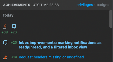
TL;DR: We're planning to make some changes to the inbox in a few weeks. You'll be able to mark individual notifications as read or unread, and to filter the inbox dropdown to show only unread notifications (or show all of them). We're also making some styling changes to make it easier to tell whether a notification is marked read or unread.
Why change the inbox?
One common complaint we've heard from our experienced users is that the inbox is difficult to use due to the notifications being immediately marked as read after opening the inbox dropdown. Statistics confirm that the problem exists: there are over 5k active users that have over 50 unread notifications, and even some of our active moderators have stopped using the inbox. Moreover, those stats don't even include people who just open and close their inbox without even reading their notifications, just to make the unread indicator go away.
We believe that the current functionality is holding the community back from deeper engagement with posts through notifications. Right now, notifications are marked as read immediately after opening the inbox, making it hard for users to read new notifications and participate on relevant posts.
What's being changed?
To address these issues, we're planning to release some new features for the inbox soon:
- The ability to toggle the read/unread status on individual inbox notifications
- The ability to toggle the inbox between showing all notifications and only unread notifications
- Style changes to help with distinguishing between read and unread notifications
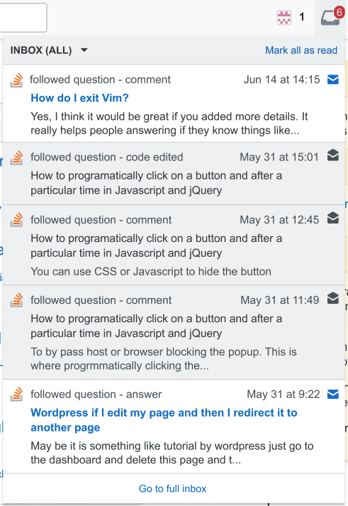
Here's an example of what the inbox will look like when these improvements are released:
Marking notifications as read
In this update, opening the inbox will no longer automatically mark all notifications as read. Instead, unread notifications will be only marked as read if the user interacts with them. To mark a notification as read, you can do any of the following:
Click (left click or middle click) on the notification to open it (which will also mark it as read):
Example screenshot of a single unread notification in the inboxLeft click on the closed-envelope icon ( Dark gray icon of a closed envelope, indicating an unread message ) on the right side of the notification to mark it as read without opening it.
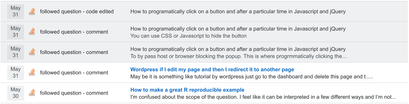
Click (left click or middle click) on the notification in the inbox tab of your stackexchange.com profile:
Example screenshot of a single unread notification in the global inbox on stackexchange.com
Users can also click the "Mark all as read" button at the top-right of the inbox dropdown on a site to mark all notifications as read at once:
Marking notifications as unread
Read notifications can be marked as unread by clicking on the open-envelope icon ( Blue icon of an open envelope, indicating a read message ) on the right side of the notification.
Example screenshot of a single read notification in the inbox
Other display changes
As you can see, we are introducing some changes in how read and unread notifications are displayed:
In the inbox dropdown, read notifications are still clickable, but are now fully grayed out (including the link title), as shown above. There are no significant changes to how unread notifications look in the dropdown.
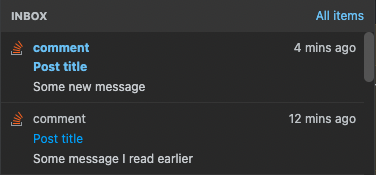
Since users will also be able to see the unread status of notifications in the inbox on stackexchange.com as well, there will be a visible distinction between read and unread notifications there, very similar to the one in the dropdown:
As with the dropdown, clicking on individual notifications in the global inbox on stackexchange.com will cause them to be marked as read. However, no additional interactions will be added to the inbox on stackexchange.com at this time.
Filtering notifications
We're also adding the functionality to filter the inbox to only unread notifications. Users can use the context menu in the top bar to toggle between viewing all notifications or only unread ones:
Note that the inbox dropdown only loads up to the 50 most recent notifications. Filtering the inbox to "Unread" will not load any additional notifications beyond that limit – it will just filter out unread ones. You can always see all of your notifications in the global inbox on stackexchange.com, so any users who have unread notifications outside of their 50 most recent notifications can find them there.
When and how will these changes be rolled out?
We're planning to release the first version of these inbox improvements within the next couple of weeks. We'll most likely roll these changes out in stages to ensure that everything's working properly; we'll make a new post to inform the community when we begin to roll those changes out.
We'll also be tracking metrics on usage of the new features to help us decide on further improvements in this area.
There should not be any changes to the way that email notifications work as a result of these changes to the inbox user interface.
How should we share feedback on these changes?
If you have any questions, suggestions, or other feedback regarding the planned inbox improvements we've described here, please post it in an answer below.
(As mentioned above, we'll make a new announcement once these changes are live; we'll direct bug reports and any additional feedback there at that time.)
11 Answers 11
It is great to at last see substantive updates to this venerable UI!
Now... How about some notifications API integration? It is pretty much the only reason anyone's still using the old mobile apps, and while it wouldn't help those beleaguered iPhone folks... Nothing will.
-
14I guess I know that you've been judging me all this time. :P2022年10月07日 16:36:44 +00:00Commented Oct 7, 2022 at 16:36
-
6As an iPhone user, I'm perfectly happy not to receive even more notifications.Cody Gray– Cody Gray2022年10月08日 04:18:56 +00:00Commented Oct 8, 2022 at 4:18
-
4Web push notifications are finally coming to mobile Safari in an update next year, apparentlytoastrackengima– toastrackengima2022年10月08日 07:47:38 +00:00Commented Oct 8, 2022 at 7:47
-
4I'd second that, but I was hoping for this first. I do feel that it would be a really nice enhancement :D2022年10月08日 12:39:30 +00:00Commented Oct 8, 2022 at 12:39
-
1This is an optional feature @CodyGray, aka, the site has to ask for permissions before being able to send you anything.Braiam– Braiam2022年10月17日 17:25:31 +00:00Commented Oct 17, 2022 at 17:25
Moreover, those stats don't even include people who just open and close their inbox without even reading their notifications, just to make the unread indicator go away.
Hi, that's (partially) me. I like to think of the indicator as 'there's something new in your inbox', not as a 'there's something unread in your inbox'. So, I do open my inbox from time to time, check the new stuff, and if it's nothing urgent, I close my inbox again. No need for the bright red indicator to stay, and no need for me to actually read the notifications or mark them as read in a separate manual step.
Added on top of that, especially with this new functionality, I might end up deliberately marking some read notifications as 'unread' again, in a 'I need to check back on this in 6-8' reminder kind of way. I really, really don't want an indicator pretending there's something new to be seen to be there for the entire 6-8 though, yet this screenshot confirms that the latter would be the case and the indicator would stay.
So, I hereby request you to please still make the indicator go away once I have made the conscious decision to open the inbox but not mark as 'read' all of the messages there, I don't want to be notified of old, unread things, only of truly new things. I can catch up the old unread stuff later if need be, but it's nothing urgent and it's not something I need a bright red indicator for.
-
8As to marking the messages as unread deliberately, that's totally fine and also one of the use cases we were thinking of. As to keeping the indicator on or turning it off, I see what you mean, we actually had a discussion about it with some people being for keeping it on and some for showing only new messages count. At this moment we chose to keep it on, but the plan is to listen to the community and afterwards choose the option that fits you best.2022年10月07日 11:49:29 +00:00Commented Oct 7, 2022 at 11:49
-
9This is precisely how the Windows 10 email client displays the number of unread emails in the taskbar: it resets as soon as you open it, but doesn't mark any email messages as read. I find this functionality quite useful.Sonic the Anonymous Hedgehog– Sonic the Anonymous Hedgehog2022年10月07日 12:15:43 +00:00Commented Oct 7, 2022 at 12:15
-
6This workflow appears to be highly idiosyncratic, and I would personally find it highly problematic, if I were to return to actually being able to use the inbox (which it looks like these changes may allow me to do). If there are unread messages in it, I would expect it to have a badge indicating that. I definitely don't want it to automatically clear the notification simply because I drop it down; that's the behavior it has now, and it makes it nearly unusable for me. (I periodically accidentally drop it down by pressing the "I" key, since I have keyboard shortcuts turned on.)Cody Gray– Cody Gray2022年10月08日 04:21:32 +00:00Commented Oct 8, 2022 at 4:21
-
4A more reasonable compromise seems like it would be to have a button/option for clearing the notification icon, similar to "mark all as read" or whatever.Cody Gray– Cody Gray2022年10月08日 04:21:59 +00:00Commented Oct 8, 2022 at 4:21
-
3Shrug. Seems like you're going to get things your way anyways @Cody, see the response from staff to my request. It may make things useable for you, it makes things unusable for me. I will end up indiscriminately mashing "mark all as read" and not using the functionality to leave things unread for later if having unread items from weeks ago means the indicator stays.2022年10月08日 08:31:36 +00:00Commented Oct 8, 2022 at 8:31
-
3I also like the old behaviour, where opening the inbox marks everything as seen. One convenient property is that everything above a certain line is new, and everything below it has been seen. I find it easy to make a mental note to handle everything above that line during a session. If it takes any effort to explicitly mark a notification as seen, then I won't bother, and the indicators will stay lit and therefore useless. (An e-banking system that I use requires me to open each message to clear the mark, even though skimming the summary tells me enough of what I need to know. So annoying.)200_success– 200_success2022年10月12日 06:31:38 +00:00Commented Oct 12, 2022 at 6:31
I can't wait, this will definitely help me in not forgetting important notifications, which all too often get drowned in the noise. (Yes, follow-post, I'm looking at you.)
Question: will these or similar improvements also be ported to the ♦ moderator inbox? Its behaviour tricked me in the past.
-
7Not in the first step, but if the changes will be positively received, I think it'll be a natural next step to improve that inbox, too.2022年10月07日 11:18:35 +00:00Commented Oct 7, 2022 at 11:18
-
1snort On one hand, follow post is essential for modding meta. On the other, I'm sure my inbox has caught fire a few times :D2022年10月07日 11:54:44 +00:00Commented Oct 7, 2022 at 11:54
-
2@JourneymanGeek that is because the stuff you touch is too hot to handle ...2022年10月07日 12:42:15 +00:00Commented Oct 7, 2022 at 12:42
-
7I've been wondering about this, too. I'd love to see better handling of orange inbox notifications as the SO mods frequently miss them due to the volume of mod messages they send.2022年10月07日 12:45:27 +00:00Commented Oct 7, 2022 at 12:45
-
1Its a tangent, but I wonder what's the 'value' of putting every mod message as a diamond notification and/or always having an orange inbox notification on top2022年10月07日 13:44:09 +00:00Commented Oct 7, 2022 at 13:44
-
5Having a way to go further back in the diamond inbox history would be nice. Ours currently goes back a whopping 16 hours.Ryan M– Ryan M2022年10月07日 18:43:03 +00:00Commented Oct 7, 2022 at 18:43
-
2@RyanM 16 hours? One of my colleagues has a script which suspends spammers before destroying them. Sometimes the history goes back 16 minutes...2022年10月07日 18:48:22 +00:00Commented Oct 7, 2022 at 18:48
-
6@Glorfindel We've mostly gotten those to stop showing up by exploiting a bug that causes messages with sufficiently long titles to not show up in the diamond inbox. Before that, it was far worse. And even with that, it was down to ~four hours yesterday.Ryan M– Ryan M2022年10月07日 18:50:05 +00:00Commented Oct 7, 2022 at 18:50
-
8...speaking of which, if y'all fix that bug, pleeeease give us a workaround for suspending spammers before destroying them without cluttering the mod inbox. It was so noisy.Ryan M– Ryan M2022年10月08日 01:38:38 +00:00Commented Oct 8, 2022 at 1:38
-
2Relevant xkcd: WorkflowDarryl Noakes– Darryl Noakes2022年10月11日 13:20:05 +00:00Commented Oct 11, 2022 at 13:20
In the inbox dropdown, read notifications are still clickable, but are now fully grayed out (including the link title), as shown above. There are no significant changes to how unread notifications look in the dropdown.
As of now, the unread notifications are marked with a colored background and the read ones are simply white. I feel this distinction is good enough and it looks prettier to me:
Screenshot of the current design
In the new design I see pretty much the inverse of above:
Example screenshot of the improved inbox
- It feels like the read notifications stand out more than the unread ones at first, but I'm not quite sure overall;
- The new Inbox dropdown will look inconsistent with the Achievements dropdown.
Could you please not touch the design here? Or if you really want the read notifications to be grayed out, please leave the background white at least.
-
2Yeah, their "grayed out" is a joke now with the new design, it stands out more than actual highlighting. This is super annoying with ignored tags, and with that inbox change, it would become much worse.user152859– user1528592022年10月19日 10:26:29 +00:00Commented Oct 19, 2022 at 10:26
-
4We are aiming for a "gmail like" style, with read messages being greyed out and unread messages bolded. Would your suggestion be to keep the current style (always white background, only bolding the text)? We were considering few options, I think this design was also a top contender: i.sstatic.net/jQQd4.png2022年10月20日 11:14:57 +00:00Commented Oct 20, 2022 at 11:14
-
1tbh - I like the one in the comment better.2022年10月20日 11:40:52 +00:00Commented Oct 20, 2022 at 11:40
-
@marrados Yes, please keep the current style, like on your screenshot (it's not always white background ;-) ).EvgenKo423– EvgenKo4232022年10月20日 13:50:02 +00:00Commented Oct 20, 2022 at 13:50
-
1Hi! We discussed it with our design team and we'll go with the design proposed by us for the beta, which will start in a few days. If the broader feedback during the beta will be similar to your concerns, we'll react.2022年10月27日 09:19:45 +00:00Commented Oct 27, 2022 at 9:19
-
@marrados Ah, fair enough, I guess.EvgenKo423– EvgenKo4232022年10月28日 08:45:24 +00:00Commented Oct 28, 2022 at 8:45
-
@marrados I thought there will be a public beta. Now you've got a broader feedback of two similar posts with a total score of 26 in addition to this one. Do you plan to change anything?EvgenKo423– EvgenKo4232022年12月22日 08:21:13 +00:00Commented Dec 22, 2022 at 8:21
Bringing up an old feature request for consideration.
Sometimes people are jerks, and we get abusive posts into the inbox. Could there be some way to remove specific notifications from the inbox totally? This would be useful in dealing with the fallout of users being abusive. Maybe stuff that's flagged Rude or comments flagged unkind or worse.
-
1I'll make sure that's in our backlog - no promises on when it'll get implemented, though.2022年10月20日 10:43:06 +00:00Commented Oct 20, 2022 at 10:43
-
That's appreciated2022年10月20日 11:53:30 +00:00Commented Oct 20, 2022 at 11:53
-
How about a toggle moderators could use when handling flags on a post to remove these items from recipients their inboxes.Luuklag– Luuklag2022年10月21日 11:37:38 +00:00Commented Oct 21, 2022 at 11:37
-
The simplest implementation is to remove deleted posts I'd guess, especially if its R/A or unkind flagged I suspect2022年10月21日 11:40:52 +00:00Commented Oct 21, 2022 at 11:40
My current workflow is to open the notifications once, Ctrl+click on each unread notification to open it in a background tab, then close to see them marked as read. Thanks for taking the initiative to improve this situation!
Allow me to suggest a feature that would really help: group notifications by post/topic!
Often I receive numerous notifications about edits, closures, comments, all on the same post, but intermingled with those from other posts. I need to visit that page only once to read them all, will I need to mark them as read individually? It would be great to have a button "Mark all <N> notifications as read that originated from the current page" or something.
Or to declutter the inbox a bit, do not show one notification per comment, just show one per post to say "Answer <Xyz> has <N> new comments, starting at ...".
-
I used to use exactly this same workflow, but now that it's not uncommon for me to get 50-100 notifications every couple of days, it is no longer reasonable to tax the browser by opening that many tabs. I also agree that grouping would be useful; good suggestion!Cody Gray– Cody Gray2022年10月15日 10:59:05 +00:00Commented Oct 15, 2022 at 10:59
Can we add an option to filter on followed questions too? Either to include or exclude them from your view. If you follow a lot of active posts you get, obviously, a lot of notifications which usually aren't that important. They could easily drown that one comment on your post asking for clarification, which I would consider important.
-
4I think this is something we will consider in the future, but it will not be a part of the first or the second release. I'd say that for now we want to make sure that we make sure that the basic functionality is received well, then I think we will focus on the moderator inbox and then we can see what your other top needs are. But for sure we'll keep it in the backlog!2022年10月07日 19:28:27 +00:00Commented Oct 7, 2022 at 19:28
-
1This is implemented in the Teams' Inbox, choosing to filter gives these choices: i.sstatic.net/bwpQu.jpgRob– Rob2022年12月09日 12:33:42 +00:00Commented Dec 9, 2022 at 12:33
-
@marrados any chances you are willing to port the design from teams?Luuklag– Luuklag2022年12月09日 13:37:15 +00:00Commented Dec 9, 2022 at 13:37
As requested in the comment, this 'answer' has been converted into the question — Inbox improvements: providing more control over what appears in the dropdown list.
With the outlined modifications, I'd like to see a way to get rid of (not show) notifications that I don't want to see anymore, and a way to keep (show) notifications that I do want to see in the dropdown list, for perhaps a month or so.
I see that notifications are kept forever — if I scroll down to the bottom of the drop-down (the last shown notification shown for me today is from 23rd September), then the 'show all notifications' link pops up (for me) 1616 pages of notifications dating back to September 2008. It would be helpful if that list could be searched — by date range, tags, user ID, as well as the content of the notification. Similar comments apply to searching through comments I've made, though the user ID would be for the recipient of the comment rather than the sender. (That gets tricky: for a comment to an answer, the comment could be addressed to another commentator, or the answerer, or the OP of the question. Additionally, over time, some people change the name associated with their ID, but the message content doesn't change. Mapping names becomes its own headache.)
-
1Could you create a separate post for this request? Or maybe there is one already? It'd be great to hear what the rest of community thinks about it, i.e. do you prefer to expand the functionality of the global inbox, or rather have it in the popup? Based on that we can come up with a new feature. I think best would be if you start this topic after the release of the new inbox management. Does that sound good?2022年10月20日 11:00:30 +00:00Commented Oct 20, 2022 at 11:00
-
@marrados — done: see Inbox improvements: providing more control over what appears in the dropdown list. Feel free to tweak it if there's something you want to emphasize or add.Jonathan Leffler– Jonathan Leffler2022年10月20日 18:52:22 +00:00Commented Oct 20, 2022 at 18:52
The styles in StackOverflow dark mode have changed to use the same colour as :visited links for new, unread messages which is pretty much the opposite of what I'd expect to see.
body.theme-dark {
 --blue-700: hsl(206,90%,74%);
 --theme-link-color-visited: var(--blue-700);
 --theme-post-title-color-visited: var(--theme-link-color-visited);
}
a:visited {
 color: var(--theme-post-title-color-visited);
}
.topbar-dialog li.unread-item .unread-bold {
 font-weight: bold;
 color: var(--blue-700);
}
Aren't you trying to improve accessibility?
The same problem is present in the reputation dropdown as well
-
3This also happened in light mode. Instead of a subtle background colour to highlight unread items, or rep gain, an obnoxious boldface is used now.Luuklag– Luuklag2022年10月27日 23:21:23 +00:00Commented Oct 27, 2022 at 23:21
-
2We just pushed the fix for the issue. During implementation of the new inbox features we had to touch existing code, too, and unfortunately we caused this bug. Thank you very much for the report and even more for your patience. We're sorry you've experienced those issues and hope that the planned improvements will make up for it!2022年10月28日 18:43:20 +00:00Commented Oct 28, 2022 at 18:43
-
@marrados still looks like a visited link to me. It's got a different background colour but the text colour hasn't changedPhil– Phil2022年10月28日 23:14:36 +00:00Commented Oct 28, 2022 at 23:14
Please let us know what the UI will look like on smartphones by sharing screenshots. The screenshots in the post look as if they only apply to computers.
-
4It should look relatively the same? We no longer have separate views for mobile vs full site - it's all responsive now. The only change that occurs when getting to a small screen size now is that the dropdown expands to 100% screen width, but the inbox otherwise looks exactly the same between both. Are you expecting something should change between the two?2022年10月07日 16:30:04 +00:00Commented Oct 7, 2022 at 16:30
-
2@animuson Those icons are gonna certainly look small on mobile (if it's similar to computer) and it would be hard to press them in touch screen I suppose.Random Person– Random Person2022年10月07日 17:29:03 +00:00Commented Oct 7, 2022 at 17:29
I have been (how should I put it?) distressed over my privacy for the past 2 days after reading Websockets can be used to spy on users' activity because of the apparent privacy risks that notifications cause (through the API).
My only question is: How do these upcoming changes make my privacy better, or worse?
-
2I don't think I've written these sentences correctly, if a native English speaker cares to revise them please edit.bad_coder– bad_coder2022年10月07日 13:06:49 +00:00Commented Oct 7, 2022 at 13:06
-
Technically this makes it 'harder' to use those endpoints to check when you last opened/cleared it, though its entirely incidental.2022年10月07日 13:43:03 +00:00Commented Oct 7, 2022 at 13:43
-
1Well in the context of what they're doing, an inbox with items wouldn't indicate that the user has just opened the inbox if you could set items to be read or unread. As such you can't use the state of the inbox to guess what the user is doing? As such its 'better' for privacy, but not by design2022年10月07日 14:07:11 +00:00Commented Oct 7, 2022 at 14:07
-
But they can now also increase, or different posts selected and unselected. Its got 'less' meaning now. Its not a replacement for reviewing and considering how to fix the issue of course but all else remaining the same,the raw count is less meaningful2022年10月07日 14:12:18 +00:00Commented Oct 7, 2022 at 14:12
You must log in to answer this question.
Explore related questions
See similar questions with these tags.
Moreover, those stats don't even include people who just open and close their inbox without even reading their notifications, just to make the unread indicator go away.--- They are on to us, run!