The Public Platform team is continuing to work towards improving the review queues and we’re here today to announce a new onboarding experience for the review queues.
In the product discovery phase (see this earlier Meta announcement), we learned that each queues’ instructions could be easily misinterpreted and additional information was difficult to find. Without proper guidance or context, new reviewers would contribute inconsistent reviews and risk having their review privileges suspended.
With this release, our goals were to 1) better highlight the review privilege and 2) provide upfront instruction and guidance for successful reviewing.
New privilege announcements
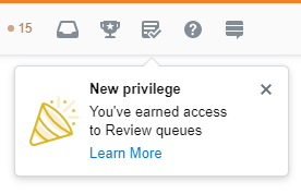
Community moderation is a significant aspect of Stack Overflow and the Stack Exchange sites. We want users to be aware and familiar with this newly earned privilege, but also celebrate the opportunity to contribute to the community in a unique way.
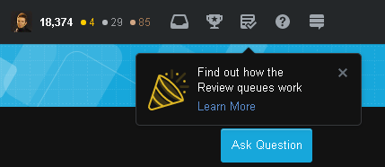
Many users were discovering the review queues by chance. Once the privilege is earned, a new review queue icon with a red alert would appear in the top-right part of the navigation. We are adding a popover to bring more attention to this easy-to-miss icon. We will also be adding notices for when users earn access to other, higher reputation queues.
Additionally, new reviewers will also receive an email notification about the newly earned privilege. They will only get the email if they earn the privilege and don't perform a review within 24 hours (anyone who doesn't want to receive email notifications like this can visit their email settings preferences and turn off "Tips and Reminders").
We are also showing a popover to users who earned access to review queues in the past, but have never done a review or haven't reviewed in the last 30 days. This popover is only appearing for the next 90 days. The goal is to engage users who may not have interacted with the queues since we made visual design changes and improved communication about suspensions.
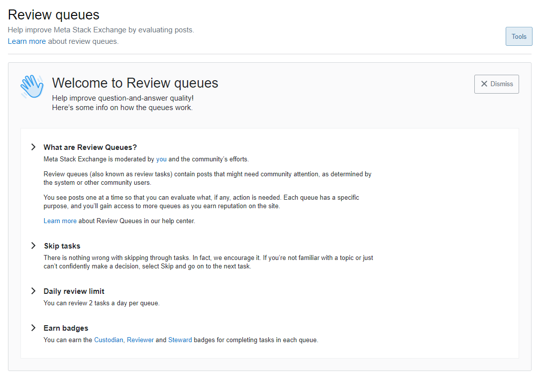
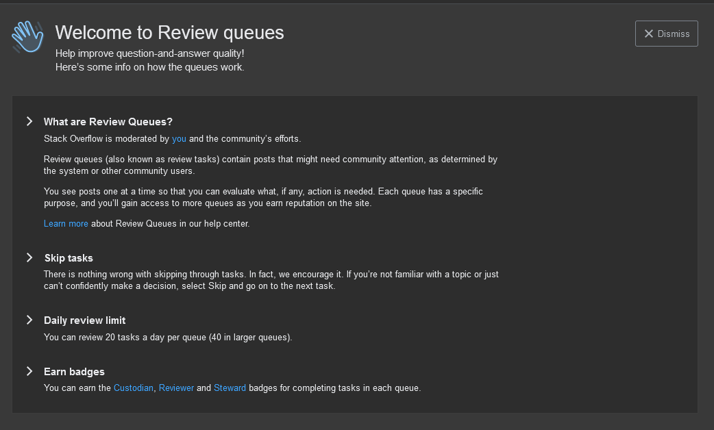
Welcome banner
enter image description here If a reviewer clicks "Learn more" on the on-page popover or goes to the review queue home page (/review), they’ll be greeted with an onboarding message with general information about the review queues.
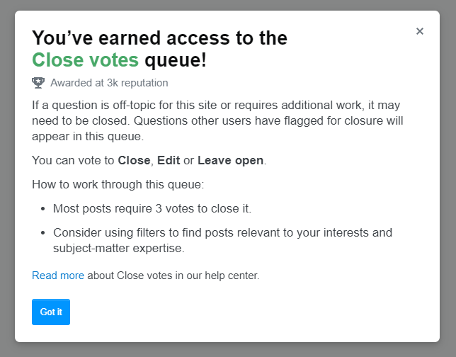
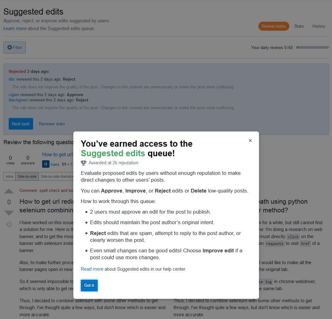
Informational modals
Queue-specific modals will appear upon page load as you visit each queue. They summarize and highlight important aspects and tips about reviewing in a particular queue. This information can be revisited at any time by clicking "Learn more" under the page header.
Feedback
As always, please leave your feedback and any bugs you may discover related to this release below this post. We will be monitoring this post for the next few weeks (May 4, 2021). After May 4th, please report any further issues as new questions.
-
4"You can review 2 tasks a day per queue."?user707129– user7071292021年04月20日 18:16:56 +00:00Commented Apr 20, 2021 at 18:16
-
4"Queue-specific modals will appear upon page load as you visit each queue" Does this mean they will appear each and every time you go into a queue? If so, is there a way to disable this after the first time it pops up?caird coinheringaahing– caird coinheringaahing2021年04月20日 18:20:57 +00:00Commented Apr 20, 2021 at 18:20
-
18@Xnero That's my fault. The screenshots are from my local machine and I had been testing reaching the daily limit.Brian Nickel– Brian Nickel StaffMod2021年04月20日 18:33:47 +00:00Commented Apr 20, 2021 at 18:33
-
3Will this be modifiable per SE?Mast– Mast2021年04月20日 18:53:05 +00:00Commented Apr 20, 2021 at 18:53
-
3Are these changes behind the recent reduction in review queue update frequency?KillingTime– KillingTime2021年04月20日 19:00:05 +00:00Commented Apr 20, 2021 at 19:00
-
12Please could the question title be in a more international version of English than US English? The "onboarding" in "New onboarding for review queues" needs to be explained. There are some words in US English which are not known around the world.Andrew Morton– Andrew Morton2021年04月20日 19:19:41 +00:00Commented Apr 20, 2021 at 19:19
-
34@Andrew I was part of a German company with a location in the Netherlands for a while and they had an onboarding process. We know the word. Perhaps you hadn't encountered it yet, but in corporate country, it's part of the lingo nowadays. Worldwide.Mast– Mast2021年04月20日 19:22:25 +00:00Commented Apr 20, 2021 at 19:22
-
23@AndrewMorton It's been a global business term for like 60 years, but it means introducing new organizational members to workflows and procedures at that organization. It's taken quite literally from 'bringing someone "on board" a ship where the ship in the metaphor is the company or organization.TylerH– TylerH2021年04月20日 19:32:25 +00:00Commented Apr 20, 2021 at 19:32
-
5@TylerH It's been a global business term for the USA.Andrew Morton– Andrew Morton2021年04月20日 19:42:07 +00:00Commented Apr 20, 2021 at 19:42
-
34As an elected moderator and user of Stack Overflow very close to earning their 12th yearling badge, I do find the notification.. annoying. I visit the review queues quite regularly, I just don't usually do reviews there.Martijn Pieters– Martijn Pieters2021年04月20日 20:28:39 +00:00Commented Apr 20, 2021 at 20:28
-
7@AndrewMorton and in Japan, and in India, and as mentioned by other commentors, Germany, the Netherlands, etc. If that isn't global, nothing above high-school English is.muru– muru2021年04月21日 09:31:23 +00:00Commented Apr 21, 2021 at 9:31
-
4I've cleared a bunch of comments about how the popup shows even if you have reviewed in the past 30 days, or how it is annoying. Anyone that wants to, can go upvote or comment on this, this, this or this, or write yet another answer... but don't drown out other possibly useful comments with even more complaints, please.Tinkeringbell– Tinkeringbell Mod2021年04月21日 12:43:48 +00:00Commented Apr 21, 2021 at 12:43
-
7@AndrewMorton it is also used in BrE, defined in both the Cambridge and Oxford dictionaries. I think the issue is that it is a newfangled term rather than a regional one. I only came across the word recently myself, but its meaning was self-evident.terdon– terdon2021年04月21日 12:45:45 +00:00Commented Apr 21, 2021 at 12:45
-
9@Mast "Perhaps you hadn't encountered it yet, but in corporate country, it's part of the lingo nowadays." But we are not part of the coporation here. I can understand it if people don't like jargon like "onboarding" much.NoDataDumpNoContribution– NoDataDumpNoContribution2021年04月22日 05:44:26 +00:00Commented Apr 22, 2021 at 5:44
-
3I immediately thought of pirates when I encountered the incomprehensible "onboarding"Milliways– Milliways2021年04月27日 12:19:30 +00:00Commented Apr 27, 2021 at 12:19
28 Answers 28
The popup shows even when I have used the review queues a lot on other SE sites.
I am aware of how the queues work.
I don't want to be diverted to looking at how they have changed since last time I looked a few minutes ago. (Hey maybe they have, why would they alert me if they haven't?)
-
4I'm pretty sure this is by design, unless I'm misunderstanding. Many people already have the ability to access these queues and don't use them or use them poorly - so we want everyone (including people like me) to be aware of the new help guidance. Now, whether they'll look through that guidance if they're in the latter group is an open question but I think it's still worth making it available to them.2021年04月20日 19:45:50 +00:00Commented Apr 20, 2021 at 19:45
-
19@Catija If they're keeping stats, I was (mildly, of course) offended by being presented with the popup. But not so mildly that I would not mention it. Because I should not have been presented with the popup.Andrew Morton– Andrew Morton2021年04月20日 19:50:49 +00:00Commented Apr 20, 2021 at 19:50
-
9And it doesn't stop! Please make it pop up only once per site!Organic Marble– Organic Marble2021年04月20日 20:02:12 +00:00Commented Apr 20, 2021 at 20:02
-
4I'm seeing it even when I have used the review queues recently on the same site.dbc– dbc2021年04月20日 20:12:39 +00:00Commented Apr 20, 2021 at 20:12
-
12On every single stack site. Seriously. I've seen this thing about 30 times in the past day. Presumably, if I've used the review queues before and have dismissed this idiotic thing on one site, I have gotten the message. Why make me do it again and again and again and again for every other stack site. It's the same review process.J...– J...2021年04月21日 12:30:46 +00:00Commented Apr 21, 2021 at 12:30
-
3@J... You should only see it on sites where you actually have access to queues. I don't see it on sites where I have under about 700 rep. Even on Anime where I have 500 rep, I don't see it - if you're seeing it 30 times it's either because you're not dismissing it or you're vastly overestimating because you don't have 30 sites with the required reputation... or there's a bug that I'm not personally experiencing.2021年04月21日 13:30:33 +00:00Commented Apr 21, 2021 at 13:30
-
2@Catija Yes, I was being hyperbolic. I guess it was nine. It's enough to have been irritating. You probably saw it 12 times yourself. Surely that got annoying.J...– J...2021年04月21日 13:38:15 +00:00Commented Apr 21, 2021 at 13:38
-
14@J... It's not helpful to be hyperbolic when you're talking on a question where we're trying to identify and fix bugs - we need real info, not hugely inflated info - if someone just read your comment, there's nothing indicating that it's hyperbolic, so they might think that you're actually seeing this everywhere... and that's incorrect and makes it seem like this feature is more harmful than it really is. I've only seen it twice because I don't visit all the sites where I have 700 rep every day. I had to go looking for them.2021年04月21日 13:40:00 +00:00Commented Apr 21, 2021 at 13:40
-
2@Catija Fair. It felt like thirty and I apologize for not keeping detailed records. In the future, it should be trivial to make the dismissal a stack-wide setting where this neo-Clippy is cheerleading a stack-wide feature.J...– J...2021年04月21日 13:46:37 +00:00Commented Apr 21, 2021 at 13:46
-
3@Catija I've seen it six times this morning so far, some on sites I'm sure I've dismissed before. I also just saw it on Photography, where I have <700 rep. Make that seven, and on Space Exploration where I also have <700rep.J...– J...2021年04月21日 15:40:07 +00:00Commented Apr 21, 2021 at 15:40
-
4@Catija Up to nine today - Motor Vehicles and SuperUser now also. Review queues are 500+ rep on some sites, 350+ rep on others. Maybe not as hyperbolic as that after all...J...– J...2021年04月21日 18:05:23 +00:00Commented Apr 21, 2021 at 18:05
-
9@Catija The fact that something is "by design" doesn't make it useful or sensible. It just means some fool designed it that way.alephzero– alephzero2021年04月23日 00:08:07 +00:00Commented Apr 23, 2021 at 0:08
-
1it is patently absurd that I need to acknowledge this on every single site I got an account on. If you check my review history as well as my post history you can see that I deliberately do not review anything because I fundamentally disagree with the concept of forcing reviews onto everyone rather than allowing volunteers to opt in.Nzall– Nzall2021年04月30日 11:45:40 +00:00Commented Apr 30, 2021 at 11:45
-
@Catija I am also seeing these popups constantly, on multiple sites, even when I've dismissed them before. I have the same problem with the dialog about cookies and tracking - both it and the review queue onboarding seem to come up every couple of days on each site. This started happening with the cookies dialog when I switched to Safari recently, so if it's not intentional it might be a browser specific thing.N. Virgo– N. Virgo2021年05月01日 11:55:34 +00:00Commented May 1, 2021 at 11:55
-
1I commented on another answer but the topbar popover that you're seeing is now dismissible across the network and no longer shown if you've previously earned a Reviewer badge on that site.2021年05月04日 20:53:14 +00:00Commented May 4, 2021 at 20:53
The posting states,
We are also showing a popover to users who earned access to review queues in the past, but have never done a review or haven't reviewed in the last 30 days.
I am seeing the popover for queues where I have reviewed within the past two days on the very same site (specifically Stack Overflow). Here's a screen shot of a "Suggested edit" review I did two days ago. When I click through to the review in my review history, the popover is displayed:
A review from two days ago with the popover displayed
As you can see I worked in this queue two days ago, but I'm still getting the popover.
I am also getting the popover if I start a new review in the "Suggested edits" queue:
-
13Can confirm - the last review made was 5 days ago, got the popup regardless. I wish reviewers with hundreds or thousands of reviews would not get the popup at all, but here we are.0Valt– 0Valt2021年04月20日 22:05:48 +00:00Commented Apr 20, 2021 at 22:05
-
7I've reviewed VLQ on SO today, and still got it just now. I also have a total of 2290 reviews in the queue.Zoe - Save the data dump– Zoe - Save the data dump2021年04月20日 22:12:45 +00:00Commented Apr 20, 2021 at 22:12
-
8I can also confirm this... I reviewed Suggested edits just today (to the point where it was then empty). I also have 1441 reviews in that queue and I still saw the message.10 Rep– 10 Rep2021年04月20日 22:14:37 +00:00Commented Apr 20, 2021 at 22:14
-
6Question at meta.rpg.se about this bug: Why am I suddenly being notified of privileges?Thomas Markov– Thomas Markov2021年04月21日 15:05:59 +00:00Commented Apr 21, 2021 at 15:05
-
That text was referring to the topbar popover rather than the per-queue modal, which is why you saw it even if you had recently done reviews. We've shipped some changes to suppress the per-queue onboarding for existing reviewers who had earned the Reviewer privilege on a given queue. Incidentally, the suggested edit queue was the biggest limiter for us because many users have completed suggested edit reviews on their own posts prior to earning the privilege.2021年05月04日 21:00:15 +00:00Commented May 4, 2021 at 21:00
There's a grammatical error in
- Most posts require x votes to close it
posts is plural, so the last word must be them.
-
4Removing the trailing it/them is the best option IMO, "most posts require x votes to close them" sounds kind of unnatural to merydwolf– rydwolf2021年04月23日 14:07:44 +00:00Commented Apr 23, 2021 at 14:07
-
1@RedwolfPrograms To me, that's because of a missing "each" – though your solution is better than adding it.wizzwizz4– wizzwizz42021年04月23日 21:39:50 +00:00Commented Apr 23, 2021 at 21:39
-
2Fixed this! It'll be out later today or tomorrow. As always, thanks for the report.2021年04月27日 13:29:58 +00:00Commented Apr 27, 2021 at 13:29
-
1@kristinalustig There's at least one site that only requires one vote to close questions (Hardware Recommendations, plus a couple with active feature requests). I don't have enough rep on it to check, but is there a pluralization issue on that site? If so, can it please be fixed?Sonic the Anonymous Hedgehog– Sonic the Anonymous Hedgehog2021年04月28日 18:45:13 +00:00Commented Apr 28, 2021 at 18:45
feature-request status-completed
I really like the idea of notifying new users who have just gained the review privilege. That's cool! And I can understand that you might also want to show it to old hands as well if they haven't reviewed for a while. However, many of us are active on many sites, so now I need to dismiss a popup telling me that I can learn about reviewing on every site!
I regularly visit Unix & Linux, Ask Ubuntu, Meta SE, Stack Overflow, Biology, Bioinformatics, Science Fiction and Fantasy, English Language and more rarely various others. Please don't make me have to dismiss the same popup everywhere I go.
Next, if I want to do a review, I need to click through 6 other popups (one per queue) with onboarding info. And, once more, I need to do this for every site on which I have review privileges. In my case, that is 10 sites, which means I would have to click through 10 popups like the above, and then another 60 introductions to the review queues1.
Now, I admit I am not the most active reviewer these days, I do most of my reviewing on the posts directly and on the site I moderate. But others are more active reviewers than I and also have the rep on many sites. Also, this makes me much less likely to touch the review queues now that I know I'll need to click through all these banners to get to the actual reviews.
So, could we please only show these things once per user? If I have dismissed the popup on one site, dismiss it from all. And if I have clicked through the introduction to Queue X on Site Y, then also dismiss the introduction to Queue X on all others sites I have review access on.
1OK, that's a slight exaggeration. I don't have access to all 6 queues on all 10 sites. So it would actually be 57 (or thereabouts), not 60.
-
2Lets put more third-party cookies in place please!Luuklag– Luuklag2021年04月21日 11:51:50 +00:00Commented Apr 21, 2021 at 11:51
-
4@Luuklag why would there be a need for 3rd party cookies? Surely any information required could be served from stackexchange.com, right? So maybe you'd need something separate for SO and MSE, but not for the rest.terdon– terdon2021年04月21日 11:54:54 +00:00Commented Apr 21, 2021 at 11:54
-
You would need something for every domain @terdon. So SO, SU, *.SE, MO, AULuuklag– Luuklag2021年04月21日 11:57:42 +00:00Commented Apr 21, 2021 at 11:57
-
1@Luuklag well, even if that is a problem for some reason, at least make it so that the popups on the various
*stackexchange.comsites (which is the vast majority, very few sites have named domains) can be dismissed at once.terdon– terdon2021年04月21日 12:17:01 +00:00Commented Apr 21, 2021 at 12:17 -
29If we're logged in, which we would need to be to have access to the review queues, presumably SE knows who we are... why would they need any cookies to keep track of whether we have received appropriate notifications of various things?ColleenV– ColleenV2021年04月21日 13:02:25 +00:00Commented Apr 21, 2021 at 13:02
-
I am trying to grasp why not use local storage for the purposes of keeping the preferences client-side after fetching them once from the user info from the database once. Are we supporting browsers older than IE8? I am genuinely curious0Valt– 0Valt2021年04月21日 13:04:55 +00:00Commented Apr 21, 2021 at 13:04
-
Yay! Thank you @kristinalustig!terdon– terdon2021年04月22日 14:37:39 +00:00Commented Apr 22, 2021 at 14:37
-
17We get this sort of answer every time SE do something like this. Banners, barkers, popups, whatever, they are all, always site-specific. We only need to see them once. But they never listen. Or, always forget. Or, always "forget".Andrew Leach– Andrew Leach2021年04月22日 16:26:05 +00:00Commented Apr 22, 2021 at 16:26
-
2Don't forget meta sites! That makes it 11N clicks (where N is the number of your active sites), not just 7N. One for each of the 6 queues on main and 3 queues on meta, plus one for the big thing on the main /review page on each of main and meta.Rand al'Thor– Rand al'Thor2021年04月23日 18:33:18 +00:00Commented Apr 23, 2021 at 18:33
-
3Another reason for this feature request: some of us know about the review queues but are simply never going to use them. Constantly having to dismiss popups about it isn't going to change that.N. Virgo– N. Virgo2021年04月25日 03:27:23 +00:00Commented Apr 25, 2021 at 3:27
-
2Sorry for the delay here, but a good chunk of this shipped. You now only have to dismiss the non-privilege banner once and it'll stay gone across the network. We also turned it off for anyone who has previously earned a Reviewer badge and the per-queue onboarding on queues where you earned the badge on that site. This is a somewhere in the middle approach that should hopefully inform users who need it while annoying seasoned reviewers less.2021年05月04日 20:49:40 +00:00Commented May 4, 2021 at 20:49
-
1I completely forgot to thank you for this, @BrianNickel but better late than never: thanks!terdon– terdon2021年07月07日 18:19:16 +00:00Commented Jul 7, 2021 at 18:19
It's probably too late for this, but if the goals included:
a new onboarding experience for the review queues
and to
provide upfront instruction and guidance for successful reviewing.
(my emphasis)
... then I would suggest that veteran reviewers be excluded from the target audience. Consider excluding people who have one or more Steward badges for that queue, for example. I feel like this change is targeted at new users, which is great, but please consider the use-case of established users.
-
@kristinalustig is this still "planned"?user152859– user1528592023年04月17日 13:25:58 +00:00Commented Apr 17, 2023 at 13:25
Daily review limit
You can review 20 tasks a day per queue.
I see that on sites where I'm a ♦ moderator and I consequently don't have a daily review limit.
-
3Have you tested it out yet? Maybe you are limited to 20 tasks a day now :-PTylerH– TylerH2021年04月20日 18:20:49 +00:00Commented Apr 20, 2021 at 18:20
-
2@TylerH if he did it in the 8 minutes between Lisa's post and his answer, he might very well be a roboreviewerLuuklag– Luuklag2021年04月20日 18:22:09 +00:00Commented Apr 20, 2021 at 18:22
-
11I kinda feel like, as a moderator, the onboarding dialog for reviews probably isn't aimed at youuser400654– user4006542021年04月20日 18:22:42 +00:00Commented Apr 20, 2021 at 18:22
-
9@user400654 In which case, why bother showing it to moderators (and high rep users) in the first place?caird coinheringaahing– caird coinheringaahing2021年04月20日 18:23:26 +00:00Commented Apr 20, 2021 at 18:23
-
5@cairdcoinheringaahing i'd agree with the moderater side of that, but not all high rep users use or are familiar with review queuesuser400654– user4006542021年04月20日 18:24:07 +00:00Commented Apr 20, 2021 at 18:24
-
7I thought about this, also not having a review limit. I decided against doing something special because it would end up as a second translatable string and our translators are taxed enough.2021年04月20日 18:25:29 +00:00Commented Apr 20, 2021 at 18:25
-
@BrianNickel So is this declined, then?Sonic the Anonymous Hedgehog– Sonic the Anonymous Hedgehog2021年04月20日 18:27:25 +00:00Commented Apr 20, 2021 at 18:27
-
3@BrianNickel but there is an exemption for sites with large review queues. You could just omit that bullet point ...2021年04月20日 18:28:04 +00:00Commented Apr 20, 2021 at 18:28
-
1I just find it more challenging to make sure moderators aren't shown these stuff. The message is, I believe, easily dismisable.Braiam– Braiam2021年04月20日 18:30:29 +00:00Commented Apr 20, 2021 at 18:30
-
5I don't think it's news to any diamond mod that some restrictions don't apply to them. Special-casing for that seems pointless .Baum mit Augen– Baum mit Augen2021年04月20日 18:46:36 +00:00Commented Apr 20, 2021 at 18:46
-
@BaummitAugen A brand new moderator may see this and wonder why they were able to review more than that, and mistakenly file a bug.Sonic the Anonymous Hedgehog– Sonic the Anonymous Hedgehog2021年04月20日 18:49:34 +00:00Commented Apr 20, 2021 at 18:49
-
1@SonictheAnonymousHedgehog Even brand new moderators are established users on the network and know what the diamond moderators are to begin with. They won't learn about review queues from a pop-up either.Baum mit Augen– Baum mit Augen2021年04月20日 18:50:49 +00:00Commented Apr 20, 2021 at 18:50
-
10@SonictheAnonymousHedgehog Not declined off the bat, we'll be reviewing all of these and deciding what to take on. My initial assumption was that it wouldn't be a problem but I've been known to be wrong about such things.2021年04月20日 20:07:37 +00:00Commented Apr 20, 2021 at 20:07
-
4After discussing this a bit further, we've decided not to add additional details here specific to moderators. We'll look into how we onboard moderators to make sure this is covered there, instead.2021年04月22日 13:48:30 +00:00Commented Apr 22, 2021 at 13:48
-
3@kristinalustig fair enough. I realize the number of moderators who will see this message will be declining swiftly.2021年04月22日 13:51:51 +00:00Commented Apr 22, 2021 at 13:51
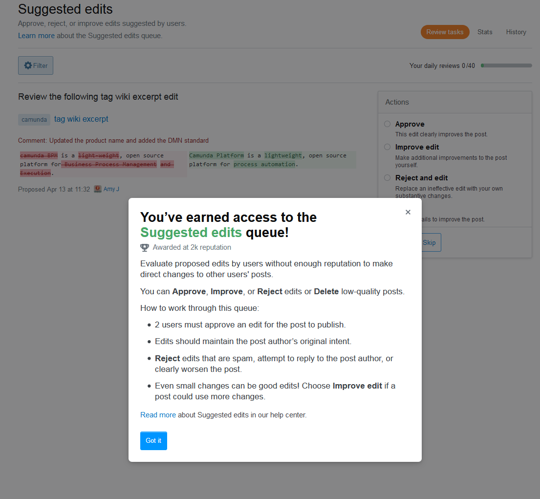
The Suggested Edits modal looks like:
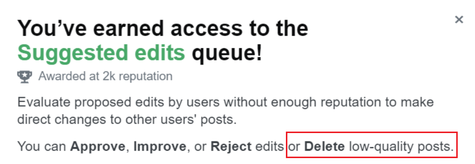
I don't think we are able to delete posts from the suggested edits queue (unless that's a new feature you haven't told us about)...
Looks like it made its way there by mistake.
-
6FWIW, moderators can delete LQPs from that queue. I agree it's a bug though.2021年04月20日 21:05:35 +00:00Commented Apr 20, 2021 at 21:05
-
6Still, moderators are a minority. The majority of users reviewing do not have that option and I'm sure moderators don't need the reminder (or the whole onboarding for that matter...)Tomerikoo– Tomerikoo2021年04月20日 21:09:44 +00:00Commented Apr 20, 2021 at 21:09
-
3We fixed the text of this modal, thanks for the heads up. The fix should be out later today or tomorrow.2021年04月27日 13:30:56 +00:00Commented Apr 27, 2021 at 13:30
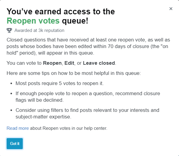
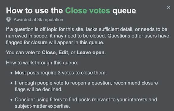
The reopen vote queue popup talks about 'recommend closure flags' that will be declined. As far as I know, recommend closure flags are marked helpful when a post is closed, and you can't flag a post that's already closed to recommend more closure.
Shouldn't this line be in the close vote popup instead, saying such flags will be declined if enough people vote to "Leave Open"?
-
5I like the addition of the Oxford comma in this screenshot that is missing from the one in Lisa's post.TylerH– TylerH2021年04月20日 18:33:01 +00:00Commented Apr 20, 2021 at 18:33
-
2@TylerH new answer, feature request? :P You could probably go through the other queues as well to get all of them in one post. I agree they should all be the same! ;)2021年04月20日 18:34:20 +00:00Commented Apr 20, 2021 at 18:34
-
1We added this line to the Close votes queue as well, thanks for the idea. The fix will be in today or tomorrow.2021年04月27日 13:31:24 +00:00Commented Apr 27, 2021 at 13:31
The Low Quality Posts queue has questions as well as answers (except on Stack Overflow); the guidance popup seems to be solely directed at answers. Questions cannot be deleted from that queue (unless you are a ♦ moderator); they can be voted or flagged for closure.
-
4Taking this as a moment to soapbox about how questions don't belong in the very low quality posts queue to begin with... Getting the mention of questions out of the guidance entirely would be preferred.2021年04月21日 12:47:51 +00:00Commented Apr 21, 2021 at 12:47
-
@Tinkeringbell only on SO. Everywhere else, they do.Braiam– Braiam2021年04月22日 15:30:07 +00:00Commented Apr 22, 2021 at 15:30
-
2We special-cased the instructions for Stack Overflow here so that they (and thus the other sites) make more sense. Thanks for the heads up. Fix will be in today or tomorrow.2021年04月27日 13:32:06 +00:00Commented Apr 27, 2021 at 13:32
Inconsistent capitalization:
vs.
Unsure why "Review" is capitalized.
-
2It is capitalized everywhere it is used as the name for the "Review queues". Seems consistent to me at least in that regard. I agree it is a bit odd though to only capitalize "Review".TylerH– TylerH2021年04月20日 19:39:56 +00:00Commented Apr 20, 2021 at 19:39
-
8I agree this casing is weird and off-putting, and I do not believe it is in line with our sentence casing guidance. The word "Review" is not a trademarked word and is not used as part of a product-specific feature (e.g. we never say Stack Overflow Review anywhere). It should not be capitalized in the middle of sentences.2021年04月20日 19:46:47 +00:00Commented Apr 20, 2021 at 19:46
-
2We agree - we changed this so that review won't be capitalized mid-sentence like this anymore. The fix will be in later today or tomorrow.2021年04月27日 13:32:37 +00:00Commented Apr 27, 2021 at 13:32
The modal popups are super annoying. Please put a button on them that says "Don't show me any of these popups on any site again."
And please modify your design rules to make that an essential part of any future modals you add to SE. I'm honestly extremely surprised it isn't already part of your rules.
discussion proposal status-completed
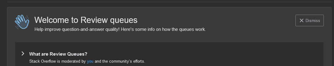
Screenshot for reference; suggestions/issues listed below:
Dark mode screenshot of the new 'welcome' message
-
"Welcome to Review queues"
I would suggest that "the" be added here... articles do wonders for readability: "Welcome to the Review queues". The feature toast already does it this way: feature toast using "the" before "Review queues"
-
Help improve question-and-answer quality!
Shouldn't this just be "question and answer quality", sans hyphens? Also, why a newline/separate div after this? Both lines can easily fit on a single line. Text will wrap automatically anyway for extremely small viewports if necessary:
The sideways carets make me think they are menu options that I can click to expand each section to read more. If they are just bullet points, I would recommend just making the bullet icon a traditional bullet point or dash.
-
is moderated by you and the community's efforts.
For consistency this should probably be "moderated by you and the community" or "moderated by your and the community's efforts". Otherwise it sounds like my actions should somehow be different from the community's actions.
-
Review queues (also known as review tasks)
Review queues are not known as Review tasks... individual review items are called tasks... right? This seems borne out by the explanation under the "Daily review limit" bulleted item. This line is confusing to me... maybe the parenthetical statement should be after the word "posts" rather than after the word "queues"?
Your screenshot above is lacking an Oxford/serial comma between "Edit" and "and Leave open". My screenshot is also lacking an Oxford/serial comma on the last bulleted item between the listed badges "Reviewer" and "Steward". AFAIK the network uses Oxford/serial commas everywhere in their official copy.
-
Regarding point 6: no, the network doesn't use Oxford commas everywhere. If I recall correctly, the migration rejection notice doesn't use one.Sonic the Anonymous Hedgehog– Sonic the Anonymous Hedgehog2021年04月20日 18:47:44 +00:00Commented Apr 20, 2021 at 18:47
-
4@SonictheAnonymousHedgehog Oxford commas are in Stacks as being the correct behavior - older dialogues may not have been updated.2021年04月20日 19:17:36 +00:00Commented Apr 20, 2021 at 19:17
-
@Catija Huh, I may be recalling incorrectly. Still, I remember fairly recently that a bug report about a missing Oxford comma elsewhere was declined by an employee as they said it was "valid grammar", though that may have been before the Stacks manual was published.Sonic the Anonymous Hedgehog– Sonic the Anonymous Hedgehog2021年04月20日 19:22:41 +00:00Commented Apr 20, 2021 at 19:22
-
3Ah, yep - here's the guide, if it's helpful @sonic - stackoverflow.design/content/guidelines/grammar-and-mechanics/…2021年04月20日 19:42:24 +00:00Commented Apr 20, 2021 at 19:42
-
3Okay, so we made a bunch of these changes (which will be shipped today or tomorrow)! We added "the" in the modal header, we removed the sideways carets, we fixed the grammatical error in "you and the community's efforts," we stopped saying that review queues are review tasks, and I think we added in oxford commas everywhere. As always thank you for your detailed feedback!2021年04月27日 13:34:53 +00:00Commented Apr 27, 2021 at 13:34
I have a problem with the Late Answers modal:
First of all, it should probably state that you need to choose "I'm Done" when you're done, but we can let that slide as it's pretty obvious.
I'm more worried that it doesn't say anything about skipping and makes it look like those are the two options: action on the post, or looks ok.
That worries me because it only takes one such action to remove the post from the queue. That means that unsure reviewers might wrongly remove the post from the queue before it gets a proper review.
Is that intentional and relies on the general skipping notice of the welcome banner? Shouldn't we emphasize that skipping is fine?
-
4It should probably say something like "Perform all necessary actions [before clicking 'I'm done']" instead of "Perform as many actions as you see fit". Although if you're not used to using all those actions, it's likely not all that useful. It should probably at least more explicitly say something like "Click here to find out when to use all those things" instead of just "Read more", or have each one be a link to an explanation.Bernhard Barker– Bernhard Barker2021年04月22日 07:46:02 +00:00Commented Apr 22, 2021 at 7:46
-
2We added in a bullet about skipping in each queue's modal. Good call. The fix will be in today or tomorrow.2021年04月27日 13:35:40 +00:00Commented Apr 27, 2021 at 13:35
Can we please get the same onboarding for the 10k-tools, seeing as they are under the same dropdown menu in the UI.
-
2This isn't directly related to new reviewer onboarding. Please feel free to post a separate feature request.2021年04月22日 17:41:34 +00:00Commented Apr 22, 2021 at 17:41
In the modal for the close vote queue it says:
"Most posts require 5 votes to close it."
On SO, the 5 is replaced with a 3, which is how it should be. However why emphasize that there are exceptions, binding moderator votes or gold badge duplicate closures, here in this modal. These are exceptions to the general rule that a post requires 5 close votes, or any other number of votes set for that site, in order to be closed.
Emphasizing that there are exceptions here, will lead to questions. Questions like: What will cause a post to require less votes?
This all deviates from the intent of this onboarding, making users known with how to use the system. As there also is no way in which the review system lets you see if your vote did close a question or not, it is also not relevant to the system of reviewing that there are exceptions to the number of close votes needed.
So, can we please reduce possible confusion and simply state:
"It takes 5 votes to close a question"
-
It seems a bit misguided to point out how many votes are required to close a question, but not explaining when questions actually need to be closed or edited, i.e. explaining what happens behind the scenes instead of what you should do when reviewing. Yeah, you can click "Read more" to get that info, but I would think that's the more important part that's shown upfront.Bernhard Barker– Bernhard Barker2021年04月22日 07:57:31 +00:00Commented Apr 22, 2021 at 7:57
-
Meta nitpickery says this will be marked as "by design" if it's flagged as a bug instead of a feature request.Bernhard Barker– Bernhard Barker2021年04月22日 07:59:55 +00:00Commented Apr 22, 2021 at 7:59
-
2After discussing this a bit more, we've decided that, as this is already filled in with the correct number of votes depending on the site, we'd rather leave it as "Most," as that is most accurate. All the information that the typical user needs to proceed with the queue is present in the modal, so we don't need to list out the exceptions.2021年04月22日 17:41:24 +00:00Commented Apr 22, 2021 at 17:41
feature-request status-completed
The dialog for the reopen queue has the following text:
posts whose bodies have been edited within 70 days of closure (the "on hold" period)
However, the "on hold" period is no longer a thing since the rollout of the new post notices.
This text seems to have been taken from an old revision of the general review queue FAQ here on Meta.SE. The text in question is a reference to the former behavior in which questions that were closed would show up as "on hold" instead of "closed" for the first five days of closure, to emphasize that they could be edited and reopened. However, as the first post I linked says, that behavior was removed, and "on hold" is no longer shown anywhere in the system.
Can the parenthetical note about the "on hold" period please be removed, as it only serves to make confusion since that period hasn't existed for a long while now?
-
70 days? I thought it was 7? Typo?TylerH– TylerH2021年04月20日 20:11:27 +00:00Commented Apr 20, 2021 at 20:11
-
3@TylerH Not a typo. Shog was increasing the threshold gradually in the last month of his employment, intending to eventually make it forever, but was removed as a staff member before he could complete it.Sonic the Anonymous Hedgehog– Sonic the Anonymous Hedgehog2021年04月20日 20:18:03 +00:00Commented Apr 20, 2021 at 20:18
-
Alternately: just remove the 70-day period altogether like Shog intended. I'm not really sure what useful purpose it serves.Ryan M– Ryan M2021年04月20日 21:21:27 +00:00Commented Apr 20, 2021 at 21:21
-
Good catch - we removed this parenthetical. The fix will be in today or tomorrow.2021年04月27日 13:37:06 +00:00Commented Apr 27, 2021 at 13:37
-
@kristinalustig Any idea why text was taken from an old revision in this case? The text in question had been edited out of the FAQ it was copied from back in November 2020, so I'm curious as to why/how it ended up being used.Sonic the Anonymous Hedgehog– Sonic the Anonymous Hedgehog2021年05月21日 17:28:50 +00:00Commented May 21, 2021 at 17:28
feature-request status-completed
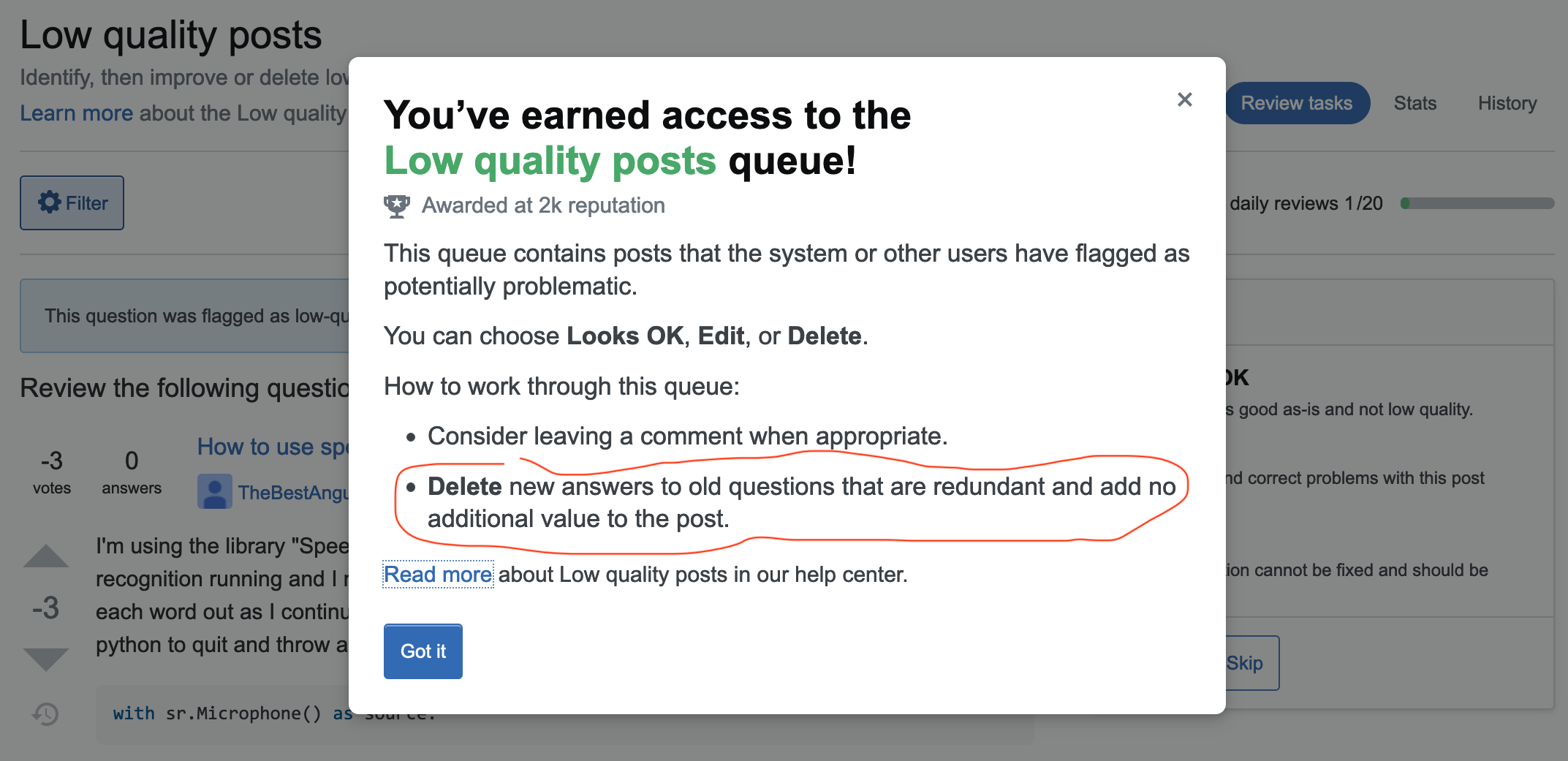
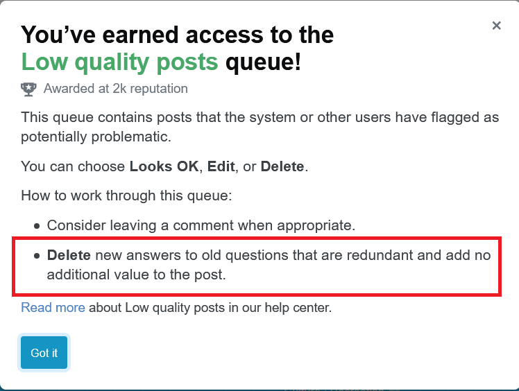
The welcome message for the low-quality queue says:
This queue contains posts that the system or other users have flagged as potentially problematic.
You can choose Looks OK, Edit, or Delete.
How to work through this queue:
- Consider leaving a comment when appropriate.
- Delete new answers to old questions that are redundant and add no additional value to the post.
Read more about Low quality posts in our help center.
The only specific advice is:
Delete new answers to old questions that are redundant and add no additional value to the post.
I find this very surprising. While deleting such answers is one of the queue’s (disputed) purposes, it is certainly far from the most frequent or important one. I suggest to replace the guidance with something like (assuming that you manage to finally remove questions from this queue):
How to work through this queue:
- Leave a comment or edit when appropriate.
- Delete posts that do not attempt to answer the question, are incomprehensible, or contain nothing valuable but a link.
- Choose Looks OK for posts that attempt to answer the question, even if you consider them wrong.
-
2We've edited this text to make it more in line with delete guidance elsewhere in the product. Thanks for the feedback. The fix will be shipped today or tomorrow.2021年04月27日 13:38:20 +00:00Commented Apr 27, 2021 at 13:38
feature-request status-completed
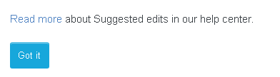
Since the modals link to the "How do I use the [X] queue" page, can we change the text:
To "Read more about the [X] queue in our help center", since we want to know about how the queue works and not the suggested edits themselves?
-
2We changed the text to "Read more about this queue in our help center." Thanks for the feedback, this fix will be in today or tomorrow.2021年04月27日 13:39:49 +00:00Commented Apr 27, 2021 at 13:39
feature-request status-norepro
The sentence on the daily review limit blanketly states:
You can review 20 tasks a day per queue.
However, this isn't always correct, even on non-Stack Overflow sites. The review queue size limit can increase to 40 for a particular queue if its size is larger than a threshold (150 on Stack Overflow, 1,000 on other sites). Additionally, one can review suggested edits to their own posts even if they've already reached the limit in the suggested edits queue, allowing them to exceed the limit in that case.
Can the sentence please be changed on all sites to:
You can generally review 20 tasks a day per queue. However, if there are enough items in a specific queue pending review, you'll be allowed to review 40 tasks in that queue.
Update: Glorfindel commented that the parenthetical note "(40 in larger queues)" shows up on Stack Overflow only. However, the queue size being 40 is not a Stack Overflow-only thing, it can also happen on other sites: it's just seen more often on Stack Overflow due to their reduced threshold of 150 pending tasks instead of 1,000. Also, a "larger" queue can become small enough one day to only allow 20 review queues, so I think it's better to explain when and why the size becomes 40, as my text says.
-
1A similar sentence is already in place on SO.user707129– user7071292021年04月20日 18:48:55 +00:00Commented Apr 20, 2021 at 18:48
-
2On Stack Overflow it says "You can review 20 tasks a day per queue (40 in larger queues)."2021年04月20日 18:49:30 +00:00Commented Apr 20, 2021 at 18:49
-
1Please remember that we have the ability to put wildcards in text, which customizes them per-site - so please ensure that the bugs you're reporting actually are bugs on the sites where this isn't the case. As Glorfindel shows, this has been addressed already. I don't really think that this caveat is important enough for us to hash out so minutely as it can create a ton of confusion.2021年04月20日 19:14:58 +00:00Commented Apr 20, 2021 at 19:14
-
@Catija As I mention, it is not only Stack Overflow on which the daily limit can be 40. It can also happen on other sites too, as indicated in the rate limit FAQ.Sonic the Anonymous Hedgehog– Sonic the Anonymous Hedgehog2021年04月20日 19:20:48 +00:00Commented Apr 20, 2021 at 19:20
-
1I guess my question then would be how common is it that other sites ever hit 1000 items in a queue. If the answer is - never or almost never - I'm not sure that it really matters. The biggest I could find currently is ~500 on Math.2021年04月20日 19:48:39 +00:00Commented Apr 20, 2021 at 19:48
-
Seems weird to make it more complicated when the goal is to make it simple and easy to read to avoid people skipping it entirely.user400654– user4006542021年04月20日 19:49:14 +00:00Commented Apr 20, 2021 at 19:49
-
As far as I remember mods don't have any review limits at all... and we are still getting the damn popups ...DavidPostill– DavidPostill2021年04月21日 11:53:46 +00:00Commented Apr 21, 2021 at 11:53
-
2I've looked into this and we're definitely meant to be showing the parenthetical caveat on any site that has a queue with a larger task limit than the site's general task limit. Could you give me a counter-example so that I can look into whether this is a bug? Thank you!2021年04月22日 17:54:13 +00:00Commented Apr 22, 2021 at 17:54
-
@kristinalustig My mistake. I didn't try to find another site with a queue large enough to trigger it, and mistakenly thought it was SO-only. Still, though, it would be nice to have the longer sentence I proposed, either all the time or if a queue is large enough.Sonic the Anonymous Hedgehog– Sonic the Anonymous Hedgehog2021年04月22日 18:25:55 +00:00Commented Apr 22, 2021 at 18:25
-
There's no auto-magic at 1000 or any number so far as I can tell, and nothing tied to Stack Overflow. If a queue becomes too large, a CM/dev will give that queue a limit multiplier in the site settings, taking it from 20 to 40, 60, 80, etc. When we render the instructions, we simply look for the highest number limit and compare it with the lowest. If they're different we show the extra details. In practice, I don't think this happens outside of SO so I wouldn't bother brand new reviewers with those details...2021年04月23日 16:14:33 +00:00Commented Apr 23, 2021 at 16:14
-
1The instructions here are geared towards getting users started and setting them up for success, so there's merits to keeping it short and clear without capturing all the nuances that may live in the help center.2021年04月23日 16:16:41 +00:00Commented Apr 23, 2021 at 16:16
-
@BrianNickel When did this change? All of the documentation posts I've read so far say that the daily limit is automatically increased to 40 if a queue has 1,000+ pending tasks on most sites or 150+ pending tasks on Stack Overflow. Has this been an entirely manual exercise (a staff member would increase it if they noticed the number was higher than the threshold)?Sonic the Anonymous Hedgehog– Sonic the Anonymous Hedgehog2021年04月23日 17:43:06 +00:00Commented Apr 23, 2021 at 17:43
-
1Ugh, nope, I was completely wrong and you were right. This is a reading comprehension failure on my part and my code makes a bad assumption that just happens to (maybe) always be true. Some facts on the ground: For every site that's not Stack Overflow, the "large queue" number has been stuck at 1000 since 2012. Stack Overflow has had a dramatically lower "large queue" limit of 150 since 2016, meaning 6/8 queues have a limit of 40. The closest queue to hitting 1000 is ru.stackoverflow.com/review/close/stats, currently at 770 and askubuntu.com/review/first-posts at 647.2021年04月23日 18:30:40 +00:00Commented Apr 23, 2021 at 18:30
Minor point, but you will also get the welcome banner to appear even if you don't have review privileges. Just visit the review page of a site where you're below the threshold. You can even dismiss it and, as I tested, when you go back, it stays gone. Which means that on the day that I finally do get review privileges for that site, I presumably won't see the welcome banner.
On a related note, you also will see the welcome banner on review pages on sites where you're not even registered. I consider these very low-level low-priority bugs, but felt they should be noted so atleast they are somewhere in the queue.
discussion wording status-completed
The current text in the VLQ queue doesn't seem accurate at all with prevalent guidelines, and the fact that the post might be "an answer to an old question" is more appropriate to "Late answers" queue than VLQ.
-
Wow. It's never been a rule or even a guideline in the SE network as far as I know that new answers to old questions should be deleted if they're redundant. If it's literally just copying something that's been said before, sure (and in this case the age of the question/answer is irrelevant). But usually that redundancy is accompanied by explanations in different wordings, and just might be more helpful to some readers.curiousdannii– curiousdannii2021年04月22日 13:12:59 +00:00Commented Apr 22, 2021 at 13:12
-
1@curiousdannii actually, "Answers that do not fundamentally answer the question may be removed. This includes answers that are: [...] exact duplicates of other answers". So, yes, redundancy is removed.Braiam– Braiam2021年04月22日 15:01:45 +00:00Commented Apr 22, 2021 at 15:01
-
2We've edited this text to make it more in line with delete guidance elsewhere in the product. Thanks for the feedback. The fix will be shipped today or tomorrow.2021年04月27日 13:40:15 +00:00Commented Apr 27, 2021 at 13:40
The review guidance for Close Votes says:
- If enough people vote to reopen a question, recommend closure flags will be declined.
This is a bit strange, since we can't vote to reopen a question which isn't closed yet. Even
- If enough people vote to leave a question open, recommend closure flags will be declined.
won't work; if there's only one user who votes to close with the same close reason, that's enough for the flag to be marked helpful (even if the question isn't closed in the end). But at least it's closer to the actual behaviour than the current version.
-
4Good catch. We will change the language. Double-checking internally on the exact behavior and the best way to phrase it.2021年05月26日 17:56:16 +00:00Commented May 26, 2021 at 17:56
-
It looks like they simply copied the text, and changed as little as possible; but not enough, or correctly.Rob– Rob2021年05月27日 09:40:42 +00:00Commented May 27, 2021 at 9:40
until confirmed, using the [support] tag - not sure if this is by-design
Something definitely shifted in the sorting of the review tasks in the Suggested Edits review queue. Previously, they were interspersed between suggested edits on questions and answers, but today they are exceptionally closely grouped.
This is how the review history looks like for today (orange rectangles highlight the wiki and excerpt suggestions, the green ones - normal tasks). What's more, I also had a suggested edit of mine on a tag wiki approved that was pending for more than a month:
suggested edits review history, April 21st
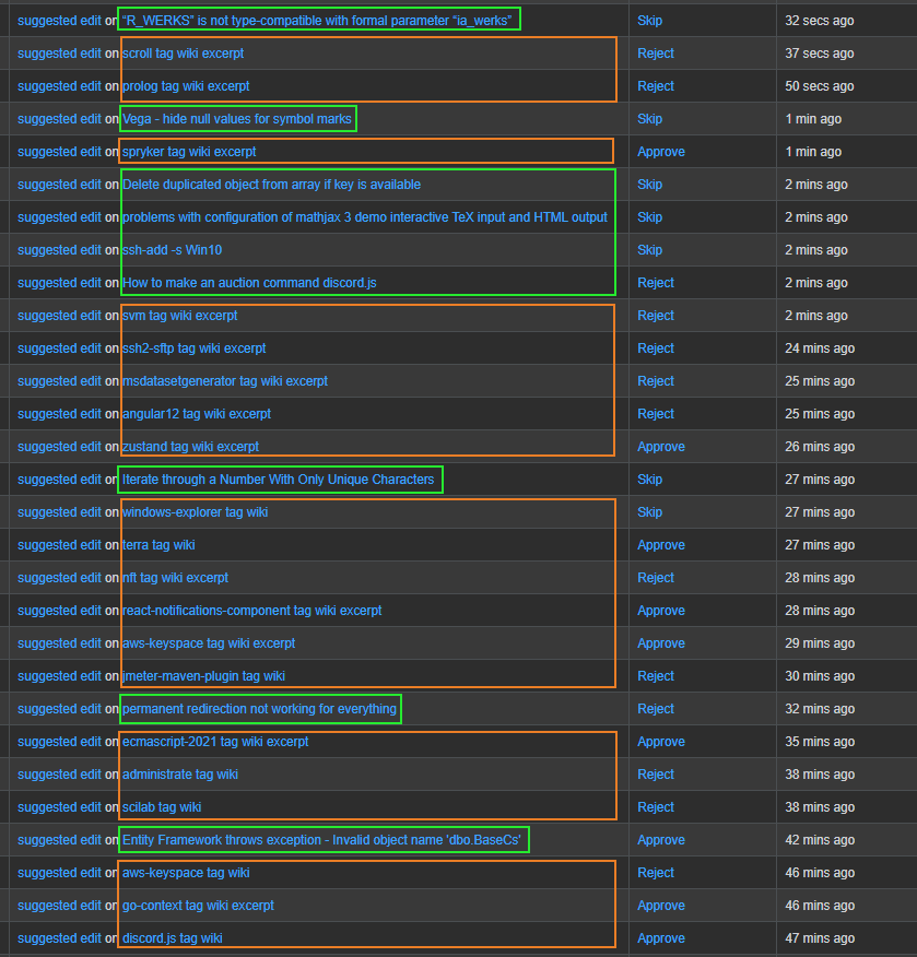
Compare that to a similar review history from April, 10th and see the difference:
suggested edits review history, April 10th
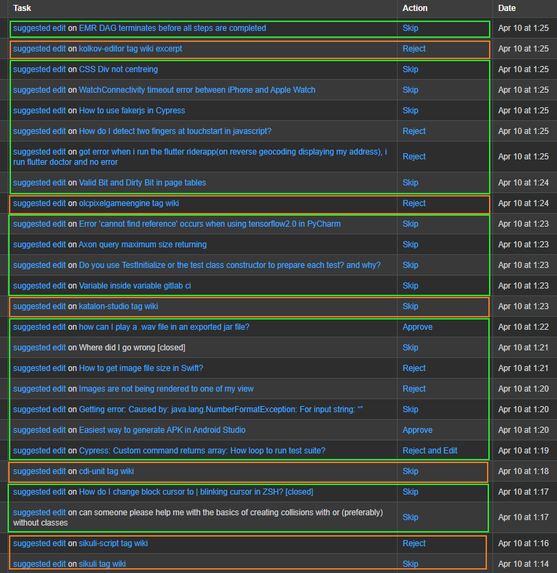
I do not mind the change being heavily invested in tags on SO if that is intentional, but there is nothing in the announcement or the change plan post that could indicate the change is intentional.
-
It looks to me like what you’re seeing is that there were a lot more wiki suggested edits yesterday than there were on April 10. On April 20 you saw 20 wiki edits and 9 Q&A edits. On April 10 you saw 6 wiki edits and 20 Q&A edits. You can’t avoid having groups of oranges if there’s more of them than there are greens. What am I missing? Do you have reason to believe that it’s something other than just more people suggesting edits to wikis on April 20?G-Man Says 'Reinstate Monica'– G-Man Says 'Reinstate Monica'2021年04月21日 21:42:58 +00:00Commented Apr 21, 2021 at 21:42
-
@G-ManSays'ReinstateMonica' - the behaviour continued today (although a bit better). I only cherry-picked April 10th as this is the most extensive edit spree I've done this month (before today). Unless there was a sudden surge in suggested edits to tag wikis/excerpts (which I accept is a possibility), the ratio feels very different. Not that I am complaining, though - I like reviewing wiki suggestions very much, but that's unusual. I am fairly active in the suggested edits review queue on SO - the flow is certainly unusual. [1/2]0Valt– 0Valt2021年04月21日 22:21:09 +00:00Commented Apr 21, 2021 at 22:21
-
[2/2] A strange coincidence is that the day the change was rolled out, a lot of old pending edits on tag wikis specifically were finally processed (like mine more than a month old).0Valt– 0Valt2021年04月21日 22:21:16 +00:00Commented Apr 21, 2021 at 22:21
-
A possibility is the queue got reshuffled upon the change which resurfaced tag wiki/excerpt edits, for which I am actually grateful. Just very curious if the surge was intended or even a thing.0Valt– 0Valt2021年04月21日 22:29:58 +00:00Commented Apr 21, 2021 at 22:29
-
4Hi Oleg, thanks for reporting this. Could you please post this as its own separate post, as it's unrelated to the topic of review queue onboarding? That will make it easier for us to track/look into this to see if it's an issue.2021年04月22日 17:57:02 +00:00Commented Apr 22, 2021 at 17:57
-
@kristinalustig - sure, will do later - I posted as feedback here as the onboarding rollout happened at the same time, so it was unclear to me if this is just correlation or causation. P.s. After the last comment, the rate somewhat stabilized, but that may be due to the queue running out of tag wiki suggestions.0Valt– 0Valt2021年04月22日 18:04:17 +00:00Commented Apr 22, 2021 at 18:04
triage bug wording status-completed
In the triage review modal there is the following text:
The primary goal of this queue is to quickly sort potentially problematic questions for further review.
You can choose Looks OK, Needs editing, or Flag questions.
How to work through this queue:
- 3 users must say a post Looks OK for it to publish.
- Choose Needs community edit if you could personally improve the post.
- Choose Needs author edit for questions that can’t be answered as-is.
- Flag posts that may need to be closed.
emphasis mine
This should either be rewritten as:
3 users must say a post Looks OK for it to publish to the front page.
Or as:
3 users must say a post Looks OK for it to be cleared from the triage queue.
Seeing that a post does get published when it goes up for triage, just not on the frontpage. When one browses a specific tag page the post is visible, according to the info in this MSO topic
https://i.sstatic.net/0Sp4d.jpg
-
2Thanks, good idea for us to clarify this. We've fixed it and the update will be live today or tomorrow.2021年04月27日 13:43:55 +00:00Commented Apr 27, 2021 at 13:43
feature-request status-declined
Applicable dialog(s): pretty much all of them: Close Votes, Reopen Votes, Low Quality Posts, First Posts and Late Answers.
Shouldn't the point of the dialogs be to explain when reviewers should take which action? As in try to get people to review correctly and effectively.
Currently this part of the dialogs are somewhat vague or nonexistent:
Close Votes: If a question is off-topic for this site or requires additional work, it may need to be closed. [No explanation of any close reason, nor when you should edit]
Reopen Votes: None. [No explanation of when to reopen]
Low Quality Posts: Consider leaving a comment when appropriate. Delete new answers to old questions that are redundant and add no additional value to the post. [No mention of edit or close or other reasons to delete]
First Posts: Interact with the post by voting, editing, commenting, flagging, closing, and deleting. Perform as many actions as you see fit. Choose No action needed if the post is fine as-is. [Decent, but might not be that useful if you don't know when to vote, edit, comment, etc.]
Late Answers: Interact with the post by voting, editing, commenting, flagging, and deleting. Perform as many actions as you see fit. Choose No action needed if the post is fine as-is. [Same as First Posts]
This is explained in more detail when you click "Read more", but it seems important enough to be featured prominently instead of being put behind a generic link.
Explaining things like filters is okay, but things that happen behind the scenes (like how many votes are required to close something) seems like supplementary information at best and should probably only be behind the link.
Suggested Edits is closer to what I would consider good:
- Edits should maintain the post author’s original intent.
- Reject edits that are spam, attempt to reply to the post author, or clearly worsen the post.
- Even small changes can be good edits! Choose Improve edit if a post could use more changes.
-
1Thanks for your feedback. After talking through this, we decided to stick with the text largely as written (though we have made a number of other clarifying changes as suggested by other answers on this post). The individual actions do have short descriptions below their titles in the action box, and we wanted to prioritize using the modal space to explain the general gist and the slightly more complicated bits in each queue. We're definitely opening to revisiting this if it seems necessary, though.2021年04月27日 13:42:44 +00:00Commented Apr 27, 2021 at 13:42
feature-request wording status-completed
For the close vote review the modal states:
"If a question is off-topic for this site or requires additional work, it may need to be closed."
Can we please highlight here that only posts that require additional work from OP should be closed? Any other post that requires work in the form of lay-out or grammatical editing should be fixed by the community / the reviewer rather then be closed.
-
I don't think that would be consistent with prevailing SE guidelines. If a question is not up to the required standards it should be closed ASAP. Not all of the changes require the OP's input, but they may still take substantial work. No one is obligated to do that work, so it is appropriate to close a question even if you could in theory be the person to improve it.curiousdannii– curiousdannii2021年04月22日 13:18:10 +00:00Commented Apr 22, 2021 at 13:18
-
3We adjusted this wording to make it clearer and more in line with other guidance for closing questions: "If a question is off topic for this site, lacks sufficient detail, or needs to be narrowed in scope, it may need to be closed." this update will be live today or tomorrow. Thanks for the feedback!2021年04月27日 13:45:00 +00:00Commented Apr 27, 2021 at 13:45
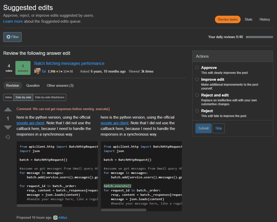
The "learn more" link (button, to be precise) opening the modal only works on the "review tasks" tab, but still present and clickable on the "stats" and "history" tabs. It should either be made clearly disabled (or removed) on these tabs, or, better, result in the popup being shown.
-
1Also reported here: "Learn more" link in review queue page is not responding on "Stats" and "History" tabs, and on MSO: Broken "Learn More" link on Suggested edits page.Sebastian Simon– Sebastian Simon2021年05月20日 15:10:53 +00:00Commented May 20, 2021 at 15:10
-
@SebastianSimon - thank you for connecting all those reports scattered around metas together, btw!0Valt– 0Valt2021年05月20日 15:13:42 +00:00Commented May 20, 2021 at 15:13
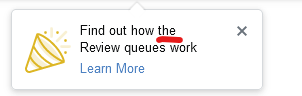
I really like the hand waving icon, it's funky and keeps with the funny themes SE has opted for over the years.
I do want to ask what the other icon means? Is it a party hat? An announcement speaker? Both combined?
-
3It is a party horn with confetti, the globally adopted (for some reason) emoji symbol for 'party' or 'celebrate'. They probably opted for that icon (or a variation of it) because users would most recognize that and make sense of it along with what they are trying to convey here.TylerH– TylerH2021年04月20日 18:28:40 +00:00Commented Apr 20, 2021 at 18:28
-
@TylerH I wouldn't have guessed it was a party horn.bad_coder– bad_coder2021年04月20日 18:29:54 +00:00Commented Apr 20, 2021 at 18:29
-
Yes, I've never seen such a party horn either, but if you look up the emoji it is named 'party horn with confetti' pretty much across the board. I unfortunately didn't make the rules on that one.TylerH– TylerH2021年04月20日 18:30:36 +00:00Commented Apr 20, 2021 at 18:30
-
11I believe it's modeled after 🎉, which my computer is calling "party popper". Our official name for it is "tada" and found at stackoverflow.design/product/resources/spots/#tada2021年04月20日 18:31:19 +00:00Commented Apr 20, 2021 at 18:31
-
So it's one of these, a party popperbad_coder– bad_coder2021年04月20日 18:34:57 +00:00Commented Apr 20, 2021 at 18:34
-
2I have never seen party popper in real life but I believe this icon means celebration. It's one of these weird icons that originated in real life, but became more famous as an emoji. For me it always reminds of a megaphone and I imagine someone holding it and yelling some happy words.Dharman– Dharman2021年04月20日 21:54:42 +00:00Commented Apr 20, 2021 at 21:54
-
1I feel like the cone-shaped poppers are a lot less common than the little plastic ones, but I really assumed it was a well recognized item likewise! It never dawned on me that some (many?) wouldn't know what that item actually is.zcoop98– zcoop982021年04月21日 14:57:15 +00:00Commented Apr 21, 2021 at 14:57
-
1It looks more like one of the typical megaphone icons, especially with the 3 straight lines coming out of it, to represent sound.Bernhard Barker– Bernhard Barker2021年04月22日 09:23:45 +00:00Commented Apr 22, 2021 at 9:23