🌀 A lightweight dropdown popup spinner, fully customizable with an arrow and animations for Android.
License API Build Status Android Weekly Medium Profile Javadoc
Add the dependency below to your module's build.gradle file:
dependencies {
 implementation "com.github.skydoves:powerspinner:1.2.7"
}
PowerSpinner
Snapshots of the current development version of PowerSpinner are available, which track the latest versions.
repositories {
 maven { url 'https://oss.sonatype.org/content/repositories/snapshots/' }
}
Add the XML namespace below inside your XML layout file:
xmlns:app="http://schemas.android.com/apk/res-auto"
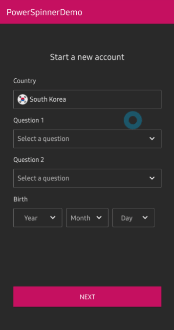
You can implement PowerSpinnerView in your XML layout as the below example. You can use PowerSpinnerView same as TextView. For instance, you can set the default text with the hint and textColorHint attributes..
<com.skydoves.powerspinner.PowerSpinnerView
 android:layout_width="match_parent"
 android:layout_height="wrap_content"
 android:background="@color/md_blue_200"
 android:gravity="center"
 android:hint="Question 1"
 android:padding="10dp"
 android:textColor="@color/white_93"
 android:textColorHint="@color/white_70"
 android:textSize="14.5sp"
 app:spinner_arrow_gravity="end"
 app:spinner_arrow_padding="8dp"
 app:spinner_divider_color="@color/white_70"
 app:spinner_divider_show="true"
 app:spinner_divider_size="0.4dp"
 app:spinner_item_array="@array/questions"
 app:spinner_item_height="46dp"
 app:spinner_popup_animation="dropdown"
 app:spinner_popup_background="@color/background800"
 app:spinner_popup_elevation="14dp" />
You can also create the PowerSpinnerView programmatically with the Kotlin extension class.
val mySpinnerView = createPowerSpinnerView(this) {
 setSpinnerPopupWidth(300)
 setSpinnerPopupHeight(350)
 setArrowPadding(6)
 setArrowAnimate(true)
 setArrowAnimationDuration(200L)
 setArrowGravity(SpinnerGravity.START)
 setArrowTint(ContextCompat.getColor(this@MainActivity, R.color.md_blue_200))
 setSpinnerPopupAnimation(SpinnerAnimation.BOUNCE)
 setShowDivider(true)
 setDividerColor(Color.WHITE)
 setDividerSize(2)
 setLifecycleOwner(this@MainActivity)
}
Note: It's highly recommended to set the height size of the item with the
spinner_item_heightattribute or the entire height size of the popup with thespinner_popup_heightto implement the correct behaviors of your spinner.
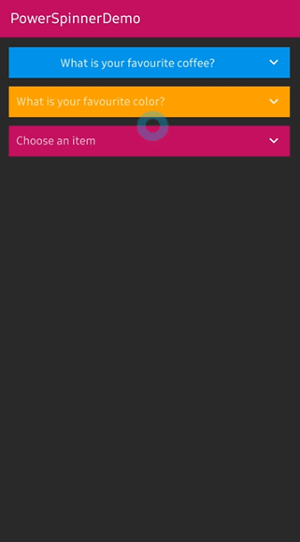
By default, the spinner popup will be displayed when you click the PowerSpinnerView, and it will be dismissed when you select an item. You can also show and dismiss manually with the methods below:
powerSpinnerView.show() // show the spinner popup.
powerSpinnerView.dismiss() // dismiss the spinner popup.
// If the popup is not showing, shows the spinner popup menu.
// If the popup is already showing, dismiss the spinner popup menu.
powerSpinnerView.showOrDismiss()
You can customize the default behaviours of the spinner with the method and property below:
// the spinner popup will not be shown when clicked.
powerSpinnerView.setOnClickListener { }
// the spinner popup will not be dismissed when item selected.
powerSpinnerView.dismissWhenNotifiedItemSelected = false
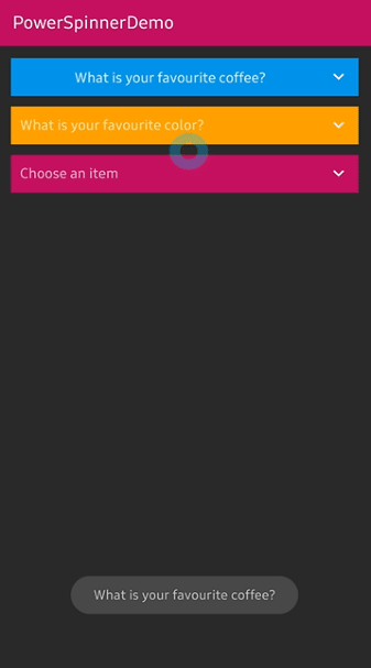
You can listen the selection of the spinner items with the setOnSpinnerItemSelectedListener method below:
powerSpinnerView.setOnSpinnerItemSelectedListener<String> { oldIndex, oldItem, newIndex, newText ->
 toast("$text selected!")
}
If you use Java, see the example below:
powerSpinnerView.setOnSpinnerItemSelectedListener(new OnSpinnerItemSelectedListener<String>() {
 @Override public void onItemSelected(int oldIndex, @Nullable String oldItem, int newIndex, String newItem) {
 toast(item + " selected!");
 }
});
You can select an item manually/initially with the method below:
powerSpinnerView.selectItemByIndex(4)Note:
selectItemByIndexmust be invoked after setting items with thesetItemsmethod.
You can store and restore the selected position automatically and it will be re-selected automatically when the PowerSpinnerView is inflated with the property below:
powerSpinnerView.preferenceName = "country"
You can also set the property above with the attribute below in your XML layout:
app:spinner_preference_name="country"
You can remove or clear the stored position data with the methods below:
powerSpinnerView.clearSelectedItem()
You can set an animation when you display and dismiss the spinner with the method below:
app:spinner_popup_animation="normal"
This library supports the four animations below:
SpinnerAnimation.NORMAL
SpinnerAnimation.DROPDOWN
SpinnerAnimation.FADE
SpinnerAnimation.BOUNCE
| NORMAL | DROPDOWN | FADE | BOUNCE |
|---|---|---|---|
You can also check out the dafult custom adapter, IconSpinnerAdapter with the setItems and IconSpinnerItem methods below:
spinnerView.apply {
 setSpinnerAdapter(IconSpinnerAdapter(this))
 setItems(
 arrayListOf(
 IconSpinnerItem(text = "Item1", iconRes = R.drawable.unitedstates),
 IconSpinnerItem(text = "Item2", iconRes = R.drawable.southkorea)))
 getSpinnerRecyclerView().layoutManager = GridLayoutManager(context, 2)
 selectItemByIndex(0) // select a default item.
 lifecycleOwner = this@MainActivity
}
Note: You can get the
RecyclerViewof the spinner with thegetSpinnerRecyclerView()method.
If you use Java, see the example below:
List<IconSpinnerItem> iconSpinnerItems = new ArrayList<>();
iconSpinnerItems.add(new IconSpinnerItem("item1", contextDrawable(R.drawable.unitedstates)));
IconSpinnerAdapter iconSpinnerAdapter = new IconSpinnerAdapter(spinnerView);
spinnerView.setSpinnerAdapter(iconSpinnerAdapter);
spinnerView.setItems(iconSpinnerItems);
spinnerView.selectItemByIndex(0);
spinnerView.setLifecycleOwner(this);
You can also implement your own custom adapter and bind to the PowerSpinnerView. Firstly, create a new adapter and viewHolder, which extend each RecyclerView.Adapter and PowerSpinnerInterface<T> below:
class MySpinnerAdapter(
 powerSpinnerView: PowerSpinnerView
) : RecyclerView.Adapter<MySpinnerAdapter.MySpinnerViewHolder>(),
 PowerSpinnerInterface<MySpinnerItem> {
 override var index: Int = powerSpinnerView.selectedIndex
 override val spinnerView: PowerSpinnerView = powerSpinnerView
 override var onSpinnerItemSelectedListener: OnSpinnerItemSelectedListener<MySpinnerItem>? = null
With the custom spinner adapter, you can use your own custom spinner item, which includes information of the spinner item.
Note: You shoud override the
spinnerView,onSpinnerItemSelectedListenerproperties andsetItems,notifyItemSelectedmethods.
Next, you must call spinnerView.notifyItemSelected method when your item is clicked or the spinner item should be changed:
override fun onBindViewHolder(holder: MySpinnerViewHolder, position: Int) {
 holder.itemView.setOnClickListener {
 notifyItemSelected(position)
 }
}
// You must call the `spinnerView.notifyItemSelected` method to let `PowerSpinnerView` know the item is changed.
override fun notifyItemSelected(index: Int) {
 if (index == NO_SELECTED_INDEX) return
 val oldIndex = this.index
 this.index = index
 this.spinnerView.notifyItemSelected(index, this.spinnerItems[index].text)
 this.onSpinnerItemSelectedListener?.onItemSelected(
 oldIndex = oldIndex,
 oldItem = oldIndex.takeIf { it != NO_SELECTED_INDEX }?.let { spinnerItems[oldIndex] },
 newIndex = index,
 newItem = item
 )
}
Lastly, you can add the item selected listener like the below:
spinnerView.setOnSpinnerItemSelectedListener<MySpinnerItem> {
 oldIndex, oldItem, newIndex, newItem -> toast(newItem.text)
}
You can customize attributes of the scrollbar by defining your own style in your styles.xml file like the below:
<style name="PowerSpinnerStyle">
 <item name="android:scrollbarAlwaysDrawVerticalTrack">true</item>
 <item name="android:scrollbars">vertical</item>
 <item name="android:fadeScrollbars">false</item>
 <item name="android:scrollbarSize">2dp</item>
 <item name="android:scrollbarThumbVertical">@drawable/powerspinner_scrollbar</item>
</style>
You can also customize the drawable of the scrollbar by creating powerspinner_scrollbar.xml file like the below:
<shape xmlns:android="http://schemas.android.com/apk/res/android">
 <solid android:color="@color/colorPrimaryDark" />
 <corners android:radius="6dp" />
</shape>
Then the library will use the overwritten customized styles.
Note: Please keep in mind you should use the exactly same name for
PowerSpinnerStyleandpowerspinner_scrollbar.xmlto apply your custom styles.
You can use PowerSpinnerView in your PreferenceScreen XML for building preferences screens. Add the dependency below to your module's build.gradle file:
dependencies {
 implementation "androidx.preference:preference-ktx:1.2.0"
}
You can implement the spinner preference with the PowerSpinnerPreference in your XML file below:
<?xml version="1.0" encoding="utf-8"?>
<androidx.preference.PreferenceScreen xmlns:android="http://schemas.android.com/apk/res/android"
 xmlns:app="http://schemas.android.com/apk/res-auto">
 <androidx.preference.Preference
 android:title="Account preferences"
 app:iconSpaceReserved="false" />
 <com.skydoves.powerspinner.PowerSpinnerPreference
 android:key="question1"
 android:title="Question1"
 app:spinner_arrow_gravity="end"
 app:spinner_arrow_padding="8dp"
 app:spinner_divider_color="@color/white_70"
 app:spinner_divider_show="true"
 app:spinner_divider_size="0.2dp"
 app:spinner_item_array="@array/questions1"
 app:spinner_popup_animation="dropdown"
 app:spinner_popup_background="@color/background900"
 app:spinner_popup_elevation="14dp" />
You don't need to set preferenceName attribute, and OnSpinnerItemSelectedListener should be set on PowerSpinnerPreference. You can reference this sample codes.
val countySpinnerPreference = findPreference<PowerSpinnerPreference>("country")
countySpinnerPreference?.setOnSpinnerItemSelectedListener<IconSpinnerItem> { oldIndex, oldItem, newIndex, newItem ->
 Toast.makeText(requireContext(), newItem.text, Toast.LENGTH_SHORT).show()
}
Dialog, PopupWindow and etc.. have memory leak issue if not dismissed before activity or fragment are destroyed. But Lifecycles are now integrated with the Support Library since Architecture Components 1.0 Stable released. So you can solve the memory leak issue simply by setting the lifecycle owner with the method below:
.setLifecycleOwner(lifecycleOwner)
By setting the lifecycle owner, the dismiss() method will be invoked automatically before destroying your activity or fragment.
| Attributes | Type | Default | Description |
|---|---|---|---|
| spinner_arrow_drawable | Drawable | arrow | arrow drawable. |
| spinner_arrow_show | Boolean | true | sets the visibility of the arrow. |
| spinner_arrow_gravity | SpinnerGravity | end | the gravity of the arrow. |
| spinner_arrow_padding | Dimension | 2dp | padding of the arrow. |
| spinner_arrow_tint | Color | None | tint color of the arrow. |
| spinner_arrow_animate | Boolean | true | show arrow rotation animation when showing. |
| spinner_arrow_animate_duration | Integer | 250 | the duration of the arrow animation. |
| spinner_divider_show | Boolean | true | show the divider of the popup items. |
| spinner_divider_size | Dimension | 0.5dp | sets the height of the divider. |
| spinner_divider_color | Color | White | sets the color of the divider. |
| spinner_popup_width | Dimension | spinnerView's width | the width of the popup. |
| spinner_popup_height | Dimension | WRAP_CONTENT | the height of the popup. |
| spinner_item_height | Dimension | WRAP_CONTENT | a fixed item height of the popup. |
| spinner_popup_background | Color | spinnerView's background | the background color of the popup. |
| spinner_popup_animation | SpinnerAnimation | NORMAL | the spinner animation when showing. |
| spinner_popup_animation_style | Style Resource | -1 | sets the customized animation style. |
| spinner_popup_elevation | Dimension | 4dp | the elevation size of the popup. |
| spinner_item_array | String Array Resource | null | sets the items of the popup. |
| spinner_dismiss_notified_select | Boolean | true | sets dismiss when the popup item is selected. |
| spinner_debounce_duration | Integer | 150 | A duration of the debounce for showOrDismiss. |
| spinner_preference_name | String | null | saves and restores automatically the selected position. |
Support it by joining stargazers for this repository. ⭐
And follow me for my next creations! 🤩
Copyright 2019 skydoves (Jaewoong Eum)
Licensed under the Apache License, Version 2.0 (the "License");
you may not use this file except in compliance with the License.
You may obtain a copy of the License at
 http://www.apache.org/licenses/LICENSE-2.0
Unless required by applicable law or agreed to in writing, software
distributed under the License is distributed on an "AS IS" BASIS,
WITHOUT WARRANTIES OR CONDITIONS OF ANY KIND, either express or implied.
See the License for the specific language governing permissions and
limitations under the L