You can subscribe to this list here.
| 2003 |
Jan
|
Feb
|
Mar
|
Apr
|
May
|
Jun
|
Jul
|
Aug
|
Sep
|
Oct
(1) |
Nov
(33) |
Dec
(20) |
|---|---|---|---|---|---|---|---|---|---|---|---|---|
| 2004 |
Jan
(7) |
Feb
(44) |
Mar
(51) |
Apr
(43) |
May
(43) |
Jun
(36) |
Jul
(61) |
Aug
(44) |
Sep
(25) |
Oct
(82) |
Nov
(97) |
Dec
(47) |
| 2005 |
Jan
(77) |
Feb
(143) |
Mar
(42) |
Apr
(31) |
May
(93) |
Jun
(93) |
Jul
(35) |
Aug
(78) |
Sep
(56) |
Oct
(44) |
Nov
(72) |
Dec
(75) |
| 2006 |
Jan
(116) |
Feb
(99) |
Mar
(181) |
Apr
(171) |
May
(112) |
Jun
(86) |
Jul
(91) |
Aug
(111) |
Sep
(77) |
Oct
(72) |
Nov
(57) |
Dec
(51) |
| 2007 |
Jan
(64) |
Feb
(116) |
Mar
(70) |
Apr
(74) |
May
(53) |
Jun
(40) |
Jul
(519) |
Aug
(151) |
Sep
(132) |
Oct
(74) |
Nov
(282) |
Dec
(190) |
| 2008 |
Jan
(141) |
Feb
(67) |
Mar
(69) |
Apr
(96) |
May
(227) |
Jun
(404) |
Jul
(399) |
Aug
(96) |
Sep
(120) |
Oct
(205) |
Nov
(126) |
Dec
(261) |
| 2009 |
Jan
(136) |
Feb
(136) |
Mar
(119) |
Apr
(124) |
May
(155) |
Jun
(98) |
Jul
(136) |
Aug
(292) |
Sep
(174) |
Oct
(126) |
Nov
(126) |
Dec
(79) |
| 2010 |
Jan
(109) |
Feb
(83) |
Mar
(139) |
Apr
(91) |
May
(79) |
Jun
(164) |
Jul
(184) |
Aug
(146) |
Sep
(163) |
Oct
(128) |
Nov
(70) |
Dec
(73) |
| 2011 |
Jan
(235) |
Feb
(165) |
Mar
(147) |
Apr
(86) |
May
(74) |
Jun
(118) |
Jul
(65) |
Aug
(75) |
Sep
(162) |
Oct
(94) |
Nov
(48) |
Dec
(44) |
| 2012 |
Jan
(49) |
Feb
(40) |
Mar
(88) |
Apr
(35) |
May
(52) |
Jun
(69) |
Jul
(90) |
Aug
(123) |
Sep
(112) |
Oct
(120) |
Nov
(105) |
Dec
(116) |
| 2013 |
Jan
(76) |
Feb
(26) |
Mar
(78) |
Apr
(43) |
May
(61) |
Jun
(53) |
Jul
(147) |
Aug
(85) |
Sep
(83) |
Oct
(122) |
Nov
(18) |
Dec
(27) |
| 2014 |
Jan
(58) |
Feb
(25) |
Mar
(49) |
Apr
(17) |
May
(29) |
Jun
(39) |
Jul
(53) |
Aug
(52) |
Sep
(35) |
Oct
(47) |
Nov
(110) |
Dec
(27) |
| 2015 |
Jan
(50) |
Feb
(93) |
Mar
(96) |
Apr
(30) |
May
(55) |
Jun
(83) |
Jul
(44) |
Aug
(8) |
Sep
(5) |
Oct
|
Nov
(1) |
Dec
(1) |
| 2016 |
Jan
|
Feb
|
Mar
(1) |
Apr
|
May
|
Jun
(2) |
Jul
|
Aug
(3) |
Sep
(1) |
Oct
(3) |
Nov
|
Dec
|
| 2017 |
Jan
|
Feb
(5) |
Mar
|
Apr
|
May
|
Jun
|
Jul
(3) |
Aug
|
Sep
(7) |
Oct
|
Nov
|
Dec
|
| 2018 |
Jan
|
Feb
|
Mar
|
Apr
|
May
|
Jun
|
Jul
(2) |
Aug
|
Sep
|
Oct
|
Nov
|
Dec
|
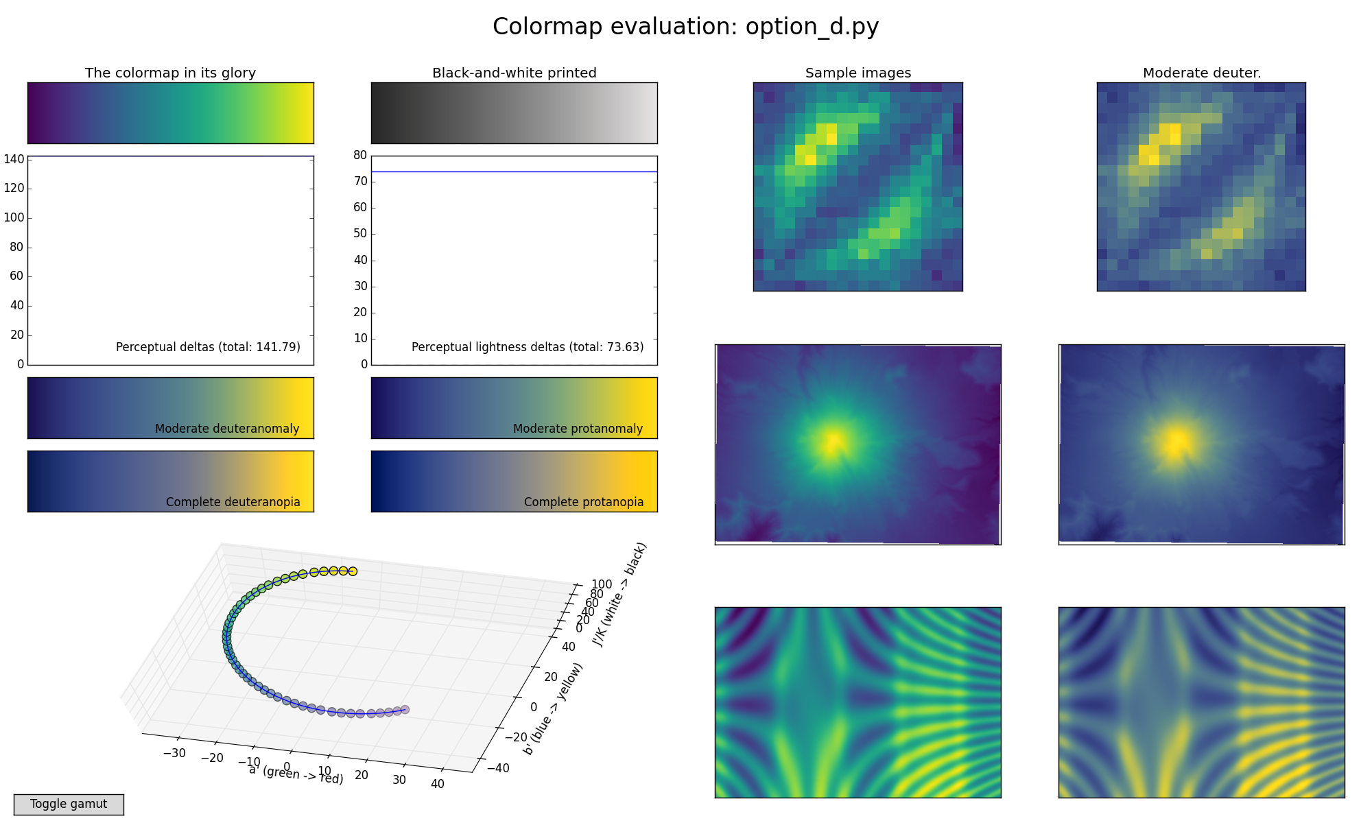
On Thu, Jun 4, 2015 at 12:42 AM, Nathan Goldbaum <nat...@gm...> wrote:
>
> On Wed, Jun 3, 2015 at 5:17 PM, Stéfan van der Walt <st...@su...>
> wrote:
>>
>> On Wed, Jun 3, 2015 at 5:08 PM, Nathan Goldbaum <nat...@gm...>
>> wrote:
>> > I'm a big fan of option D. So much so that when I needed to make a
>> > movie of
>> > ony my galaxy simulations today I went ahead and used it:
>> >
>> > https://youtu.be/bnm554et0T8
>>
>> Beautiful! How hard would it be to also do this for the other
>> proposed colormaps?
>
>
> Thankfully you made it pretty easy to script this.
>
> jet: https://www.youtube.com/watch?v=dsvT5hImPmo
>
> parula: https://www.youtube.com/watch?v=8146CMi-OaQ
>
> option a: https://www.youtube.com/watch?v=IqvxuQSzWO4
>
> option b: https://www.youtube.com/watch?v=wa7bpV3XPV0
>
> option c: https://www.youtube.com/watch?v=3rHbq4jw1ew
>
> option d: https://www.youtube.com/watch?v=2_HiUXVNm2k
Awesome! Added these to the webpage.
For extra fun (90 mb download, but worth it):
http://vorpus.org/~njs/goldbaum-galaxies-all-colormaps.mkv
--
Nathaniel J. Smith -- http://vorpus.org
On Thu, Jun 4, 2015 at 3:32 PM, Benjamin Root <ben...@ou...> wrote:
> As for option D, my only apprehension for it is on the blue (purple?) end of
> the scale. I can't really perceive any changes on that end and it just seems
> like a solid color to me. Does it seem that way to anybody else? Maybe shift
> the curve a bit to start a little more into the greens and have more
> yellow/orange?
This is useful feedback, but FWIW it looks fine here... so my first
guess is that this is due to variation between individual monitors.
While the Fancy Color Math we're using is definitely not perfect, it
does represent basically everything anyone knows about how color
works. The biggest limitation is that at the end of the day we have to
write down the colormap using RGB values, and you can send the exact
same RGB values to two different monitors and get different colors. So
the only thing we can do is to target sRGB, which has two virtues:
it's designed to be an inexact but reasonable approximation to what
most hardware does if you use it in a naive way; and, it's also what's
expected by more sophisticated setups -- like OSes and applications
that are color-management-aware, and ideally have access to calibrated
models of specific monitors / printers / whatever.
Over time this will hopefully improve as software and hardware are
upgraded, and more workflows will become "sophisticated". But until
then there's not much to do besides target sRGB and cross our fingers.
Unless anyone has access to some data on how popular consumer hardware
systematically deviates from sRGB... designing the perfect colormap
for "the monitor sitting on Benjamin Root's desk with its current
software drivers" may or may not help for anyone else :-).
Lacking real data like this, the best we can hope for is to try and
avoid any colormap that lots of people report causing specific
problems on the hardware they have access to (which is why I was
asking about projectors in particular upthread).
TL;DR: please do report such issues, but IMO these reports are only
really useful if lots of people report the same thing, or if it causes
many people to prefer one colormap to another; unfortunately it's not
very useful for tweaking small details.
-n
--
Nathaniel J. Smith -- http://vorpus.org
... unless you have red-green colorblindness. I abhor using laser pointers
during talks and instead use descriptive text such as "upper-left" or "in
the middle". Also helps when only the slides and the audio is being
recorded.
As for option D, my only apprehension for it is on the blue (purple?) end
of the scale. I can't really perceive any changes on that end and it just
seems like a solid color to me. Does it seem that way to anybody else?
Maybe shift the curve a bit to start a little more into the greens and have
more yellow/orange?
As for branding, while it isn't the same as Matlab's Parula, it does look
similar. That may or may not be a concern.
Ben Root
On Thu, Jun 4, 2015 at 4:13 PM, Eric Firing <ef...@ha...> wrote:
> On 2015年06月04日 9:52 AM, Alexander Heger wrote:
> > When used in talks, you can see the green laser pointer
> > better on top of C.
>
> And perhaps a red laser pointer better on top of D?
>
>
> ------------------------------------------------------------------------------
> _______________________________________________
> Matplotlib-devel mailing list
> Mat...@li...
> https://lists.sourceforge.net/lists/listinfo/matplotlib-devel
>
On 2015年06月04日 9:52 AM, Alexander Heger wrote:
> When used in talks, you can see the green laser pointer
> better on top of C.
And perhaps a red laser pointer better on top of D?
I think the very dark tones in Options A and B would make it harder to
add annotations on top, so C and D are better for that. Between C and
D I find that C looks slightly more "energetic", D is too rather calm
though nice. When used in talks, you can see the green laser pointer
better on top of C.
-Alexander
On 3 June 2015 at 11:46, Nathaniel Smith <nj...@po...> wrote:
> Hi all,
>
> As was hinted at in a previous thread, Stéfan van der Walt and I have
> been using some Fancy Color Technology to attempt to design a new
> colormap intended to become matplotlib's new default. (Down with jet!)
>
> Unfortunately, while our Fancy Color Technology includes a
> computational model of perceptual distance, it does not include a
> computational model of aesthetics. So this is where you come in.
>
> We've put up three reasonable candidates at:
> https://bids.github.io/colormap/
> (along with some well-known colormaps for comparison), and we'd like
> your feedback.
>
> They are all optimal on all of the objective criteria we know how to
> measure. What we need judgements on is which one you like best, both
> aesthetically and as a way of visualizing data. (There are some sample
> plots to look at there, plus you can download them and play with them
> on your own data if you want.)
>
> We especially value input from anyone with anomalous color vision.
> There are some simulations there, but computational models are
> inherently limited here. (It's difficult to ask someone with
> colorblindness "does this look to you, the same way this other picture
> looks to me?")
>
> -n
>
> --
> Nathaniel J. Smith -- http://vorpus.org
>
> ------------------------------------------------------------------------------
> _______________________________________________
> Matplotlib-devel mailing list
> Mat...@li...
> https://lists.sourceforge.net/lists/listinfo/matplotlib-devel
>
> I'm not sure what I'm looking at in that picture exactly, or how to
> distinguish a good result from a poor one -- could you elaborate?
>
It an nutshell, it's whether shading can be distinguished from value
changes.
> FYI I should also note that we're planning on additionally providing
> isoluminant (or approximately isoluminant) variants for whatever colormaps
> we end up contributing, exactly for cases where you want to preserve the
> lightness channel for shading effects. So in any case you'll have a choice
> between "mapA" and "mapA-isoluminant", etc.
>
> -n
>
It's essentially isoluminance, but also the absolute value of the
luninance. (Ideally, you'd want a more-or-less isoluminant colormap with an
average luminance near 0.5.)
A colormap with all dark colors or all light colors can be isoluminant, but
is largely useless for this application, as it will be difficult to
distinguish shaded slopes from low areas or highlighted slopes from high
areas.
Also, from a purely subjective level for this example, it's how effectively
the shading tricks your brain into seeing a topographic surface. The
colormap has a good bit of influence on this, but I have no idea how to
quantify it.
At any rate, including an isoluminant version solves a large amount of the
problem. Thanks!
Also, to illustrate the exact issue I was referring to a touch more
clearly, here's a zoomed-in version of the previous example:
P.S. Sorry, Nathaniel, you're going to get this twice. I didn't look
closely enough when I hit reply. I seem to be rather bad at the whole
"e-mail" thing today.
On Jun 4, 2015 9:28 AM, "Joe Kington" <jof...@gm...> wrote:
>
> One other (admittedly very minor) consideration is how the colormaps look
with shading applied. To borrow from the hillshading example:
>
> (The image appears to be too large to attatch. Try here:
http://www.geology.beer/images/hillshaded.png)
>
> I personally really like option D for a lot of reasons, but this is
another reason to prefer it. Providing additional information through
"shading" etc, still works quite well. Option C also does well in this
particular test, though it appears too "washed out" for my tastes.
I'm not sure what I'm looking at in that picture exactly, or how to
distinguish a good result from a poor one -- could you elaborate?
FYI I should also note that we're planning on additionally providing
isoluminant (or approximately isoluminant) variants for whatever colormaps
we end up contributing, exactly for cases where you want to preserve the
lightness channel for shading effects. So in any case you'll have a choice
between "mapA" and "mapA-isoluminant", etc.
-n
Same here. I prefer D over the rest because of both its aesthetic and technical merits.
Phil
--------------------------------------------------
Phillip J. Wolfram, Ph.D.
Postdoctoral Research Associate
Climate, Ocean and Sea Ice Modeling
T-3 Fluid Dynamics and Structural Mechanics
Los Alamos National Laboratory
Phone: (505) 667-3518
Email: pwo...@la...
On Jun 4, 2015, at 10:37 AM, <mat...@li...> <mat...@li...> wrote:
> Message: 1
> Date: Thu, 4 Jun 2015 09:37:12 -0700
> From: Brian Granger <ell...@gm...>
> Subject: Re: [matplotlib-devel] RFC: candidates for a new default
> 	colormap
> To: Joe Kington <jof...@gm...>
> Cc: matplotlib-devel <mat...@li...>
> Message-ID:
> 	<CAH4pYpRms3xbu=m==Jdi7=XJA...@ma...>
> Content-Type: text/plain; charset="utf-8"
>
> I very much like D.
>
> On Thu, Jun 4, 2015 at 9:34 AM, Joe Kington <jof...@gm...> wrote:
>
>> Well that got horribly garbled somehow (and I hit send too early). Let me
>> try that again:
>>
>>
>> ?
>>
>>
>> On Thu, Jun 4, 2015 at 11:27 AM, Joe Kington <jof...@gm...>
>> wrote:
>>
>>> One other (admittedly very minor) consideration is how the colormaps look
>>> with shading applied. To borrow from the hillshading example
>>> <http://matplotlib.org/devdocs/examples/specialty_plots/topographic_hillshading.html>
>>> :
>>>
>>> (The image appears to be too large to attatch. Try here: http://
>>> <http://www.geology.beer/images/hillshaded.png>www.geology.beer
>>> <http://www.geology.beer/images/hillshaded.png>/images/
>>> <http://www.geology.beer/images/hillshaded.png>hillshaded.png
>>> <http://www.geology.beer/images/hillshaded.png>)
>>> <http://www.geology.beer/images/hillshaded.png>
>>>
>>> I personally really like option D for a lot of reasons, but this is
>>> another reason to prefer it. Providing additional information through
>>> "shading" etc, still works quite well. Option C also does well in this
>>> particular test, though it appears too "washed out" for my tastes.
>>>
>>> At least to my eyes, options B fairs particularly poorly. In B's case,
>>> the fact that the colormap runs towards black means that hillshading is
>>> difficult to distinguish from elevation changes. A suffers from similar
>>> problems in this case, though they're much less severe.
>>>
>>> In my personal opinion: D >> A > C > B
>>>
>>> Cheers,
>>> -Joe
>>> Fun activity: watch all 6 videos in a row then watch the text on this
>>> email spin and spin. =P
>>>
>>> Gorgeous! Thanks Nathan!
>>>
>>> I hope this kills C dead. It clearly makes certain features of the
>>> simulation harder to spot.
>>>
>>> A great demo of the terribleness of jet, too: it looks like a huge mess.
>>>
>>> On Thu, Jun 4, 2015 at 5:42 PM, Nathan Goldbaum <nat...@gm...>
>>> wrote:
>>>
>>>>
>>>>
>>>> On Wed, Jun 3, 2015 at 5:17 PM, St?fan van der Walt <st...@su...>
>>>> wrote:
>>>>
>>>>> On Wed, Jun 3, 2015 at 5:08 PM, Nathan Goldbaum <nat...@gm...>
>>>>> wrote:
>>>>>> I'm a big fan of option D. So much so that when I needed to make a
>>>>> movie of
>>>>>> ony my galaxy simulations today I went ahead and used it:
>>>>>>
>>>>>> https://youtu.be/bnm554et0T8
>>>>>
>>>>> Beautiful! How hard would it be to also do this for the other
>>>>> proposed colormaps?
>>>>>
>>>>
>>>> Thankfully you made it pretty easy to script this.
>>>>
>>>> jet: https://www.youtube.com/watch?v=dsvT5hImPmo
>>>>
>>>> parula: https://www.youtube.com/watch?v=8146CMi-OaQ
>>>>
>>>> option a: https://www.youtube.com/watch?v=IqvxuQSzWO4
>>>>
>>>> option b: https://www.youtube.com/watch?v=wa7bpV3XPV0
>>>>
>>>> option c: https://www.youtube.com/watch?v=3rHbq4jw1ew
>>>>
>>>> option d: https://www.youtube.com/watch?v=2_HiUXVNm2k
>>>>
>>>>
>>>>>
>>>>> St?fan
>>>>>
>>>>>
>>>>> ------------------------------------------------------------------------------
>>>>> _______________________________________________
>>>>> Matplotlib-devel mailing list
>>>>> Mat...@li...
>>>>> https://lists.sourceforge.net/lists/listinfo/matplotlib-devel
>>>>>
>>>>
>>>>
>>>>
>>>> ------------------------------------------------------------------------------
>>>>
>>>> _______________________________________________
>>>> Matplotlib-devel mailing list
>>>> Mat...@li...
>>>> https://lists.sourceforge.net/lists/listinfo/matplotlib-devel
>>>>
>>>>
>>>
>>>
>>> ------------------------------------------------------------------------------
>>>
>>> _______________________________________________
>>> Matplotlib-devel mailing list
>>> Mat...@li...
>>> https://lists.sourceforge.net/lists/listinfo/matplotlib-devel
>>>
>>>
>>
>>
>> ------------------------------------------------------------------------------
>>
>> _______________________________________________
>> Matplotlib-devel mailing list
>> Mat...@li...
>> https://lists.sourceforge.net/lists/listinfo/matplotlib-devel
>>
>>
>
>
> --
> Brian E. Granger
> Cal Poly State University, San Luis Obispo
> @ellisonbg on Twitter and GitHub
> bgr...@ca... and ell...@gm...
> -------------- next part --------------
> An HTML attachment was scrubbed...
> -------------- next part --------------
> A non-text attachment was scrubbed...
> Name: hillshaded.png
> Type: image/png
> Size: 1056284 bytes
> Desc: not available
I very much like D. On Thu, Jun 4, 2015 at 9:34 AM, Joe Kington <jof...@gm...> wrote: > Well that got horribly garbled somehow (and I hit send too early). Let me > try that again: > > > > > > On Thu, Jun 4, 2015 at 11:27 AM, Joe Kington <jof...@gm...> > wrote: > >> One other (admittedly very minor) consideration is how the colormaps look >> with shading applied. To borrow from the hillshading example >> <http://matplotlib.org/devdocs/examples/specialty_plots/topographic_hillshading.html> >> : >> >> (The image appears to be too large to attatch. Try here: http:// >> <http://www.geology.beer/images/hillshaded.png>www.geology.beer >> <http://www.geology.beer/images/hillshaded.png>/images/ >> <http://www.geology.beer/images/hillshaded.png>hillshaded.png >> <http://www.geology.beer/images/hillshaded.png>) >> <http://www.geology.beer/images/hillshaded.png> >> >> I personally really like option D for a lot of reasons, but this is >> another reason to prefer it. Providing additional information through >> "shading" etc, still works quite well. Option C also does well in this >> particular test, though it appears too "washed out" for my tastes. >> >> At least to my eyes, options B fairs particularly poorly. In B's case, >> the fact that the colormap runs towards black means that hillshading is >> difficult to distinguish from elevation changes. A suffers from similar >> problems in this case, though they're much less severe. >> >> In my personal opinion: D >> A > C > B >> >> Cheers, >> -Joe >> Fun activity: watch all 6 videos in a row then watch the text on this >> email spin and spin. =P >> >> Gorgeous! Thanks Nathan! >> >> I hope this kills C dead. It clearly makes certain features of the >> simulation harder to spot. >> >> A great demo of the terribleness of jet, too: it looks like a huge mess. >> >> On Thu, Jun 4, 2015 at 5:42 PM, Nathan Goldbaum <nat...@gm...> >> wrote: >> >>> >>> >>> On Wed, Jun 3, 2015 at 5:17 PM, Stéfan van der Walt <st...@su...> >>> wrote: >>> >>>> On Wed, Jun 3, 2015 at 5:08 PM, Nathan Goldbaum <nat...@gm...> >>>> wrote: >>>> > I'm a big fan of option D. So much so that when I needed to make a >>>> movie of >>>> > ony my galaxy simulations today I went ahead and used it: >>>> > >>>> > https://youtu.be/bnm554et0T8 >>>> >>>> Beautiful! How hard would it be to also do this for the other >>>> proposed colormaps? >>>> >>> >>> Thankfully you made it pretty easy to script this. >>> >>> jet: https://www.youtube.com/watch?v=dsvT5hImPmo >>> >>> parula: https://www.youtube.com/watch?v=8146CMi-OaQ >>> >>> option a: https://www.youtube.com/watch?v=IqvxuQSzWO4 >>> >>> option b: https://www.youtube.com/watch?v=wa7bpV3XPV0 >>> >>> option c: https://www.youtube.com/watch?v=3rHbq4jw1ew >>> >>> option d: https://www.youtube.com/watch?v=2_HiUXVNm2k >>> >>> >>>> >>>> Stéfan >>>> >>>> >>>> ------------------------------------------------------------------------------ >>>> _______________________________________________ >>>> Matplotlib-devel mailing list >>>> Mat...@li... >>>> https://lists.sourceforge.net/lists/listinfo/matplotlib-devel >>>> >>> >>> >>> >>> ------------------------------------------------------------------------------ >>> >>> _______________________________________________ >>> Matplotlib-devel mailing list >>> Mat...@li... >>> https://lists.sourceforge.net/lists/listinfo/matplotlib-devel >>> >>> >> >> >> ------------------------------------------------------------------------------ >> >> _______________________________________________ >> Matplotlib-devel mailing list >> Mat...@li... >> https://lists.sourceforge.net/lists/listinfo/matplotlib-devel >> >> > > > ------------------------------------------------------------------------------ > > _______________________________________________ > Matplotlib-devel mailing list > Mat...@li... > https://lists.sourceforge.net/lists/listinfo/matplotlib-devel > > -- Brian E. Granger Cal Poly State University, San Luis Obispo @ellisonbg on Twitter and GitHub bgr...@ca... and ell...@gm...
Well that got horribly garbled somehow (and I hit send too early). Let me try that again: On Thu, Jun 4, 2015 at 11:27 AM, Joe Kington <jof...@gm...> wrote: > One other (admittedly very minor) consideration is how the colormaps look > with shading applied. To borrow from the hillshading example > <http://matplotlib.org/devdocs/examples/specialty_plots/topographic_hillshading.html> > : > > (The image appears to be too large to attatch. Try here: http:// > <http://www.geology.beer/images/hillshaded.png>www.geology.beer > <http://www.geology.beer/images/hillshaded.png>/images/ > <http://www.geology.beer/images/hillshaded.png>hillshaded.png > <http://www.geology.beer/images/hillshaded.png>) > <http://www.geology.beer/images/hillshaded.png> > > I personally really like option D for a lot of reasons, but this is > another reason to prefer it. Providing additional information through > "shading" etc, still works quite well. Option C also does well in this > particular test, though it appears too "washed out" for my tastes. > > At least to my eyes, options B fairs particularly poorly. In B's case, > the fact that the colormap runs towards black means that hillshading is > difficult to distinguish from elevation changes. A suffers from similar > problems in this case, though they're much less severe. > > In my personal opinion: D >> A > C > B > > Cheers, > -Joe > Fun activity: watch all 6 videos in a row then watch the text on this > email spin and spin. =P > > Gorgeous! Thanks Nathan! > > I hope this kills C dead. It clearly makes certain features of the > simulation harder to spot. > > A great demo of the terribleness of jet, too: it looks like a huge mess. > > On Thu, Jun 4, 2015 at 5:42 PM, Nathan Goldbaum <nat...@gm...> > wrote: > >> >> >> On Wed, Jun 3, 2015 at 5:17 PM, Stéfan van der Walt <st...@su...> >> wrote: >> >>> On Wed, Jun 3, 2015 at 5:08 PM, Nathan Goldbaum <nat...@gm...> >>> wrote: >>> > I'm a big fan of option D. So much so that when I needed to make a >>> movie of >>> > ony my galaxy simulations today I went ahead and used it: >>> > >>> > https://youtu.be/bnm554et0T8 >>> >>> Beautiful! How hard would it be to also do this for the other >>> proposed colormaps? >>> >> >> Thankfully you made it pretty easy to script this. >> >> jet: https://www.youtube.com/watch?v=dsvT5hImPmo >> >> parula: https://www.youtube.com/watch?v=8146CMi-OaQ >> >> option a: https://www.youtube.com/watch?v=IqvxuQSzWO4 >> >> option b: https://www.youtube.com/watch?v=wa7bpV3XPV0 >> >> option c: https://www.youtube.com/watch?v=3rHbq4jw1ew >> >> option d: https://www.youtube.com/watch?v=2_HiUXVNm2k >> >> >>> >>> Stéfan >>> >>> >>> ------------------------------------------------------------------------------ >>> _______________________________________________ >>> Matplotlib-devel mailing list >>> Mat...@li... >>> https://lists.sourceforge.net/lists/listinfo/matplotlib-devel >>> >> >> >> >> ------------------------------------------------------------------------------ >> >> _______________________________________________ >> Matplotlib-devel mailing list >> Mat...@li... >> https://lists.sourceforge.net/lists/listinfo/matplotlib-devel >> >> > > > ------------------------------------------------------------------------------ > > _______________________________________________ > Matplotlib-devel mailing list > Mat...@li... > https://lists.sourceforge.net/lists/listinfo/matplotlib-devel > >
One other (admittedly very minor) consideration is how the colormaps look
with shading applied. To borrow from the hillshading example
<http://matplotlib.org/devdocs/examples/specialty_plots/topographic_hillshading.html>
:
(The image appears to be too large to attatch. Try here: http://
<http://www.geology.beer/images/hillshaded.png>www.geology.beer
<http://www.geology.beer/images/hillshaded.png>/images/
<http://www.geology.beer/images/hillshaded.png>hillshaded.png
<http://www.geology.beer/images/hillshaded.png>)
<http://www.geology.beer/images/hillshaded.png>
I personally really like option D for a lot of reasons, but this is another
reason to prefer it. Providing additional information through "shading"
etc, still works quite well. Option C also does well in this particular
test, though it appears too "washed out" for my tastes.
At least to my eyes, options B fairs particularly poorly. In B's case, the
fact that the colormap runs towards black means that hillshading is
difficult to distinguish from elevation changes. A suffers from similar
problems in this case, though they're much less severe.
In my personal opinion: D >> A > C > B
Cheers,
-Joe
Fun activity: watch all 6 videos in a row then watch the text on this email
spin and spin. =P
Gorgeous! Thanks Nathan!
I hope this kills C dead. It clearly makes certain features of the
simulation harder to spot.
A great demo of the terribleness of jet, too: it looks like a huge mess.
On Thu, Jun 4, 2015 at 5:42 PM, Nathan Goldbaum <nat...@gm...>
wrote:
>
>
> On Wed, Jun 3, 2015 at 5:17 PM, Stéfan van der Walt <st...@su...>
> wrote:
>
>> On Wed, Jun 3, 2015 at 5:08 PM, Nathan Goldbaum <nat...@gm...>
>> wrote:
>> > I'm a big fan of option D. So much so that when I needed to make a
>> movie of
>> > ony my galaxy simulations today I went ahead and used it:
>> >
>> > https://youtu.be/bnm554et0T8
>>
>> Beautiful! How hard would it be to also do this for the other
>> proposed colormaps?
>>
>
> Thankfully you made it pretty easy to script this.
>
> jet: https://www.youtube.com/watch?v=dsvT5hImPmo
>
> parula: https://www.youtube.com/watch?v=8146CMi-OaQ
>
> option a: https://www.youtube.com/watch?v=IqvxuQSzWO4
>
> option b: https://www.youtube.com/watch?v=wa7bpV3XPV0
>
> option c: https://www.youtube.com/watch?v=3rHbq4jw1ew
>
> option d: https://www.youtube.com/watch?v=2_HiUXVNm2k
>
>
>>
>> Stéfan
>>
>>
>> ------------------------------------------------------------------------------
>> _______________________________________________
>> Matplotlib-devel mailing list
>> Mat...@li...
>> https://lists.sourceforge.net/lists/listinfo/matplotlib-devel
>>
>
>
>
> ------------------------------------------------------------------------------
>
> _______________________________________________
> Matplotlib-devel mailing list
> Mat...@li...
> https://lists.sourceforge.net/lists/listinfo/matplotlib-devel
>
>
------------------------------------------------------------------------------
_______________________________________________
Matplotlib-devel mailing list
Mat...@li...
https://lists.sourceforge.net/lists/listinfo/matplotlib-devel
Fun activity: watch all 6 videos in a row then watch the text on this email
spin and spin. =P
Gorgeous! Thanks Nathan!
I hope this kills C dead. It clearly makes certain features of the
simulation harder to spot.
A great demo of the terribleness of jet, too: it looks like a huge mess.
On Thu, Jun 4, 2015 at 5:42 PM, Nathan Goldbaum <nat...@gm...>
wrote:
>
>
> On Wed, Jun 3, 2015 at 5:17 PM, Stéfan van der Walt <st...@su...>
> wrote:
>
>> On Wed, Jun 3, 2015 at 5:08 PM, Nathan Goldbaum <nat...@gm...>
>> wrote:
>> > I'm a big fan of option D. So much so that when I needed to make a
>> movie of
>> > ony my galaxy simulations today I went ahead and used it:
>> >
>> > https://youtu.be/bnm554et0T8
>>
>> Beautiful! How hard would it be to also do this for the other
>> proposed colormaps?
>>
>
> Thankfully you made it pretty easy to script this.
>
> jet: https://www.youtube.com/watch?v=dsvT5hImPmo
>
> parula: https://www.youtube.com/watch?v=8146CMi-OaQ
>
> option a: https://www.youtube.com/watch?v=IqvxuQSzWO4
>
> option b: https://www.youtube.com/watch?v=wa7bpV3XPV0
>
> option c: https://www.youtube.com/watch?v=3rHbq4jw1ew
>
> option d: https://www.youtube.com/watch?v=2_HiUXVNm2k
>
>
>>
>> Stéfan
>>
>>
>> ------------------------------------------------------------------------------
>> _______________________________________________
>> Matplotlib-devel mailing list
>> Mat...@li...
>> https://lists.sourceforge.net/lists/listinfo/matplotlib-devel
>>
>
>
>
> ------------------------------------------------------------------------------
>
> _______________________________________________
> Matplotlib-devel mailing list
> Mat...@li...
> https://lists.sourceforge.net/lists/listinfo/matplotlib-devel
>
>
On Wed, Jun 3, 2015 at 5:17 PM, Stéfan van der Walt <st...@su...>
wrote:
> On Wed, Jun 3, 2015 at 5:08 PM, Nathan Goldbaum <nat...@gm...>
> wrote:
> > I'm a big fan of option D. So much so that when I needed to make a
> movie of
> > ony my galaxy simulations today I went ahead and used it:
> >
> > https://youtu.be/bnm554et0T8
>
> Beautiful! How hard would it be to also do this for the other
> proposed colormaps?
>
Thankfully you made it pretty easy to script this.
jet: https://www.youtube.com/watch?v=dsvT5hImPmo
parula: https://www.youtube.com/watch?v=8146CMi-OaQ
option a: https://www.youtube.com/watch?v=IqvxuQSzWO4
option b: https://www.youtube.com/watch?v=wa7bpV3XPV0
option c: https://www.youtube.com/watch?v=3rHbq4jw1ew
option d: https://www.youtube.com/watch?v=2_HiUXVNm2k
>
> Stéfan
>
>
> ------------------------------------------------------------------------------
> _______________________________________________
> Matplotlib-devel mailing list
> Mat...@li...
> https://lists.sourceforge.net/lists/listinfo/matplotlib-devel
>
I'm really digging option D too -- it has the bonus of being unambiguously
distinct from GNUPlot,
On Wed, Jun 3, 2015 at 5:29 PM, Benjamin Root <ben...@ou...> wrote:
> May I suggest an update to the code showing the 3d sRGB colorspace? Can
> you add a "shade=False" to it? Currently, in pycam02ucs.viscm.py, around
> line 279, it calls the 3d scatter function without the kwarg. This means
> that mplot3d will apply an alpha transparancy to dots that are farther away
> to give the perception of depth. Since we actually want to see the correct
> color, we probably shouldn't have that feature on.
>
> Ben Root
>
>
> On Wed, Jun 3, 2015 at 8:17 PM, Stéfan van der Walt <st...@su...>
> wrote:
>
>> On Wed, Jun 3, 2015 at 5:08 PM, Nathan Goldbaum <nat...@gm...>
>> wrote:
>> > I'm a big fan of option D. So much so that when I needed to make a
>> movie of
>> > ony my galaxy simulations today I went ahead and used it:
>> >
>> > https://youtu.be/bnm554et0T8
>>
>> Beautiful! How hard would it be to also do this for the other
>> proposed colormaps?
>>
>> Stéfan
>>
>>
>> ------------------------------------------------------------------------------
>> _______________________________________________
>> Matplotlib-devel mailing list
>> Mat...@li...
>> https://lists.sourceforge.net/lists/listinfo/matplotlib-devel
>>
>
>
>
> ------------------------------------------------------------------------------
>
> _______________________________________________
> Matplotlib-devel mailing list
> Mat...@li...
> https://lists.sourceforge.net/lists/listinfo/matplotlib-devel
>
>
May I suggest an update to the code showing the 3d sRGB colorspace? Can you
add a "shade=False" to it? Currently, in pycam02ucs.viscm.py, around line
279, it calls the 3d scatter function without the kwarg. This means that
mplot3d will apply an alpha transparancy to dots that are farther away to
give the perception of depth. Since we actually want to see the correct
color, we probably shouldn't have that feature on.
Ben Root
On Wed, Jun 3, 2015 at 8:17 PM, Stéfan van der Walt <st...@su...>
wrote:
> On Wed, Jun 3, 2015 at 5:08 PM, Nathan Goldbaum <nat...@gm...>
> wrote:
> > I'm a big fan of option D. So much so that when I needed to make a
> movie of
> > ony my galaxy simulations today I went ahead and used it:
> >
> > https://youtu.be/bnm554et0T8
>
> Beautiful! How hard would it be to also do this for the other
> proposed colormaps?
>
> Stéfan
>
>
> ------------------------------------------------------------------------------
> _______________________________________________
> Matplotlib-devel mailing list
> Mat...@li...
> https://lists.sourceforge.net/lists/listinfo/matplotlib-devel
>
On Wed, Jun 3, 2015 at 5:08 PM, Nathan Goldbaum <nat...@gm...> wrote:
> I'm a big fan of option D. So much so that when I needed to make a movie of
> ony my galaxy simulations today I went ahead and used it:
>
> https://youtu.be/bnm554et0T8
Beautiful! How hard would it be to also do this for the other
proposed colormaps?
Stéfan
I'm a big fan of option D. So much so that when I needed to make a movie
of ony my galaxy simulations today I went ahead and used it:
https://youtu.be/bnm554et0T8
On Wed, Jun 3, 2015 at 4:43 PM, Benjamin Root <ben...@ou...> wrote:
> Ooooh, I am liking "D" a lot. It is almost like what Parula should have
> been. Still not quite perfect, but I can't put my finger on it.
>
> Ben Root
>
> On Wed, Jun 3, 2015 at 6:27 PM, Nathaniel Smith <nj...@po...> wrote:
>
>> On Wed, Jun 3, 2015 at 1:51 PM, Eric Firing <ef...@ha...> wrote:
>> > On 2015年06月02日 7:58 PM, Nathaniel Smith wrote:
>> >>
>> >> On Tue, Jun 2, 2015 at 10:03 PM, Paul Ivanov <pi...@be...> wrote:
>> >
>> >
>> >> That said, if you want to play around with the editor tool, it's
>> >> linked on the webpage :-).
>> >
>> >
>> > This is a really nice tool!
>> >
>> > Attached is an example of a map that circles the other direction, and
>> that
>> > sacrifices some visual delta for less extreme ends. Although I think
>> the
>> > "sunrise" type of map that you offered in versions A, B, and C is a
>> good one
>> > to have in the arsenal, I am not convinced that it should be the only
>> > category to be considered as a default. Do we really want to reject the
>> > somewhat Parula-like category just because Matlab uses the real Parula?
>> >
>> > I'm not saying the attached example is particularly good; it is
>> intended to
>> > re-introduce the category. (It is somewhat similar to a reversal of our
>> > ColorBrewer YlGnBu, so I tried to name it following that scheme.)
>>
>> That is nice! For those following along at home, here's what Eric's
>> colormap looks like:
>>
>> https://bids.github.io/colormap/images/screenshots/erics_PuBuGnYl_r.png
>>
>> We also tried tweaking it a bit to end on a more saturated yellow,
>> which I think helps increase contrast in the deuteranomalous version
>> in particular, and put this on the website as an "option D":
>> https://bids.github.io/colormap/images/screenshots/option_d.png
>>
>> We also previously designed a colormap that follows parula's ideas
>> pretty closely, in terms of starting/ending points, overall
>> brightness, and the trick of kinking over through orange at the top
>> end. It ends up being much much more green than parula though:
>> https://bids.github.io/colormap/images/screenshots/fake_parula.png
>>
>> > It seems that the fundamental constraints in this map generator tend to
>> > yield a somewhat muddy dark end and a muted middle. That's one
>> compromise
>> > among many that are possible.
>>
>> You can somewhat avoid the muddy end by bumping up the minimum
>> brightness (option C does this to some extent), but of course that has
>> other trade-offs.
>>
>> -n
>>
>> --
>> Nathaniel J. Smith -- http://vorpus.org
>>
>>
>> ------------------------------------------------------------------------------
>> _______________________________________________
>> Matplotlib-devel mailing list
>> Mat...@li...
>> https://lists.sourceforge.net/lists/listinfo/matplotlib-devel
>>
>
>
>
> ------------------------------------------------------------------------------
>
> _______________________________________________
> Matplotlib-devel mailing list
> Mat...@li...
> https://lists.sourceforge.net/lists/listinfo/matplotlib-devel
>
>
Ooooh, I am liking "D" a lot. It is almost like what Parula should have
been. Still not quite perfect, but I can't put my finger on it.
Ben Root
On Wed, Jun 3, 2015 at 6:27 PM, Nathaniel Smith <nj...@po...> wrote:
> On Wed, Jun 3, 2015 at 1:51 PM, Eric Firing <ef...@ha...> wrote:
> > On 2015年06月02日 7:58 PM, Nathaniel Smith wrote:
> >>
> >> On Tue, Jun 2, 2015 at 10:03 PM, Paul Ivanov <pi...@be...> wrote:
> >
> >
> >> That said, if you want to play around with the editor tool, it's
> >> linked on the webpage :-).
> >
> >
> > This is a really nice tool!
> >
> > Attached is an example of a map that circles the other direction, and
> that
> > sacrifices some visual delta for less extreme ends. Although I think the
> > "sunrise" type of map that you offered in versions A, B, and C is a good
> one
> > to have in the arsenal, I am not convinced that it should be the only
> > category to be considered as a default. Do we really want to reject the
> > somewhat Parula-like category just because Matlab uses the real Parula?
> >
> > I'm not saying the attached example is particularly good; it is intended
> to
> > re-introduce the category. (It is somewhat similar to a reversal of our
> > ColorBrewer YlGnBu, so I tried to name it following that scheme.)
>
> That is nice! For those following along at home, here's what Eric's
> colormap looks like:
> https://bids.github.io/colormap/images/screenshots/erics_PuBuGnYl_r.png
>
> We also tried tweaking it a bit to end on a more saturated yellow,
> which I think helps increase contrast in the deuteranomalous version
> in particular, and put this on the website as an "option D":
> https://bids.github.io/colormap/images/screenshots/option_d.png
>
> We also previously designed a colormap that follows parula's ideas
> pretty closely, in terms of starting/ending points, overall
> brightness, and the trick of kinking over through orange at the top
> end. It ends up being much much more green than parula though:
> https://bids.github.io/colormap/images/screenshots/fake_parula.png
>
> > It seems that the fundamental constraints in this map generator tend to
> > yield a somewhat muddy dark end and a muted middle. That's one
> compromise
> > among many that are possible.
>
> You can somewhat avoid the muddy end by bumping up the minimum
> brightness (option C does this to some extent), but of course that has
> other trade-offs.
>
> -n
>
> --
> Nathaniel J. Smith -- http://vorpus.org
>
>
> ------------------------------------------------------------------------------
> _______________________________________________
> Matplotlib-devel mailing list
> Mat...@li...
> https://lists.sourceforge.net/lists/listinfo/matplotlib-devel
>
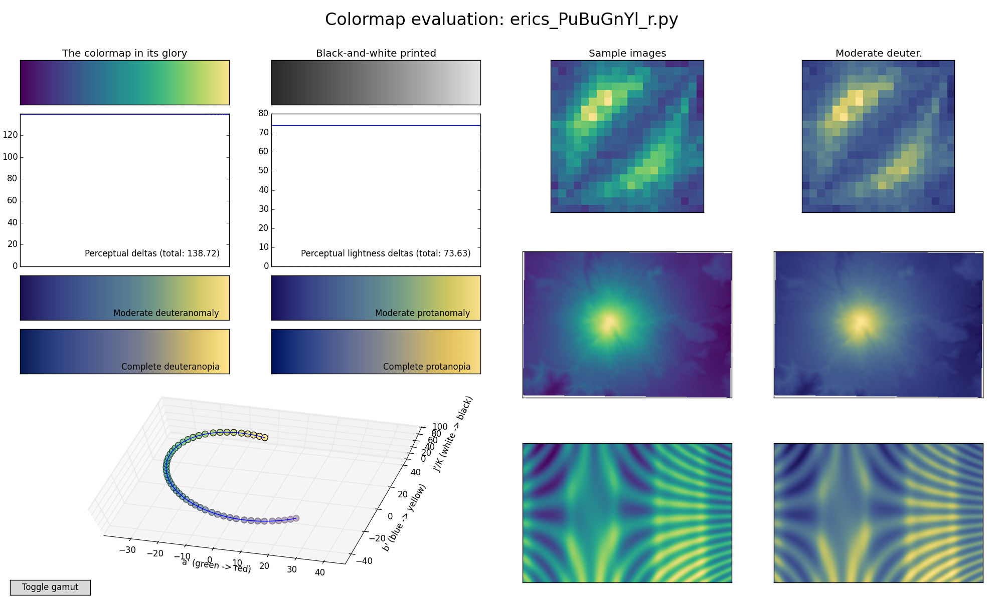
On 2015年06月03日 12:27 PM, Nathaniel Smith wrote:
> We also tried tweaking it a bit to end on a more saturated yellow,
> which I think helps increase contrast in the deuteranomalous version
> in particular, and put this on the website as an "option D":
> https://bids.github.io/colormap/images/screenshots/option_d.png
Thank you. To me, this is more comfortable to look at than A, B, and
especially C.
>
> We also previously designed a colormap that follows parula's ideas
> pretty closely, in terms of starting/ending points, overall
> brightness, and the trick of kinking over through orange at the top
> end. It ends up being much much more green than parula though:
> https://bids.github.io/colormap/images/screenshots/fake_parula.png
Interesting. That kink comes through as a visible over-emphasis of the
orange range in the images.
Attached are two more variations on the clockwise dark-to-light theme.
They achieve more dynamic range, and perhaps "colorfulness", but at the
cost of more relative loss of contrast in the colorblind cases. Is the
tradeoff worthwhile?
Eric
I prefer C, but am not too fond of any of them :(
I wonder if it would be beneficial to give up a little on the quantitative
properties of the cm in favor of moving towards something that is a bit
more aesthetic and pleasant to look at.
On Wed, Jun 3, 2015 at 1:47 PM, Paul Hobson <pmh...@gm...> wrote:
> A brief poll of my office gave
> 3 A's and a B.
>
> One of the A's came from someone who can't remember their distinct flavor
> of color blindness, but definitely gets tripped up by reds and greens.
> -p
>
> On Wed, Jun 3, 2015 at 1:29 PM, Arnd Baecker <arn...@we...> wrote:
>
>> In our group I also recieved quite mixed responses:
>> - C B A (2 x)
>> - B A C
>> - A B C
>> - C
>> - B
>>
>> One collegue having anomalous color vision
>> (something between protanomaly and protanopia)
>> called *all* three versions "harsh" to his eye (like looking into a cars
>> lights at night) and rather unpleasant.
>> He considered C as the least unpleasant, but not that easy to look at.
>>
>> Moreover, he stated that, the parula may be flawed, but at least it
>> doesn’t make one want to look away immediately.
>>
>> Best, Arnd
>>
>>
>>
>>
>> ------------------------------------------------------------------------------
>>
>> _______________________________________________
>> Matplotlib-devel mailing list
>> Mat...@li...
>> https://lists.sourceforge.net/lists/listinfo/matplotlib-devel
>>
>>
>
>
> ------------------------------------------------------------------------------
>
> _______________________________________________
> Matplotlib-devel mailing list
> Mat...@li...
> https://lists.sourceforge.net/lists/listinfo/matplotlib-devel
>
>
--
Brian E. Granger
Cal Poly State University, San Luis Obispo
@ellisonbg on Twitter and GitHub
bgr...@ca... and ell...@gm...
On Wed, Jun 3, 2015 at 1:51 PM, Eric Firing <ef...@ha...> wrote:
> On 2015年06月02日 7:58 PM, Nathaniel Smith wrote:
>>
>> On Tue, Jun 2, 2015 at 10:03 PM, Paul Ivanov <pi...@be...> wrote:
>
>
>> That said, if you want to play around with the editor tool, it's
>> linked on the webpage :-).
>
>
> This is a really nice tool!
>
> Attached is an example of a map that circles the other direction, and that
> sacrifices some visual delta for less extreme ends. Although I think the
> "sunrise" type of map that you offered in versions A, B, and C is a good one
> to have in the arsenal, I am not convinced that it should be the only
> category to be considered as a default. Do we really want to reject the
> somewhat Parula-like category just because Matlab uses the real Parula?
>
> I'm not saying the attached example is particularly good; it is intended to
> re-introduce the category. (It is somewhat similar to a reversal of our
> ColorBrewer YlGnBu, so I tried to name it following that scheme.)
That is nice! For those following along at home, here's what Eric's
colormap looks like:
 https://bids.github.io/colormap/images/screenshots/erics_PuBuGnYl_r.png
We also tried tweaking it a bit to end on a more saturated yellow,
which I think helps increase contrast in the deuteranomalous version
in particular, and put this on the website as an "option D":
 https://bids.github.io/colormap/images/screenshots/option_d.png
We also previously designed a colormap that follows parula's ideas
pretty closely, in terms of starting/ending points, overall
brightness, and the trick of kinking over through orange at the top
end. It ends up being much much more green than parula though:
 https://bids.github.io/colormap/images/screenshots/fake_parula.png
> It seems that the fundamental constraints in this map generator tend to
> yield a somewhat muddy dark end and a muted middle. That's one compromise
> among many that are possible.
You can somewhat avoid the muddy end by bumping up the minimum
brightness (option C does this to some extent), but of course that has
other trade-offs.
-n
--
Nathaniel J. Smith -- http://vorpus.org
On 2015年06月02日 7:58 PM, Nathaniel Smith wrote:
> On Tue, Jun 2, 2015 at 10:03 PM, Paul Ivanov <pi...@be...> wrote:
> That said, if you want to play around with the editor tool, it's
> linked on the webpage :-).
This is a really nice tool!
Attached is an example of a map that circles the other direction, and
that sacrifices some visual delta for less extreme ends. Although I
think the "sunrise" type of map that you offered in versions A, B, and C
is a good one to have in the arsenal, I am not convinced that it should
be the only category to be considered as a default. Do we really want
to reject the somewhat Parula-like category just because Matlab uses the
real Parula?
I'm not saying the attached example is particularly good; it is intended
to re-introduce the category. (It is somewhat similar to a reversal of
our ColorBrewer YlGnBu, so I tried to name it following that scheme.)
It seems that the fundamental constraints in this map generator tend to
yield a somewhat muddy dark end and a muted middle. That's one
compromise among many that are possible.
Eric
A brief poll of my office gave
3 A's and a B.
One of the A's came from someone who can't remember their distinct flavor
of color blindness, but definitely gets tripped up by reds and greens.
-p
On Wed, Jun 3, 2015 at 1:29 PM, Arnd Baecker <arn...@we...> wrote:
> In our group I also recieved quite mixed responses:
> - C B A (2 x)
> - B A C
> - A B C
> - C
> - B
>
> One collegue having anomalous color vision
> (something between protanomaly and protanopia)
> called *all* three versions "harsh" to his eye (like looking into a cars
> lights at night) and rather unpleasant.
> He considered C as the least unpleasant, but not that easy to look at.
>
> Moreover, he stated that, the parula may be flawed, but at least it
> doesn’t make one want to look away immediately.
>
> Best, Arnd
>
>
>
>
> ------------------------------------------------------------------------------
>
> _______________________________________________
> Matplotlib-devel mailing list
> Mat...@li...
> https://lists.sourceforge.net/lists/listinfo/matplotlib-devel
>
>
In our group I also recieved quite mixed responses:
- C B A (2 x)
- B A C
- A B C
- C
- B
One collegue having anomalous color vision
(something between protanomaly and protanopia)
called *all* three versions "harsh" to his eye (like looking into a cars
lights at night) and rather unpleasant.
He considered C as the least unpleasant, but not that easy to look at.
Moreover, he stated that, the parula may be flawed, but at least it
doesn’t make one want to look away immediately.
Best, Arnd
Just want to chime in and say that they colorblind versions of the maps are
pretty nice too. Can those be made available?
It also occurs to me that these are pretty similar to the existing colormap
GNUPlot. I don't know if that's good or bad, but something to keep in mind
if the desire is for matplotlib to standout away from other plotting
packages.
-p
On Wed, Jun 3, 2015 at 8:38 AM, Benjamin Root <ben...@ou...> wrote:
> One of the big advantage of jet as evidenced by these graphs is that for
> most of its range, the perceptual delta is above 200 (although it loses
> that advantage in black&white). Parula sacrafices a fair amount of
> perceptual delta, but stays mostly above 100. All of the options beat or
> matches Parula in this respect overall, even in B&W mode.
>
> However, I wonder just how much should we hold fast to a constant
> perceptual delta? As we see with grayscale, perceptual delta is not
> constant with respect to luminosity. Keep in mind that our "perceptual
> delta" measure is just a model, and I don't think it properly takes into
> account luminosity. So, perhaps it might make sense to be a little bit
> flexible with perceptual delta (maybe something like an exponental decay).
> Nothing jerky like Parula or Jet, but something to help us out on the ends
> of the map?
>
> By the way, I have seen Parula in action for the display of water vapor
> over Africa, and it looks very nice. Perhaps a real-world example image
> might be some sort of geographical map of something familiar across all
> disciplines like a terrain map of a continent?
>
> Ben Root
>
> On Wed, Jun 3, 2015 at 9:55 AM, Paul Ganssle <pga...@gm...> wrote:
>
>>
>> -----BEGIN PGP SIGNED MESSAGE-----
>> Hash: SHA1
>>
>> I'm also in the B > A > C camp, FWIW. I agree with OceanWolf in that B
>> looks most professional. It looks much crisper than the others as well.
>>
>> On 6/3/2015 08:50, Tony Yu wrote:
>> > It doesn't sound like this is going to be decided by email votes, but
>> just so the arguments for C don't dominate, my vote would be:
>> >
>> > B > A >> C
>> >
>> > C has the least perceptual range (that's quantifiable, right?). Also, I
>> find A and B much more aesthetically pleasing (that's obviously debatable).
>> In particular, the yellows and blues in C have a slight visual vibration.
>> Actually, if you google "visual vibration", one of the first hits is a
>> yellow and violet image
>> <https://web.njit.edu/~mmp57/visual%20vibration.jpg>
>> <https://web.njit.edu/~mmp57/visual%20vibration.jpg>. B would have this
>> to a certain extent, but it's much more problematic if those colors are at
>> the limits of the colormap range. It looks like A wouldn't have this
>> problem at all since it's white point has a very muted yellow tone, so
>> maybe I'll switch my vote to A. (Personally, it's a toss up between the
>> two; anything but C, if I haven't made myself clear ;)
>> >
>> > Thanks to Nathaniel and Stéfan for putting this together! Hopefully
>> "jet" can be banished soon :)
>> >
>> > -Tony
>> >
>> > On Wed, Jun 3, 2015 at 5:20 AM, OceanWolf <
>> jui...@ya... <mailto:jui...@ya...>
>> <jui...@ya...>> wrote:
>> >
>> > Personally, just looking at the images I think B looks more
>> > professional, the others look faded. With A and B I see more of
>> > "contrast" in the core of the radial image (though that might arise
>> from
>> > a combination of my monitor/eyes, though I usually do quite well in
>> > colour perception tests).
>> >
>> > I think we really need to see a variety of real examples before we
>> make
>> > a decision though, both in application a.k.a different type of
>> datasets,
>> > including ones with NaNs; and different graph types, the 3d example
>> will
>> > make for a good test as we get the same information twice, from
>> height
>> > and colour, which gives us a reference for comparison.
>> >
>> > With the NaNs Andreas, why did you pick B over C? My eyes see B
>> going
>> > to white as well, only C as far as I can tell does not go to white.
>> >
>> > Looking forward to having a play later :). I wonder what
>> Parula-based
>> > colormap would look like if we were to make it linear... one other
>> > thing, mpl currently doesn't select good bounds with pure
>> > horizontal/vertical lines, making it very difficult (at least for
>> me) to
>> > see the perceptual deltas, zoomed in to option_c the line gets
>> > completely hidden by the axes...
>> >
>> > On 03/06/15 09:04, Andreas Hilboll wrote:
>> > > On 03.06.2015 08:54, Juan Nunez-Iglesias wrote:
>> > >> You can always use green for NaN with any of these maps...
>> > > In grayscale that then wouldn't be distinguishable at all ...
>> > >
>> > >> On Wed, Jun 3, 2015 at 4:30 PM, Andreas Hilboll <
>> li...@hi... <mailto:li...@hi...> <li...@hi...>
>> > >> <mailto:li...@hi... <li...@hi...>
>> <mailto:li...@hi...> <li...@hi...>>> wrote:
>> > >>
>> > >> > I particularly like that A ends on the white end of the
>> spectrum
>> > >>
>> > >> That's exactly why I don't like A that much.
>> > >>
>> > >> In many plots, I need a color for NaN results. This color
>> should not
>> > >> fall within the normal range of the colormap. In case of B
>> and C, it
>> > >> would be possible to use white as NaN color. When using
>> white for NaN
>> > >> in A, it would just look like large values. So I guess I'm
>> voting
>> > >>
>> > >> B > C > A
>> > >>
>> > >> -- Andreas.
>> > >>
>> > >>
>> ------------------------------------------------------------------------------
>> > >>
>> > >> _______________________________________________
>> > >> Matplotlib-devel mailing list
>> > >> Mat...@li...
>> <mailto:Mat...@li...>
>> <Mat...@li...>
>> > >>
>> https://lists.sourceforge.net/lists/listinfo/matplotlib-devel
>> > >>
>> > >>
>> > >
>> >
>> >
>> >
>> ------------------------------------------------------------------------------
>> > _______________________________________________
>> > Matplotlib-devel mailing list
>> > Mat...@li...
>> <mailto:Mat...@li...>
>> <Mat...@li...>
>> > https://lists.sourceforge.net/lists/listinfo/matplotlib-devel
>> >
>> >
>> >
>> >
>> >
>> ------------------------------------------------------------------------------
>> >
>> >
>> > _______________________________________________
>> > Matplotlib-devel mailing list
>> > Mat...@li...
>> > https://lists.sourceforge.net/lists/listinfo/matplotlib-devel
>>
>> -----BEGIN PGP SIGNATURE-----
>> Version: GnuPG v2.0.22 (MingW32)
>>
>> iQIcBAEBAgAGBQJVbwc8AAoJEM1U/OPZZL77c5oP/1KSJloy7ZBVyCOb2Dv2w7fM
>> +cQAHlSBgzff+/hYf4/vDjvo0MOomP3xq7PwjA5Jeg3eln+Y9wDwarCDWZK5+Kh7
>> uDil3Rdtx+yC3vUqrICHQkh6Y6b5xiv6eTAV06UA2sUM4TRnXIuLSCCnR/2ntbiY
>> NGyl7/NPFeYmFJHtGnMmNLhVIZV5a01oc7J6xb/CqQhuYzzi3NwN2tuS27+ouG2G
>> dOXWXn/f2DdHYONXyjFHQG5NeVxm50r27wZkdk9xhfmo7FaI2939xZQfbeFqUdAO
>> qspHwddr0PGIQCU8nr/CCzQ93fMPkd3cM3e4Sn1Ulq2yDuQXLIISBkA7ufi45yPt
>> q1pmFiv9La6vbZZzLLJ47c90fQ1NAe3Jdj4z1x6H4ZhZe8I2zgBhOO4m8meh+gU6
>> XRfBWFvPCMyGOndSaV18L3YJ7NTl0cdUr6iaqoFK+AyZtcGmQbAhYfs+GTGIGaN8
>> qyz2Y+HXavYrLO4kQlLoemLeuWo8EDym3zDGe3CgL/7CCDUvEhF5qoyIW67MYWR0
>> 8R1byACucRH8bs6sp5cWiwAzWBst+5a1WHQFtva64WclQe2NrD0gyveX+a27XLxQ
>> wc2f+nm4MKMfd1Eu8j+i4ln2WeGiAawTagRTakizcU5xfUq8LSzYptOco83HdvH7
>> npX4K4yVTam7AtGhFr5y
>> =V4np
>> -----END PGP SIGNATURE-----
>>
>>
>>
>> ------------------------------------------------------------------------------
>>
>> _______________________________________________
>> Matplotlib-devel mailing list
>> Mat...@li...
>> https://lists.sourceforge.net/lists/listinfo/matplotlib-devel
>>
>>
>
>
> ------------------------------------------------------------------------------
>
> _______________________________________________
> Matplotlib-devel mailing list
> Mat...@li...
> https://lists.sourceforge.net/lists/listinfo/matplotlib-devel
>
>