You can subscribe to this list here.
| 2003 |
Jan
|
Feb
|
Mar
|
Apr
|
May
|
Jun
|
Jul
|
Aug
|
Sep
|
Oct
(1) |
Nov
(33) |
Dec
(20) |
|---|---|---|---|---|---|---|---|---|---|---|---|---|
| 2004 |
Jan
(7) |
Feb
(44) |
Mar
(51) |
Apr
(43) |
May
(43) |
Jun
(36) |
Jul
(61) |
Aug
(44) |
Sep
(25) |
Oct
(82) |
Nov
(97) |
Dec
(47) |
| 2005 |
Jan
(77) |
Feb
(143) |
Mar
(42) |
Apr
(31) |
May
(93) |
Jun
(93) |
Jul
(35) |
Aug
(78) |
Sep
(56) |
Oct
(44) |
Nov
(72) |
Dec
(75) |
| 2006 |
Jan
(116) |
Feb
(99) |
Mar
(181) |
Apr
(171) |
May
(112) |
Jun
(86) |
Jul
(91) |
Aug
(111) |
Sep
(77) |
Oct
(72) |
Nov
(57) |
Dec
(51) |
| 2007 |
Jan
(64) |
Feb
(116) |
Mar
(70) |
Apr
(74) |
May
(53) |
Jun
(40) |
Jul
(519) |
Aug
(151) |
Sep
(132) |
Oct
(74) |
Nov
(282) |
Dec
(190) |
| 2008 |
Jan
(141) |
Feb
(67) |
Mar
(69) |
Apr
(96) |
May
(227) |
Jun
(404) |
Jul
(399) |
Aug
(96) |
Sep
(120) |
Oct
(205) |
Nov
(126) |
Dec
(261) |
| 2009 |
Jan
(136) |
Feb
(136) |
Mar
(119) |
Apr
(124) |
May
(155) |
Jun
(98) |
Jul
(136) |
Aug
(292) |
Sep
(174) |
Oct
(126) |
Nov
(126) |
Dec
(79) |
| 2010 |
Jan
(109) |
Feb
(83) |
Mar
(139) |
Apr
(91) |
May
(79) |
Jun
(164) |
Jul
(184) |
Aug
(146) |
Sep
(163) |
Oct
(128) |
Nov
(70) |
Dec
(73) |
| 2011 |
Jan
(235) |
Feb
(165) |
Mar
(147) |
Apr
(86) |
May
(74) |
Jun
(118) |
Jul
(65) |
Aug
(75) |
Sep
(162) |
Oct
(94) |
Nov
(48) |
Dec
(44) |
| 2012 |
Jan
(49) |
Feb
(40) |
Mar
(88) |
Apr
(35) |
May
(52) |
Jun
(69) |
Jul
(90) |
Aug
(123) |
Sep
(112) |
Oct
(120) |
Nov
(105) |
Dec
(116) |
| 2013 |
Jan
(76) |
Feb
(26) |
Mar
(78) |
Apr
(43) |
May
(61) |
Jun
(53) |
Jul
(147) |
Aug
(85) |
Sep
(83) |
Oct
(122) |
Nov
(18) |
Dec
(27) |
| 2014 |
Jan
(58) |
Feb
(25) |
Mar
(49) |
Apr
(17) |
May
(29) |
Jun
(39) |
Jul
(53) |
Aug
(52) |
Sep
(35) |
Oct
(47) |
Nov
(110) |
Dec
(27) |
| 2015 |
Jan
(50) |
Feb
(93) |
Mar
(96) |
Apr
(30) |
May
(55) |
Jun
(83) |
Jul
(44) |
Aug
(8) |
Sep
(5) |
Oct
|
Nov
(1) |
Dec
(1) |
| 2016 |
Jan
|
Feb
|
Mar
(1) |
Apr
|
May
|
Jun
(2) |
Jul
|
Aug
(3) |
Sep
(1) |
Oct
(3) |
Nov
|
Dec
|
| 2017 |
Jan
|
Feb
(5) |
Mar
|
Apr
|
May
|
Jun
|
Jul
(3) |
Aug
|
Sep
(7) |
Oct
|
Nov
|
Dec
|
| 2018 |
Jan
|
Feb
|
Mar
|
Apr
|
May
|
Jun
|
Jul
(2) |
Aug
|
Sep
|
Oct
|
Nov
|
Dec
|
| S | M | T | W | T | F | S |
|---|---|---|---|---|---|---|
|
|
1
|
2
|
3
(27) |
4
(16) |
5
(1) |
6
(1) |
|
7
(4) |
8
|
9
(1) |
10
(1) |
11
(1) |
12
|
13
|
|
14
|
15
(6) |
16
(2) |
17
(8) |
18
|
19
|
20
|
|
21
|
22
(8) |
23
|
24
(2) |
25
(2) |
26
(1) |
27
(1) |
|
28
|
29
(1) |
30
|
|
|
|
|
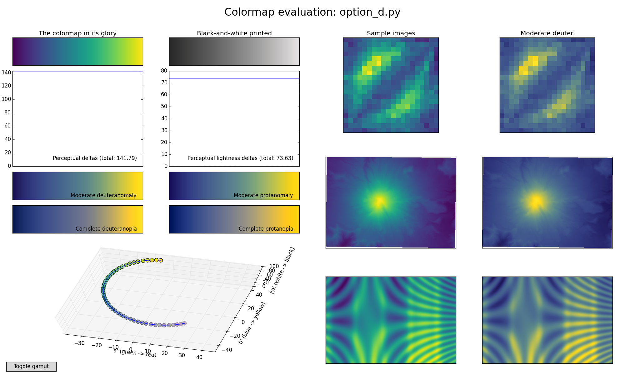
Fun activity: watch all 6 videos in a row then watch the text on this email
spin and spin. =P
Gorgeous! Thanks Nathan!
I hope this kills C dead. It clearly makes certain features of the
simulation harder to spot.
A great demo of the terribleness of jet, too: it looks like a huge mess.
On Thu, Jun 4, 2015 at 5:42 PM, Nathan Goldbaum <nat...@gm...>
wrote:
>
>
> On Wed, Jun 3, 2015 at 5:17 PM, Stéfan van der Walt <st...@su...>
> wrote:
>
>> On Wed, Jun 3, 2015 at 5:08 PM, Nathan Goldbaum <nat...@gm...>
>> wrote:
>> > I'm a big fan of option D. So much so that when I needed to make a
>> movie of
>> > ony my galaxy simulations today I went ahead and used it:
>> >
>> > https://youtu.be/bnm554et0T8
>>
>> Beautiful! How hard would it be to also do this for the other
>> proposed colormaps?
>>
>
> Thankfully you made it pretty easy to script this.
>
> jet: https://www.youtube.com/watch?v=dsvT5hImPmo
>
> parula: https://www.youtube.com/watch?v=8146CMi-OaQ
>
> option a: https://www.youtube.com/watch?v=IqvxuQSzWO4
>
> option b: https://www.youtube.com/watch?v=wa7bpV3XPV0
>
> option c: https://www.youtube.com/watch?v=3rHbq4jw1ew
>
> option d: https://www.youtube.com/watch?v=2_HiUXVNm2k
>
>
>>
>> Stéfan
>>
>>
>> ------------------------------------------------------------------------------
>> _______________________________________________
>> Matplotlib-devel mailing list
>> Mat...@li...
>> https://lists.sourceforge.net/lists/listinfo/matplotlib-devel
>>
>
>
>
> ------------------------------------------------------------------------------
>
> _______________________________________________
> Matplotlib-devel mailing list
> Mat...@li...
> https://lists.sourceforge.net/lists/listinfo/matplotlib-devel
>
>
On Wed, Jun 3, 2015 at 5:17 PM, Stéfan van der Walt <st...@su...>
wrote:
> On Wed, Jun 3, 2015 at 5:08 PM, Nathan Goldbaum <nat...@gm...>
> wrote:
> > I'm a big fan of option D. So much so that when I needed to make a
> movie of
> > ony my galaxy simulations today I went ahead and used it:
> >
> > https://youtu.be/bnm554et0T8
>
> Beautiful! How hard would it be to also do this for the other
> proposed colormaps?
>
Thankfully you made it pretty easy to script this.
jet: https://www.youtube.com/watch?v=dsvT5hImPmo
parula: https://www.youtube.com/watch?v=8146CMi-OaQ
option a: https://www.youtube.com/watch?v=IqvxuQSzWO4
option b: https://www.youtube.com/watch?v=wa7bpV3XPV0
option c: https://www.youtube.com/watch?v=3rHbq4jw1ew
option d: https://www.youtube.com/watch?v=2_HiUXVNm2k
>
> Stéfan
>
>
> ------------------------------------------------------------------------------
> _______________________________________________
> Matplotlib-devel mailing list
> Mat...@li...
> https://lists.sourceforge.net/lists/listinfo/matplotlib-devel
>
I'm really digging option D too -- it has the bonus of being unambiguously
distinct from GNUPlot,
On Wed, Jun 3, 2015 at 5:29 PM, Benjamin Root <ben...@ou...> wrote:
> May I suggest an update to the code showing the 3d sRGB colorspace? Can
> you add a "shade=False" to it? Currently, in pycam02ucs.viscm.py, around
> line 279, it calls the 3d scatter function without the kwarg. This means
> that mplot3d will apply an alpha transparancy to dots that are farther away
> to give the perception of depth. Since we actually want to see the correct
> color, we probably shouldn't have that feature on.
>
> Ben Root
>
>
> On Wed, Jun 3, 2015 at 8:17 PM, Stéfan van der Walt <st...@su...>
> wrote:
>
>> On Wed, Jun 3, 2015 at 5:08 PM, Nathan Goldbaum <nat...@gm...>
>> wrote:
>> > I'm a big fan of option D. So much so that when I needed to make a
>> movie of
>> > ony my galaxy simulations today I went ahead and used it:
>> >
>> > https://youtu.be/bnm554et0T8
>>
>> Beautiful! How hard would it be to also do this for the other
>> proposed colormaps?
>>
>> Stéfan
>>
>>
>> ------------------------------------------------------------------------------
>> _______________________________________________
>> Matplotlib-devel mailing list
>> Mat...@li...
>> https://lists.sourceforge.net/lists/listinfo/matplotlib-devel
>>
>
>
>
> ------------------------------------------------------------------------------
>
> _______________________________________________
> Matplotlib-devel mailing list
> Mat...@li...
> https://lists.sourceforge.net/lists/listinfo/matplotlib-devel
>
>
May I suggest an update to the code showing the 3d sRGB colorspace? Can you
add a "shade=False" to it? Currently, in pycam02ucs.viscm.py, around line
279, it calls the 3d scatter function without the kwarg. This means that
mplot3d will apply an alpha transparancy to dots that are farther away to
give the perception of depth. Since we actually want to see the correct
color, we probably shouldn't have that feature on.
Ben Root
On Wed, Jun 3, 2015 at 8:17 PM, Stéfan van der Walt <st...@su...>
wrote:
> On Wed, Jun 3, 2015 at 5:08 PM, Nathan Goldbaum <nat...@gm...>
> wrote:
> > I'm a big fan of option D. So much so that when I needed to make a
> movie of
> > ony my galaxy simulations today I went ahead and used it:
> >
> > https://youtu.be/bnm554et0T8
>
> Beautiful! How hard would it be to also do this for the other
> proposed colormaps?
>
> Stéfan
>
>
> ------------------------------------------------------------------------------
> _______________________________________________
> Matplotlib-devel mailing list
> Mat...@li...
> https://lists.sourceforge.net/lists/listinfo/matplotlib-devel
>
On Wed, Jun 3, 2015 at 5:08 PM, Nathan Goldbaum <nat...@gm...> wrote:
> I'm a big fan of option D. So much so that when I needed to make a movie of
> ony my galaxy simulations today I went ahead and used it:
>
> https://youtu.be/bnm554et0T8
Beautiful! How hard would it be to also do this for the other
proposed colormaps?
Stéfan
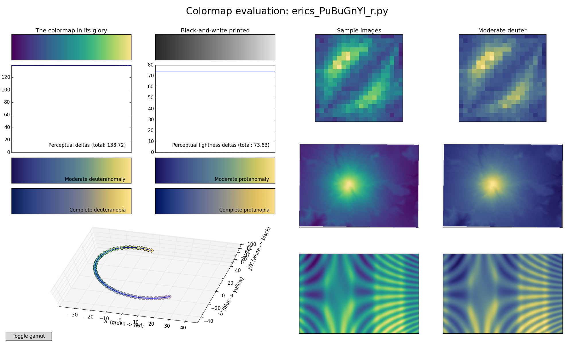
I'm a big fan of option D. So much so that when I needed to make a movie
of ony my galaxy simulations today I went ahead and used it:
https://youtu.be/bnm554et0T8
On Wed, Jun 3, 2015 at 4:43 PM, Benjamin Root <ben...@ou...> wrote:
> Ooooh, I am liking "D" a lot. It is almost like what Parula should have
> been. Still not quite perfect, but I can't put my finger on it.
>
> Ben Root
>
> On Wed, Jun 3, 2015 at 6:27 PM, Nathaniel Smith <nj...@po...> wrote:
>
>> On Wed, Jun 3, 2015 at 1:51 PM, Eric Firing <ef...@ha...> wrote:
>> > On 2015年06月02日 7:58 PM, Nathaniel Smith wrote:
>> >>
>> >> On Tue, Jun 2, 2015 at 10:03 PM, Paul Ivanov <pi...@be...> wrote:
>> >
>> >
>> >> That said, if you want to play around with the editor tool, it's
>> >> linked on the webpage :-).
>> >
>> >
>> > This is a really nice tool!
>> >
>> > Attached is an example of a map that circles the other direction, and
>> that
>> > sacrifices some visual delta for less extreme ends. Although I think
>> the
>> > "sunrise" type of map that you offered in versions A, B, and C is a
>> good one
>> > to have in the arsenal, I am not convinced that it should be the only
>> > category to be considered as a default. Do we really want to reject the
>> > somewhat Parula-like category just because Matlab uses the real Parula?
>> >
>> > I'm not saying the attached example is particularly good; it is
>> intended to
>> > re-introduce the category. (It is somewhat similar to a reversal of our
>> > ColorBrewer YlGnBu, so I tried to name it following that scheme.)
>>
>> That is nice! For those following along at home, here's what Eric's
>> colormap looks like:
>>
>> https://bids.github.io/colormap/images/screenshots/erics_PuBuGnYl_r.png
>>
>> We also tried tweaking it a bit to end on a more saturated yellow,
>> which I think helps increase contrast in the deuteranomalous version
>> in particular, and put this on the website as an "option D":
>> https://bids.github.io/colormap/images/screenshots/option_d.png
>>
>> We also previously designed a colormap that follows parula's ideas
>> pretty closely, in terms of starting/ending points, overall
>> brightness, and the trick of kinking over through orange at the top
>> end. It ends up being much much more green than parula though:
>> https://bids.github.io/colormap/images/screenshots/fake_parula.png
>>
>> > It seems that the fundamental constraints in this map generator tend to
>> > yield a somewhat muddy dark end and a muted middle. That's one
>> compromise
>> > among many that are possible.
>>
>> You can somewhat avoid the muddy end by bumping up the minimum
>> brightness (option C does this to some extent), but of course that has
>> other trade-offs.
>>
>> -n
>>
>> --
>> Nathaniel J. Smith -- http://vorpus.org
>>
>>
>> ------------------------------------------------------------------------------
>> _______________________________________________
>> Matplotlib-devel mailing list
>> Mat...@li...
>> https://lists.sourceforge.net/lists/listinfo/matplotlib-devel
>>
>
>
>
> ------------------------------------------------------------------------------
>
> _______________________________________________
> Matplotlib-devel mailing list
> Mat...@li...
> https://lists.sourceforge.net/lists/listinfo/matplotlib-devel
>
>
Ooooh, I am liking "D" a lot. It is almost like what Parula should have
been. Still not quite perfect, but I can't put my finger on it.
Ben Root
On Wed, Jun 3, 2015 at 6:27 PM, Nathaniel Smith <nj...@po...> wrote:
> On Wed, Jun 3, 2015 at 1:51 PM, Eric Firing <ef...@ha...> wrote:
> > On 2015年06月02日 7:58 PM, Nathaniel Smith wrote:
> >>
> >> On Tue, Jun 2, 2015 at 10:03 PM, Paul Ivanov <pi...@be...> wrote:
> >
> >
> >> That said, if you want to play around with the editor tool, it's
> >> linked on the webpage :-).
> >
> >
> > This is a really nice tool!
> >
> > Attached is an example of a map that circles the other direction, and
> that
> > sacrifices some visual delta for less extreme ends. Although I think the
> > "sunrise" type of map that you offered in versions A, B, and C is a good
> one
> > to have in the arsenal, I am not convinced that it should be the only
> > category to be considered as a default. Do we really want to reject the
> > somewhat Parula-like category just because Matlab uses the real Parula?
> >
> > I'm not saying the attached example is particularly good; it is intended
> to
> > re-introduce the category. (It is somewhat similar to a reversal of our
> > ColorBrewer YlGnBu, so I tried to name it following that scheme.)
>
> That is nice! For those following along at home, here's what Eric's
> colormap looks like:
> https://bids.github.io/colormap/images/screenshots/erics_PuBuGnYl_r.png
>
> We also tried tweaking it a bit to end on a more saturated yellow,
> which I think helps increase contrast in the deuteranomalous version
> in particular, and put this on the website as an "option D":
> https://bids.github.io/colormap/images/screenshots/option_d.png
>
> We also previously designed a colormap that follows parula's ideas
> pretty closely, in terms of starting/ending points, overall
> brightness, and the trick of kinking over through orange at the top
> end. It ends up being much much more green than parula though:
> https://bids.github.io/colormap/images/screenshots/fake_parula.png
>
> > It seems that the fundamental constraints in this map generator tend to
> > yield a somewhat muddy dark end and a muted middle. That's one
> compromise
> > among many that are possible.
>
> You can somewhat avoid the muddy end by bumping up the minimum
> brightness (option C does this to some extent), but of course that has
> other trade-offs.
>
> -n
>
> --
> Nathaniel J. Smith -- http://vorpus.org
>
>
> ------------------------------------------------------------------------------
> _______________________________________________
> Matplotlib-devel mailing list
> Mat...@li...
> https://lists.sourceforge.net/lists/listinfo/matplotlib-devel
>
On 2015年06月03日 12:27 PM, Nathaniel Smith wrote:
> We also tried tweaking it a bit to end on a more saturated yellow,
> which I think helps increase contrast in the deuteranomalous version
> in particular, and put this on the website as an "option D":
> https://bids.github.io/colormap/images/screenshots/option_d.png
Thank you. To me, this is more comfortable to look at than A, B, and
especially C.
>
> We also previously designed a colormap that follows parula's ideas
> pretty closely, in terms of starting/ending points, overall
> brightness, and the trick of kinking over through orange at the top
> end. It ends up being much much more green than parula though:
> https://bids.github.io/colormap/images/screenshots/fake_parula.png
Interesting. That kink comes through as a visible over-emphasis of the
orange range in the images.
Attached are two more variations on the clockwise dark-to-light theme.
They achieve more dynamic range, and perhaps "colorfulness", but at the
cost of more relative loss of contrast in the colorblind cases. Is the
tradeoff worthwhile?
Eric
I prefer C, but am not too fond of any of them :(
I wonder if it would be beneficial to give up a little on the quantitative
properties of the cm in favor of moving towards something that is a bit
more aesthetic and pleasant to look at.
On Wed, Jun 3, 2015 at 1:47 PM, Paul Hobson <pmh...@gm...> wrote:
> A brief poll of my office gave
> 3 A's and a B.
>
> One of the A's came from someone who can't remember their distinct flavor
> of color blindness, but definitely gets tripped up by reds and greens.
> -p
>
> On Wed, Jun 3, 2015 at 1:29 PM, Arnd Baecker <arn...@we...> wrote:
>
>> In our group I also recieved quite mixed responses:
>> - C B A (2 x)
>> - B A C
>> - A B C
>> - C
>> - B
>>
>> One collegue having anomalous color vision
>> (something between protanomaly and protanopia)
>> called *all* three versions "harsh" to his eye (like looking into a cars
>> lights at night) and rather unpleasant.
>> He considered C as the least unpleasant, but not that easy to look at.
>>
>> Moreover, he stated that, the parula may be flawed, but at least it
>> doesn’t make one want to look away immediately.
>>
>> Best, Arnd
>>
>>
>>
>>
>> ------------------------------------------------------------------------------
>>
>> _______________________________________________
>> Matplotlib-devel mailing list
>> Mat...@li...
>> https://lists.sourceforge.net/lists/listinfo/matplotlib-devel
>>
>>
>
>
> ------------------------------------------------------------------------------
>
> _______________________________________________
> Matplotlib-devel mailing list
> Mat...@li...
> https://lists.sourceforge.net/lists/listinfo/matplotlib-devel
>
>
--
Brian E. Granger
Cal Poly State University, San Luis Obispo
@ellisonbg on Twitter and GitHub
bgr...@ca... and ell...@gm...
On Wed, Jun 3, 2015 at 1:51 PM, Eric Firing <ef...@ha...> wrote:
> On 2015年06月02日 7:58 PM, Nathaniel Smith wrote:
>>
>> On Tue, Jun 2, 2015 at 10:03 PM, Paul Ivanov <pi...@be...> wrote:
>
>
>> That said, if you want to play around with the editor tool, it's
>> linked on the webpage :-).
>
>
> This is a really nice tool!
>
> Attached is an example of a map that circles the other direction, and that
> sacrifices some visual delta for less extreme ends. Although I think the
> "sunrise" type of map that you offered in versions A, B, and C is a good one
> to have in the arsenal, I am not convinced that it should be the only
> category to be considered as a default. Do we really want to reject the
> somewhat Parula-like category just because Matlab uses the real Parula?
>
> I'm not saying the attached example is particularly good; it is intended to
> re-introduce the category. (It is somewhat similar to a reversal of our
> ColorBrewer YlGnBu, so I tried to name it following that scheme.)
That is nice! For those following along at home, here's what Eric's
colormap looks like:
 https://bids.github.io/colormap/images/screenshots/erics_PuBuGnYl_r.png
We also tried tweaking it a bit to end on a more saturated yellow,
which I think helps increase contrast in the deuteranomalous version
in particular, and put this on the website as an "option D":
 https://bids.github.io/colormap/images/screenshots/option_d.png
We also previously designed a colormap that follows parula's ideas
pretty closely, in terms of starting/ending points, overall
brightness, and the trick of kinking over through orange at the top
end. It ends up being much much more green than parula though:
 https://bids.github.io/colormap/images/screenshots/fake_parula.png
> It seems that the fundamental constraints in this map generator tend to
> yield a somewhat muddy dark end and a muted middle. That's one compromise
> among many that are possible.
You can somewhat avoid the muddy end by bumping up the minimum
brightness (option C does this to some extent), but of course that has
other trade-offs.
-n
--
Nathaniel J. Smith -- http://vorpus.org
On 2015年06月02日 7:58 PM, Nathaniel Smith wrote:
> On Tue, Jun 2, 2015 at 10:03 PM, Paul Ivanov <pi...@be...> wrote:
> That said, if you want to play around with the editor tool, it's
> linked on the webpage :-).
This is a really nice tool!
Attached is an example of a map that circles the other direction, and
that sacrifices some visual delta for less extreme ends. Although I
think the "sunrise" type of map that you offered in versions A, B, and C
is a good one to have in the arsenal, I am not convinced that it should
be the only category to be considered as a default. Do we really want
to reject the somewhat Parula-like category just because Matlab uses the
real Parula?
I'm not saying the attached example is particularly good; it is intended
to re-introduce the category. (It is somewhat similar to a reversal of
our ColorBrewer YlGnBu, so I tried to name it following that scheme.)
It seems that the fundamental constraints in this map generator tend to
yield a somewhat muddy dark end and a muted middle. That's one
compromise among many that are possible.
Eric
A brief poll of my office gave
3 A's and a B.
One of the A's came from someone who can't remember their distinct flavor
of color blindness, but definitely gets tripped up by reds and greens.
-p
On Wed, Jun 3, 2015 at 1:29 PM, Arnd Baecker <arn...@we...> wrote:
> In our group I also recieved quite mixed responses:
> - C B A (2 x)
> - B A C
> - A B C
> - C
> - B
>
> One collegue having anomalous color vision
> (something between protanomaly and protanopia)
> called *all* three versions "harsh" to his eye (like looking into a cars
> lights at night) and rather unpleasant.
> He considered C as the least unpleasant, but not that easy to look at.
>
> Moreover, he stated that, the parula may be flawed, but at least it
> doesn’t make one want to look away immediately.
>
> Best, Arnd
>
>
>
>
> ------------------------------------------------------------------------------
>
> _______________________________________________
> Matplotlib-devel mailing list
> Mat...@li...
> https://lists.sourceforge.net/lists/listinfo/matplotlib-devel
>
>
In our group I also recieved quite mixed responses:
- C B A (2 x)
- B A C
- A B C
- C
- B
One collegue having anomalous color vision
(something between protanomaly and protanopia)
called *all* three versions "harsh" to his eye (like looking into a cars
lights at night) and rather unpleasant.
He considered C as the least unpleasant, but not that easy to look at.
Moreover, he stated that, the parula may be flawed, but at least it
doesn’t make one want to look away immediately.
Best, Arnd
Just want to chime in and say that they colorblind versions of the maps are
pretty nice too. Can those be made available?
It also occurs to me that these are pretty similar to the existing colormap
GNUPlot. I don't know if that's good or bad, but something to keep in mind
if the desire is for matplotlib to standout away from other plotting
packages.
-p
On Wed, Jun 3, 2015 at 8:38 AM, Benjamin Root <ben...@ou...> wrote:
> One of the big advantage of jet as evidenced by these graphs is that for
> most of its range, the perceptual delta is above 200 (although it loses
> that advantage in black&white). Parula sacrafices a fair amount of
> perceptual delta, but stays mostly above 100. All of the options beat or
> matches Parula in this respect overall, even in B&W mode.
>
> However, I wonder just how much should we hold fast to a constant
> perceptual delta? As we see with grayscale, perceptual delta is not
> constant with respect to luminosity. Keep in mind that our "perceptual
> delta" measure is just a model, and I don't think it properly takes into
> account luminosity. So, perhaps it might make sense to be a little bit
> flexible with perceptual delta (maybe something like an exponental decay).
> Nothing jerky like Parula or Jet, but something to help us out on the ends
> of the map?
>
> By the way, I have seen Parula in action for the display of water vapor
> over Africa, and it looks very nice. Perhaps a real-world example image
> might be some sort of geographical map of something familiar across all
> disciplines like a terrain map of a continent?
>
> Ben Root
>
> On Wed, Jun 3, 2015 at 9:55 AM, Paul Ganssle <pga...@gm...> wrote:
>
>>
>> -----BEGIN PGP SIGNED MESSAGE-----
>> Hash: SHA1
>>
>> I'm also in the B > A > C camp, FWIW. I agree with OceanWolf in that B
>> looks most professional. It looks much crisper than the others as well.
>>
>> On 6/3/2015 08:50, Tony Yu wrote:
>> > It doesn't sound like this is going to be decided by email votes, but
>> just so the arguments for C don't dominate, my vote would be:
>> >
>> > B > A >> C
>> >
>> > C has the least perceptual range (that's quantifiable, right?). Also, I
>> find A and B much more aesthetically pleasing (that's obviously debatable).
>> In particular, the yellows and blues in C have a slight visual vibration.
>> Actually, if you google "visual vibration", one of the first hits is a
>> yellow and violet image
>> <https://web.njit.edu/~mmp57/visual%20vibration.jpg>
>> <https://web.njit.edu/~mmp57/visual%20vibration.jpg>. B would have this
>> to a certain extent, but it's much more problematic if those colors are at
>> the limits of the colormap range. It looks like A wouldn't have this
>> problem at all since it's white point has a very muted yellow tone, so
>> maybe I'll switch my vote to A. (Personally, it's a toss up between the
>> two; anything but C, if I haven't made myself clear ;)
>> >
>> > Thanks to Nathaniel and Stéfan for putting this together! Hopefully
>> "jet" can be banished soon :)
>> >
>> > -Tony
>> >
>> > On Wed, Jun 3, 2015 at 5:20 AM, OceanWolf <
>> jui...@ya... <mailto:jui...@ya...>
>> <jui...@ya...>> wrote:
>> >
>> > Personally, just looking at the images I think B looks more
>> > professional, the others look faded. With A and B I see more of
>> > "contrast" in the core of the radial image (though that might arise
>> from
>> > a combination of my monitor/eyes, though I usually do quite well in
>> > colour perception tests).
>> >
>> > I think we really need to see a variety of real examples before we
>> make
>> > a decision though, both in application a.k.a different type of
>> datasets,
>> > including ones with NaNs; and different graph types, the 3d example
>> will
>> > make for a good test as we get the same information twice, from
>> height
>> > and colour, which gives us a reference for comparison.
>> >
>> > With the NaNs Andreas, why did you pick B over C? My eyes see B
>> going
>> > to white as well, only C as far as I can tell does not go to white.
>> >
>> > Looking forward to having a play later :). I wonder what
>> Parula-based
>> > colormap would look like if we were to make it linear... one other
>> > thing, mpl currently doesn't select good bounds with pure
>> > horizontal/vertical lines, making it very difficult (at least for
>> me) to
>> > see the perceptual deltas, zoomed in to option_c the line gets
>> > completely hidden by the axes...
>> >
>> > On 03/06/15 09:04, Andreas Hilboll wrote:
>> > > On 03.06.2015 08:54, Juan Nunez-Iglesias wrote:
>> > >> You can always use green for NaN with any of these maps...
>> > > In grayscale that then wouldn't be distinguishable at all ...
>> > >
>> > >> On Wed, Jun 3, 2015 at 4:30 PM, Andreas Hilboll <
>> li...@hi... <mailto:li...@hi...> <li...@hi...>
>> > >> <mailto:li...@hi... <li...@hi...>
>> <mailto:li...@hi...> <li...@hi...>>> wrote:
>> > >>
>> > >> > I particularly like that A ends on the white end of the
>> spectrum
>> > >>
>> > >> That's exactly why I don't like A that much.
>> > >>
>> > >> In many plots, I need a color for NaN results. This color
>> should not
>> > >> fall within the normal range of the colormap. In case of B
>> and C, it
>> > >> would be possible to use white as NaN color. When using
>> white for NaN
>> > >> in A, it would just look like large values. So I guess I'm
>> voting
>> > >>
>> > >> B > C > A
>> > >>
>> > >> -- Andreas.
>> > >>
>> > >>
>> ------------------------------------------------------------------------------
>> > >>
>> > >> _______________________________________________
>> > >> Matplotlib-devel mailing list
>> > >> Mat...@li...
>> <mailto:Mat...@li...>
>> <Mat...@li...>
>> > >>
>> https://lists.sourceforge.net/lists/listinfo/matplotlib-devel
>> > >>
>> > >>
>> > >
>> >
>> >
>> >
>> ------------------------------------------------------------------------------
>> > _______________________________________________
>> > Matplotlib-devel mailing list
>> > Mat...@li...
>> <mailto:Mat...@li...>
>> <Mat...@li...>
>> > https://lists.sourceforge.net/lists/listinfo/matplotlib-devel
>> >
>> >
>> >
>> >
>> >
>> ------------------------------------------------------------------------------
>> >
>> >
>> > _______________________________________________
>> > Matplotlib-devel mailing list
>> > Mat...@li...
>> > https://lists.sourceforge.net/lists/listinfo/matplotlib-devel
>>
>> -----BEGIN PGP SIGNATURE-----
>> Version: GnuPG v2.0.22 (MingW32)
>>
>> iQIcBAEBAgAGBQJVbwc8AAoJEM1U/OPZZL77c5oP/1KSJloy7ZBVyCOb2Dv2w7fM
>> +cQAHlSBgzff+/hYf4/vDjvo0MOomP3xq7PwjA5Jeg3eln+Y9wDwarCDWZK5+Kh7
>> uDil3Rdtx+yC3vUqrICHQkh6Y6b5xiv6eTAV06UA2sUM4TRnXIuLSCCnR/2ntbiY
>> NGyl7/NPFeYmFJHtGnMmNLhVIZV5a01oc7J6xb/CqQhuYzzi3NwN2tuS27+ouG2G
>> dOXWXn/f2DdHYONXyjFHQG5NeVxm50r27wZkdk9xhfmo7FaI2939xZQfbeFqUdAO
>> qspHwddr0PGIQCU8nr/CCzQ93fMPkd3cM3e4Sn1Ulq2yDuQXLIISBkA7ufi45yPt
>> q1pmFiv9La6vbZZzLLJ47c90fQ1NAe3Jdj4z1x6H4ZhZe8I2zgBhOO4m8meh+gU6
>> XRfBWFvPCMyGOndSaV18L3YJ7NTl0cdUr6iaqoFK+AyZtcGmQbAhYfs+GTGIGaN8
>> qyz2Y+HXavYrLO4kQlLoemLeuWo8EDym3zDGe3CgL/7CCDUvEhF5qoyIW67MYWR0
>> 8R1byACucRH8bs6sp5cWiwAzWBst+5a1WHQFtva64WclQe2NrD0gyveX+a27XLxQ
>> wc2f+nm4MKMfd1Eu8j+i4ln2WeGiAawTagRTakizcU5xfUq8LSzYptOco83HdvH7
>> npX4K4yVTam7AtGhFr5y
>> =V4np
>> -----END PGP SIGNATURE-----
>>
>>
>>
>> ------------------------------------------------------------------------------
>>
>> _______________________________________________
>> Matplotlib-devel mailing list
>> Mat...@li...
>> https://lists.sourceforge.net/lists/listinfo/matplotlib-devel
>>
>>
>
>
> ------------------------------------------------------------------------------
>
> _______________________________________________
> Matplotlib-devel mailing list
> Mat...@li...
> https://lists.sourceforge.net/lists/listinfo/matplotlib-devel
>
>
PYTHON CODE:
import serial # import Serial Library
import numpy # Import numpy
import matplotlib.pyplot as plt #import matplotlib library
from drawnow import *

tempF= []
pressure= []

arduinoData = serial.Serial('com6', 115200) #Creating our serial object
named arduinoData
plt.ion() #Tell matplotlib you want interactive mode to plot live data
cnt=0

def makeFig(): #Create a function that makes our desired plot
 plt.ylim(0,500) #Set y min and max
values
 plt.title('Frequency vs Time') #Plot the title
 plt.grid(True) #Turn the grid on
 plt.ylabel('Frequency (pulses/sec)') #Set
ylabels
 plt.plot(tempF, 'ro-', label='pulses/sec') #plot the temperature
 plt.legend(loc='upper left') #plot the legend


 plt2=plt.twinx() #Create a second y axis
 plt.ylim(0,500) #Set limits of second y axis-
adjust to readings you are getting
 plt2.plot(pressure, 'b^-', label='Pressure (Pa)') #plot pressure data
 plt2.set_ylabel('Pressrue (Pa)') #label second y axis
 plt2.ticklabel_format(useOffset=False) #Force matplotlib to
NOT autoscale y axis
 plt2.legend(loc='upper right') #plot the legend


while True: # While loop that loops forever
 while (arduinoData.inWaiting()==0): #Wait here until there is data
 pass #do nothing
 arduinoString = arduinoData.readline() #read the line of text from the
serial port
 dataArray = arduinoString.split(',') #Split it into an array called
dataArray
 temp = float(dataArray[0]) #Convert first element to floating
number and put in temp
 pres = float(dataArray[1]) #Convert second element to
floating number and put in P
 tempF.append(temp) #Build our tempF array by
appending temp readings
 pressure.append(pres) #Building our pressure
array by appending P readings
 drawnow(makeFig) #Call drawnow to update our live
graph
 plt.pause(.000001) #Pause Briefly. Important to keep
drawnow from crashing
 cnt=cnt+1
 if(cnt>10): #If you have 50 or more points,
delete the first one from the array
 tempF.pop(0) #This allows us to just see the
last 50 data points
 pressure.pop(0)


 ARDUINO CODE:


#include "Wire.h" // imports the wire library for talking over I2C
#include "Adafruit_BMP085.h" // import the Pressure Sensor Library
Adafruit_BMP085 mySensor; // create sensor object called mySensor

float tempC; // Variable for holding temp in C
float tempF; // Variable for holding temp in F
float pressure; //Variable for holding pressure reading

void setup(){
Serial.begin(115200); //turn on serial monitor
mySensor.begin(); //initialize mySensor
}

void loop() {
tempC = mySensor.readTemperature(); // Be sure to declare your variables
tempF = tempC*1.8 + 32.; // Convert degrees C to F
pressure=mySensor.readPressure(); //Read Pressure


Serial.print(tempF);
Serial.print(" , ");
Serial.println(pressure);
delay(250); //Pause between readings.
}


--
View this message in context: http://matplotlib.1069221.n5.nabble.com/Problems-with-scrolling-graph-tp45675.html
Sent from the matplotlib - devel mailing list archive at Nabble.com.
PYTHON CODE:
import serial # import Serial Library
import numpy # Import numpy
import matplotlib.pyplot as plt #import matplotlib library
from drawnow import *

tempF= []
pressure= []

arduinoData = serial.Serial('com6', 115200) #Creating our serial object
named arduinoData
plt.ion() #Tell matplotlib you want interactive mode to plot live data
cnt=0

def makeFig(): #Create a function that makes our desired plot
 plt.ylim(0,500) #Set y min and max
values
 plt.title('Frequency vs Time') #Plot the title
 plt.grid(True) #Turn the grid on
 plt.ylabel('Frequency (pulses/sec)') #Set
ylabels
 plt.plot(tempF, 'ro-', label='pulses/sec') #plot the temperature
 plt.legend(loc='upper left') #plot the legend


 plt2=plt.twinx() #Create a second y axis
 plt.ylim(0,500) #Set limits of second y axis-
adjust to readings you are getting
 plt2.plot(pressure, 'b^-', label='Pressure (Pa)') #plot pressure data
 plt2.set_ylabel('Pressrue (Pa)') #label second y axis
 plt2.ticklabel_format(useOffset=False) #Force matplotlib to
NOT autoscale y axis
 plt2.legend(loc='upper right') #plot the legend


while True: # While loop that loops forever
 while (arduinoData.inWaiting()==0): #Wait here until there is data
 pass #do nothing
 arduinoString = arduinoData.readline() #read the line of text from the
serial port
 dataArray = arduinoString.split(',') #Split it into an array called
dataArray
 temp = float(dataArray[0]) #Convert first element to floating
number and put in temp
 pres = float(dataArray[1]) #Convert second element to
floating number and put in P
 tempF.append(temp) #Build our tempF array by
appending temp readings
 pressure.append(pres) #Building our pressure
array by appending P readings
 drawnow(makeFig) #Call drawnow to update our live
graph
 plt.pause(.000001) #Pause Briefly. Important to keep
drawnow from crashing
 cnt=cnt+1
 if(cnt>10): #If you have 50 or more points,
delete the first one from the array
 tempF.pop(0) #This allows us to just see the
last 50 data points
 pressure.pop(0)


 ARDUINO CODE:


#include "Wire.h" // imports the wire library for talking over I2C
#include "Adafruit_BMP085.h" // import the Pressure Sensor Library
Adafruit_BMP085 mySensor; // create sensor object called mySensor

float tempC; // Variable for holding temp in C
float tempF; // Variable for holding temp in F
float pressure; //Variable for holding pressure reading

void setup(){
Serial.begin(115200); //turn on serial monitor
mySensor.begin(); //initialize mySensor
}

void loop() {
tempC = mySensor.readTemperature(); // Be sure to declare your variables
tempF = tempC*1.8 + 32.; // Convert degrees C to F
pressure=mySensor.readPressure(); //Read Pressure


Serial.print(tempF);
Serial.print(" , ");
Serial.println(pressure);
delay(250); //Pause between readings.
}


--
View this message in context: http://matplotlib.1069221.n5.nabble.com/Problems-with-scrolling-graph-tp45673.html
Sent from the matplotlib - devel mailing list archive at Nabble.com.
One of the big advantage of jet as evidenced by these graphs is that for
most of its range, the perceptual delta is above 200 (although it loses
that advantage in black&white). Parula sacrafices a fair amount of
perceptual delta, but stays mostly above 100. All of the options beat or
matches Parula in this respect overall, even in B&W mode.
However, I wonder just how much should we hold fast to a constant
perceptual delta? As we see with grayscale, perceptual delta is not
constant with respect to luminosity. Keep in mind that our "perceptual
delta" measure is just a model, and I don't think it properly takes into
account luminosity. So, perhaps it might make sense to be a little bit
flexible with perceptual delta (maybe something like an exponental decay).
Nothing jerky like Parula or Jet, but something to help us out on the ends
of the map?
By the way, I have seen Parula in action for the display of water vapor
over Africa, and it looks very nice. Perhaps a real-world example image
might be some sort of geographical map of something familiar across all
disciplines like a terrain map of a continent?
Ben Root
On Wed, Jun 3, 2015 at 9:55 AM, Paul Ganssle <pga...@gm...> wrote:
>
> -----BEGIN PGP SIGNED MESSAGE-----
> Hash: SHA1
>
> I'm also in the B > A > C camp, FWIW. I agree with OceanWolf in that B
> looks most professional. It looks much crisper than the others as well.
>
> On 6/3/2015 08:50, Tony Yu wrote:
> > It doesn't sound like this is going to be decided by email votes, but
> just so the arguments for C don't dominate, my vote would be:
> >
> > B > A >> C
> >
> > C has the least perceptual range (that's quantifiable, right?). Also, I
> find A and B much more aesthetically pleasing (that's obviously debatable).
> In particular, the yellows and blues in C have a slight visual vibration.
> Actually, if you google "visual vibration", one of the first hits is a
> yellow and violet image
> <https://web.njit.edu/~mmp57/visual%20vibration.jpg>
> <https://web.njit.edu/~mmp57/visual%20vibration.jpg>. B would have this
> to a certain extent, but it's much more problematic if those colors are at
> the limits of the colormap range. It looks like A wouldn't have this
> problem at all since it's white point has a very muted yellow tone, so
> maybe I'll switch my vote to A. (Personally, it's a toss up between the
> two; anything but C, if I haven't made myself clear ;)
> >
> > Thanks to Nathaniel and Stéfan for putting this together! Hopefully
> "jet" can be banished soon :)
> >
> > -Tony
> >
> > On Wed, Jun 3, 2015 at 5:20 AM, OceanWolf <jui...@ya...
> <mailto:jui...@ya...> <jui...@ya...>>
> wrote:
> >
> > Personally, just looking at the images I think B looks more
> > professional, the others look faded. With A and B I see more of
> > "contrast" in the core of the radial image (though that might arise
> from
> > a combination of my monitor/eyes, though I usually do quite well in
> > colour perception tests).
> >
> > I think we really need to see a variety of real examples before we
> make
> > a decision though, both in application a.k.a different type of
> datasets,
> > including ones with NaNs; and different graph types, the 3d example
> will
> > make for a good test as we get the same information twice, from
> height
> > and colour, which gives us a reference for comparison.
> >
> > With the NaNs Andreas, why did you pick B over C? My eyes see B
> going
> > to white as well, only C as far as I can tell does not go to white.
> >
> > Looking forward to having a play later :). I wonder what
> Parula-based
> > colormap would look like if we were to make it linear... one other
> > thing, mpl currently doesn't select good bounds with pure
> > horizontal/vertical lines, making it very difficult (at least for
> me) to
> > see the perceptual deltas, zoomed in to option_c the line gets
> > completely hidden by the axes...
> >
> > On 03/06/15 09:04, Andreas Hilboll wrote:
> > > On 03.06.2015 08:54, Juan Nunez-Iglesias wrote:
> > >> You can always use green for NaN with any of these maps...
> > > In grayscale that then wouldn't be distinguishable at all ...
> > >
> > >> On Wed, Jun 3, 2015 at 4:30 PM, Andreas Hilboll <li...@hi...
> <mailto:li...@hi...> <li...@hi...>
> > >> <mailto:li...@hi... <li...@hi...>
> <mailto:li...@hi...> <li...@hi...>>> wrote:
> > >>
> > >> > I particularly like that A ends on the white end of the
> spectrum
> > >>
> > >> That's exactly why I don't like A that much.
> > >>
> > >> In many plots, I need a color for NaN results. This color
> should not
> > >> fall within the normal range of the colormap. In case of B
> and C, it
> > >> would be possible to use white as NaN color. When using
> white for NaN
> > >> in A, it would just look like large values. So I guess I'm
> voting
> > >>
> > >> B > C > A
> > >>
> > >> -- Andreas.
> > >>
> > >>
> ------------------------------------------------------------------------------
> > >>
> > >> _______________________________________________
> > >> Matplotlib-devel mailing list
> > >> Mat...@li...
> <mailto:Mat...@li...>
> <Mat...@li...>
> > >>
> https://lists.sourceforge.net/lists/listinfo/matplotlib-devel
> > >>
> > >>
> > >
> >
> >
> >
> ------------------------------------------------------------------------------
> > _______________________________________________
> > Matplotlib-devel mailing list
> > Mat...@li...
> <mailto:Mat...@li...>
> <Mat...@li...>
> > https://lists.sourceforge.net/lists/listinfo/matplotlib-devel
> >
> >
> >
> >
> >
> ------------------------------------------------------------------------------
> >
> >
> > _______________________________________________
> > Matplotlib-devel mailing list
> > Mat...@li...
> > https://lists.sourceforge.net/lists/listinfo/matplotlib-devel
>
> -----BEGIN PGP SIGNATURE-----
> Version: GnuPG v2.0.22 (MingW32)
>
> iQIcBAEBAgAGBQJVbwc8AAoJEM1U/OPZZL77c5oP/1KSJloy7ZBVyCOb2Dv2w7fM
> +cQAHlSBgzff+/hYf4/vDjvo0MOomP3xq7PwjA5Jeg3eln+Y9wDwarCDWZK5+Kh7
> uDil3Rdtx+yC3vUqrICHQkh6Y6b5xiv6eTAV06UA2sUM4TRnXIuLSCCnR/2ntbiY
> NGyl7/NPFeYmFJHtGnMmNLhVIZV5a01oc7J6xb/CqQhuYzzi3NwN2tuS27+ouG2G
> dOXWXn/f2DdHYONXyjFHQG5NeVxm50r27wZkdk9xhfmo7FaI2939xZQfbeFqUdAO
> qspHwddr0PGIQCU8nr/CCzQ93fMPkd3cM3e4Sn1Ulq2yDuQXLIISBkA7ufi45yPt
> q1pmFiv9La6vbZZzLLJ47c90fQ1NAe3Jdj4z1x6H4ZhZe8I2zgBhOO4m8meh+gU6
> XRfBWFvPCMyGOndSaV18L3YJ7NTl0cdUr6iaqoFK+AyZtcGmQbAhYfs+GTGIGaN8
> qyz2Y+HXavYrLO4kQlLoemLeuWo8EDym3zDGe3CgL/7CCDUvEhF5qoyIW67MYWR0
> 8R1byACucRH8bs6sp5cWiwAzWBst+5a1WHQFtva64WclQe2NrD0gyveX+a27XLxQ
> wc2f+nm4MKMfd1Eu8j+i4ln2WeGiAawTagRTakizcU5xfUq8LSzYptOco83HdvH7
> npX4K4yVTam7AtGhFr5y
> =V4np
> -----END PGP SIGNATURE-----
>
>
>
> ------------------------------------------------------------------------------
>
> _______________________________________________
> Matplotlib-devel mailing list
> Mat...@li...
> https://lists.sourceforge.net/lists/listinfo/matplotlib-devel
>
>
-----BEGIN PGP SIGNED MESSAGE-----
Hash: SHA1

I'm also in the B > A > C camp, FWIW. I agree with OceanWolf in that B
looks most professional. It looks much crisper than the others as well.
On 6/3/2015 08:50, Tony Yu wrote:
> It doesn't sound like this is going to be decided by email votes, but just so the arguments for C
don't dominate, my vote would be:
>
> B > A >> C
>
> C has the least perceptual range (that's quantifiable, right?). Also,
I find A and B much more aesthetically pleasing (that's obviously
debatable). In particular, the yellows and blues in C have a slight
visual vibration. Actually, if you google "visual vibration", one of the
first hits is a yellow and violet image
<https://web.njit.edu/~mmp57/visual%20vibration.jpg>. B would have this
to a certain extent, but it's much more problematic if those colors are
at the limits of the colormap range. It looks like A wouldn't have this
problem at all since it's white point has a very muted yellow tone, so
maybe I'll switch my vote to A. (Personally, it's a toss up between the
two; anything but C, if I haven't made myself clear ;)
>
> Thanks to Nathaniel and Stéfan for putting this together! Hopefully
"jet" can be banished soon :)
>
> -Tony
>
> On Wed, Jun 3, 2015 at 5:20 AM, OceanWolf
<jui...@ya... <mailto:jui...@ya...>>
wrote:
>
> Personally, just looking at the images I think B looks more
> professional, the others look faded. With A and B I see more of
> "contrast" in the core of the radial image (though that might
arise from
> a combination of my monitor/eyes, though I usually do quite well in
> colour perception tests).
>
> I think we really need to see a variety of real examples before we
make
> a decision though, both in application a.k.a different type of
datasets,
> including ones with NaNs; and different graph types, the 3d
example will
> make for a good test as we get the same information twice, from height
> and colour, which gives us a reference for comparison.
>
> With the NaNs Andreas, why did you pick B over C? My eyes see B going
> to white as well, only C as far as I can tell does not go to white.
>
> Looking forward to having a play later :). I wonder what Parula-based
> colormap would look like if we were to make it linear... one other
> thing, mpl currently doesn't select good bounds with pure
> horizontal/vertical lines, making it very difficult (at least for
me) to
> see the perceptual deltas, zoomed in to option_c the line gets
> completely hidden by the axes...
>
> On 03/06/15 09:04, Andreas Hilboll wrote:
> > On 03.06.2015 08:54, Juan Nunez-Iglesias wrote:
> >> You can always use green for NaN with any of these maps...
> > In grayscale that then wouldn't be distinguishable at all ...
> >
> >> On Wed, Jun 3, 2015 at 4:30 PM, Andreas Hilboll
<li...@hi... <mailto:li...@hi...>
> >> <mailto:li...@hi... <mailto:li...@hi...>>> wrote:
> >>
> >> > I particularly like that A ends on the white end of the
spectrum
> >>
> >> That's exactly why I don't like A that much.
> >>
> >> In many plots, I need a color for NaN results. This color
should not
> >> fall within the normal range of the colormap. In case of B
and C, it
> >> would be possible to use white as NaN color. When using
white for NaN
> >> in A, it would just look like large values. So I guess I'm
voting
> >>
> >> B > C > A
> >>
> >> -- Andreas.
> >>
> >>
------------------------------------------------------------------------------
> >>
> >> _______________________________________________
> >> Matplotlib-devel mailing list
> >> Mat...@li...
<mailto:Mat...@li...>
> >> https://lists.sourceforge.net/lists/listinfo/matplotlib-devel
> >>
> >>
> >
>
>
>
------------------------------------------------------------------------------
> _______________________________________________
> Matplotlib-devel mailing list
> Mat...@li...
<mailto:Mat...@li...>
> https://lists.sourceforge.net/lists/listinfo/matplotlib-devel
>
>
>
>
>
------------------------------------------------------------------------------
>
>
> _______________________________________________
> Matplotlib-devel mailing list
> Mat...@li...
> https://lists.sourceforge.net/lists/listinfo/matplotlib-devel
-----BEGIN PGP SIGNATURE-----
Version: GnuPG v2.0.22 (MingW32)

iQIcBAEBAgAGBQJVbwc8AAoJEM1U/OPZZL77c5oP/1KSJloy7ZBVyCOb2Dv2w7fM
+cQAHlSBgzff+/hYf4/vDjvo0MOomP3xq7PwjA5Jeg3eln+Y9wDwarCDWZK5+Kh7
uDil3Rdtx+yC3vUqrICHQkh6Y6b5xiv6eTAV06UA2sUM4TRnXIuLSCCnR/2ntbiY
NGyl7/NPFeYmFJHtGnMmNLhVIZV5a01oc7J6xb/CqQhuYzzi3NwN2tuS27+ouG2G
dOXWXn/f2DdHYONXyjFHQG5NeVxm50r27wZkdk9xhfmo7FaI2939xZQfbeFqUdAO
qspHwddr0PGIQCU8nr/CCzQ93fMPkd3cM3e4Sn1Ulq2yDuQXLIISBkA7ufi45yPt
q1pmFiv9La6vbZZzLLJ47c90fQ1NAe3Jdj4z1x6H4ZhZe8I2zgBhOO4m8meh+gU6
XRfBWFvPCMyGOndSaV18L3YJ7NTl0cdUr6iaqoFK+AyZtcGmQbAhYfs+GTGIGaN8
qyz2Y+HXavYrLO4kQlLoemLeuWo8EDym3zDGe3CgL/7CCDUvEhF5qoyIW67MYWR0
8R1byACucRH8bs6sp5cWiwAzWBst+5a1WHQFtva64WclQe2NrD0gyveX+a27XLxQ
wc2f+nm4MKMfd1Eu8j+i4ln2WeGiAawTagRTakizcU5xfUq8LSzYptOco83HdvH7
npX4K4yVTam7AtGhFr5y
=V4np
-----END PGP SIGNATURE-----
It doesn't sound like this is going to be decided by email votes, but just
so the arguments for C don't dominate, my vote would be:
B > A >> C
C has the least perceptual range (that's quantifiable, right?). Also, I
find A and B much more aesthetically pleasing (that's obviously debatable).
In particular, the yellows and blues in C have a slight visual vibration.
Actually, if you google "visual vibration", one of the first hits is a yellow
and violet image <https://web.njit.edu/~mmp57/visual%20vibration.jpg>. B
would have this to a certain extent, but it's much more problematic if
those colors are at the limits of the colormap range. It looks like A
wouldn't have this problem at all since it's white point has a very muted
yellow tone, so maybe I'll switch my vote to A. (Personally, it's a toss up
between the two; anything but C, if I haven't made myself clear ;)
Thanks to Nathaniel and Stéfan for putting this together! Hopefully "jet"
can be banished soon :)
-Tony
On Wed, Jun 3, 2015 at 5:20 AM, OceanWolf <jui...@ya...>
wrote:
> Personally, just looking at the images I think B looks more
> professional, the others look faded. With A and B I see more of
> "contrast" in the core of the radial image (though that might arise from
> a combination of my monitor/eyes, though I usually do quite well in
> colour perception tests).
>
> I think we really need to see a variety of real examples before we make
> a decision though, both in application a.k.a different type of datasets,
> including ones with NaNs; and different graph types, the 3d example will
> make for a good test as we get the same information twice, from height
> and colour, which gives us a reference for comparison.
>
> With the NaNs Andreas, why did you pick B over C? My eyes see B going
> to white as well, only C as far as I can tell does not go to white.
>
> Looking forward to having a play later :). I wonder what Parula-based
> colormap would look like if we were to make it linear... one other
> thing, mpl currently doesn't select good bounds with pure
> horizontal/vertical lines, making it very difficult (at least for me) to
> see the perceptual deltas, zoomed in to option_c the line gets
> completely hidden by the axes...
>
> On 03/06/15 09:04, Andreas Hilboll wrote:
> > On 03.06.2015 08:54, Juan Nunez-Iglesias wrote:
> >> You can always use green for NaN with any of these maps...
> > In grayscale that then wouldn't be distinguishable at all ...
> >
> >> On Wed, Jun 3, 2015 at 4:30 PM, Andreas Hilboll <li...@hi...
> >> <mailto:li...@hi...>> wrote:
> >>
> >> > I particularly like that A ends on the white end of the spectrum
> >>
> >> That's exactly why I don't like A that much.
> >>
> >> In many plots, I need a color for NaN results. This color should
> not
> >> fall within the normal range of the colormap. In case of B and C,
> it
> >> would be possible to use white as NaN color. When using white for
> NaN
> >> in A, it would just look like large values. So I guess I'm voting
> >>
> >> B > C > A
> >>
> >> -- Andreas.
> >>
> >>
> ------------------------------------------------------------------------------
> >>
> >> _______________________________________________
> >> Matplotlib-devel mailing list
> >> Mat...@li...
> >> https://lists.sourceforge.net/lists/listinfo/matplotlib-devel
> >>
> >>
> >
>
>
>
> ------------------------------------------------------------------------------
> _______________________________________________
> Matplotlib-devel mailing list
> Mat...@li...
> https://lists.sourceforge.net/lists/listinfo/matplotlib-devel
>
Personally, just looking at the images I think B looks more
professional, the others look faded. With A and B I see more of
"contrast" in the core of the radial image (though that might arise from
a combination of my monitor/eyes, though I usually do quite well in
colour perception tests).
I think we really need to see a variety of real examples before we make
a decision though, both in application a.k.a different type of datasets,
including ones with NaNs; and different graph types, the 3d example will
make for a good test as we get the same information twice, from height
and colour, which gives us a reference for comparison.
With the NaNs Andreas, why did you pick B over C? My eyes see B going
to white as well, only C as far as I can tell does not go to white.
Looking forward to having a play later :). I wonder what Parula-based
colormap would look like if we were to make it linear... one other
thing, mpl currently doesn't select good bounds with pure
horizontal/vertical lines, making it very difficult (at least for me) to
see the perceptual deltas, zoomed in to option_c the line gets
completely hidden by the axes...
On 03/06/15 09:04, Andreas Hilboll wrote:
> On 03.06.2015 08:54, Juan Nunez-Iglesias wrote:
>> You can always use green for NaN with any of these maps...
> In grayscale that then wouldn't be distinguishable at all ...
>
>> On Wed, Jun 3, 2015 at 4:30 PM, Andreas Hilboll <li...@hi...
>> <mailto:li...@hi...>> wrote:
>>
>> > I particularly like that A ends on the white end of the spectrum
>>
>> That's exactly why I don't like A that much.
>>
>> In many plots, I need a color for NaN results. This color should not
>> fall within the normal range of the colormap. In case of B and C, it
>> would be possible to use white as NaN color. When using white for NaN
>> in A, it would just look like large values. So I guess I'm voting
>>
>> B > C > A
>>
>> -- Andreas.
>>
>> ------------------------------------------------------------------------------
>>
>> _______________________________________________
>> Matplotlib-devel mailing list
>> Mat...@li...
>> https://lists.sourceforge.net/lists/listinfo/matplotlib-devel
>>
>>
>
Andreas, sure, it would only be available in colour. But there's other ways
to mark NaNs, which, after all, should be exceptional, not a major chunk of
your data. I don't know enough about your use-case to comment on an exact
solution but I do think that NaN display should not drive design.
I second Todd though — I would really love to have all of these available
so people can choose.
But the issue of branding with the default is also important, so that
doesn't diminish the discussion ahead... Which looks like it will be
intense! =)
Juan.
On Wed, Jun 3, 2015 at 5:04 PM, Andreas Hilboll <li...@hi...> wrote:
> On 03.06.2015 08:54, Juan Nunez-Iglesias wrote:
> > You can always use green for NaN with any of these maps...
>
> In grayscale that then wouldn't be distinguishable at all ...
>
> > On Wed, Jun 3, 2015 at 4:30 PM, Andreas Hilboll <li...@hi...
> > <mailto:li...@hi...>> wrote:
> >
> > > I particularly like that A ends on the white end of the spectrum
> >
> > That's exactly why I don't like A that much.
> >
> > In many plots, I need a color for NaN results. This color should not
> > fall within the normal range of the colormap. In case of B and C, it
> > would be possible to use white as NaN color. When using white for NaN
> > in A, it would just look like large values. So I guess I'm voting
> >
> > B > C > A
> >
> > -- Andreas.
> >
> >
> ------------------------------------------------------------------------------
> >
> > _______________________________________________
> > Matplotlib-devel mailing list
> > Mat...@li...
> > https://lists.sourceforge.net/lists/listinfo/matplotlib-devel
> >
> >
>
>
> --
> -- Andreas.
>
>
> ------------------------------------------------------------------------------
> _______________________________________________
> Matplotlib-devel mailing list
> Mat...@li...
> https://lists.sourceforge.net/lists/listinfo/matplotlib-devel
>
On Wed, Jun 3, 2015 at 3:46 AM, Nathaniel Smith <nj...@po...> wrote:
> Hi all,
>
> As was hinted at in a previous thread, Stéfan van der Walt and I have
> been using some Fancy Color Technology to attempt to design a new
> colormap intended to become matplotlib's new default. (Down with jet!)
>
> Unfortunately, while our Fancy Color Technology includes a
> computational model of perceptual distance, it does not include a
> computational model of aesthetics. So this is where you come in.
>
> We've put up three reasonable candidates at:
> https://bids.github.io/colormap/
> (along with some well-known colormaps for comparison), and we'd like
> your feedback.
>
> They are all optimal on all of the objective criteria we know how to
> measure. What we need judgements on is which one you like best, both
> aesthetically and as a way of visualizing data. (There are some sample
> plots to look at there, plus you can download them and play with them
> on your own data if you want.)
>
> We especially value input from anyone with anomalous color vision.
> There are some simulations there, but computational models are
> inherently limited here. (It's difficult to ask someone with
> colorblindness "does this look to you, the same way this other picture
> looks to me?")
>
> -n
>
I assume these are all going to be available as colormaps?
I prefer C, the others seem to dark. Having too much black doesn't strike
me as very aesthetically pleasing.
So I would say C > B > A
On 03.06.2015 08:54, Juan Nunez-Iglesias wrote:
> You can always use green for NaN with any of these maps...
In grayscale that then wouldn't be distinguishable at all ...
> On Wed, Jun 3, 2015 at 4:30 PM, Andreas Hilboll <li...@hi...
> <mailto:li...@hi...>> wrote:
>
> > I particularly like that A ends on the white end of the spectrum
>
> That's exactly why I don't like A that much.
>
> In many plots, I need a color for NaN results. This color should not
> fall within the normal range of the colormap. In case of B and C, it
> would be possible to use white as NaN color. When using white for NaN
> in A, it would just look like large values. So I guess I'm voting
>
> B > C > A
>
> -- Andreas.
>
> ------------------------------------------------------------------------------
>
> _______________________________________________
> Matplotlib-devel mailing list
> Mat...@li...
> https://lists.sourceforge.net/lists/listinfo/matplotlib-devel
>
>
--
-- Andreas.
You can always use green for NaN with any of these maps...
—
Sent from Mailbox
On Wed, Jun 3, 2015 at 4:30 PM, Andreas Hilboll <li...@hi...> wrote:
>> I particularly like that A ends on the white end of the spectrum
> That's exactly why I don't like A that much.
> In many plots, I need a color for NaN results. This color should not
> fall within the normal range of the colormap. In case of B and C, it
> would be possible to use white as NaN color. When using white for NaN
> in A, it would just look like large values. So I guess I'm voting
> B > C > A
> -- Andreas.
> ------------------------------------------------------------------------------
> _______________________________________________
> Matplotlib-devel mailing list
> Mat...@li...
> https://lists.sourceforge.net/lists/listinfo/matplotlib-devel
> I particularly like that A ends on the white end of the spectrum
That's exactly why I don't like A that much.
In many plots, I need a color for NaN results. This color should not
fall within the normal range of the colormap. In case of B and C, it
would be possible to use white as NaN color. When using white for NaN
in A, it would just look like large values. So I guess I'm voting
 B > C > A
-- Andreas.