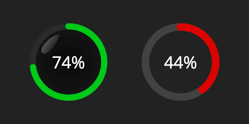
Simple Polymer-based web component to display a circular progress bar and optionally some content in the middle.
See a live demo.
bower install progress-bubble --save
<progress-bubble value="8" max="10">
 <strong>80%</strong>
</progress-bubble>
<!-- Custom styling and stroke-width -->
<style is="custom-style">
 progress-bubble {
 --progress-bubble-stroke-color: rgba(255, 0, 0, 0.8);
 --progress-bubble-stroke-linecap: butt;
 --progress-bubble-bg-stroke-color: rgba(193, 193, 193, 0.2);
 --progress-bubble-background: transparent;
 --progress-bubble-reflection-display: none;
 }
</style>
<progress-bubble value="8" max="10" stroke-width="10">
 <strong>80%</strong>
</progress-bubble>
If you need to customize the starting angle of the progress, you can use the angle property (-90 by default).
<progress-bubble angle="45"></progress-bubble>
Use polyserve during development as instructed in Create a reusable element article.