A zero-dependency web component for visualizing JSON differences
with synchronized scrolling, collapsible nodes, and syntax highlighting
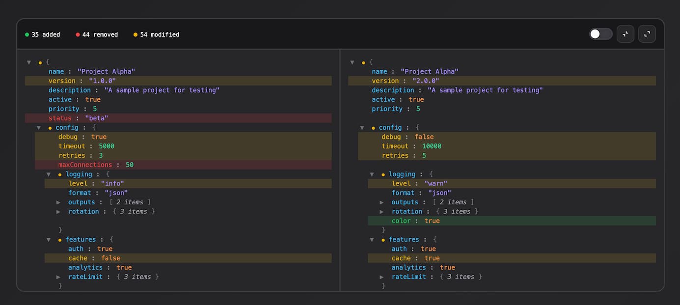
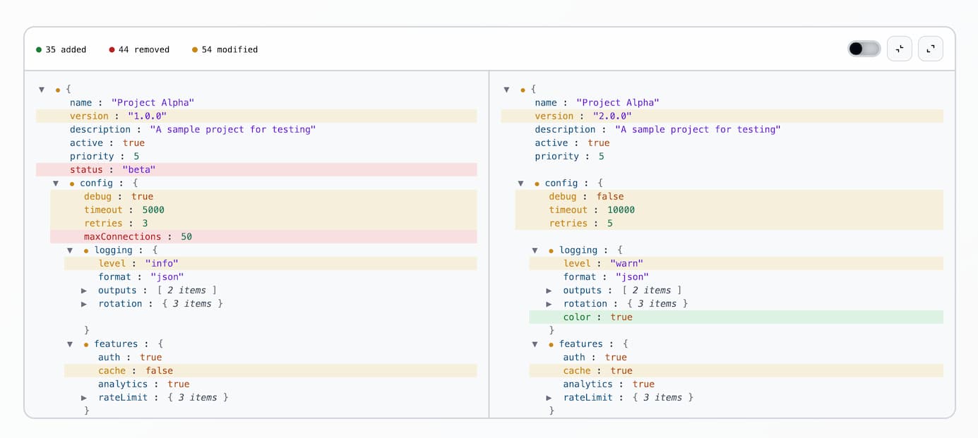
- Nested JSON comparison
- Side-by-side synchronized scrolling
- Collapsible nodes (synced between panels)
- Diff indicators roll up to parent nodes
- Stats summary (added/removed/modified)
- Show only changed filter toggle
- Syntax highlighting
- Zero dependencies
- Shadow DOM encapsulation
npm i json-diff-viewer-component
Import the package to register the <json-diff-viewer> custom element, then call setData() with both JSON values:
import "json-diff-viewer-component";
const viewer = document.querySelector("json-diff-viewer");
viewer.setData(leftObj, rightObj);
For testing or extension, the class is also exported:
import { JsonDiffViewer } from "json-diff-viewer-component";
Static JSON can be passed as attributes. Values must be valid JSON strings:
<json-diff-viewer
 left='{"name":"foo"}'
 right='{"name":"bar"}'
></json-diff-viewer>
JSON.parseparses attribute values. Invalid JSON throws at parse time.- Prefer
setData()or property setters for dynamic or object data
Set left and right as JavaScript values. Set both before the viewer draws a diff:
viewer.left = { name: "foo" };
viewer.right = { name: "bar" };
viewer.left; // read current left value
viewer.right; // read current right value
The component toolbar includes:
- Show only changed: filter toggle (default: on); hides unchanged nodes
- Collapse all / Expand all: bulk expand/collapse
- Node toggles: click any object/array line to expand/collapse (synced across both panels)
Framework Examples
import { useEffect, useRef } from "react";
import "json-diff-viewer-component";
function DiffViewer({ left, right }) {
 const viewerRef = useRef(null);
 useEffect(() => {
 if (viewerRef.current) {
 viewerRef.current.setData(left, right);
 }
 }, [left, right]);
 return <json-diff-viewer ref={viewerRef} />;
}
<template>
 <json-diff-viewer ref="viewerRef" />
</template>
<script setup>
import { ref, watch } from "vue";
import "json-diff-viewer-component";

const props = defineProps({
 left: Object,
 right: Object,
});

const viewerRef = ref(null);

watch(
 () => [props.left, props.right],
 () => {
 if (viewerRef.value) {
 viewerRef.value.setData(props.left, props.right);
 }
 },
 { immediate: true },
);
</script>
| Type | Color | Description |
|---|---|---|
| Added | Green | Key exists only in right |
| Removed | Red | Key exists only in left |
| Modified | Yellow | Value changed |
Override CSS custom properties (design tokens) on json-diff-viewer. Tokens live on :host; you set them from outside the shadow DOM.
json-diff-viewer {
 /* Diff colors */
 --add: #22c55e; /* Added items */
 --rem: #ef4444; /* Removed items */
 --mod: #eab308; /* Modified items */
 /* Backgrounds */
 --bg: #18181b; /* Main background */
 --bg2: #27272a; /* Panel background */
 /* Borders */
 --bdr: #3f3f46; /* Border color */
 /* Text */
 --txt: #fafafa; /* Primary text */
 --dim: #a1a1aa; /* Dimmed/secondary text */
 /* Controls */
 --slider: var(--bdr); /* Slider toggle active color */
 /* Syntax highlighting */
 --key: #38bdf8; /* Object keys */
 --str: #a78bfa; /* String values */
 --num: #34d399; /* Number values */
 --bool: #fb923c; /* Boolean values */
 --nul: #f472b6; /* Null values */
 --br: #71717a; /* Brackets and braces */
}
Create your own theme by overriding these tokens. For example, a light theme:
json-diff-viewer {
 --add: #15803d;
 --rem: #b91c1c;
 --mod: #ca8a04;
 --bg: #f4f4f4;
 --bg2: #f9fafb;
 --bdr: #d1d5db;
 --txt: #030712;
 --dim: #4b5563;
 --slider: #d1d5db;
 --key: #075985;
 --str: #6d28d9;
 --num: #047857;
 --bool: #b45309;
 --nul: #a21caf;
 --br: #6b7280;
}
Set a height to get scrolling. Without one, the viewer grows to fit all content. Default border-radius is 12px.
json-diff-viewer {
 height: 600px;
 border-radius: 16px;
}
For full-height layouts, use flexbox:
.container {
 display: flex;
 flex-direction: column;
 height: 100vh;
}
json-diff-viewer {
 flex: 1;
 min-height: 0;
}
npm run dev # start dev server
npm run build # build for production