-
-
Notifications
You must be signed in to change notification settings - Fork 8.1k
Added USF Masters Data Science inspired stylesheet, great for presentat... #25660
New issue
Have a question about this project? Sign up for a free GitHub account to open an issue and contact its maintainers and the community.
By clicking “Sign up for GitHub”, you agree to our terms of service and privacy statement. We’ll occasionally send you account related emails.
Already on GitHub? Sign in to your account
Conversation
There was a problem hiding this comment.
Choose a reason for hiding this comment
The reason will be displayed to describe this comment to others. Learn more.
Thank you for opening your first PR into Matplotlib!
If you have not heard from us in a while, please feel free to ping @matplotlib/developers or anyone who has commented on the PR. Most of our reviewers are volunteers and sometimes things fall through the cracks.
You can also join us on gitter for real-time discussion.
For details on testing, writing docs, and our review process, please see the developer guide
We strive to be a welcoming and open project. Please follow our Code of Conduct.
Hi, thanks for opening the PR!
We're kinda conservative on accepting new style sheets since we consider them API,
so it'd be really helpful if you could post some examples of what this one looks like (like how it's shown in the https://matplotlib.org/devdocs/gallery/style_sheets/style_sheets_reference.html#sphx-glr-gallery-style-sheets-style-sheets-reference-py) to illustrate some of the advantages of adding this style sheet.
@story645 thank you for your timely response and sure!
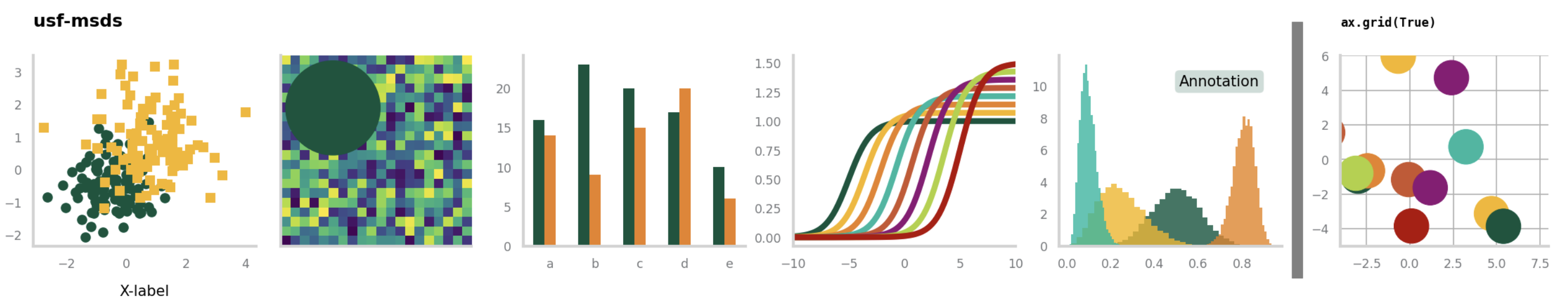
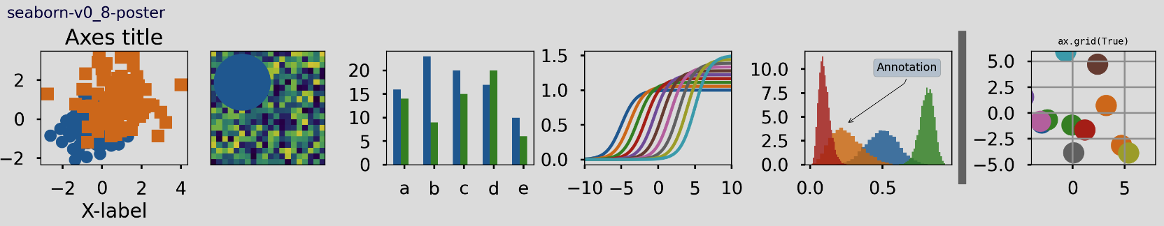
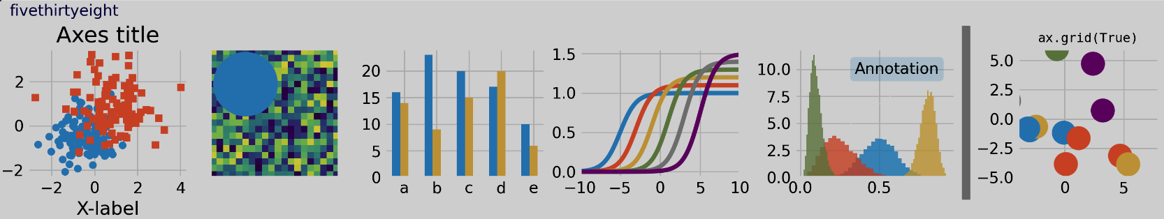
I've attached screenshots of the usf-msds design along with the fivethirtyeight and the seaborn poster designs as I believe they all fall under the same category for posters or presentations. I've used the other two designs (especially fivethirtyeight) for years (for presentations) so this new design is based on my learnings. I think of this design as an improved version of fivethirtyeight.
The unique qualities of the usf-msds design:
-
By default only keeps the left and bottom border to reduce clutter (Knaflic, 2015)
-
Additionally, it removes axes ticks and makes axes labels and lines light grey. The point is to establish a visual hierarchy such that primary attention is given to the graph first before the axes numbers and labels (Knaflic, 2015)
-
Left aligns titles: By default jupyter notebooks left align plots, so it looks odd when the title is in the center, so I've made the title left aligned by default and increased the padding to make the title stand out a little more.
-
High contrast colors: this isn't exactly a unique feature but the color palette is unique and features high contrast colors.
-
Keeps the background white: unlike fivethirtyeight which greys the background, I keep the default background white. This is because in most presentations and jupyter notebooks, the background is white, not grey. So it looks awkward when someone uses the default fivethirtyeight.
Some of these design choices are subjective but for the most part it agrees with what's there in the literature on design. Again, thought it might be useful for the community, totally cool if not or if it's not unique enough. Thanks!
Screenshot 2023年04月11日 at 8 50 09 AM
jklymak
commented
Apr 11, 2023
@bassimeledath this looks nice, but as @story645 mentions, we are very conservative about adding new style sheets (after a period of not being so conservative).
I'd love to see a user-contrib style site; I think it is unreasonable to make a style a whole third-party package, but a site where users submitted a style and it rendered as a big gallery of styles, perhaps with subsections, would be a really nice resource.
I'd love to see a user-contrib style site; I think it is unreasonable to make a style a whole third-party package, but a site where users submitted a style and it rendered as a big gallery of styles, perhaps with subsections, would be a really nice resource.
Maybe do something like adapt https://github.com/dhaitz/matplotlib-style-voting by @dhaitz? The site is down now but I think it does most of those things out of the box.
jklymak
commented
Apr 11, 2023
Well adding voting would be an interesting feature, or download counts...
bassimeledath
commented
Apr 11, 2023
@jklymak That's definitely fair. I could work on something like that on the side. In addition to showcasing user contributed style sheets I think it would be nice to have a web UI to create new style sheets (I doubt that would be too difficult to make). What would be the best way to communicate if I've made a good amount of progress on that project?
story645
commented
Apr 11, 2023
I think it would be nice to have a web UI to create new style sheets (I doubt that would be too difficult to make).
https://github.com/dhaitz/matplotlib-style-configurator ?
And you can post here or to the developers mailing list or discourse or gitter links here
ksunden
commented
May 16, 2023
I'm going to close as I think the consensus is "looks nice, but let's not add too many styles here"
Please do let us know if you have any follow up on a site/showcase for styles!
Uh oh!
There was an error while loading. Please reload this page.
...ions
PR Summary
This is a simple pull request just adding a style sheet that would work well in presentations. It is unique enough that it might add value to other people. I'm a first time contributor here so apologies in advance if I'm missing a step in doing this.
The documentation builds without issue but I'm having some trouble adding the new style to the documentation. Please advise, thank you.
PR Checklist
Documentation and Tests
pytestpasses)Release Notes
.. versionadded::directive in the docstring and documented indoc/users/next_whats_new/.. versionchanged::directive in the docstring and documented indoc/api/next_api_changes/next_whats_new/README.rstornext_api_changes/README.rst