Update July 2020 - latest SwiftUI now has built-in components to do this, which should be used instead.
FlowStack is a SwiftUI component for laying out content in a grid.
Xcode 11 beta on MacOS 10.14 or 10.15
In Xcode, choose File -> Swift Packages -> Add Package Dependency and enter this repo's URL.
- columns (Int)
- The number of columns to display.
- numItems (Int)
- The total count of items you will be displaying.
- alignment (HorizontalAlignment?)
- Default: .leading
The alignment of any trailing columns in the last row.
- index (Int)
- The index of the item currently being processed.
- colWidth (CGFloat)
- The computed width of the column currently being processed.
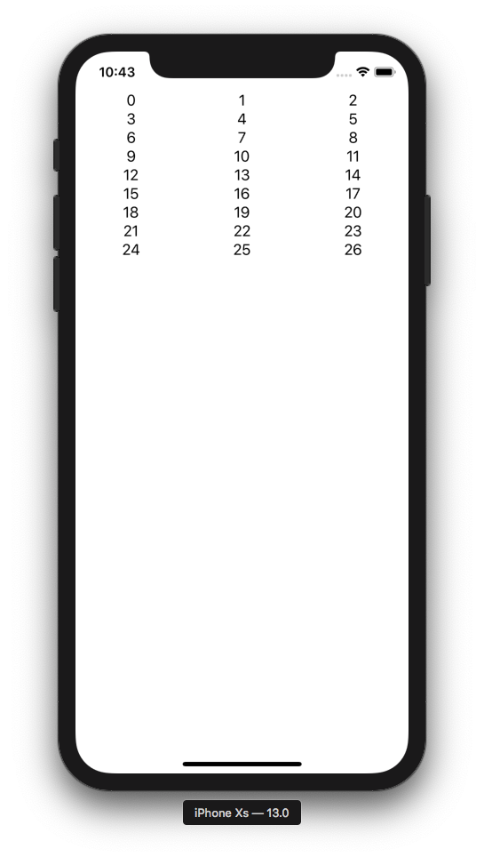
The simplest possible example:
FlowStack(columns: 3, numItems: 27, alignment: .leading) { index, colWidth in
 Text("\(index)").frame(width: colWidth)
}
You should always add .frame(width: colWidth) to the immediate child of FlowStack.
Screen Shot 2019年06月25日 at 10 43 41 PM
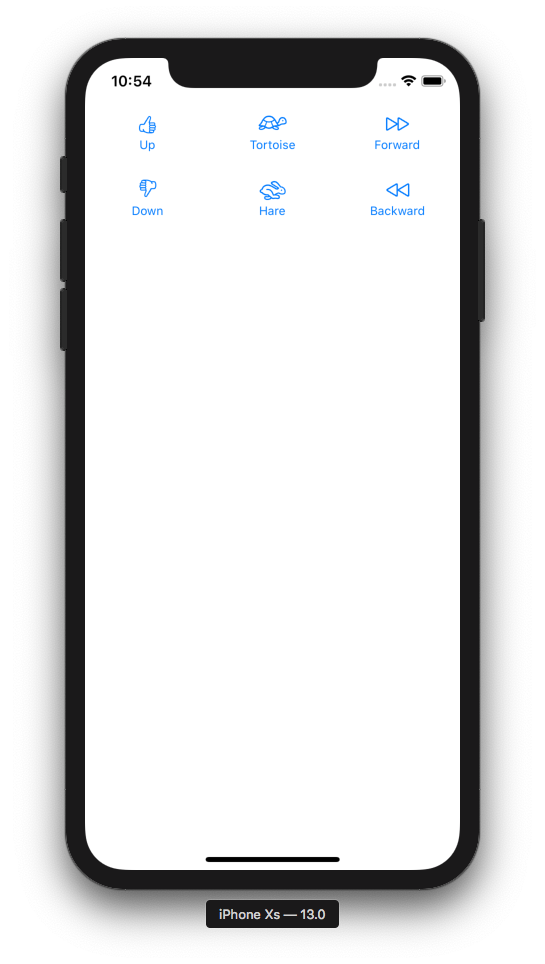
struct Item {
 var image: String
 var label: String
}
let items = [
 Item(image: "hand.thumbsup", label: "Up"),
 Item(image: "tortoise", label: "Tortoise"),
 Item(image: "forward", label: "Forward"),
 Item(image: "hand.thumbsdown", label: "Down"),
 Item(image: "hare", label: "Hare"),
 Item(image: "backward", label: "Backward")
]
FlowStack(columns: 3, numItems: items.count, alignment: .leading) { index, colWidth in
 Button(action: { print("Tap \(index)!") }) {
 Image(systemName: items[index].image)
 Text(items[index].label).font(Font.caption)
 }
 .padding()
 .frame(width: colWidth)
}
Screen Shot 2019年06月25日 at 10 54 25 PM
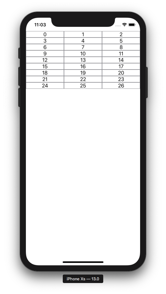
Let's draw a border on our cells to visualize some concepts:
FlowStack(columns: 3, numItems: 27, alignment: .leading) { index, colWidth in
 Text("\(index)").frame(width: colWidth).border(Color.gray)
}
Screen Shot 2019年06月25日 at 11 03 05 PM
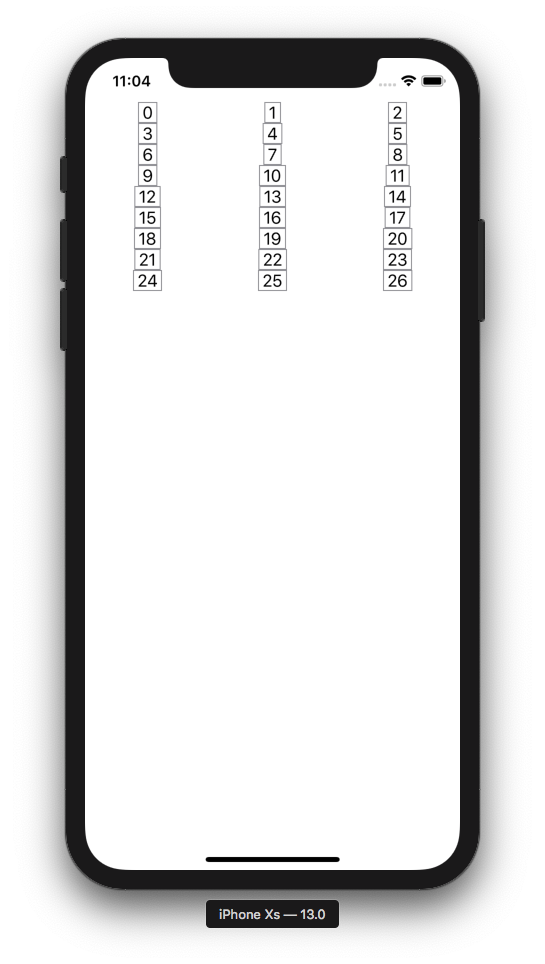
Now let's swap the .frame and .border order and note what happens. This demonstrates the order of operations is important when chaining layout modifiers.
FlowStack(columns: 3, numItems: 27, alignment: .leading) { index, colWidth in
 Text("\(index)").border(Color.gray).frame(width: colWidth)
}
Screen Shot 2019年06月25日 at 11 04 58 PM
Now let's swap the order back and add some padding:
FlowStack(columns: 3, numItems: 27, alignment: .leading) { index, colWidth in
 Text("\(index)").padding().frame(width: colWidth).border(Color.gray)
}
Screen Shot 2019年06月25日 at 11 10 10 PM
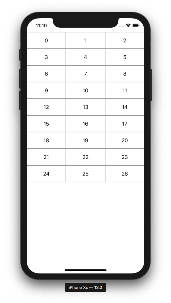
To add actions, you can of course just put buttons in your cells like example #2. But there is also a way to detect a tap on the entire cell. Note we add a background to detect taps in the empty areas outside the text.
FlowStack(columns: 3, numItems: 27, alignment: .leading) { index, colWidth in
 Text("\(index)")
 .padding()
 .frame(width: colWidth)
 .border(Color.gray)
 .background(Color.white)
 .tapAction {
 print("Tap!")
 }
}
Here's an example with images. LoadableImageView is from here.
FlowStack(columns: 3, numItems: 27, alignment: .leading) { index, colWidth in
 VStack {
 LoadableImageView(with: "https://cataas.com/cat?type=sq?foo")
 .padding()
 .frame(width: colWidth, height: colWidth)
 .tapAction { print("Meow!") }
 Text("\(index)")
 }
 .padding()
 .frame(width: colWidth)
 .border(Color.gray)
 .background(Color.white)
 .tapAction {
 print("Tap!")
 }
}
Screen Shot 2019年06月25日 at 11 41 18 PM
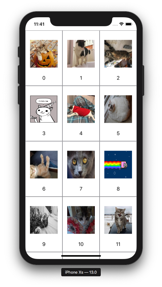
FlowStack(columns: 4, numItems: 27, alignment: .leading) { index, colWidth in
 LoadableImageView(with: "https://cataas.com/cat?type=sq?rando")
 .padding(5)
 .frame(width: colWidth, height: colWidth)
}.padding(5)
Screen Shot 2019年06月26日 at 12 13 21 AM
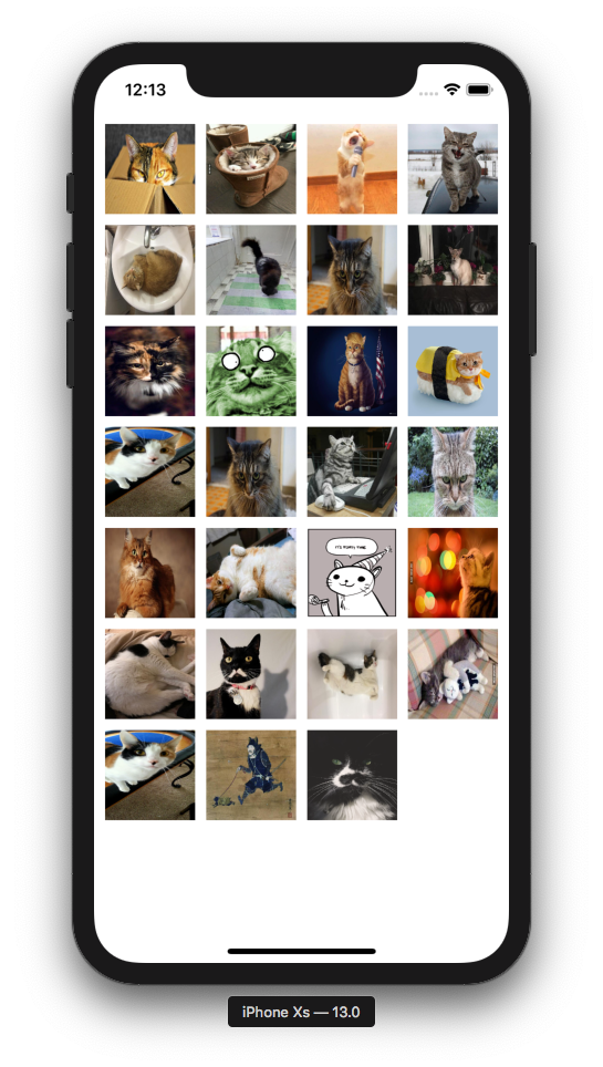
Please file a github issue if you're having trouble or spot a bug.