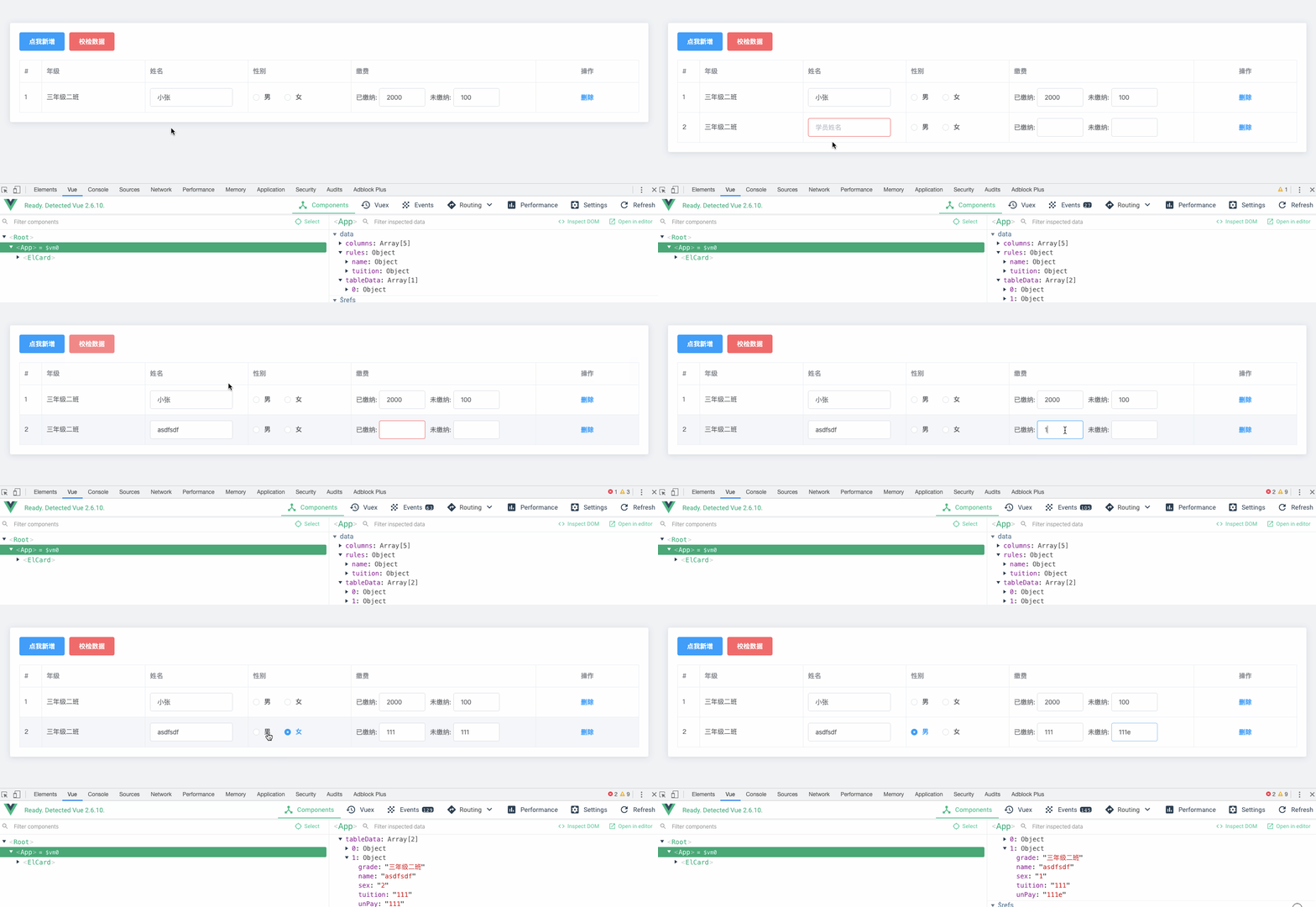
通过对 el-table-column 增加一个属性 content, 实现了如下特性:
- 数据驱动
- 行内编辑
- 输入校检
- 错误展示
- 数据格式化
- 一键禁用
npm install ele-table-editor --save
import EleTableEditor from 'ele-table-editor'
export default {
 components: {
 EleTableEditor
 }
}
<template>
 <div style="margin: 50 auto;">
 <div style="margin-bottom: 20px;">
 <el-button type="danger" @click="handleCheck">校检数据</el-button>
 </div>
 <ele-table-editor
 ref="table"
 :extraBtns="extraBtns"
 :rules="rules"
 :columns="columns"
 :newColumnValue="newColumnValue"
 v-model="tableData"
 >
 <!-- 支持插槽 -->
 <template v-slot:sex="{ data }">
 <el-radio-group v-model="data.sex">
 <el-radio label="1">男</el-radio>
 <el-radio label="2">女</el-radio>
 </el-radio-group>
 </template>
 </ele-table-editor>
 </div>
</template>
<script>
 import EleTableEditor from 'ele-table-editor'
 import { InputNumber } from 'element-ui'
 export default {
 components: {
 EleTableEditor
 },
 data() {
 return {
 // 表格数据
 tableData: [
 {
 grade: '三年级二班',
 name: '小张',
 sex: '男',
 tuition: 2000,
 unPay: 100,
 status: 0,
 dream: ''
 }
 ],
 newColumnValue: {
 grade: '三年级二班',
 status: 1
 },
 // 校检规则
 rules: {
 name: [{ required: true, message: '姓名必填' }],
 tuition: { required: true, message: '已缴纳金额必填' }
 },
 // 其它按钮
 extraBtns: [
 {
 // text 按钮显示的文本
 text: '关联',
 // 按钮的属性
 attrs: {
 type: 'text'
 },
 style: {
 color: '#303133'
 },
 // click事件
 click(scope) {
 /* eslint-disable */
 console.log(scope)
 }
 }
 ],
 // 表格列
 columns: [
 {
 // el-table-column 的属性
 type: 'index'
 },
 {
 // el-table-column 的属性
 prop: 'grade',
 label: '年级',
 // 支持 显示隐藏
 vif: true
 },
 {
 prop: 'name',
 label: '姓名',
 // 支持显示隐藏为 函数
 vif(tableData) {
 return true;
 },
 // 当有 content 属性时, 可以指定相应的组件
 content: {
 // type 可以为全局注册的组件名或者组件引用
 type: 'el-input',
 // attrs 是组件的属性
 attrs: {
 placeholder: '学员姓名'
 },
 change(val, row, index) {
 console.log(val, row, index)
 },
 // 此外还有
 // style: {}, // 组件的样式
 // class: {}, // 组件的class
 // on: {}, // 组件的事件
 // slots: {}, // 插槽
 // scopedSlots: {}, 作用域插槽
 }
 },
 {
 prop: 'sex',
 label: '性别'
 },
 {
 label: '缴费',
 width: 400,
 // content 可以为数组
 content: [
 '已缴纳: ', // 数组可以是 组件 和 普通字符串 混用
 {
 type: 'el-input',
 valueKey: 'tuition', // 当content为数组时, 必须制定组件绑定的 tableData 的 key
 // 支持 attrs 为函数
 attrs(scope, tableData){
 console.log(scope, tableData)
 return {
 disabled: scope.$index === 2 ? true : false
 }
 },
 style: {
 width: '100px',
 marginRight: '10px'
 }
 },
 '未缴纳: ',
 {
 type: 'el-input',
 valueKey: 'unPay', // 这里也需要绑定 key
 style: {
 width: '100px'
 }
 }
 ]
 },
 {
 prop: 'dream',
 label: '梦想',
 content: {
 type: 'el-radio-group',
 // 对于 el-select, el-checkbox-group, el-radio-group 三个组件
 // 可以指定 options 数组进行选项的渲染
 options: [
 // option 的值可以为对象
 // 此处对以上三个组件做了封装, 显示的key为 text, 值key为 value
 { text: '科学家', value: 'scientist' },
 { text: '警察', value: 'policeman' },
 // 也可以指定为字符串, 则会转化为 '程序员' => { text: '程序员', value: '程序员' }
 '程序员'
 ]
 }
 },
 {
 prop: 'birthplace',
 label: '籍贯',
 content: {
 type: 'el-select',
 // 如果 key 不是 text 和 value
 // 可以使用 prop 指定 key
 options: [
 { name: '北京', id: 'beijing' },
 { name: '上海', id: 'shanghai' },
 { name: '广州', id: 'guangzhou' }
 ],
 // prop 将 text 对应 name, value 对应 id
 prop: {
 text: 'name',
 value: 'id'
 }
 }
 },
 {
 prop: 'status',
 label: '状态',
 // 通过 options 将枚举值转为文本
 options: {
 0: '禁用',
 1: '正常',
 2: '异常'
 }
 }
 ]
 }
 },
 methods: {
 // 校检数据
 handleCheck() {
 this.$refs['table'].validate().catch(({ errors, fields }) => {
 console.log(errors, fields)
 })
 }
 }
 }
</script>
props: {
 // 表格的属性
 tableAttrs: {
 type: Object,
 default: () => ({ border: true })
 },
 // 表格事件
 tableOn: {
 type: Object
 },
 // 表单数据
 value: {
 type: Array,
 default: () => []
 },
 // 是否显示删除
 isShowDelete: {
 type: Boolean,
 default: true
 },
 // 删除按钮属性
 deleteBtnAttr: {
 type: Object,
 default () {
 return {
 type: 'text'
 }
 }
 },
 // 右侧其它按钮
 extraBtns: {
 type: Array,
 default: null
 },
 // table 列
 columns: {
 type: Array,
 default: () => []
 },
 // 校检规则
 rules: Object,
 // 禁用 (对所有input框禁用))
 disabled: {
 type: Boolean,
 default: false
 },
 // 新增列的值
 newColumnValue: {
 type: Object,
 default: () => ({})
 },
 // 是否显示新增按钮
 isShowAdd: {
 type: Boolean,
 default: true
 },
 // 新增按钮文本
 addBtnText: {
 type: String,
 default: '新增'
 }
}
columns: [
 {
 // attrs 为 el-table-column 的属性 + content
 // el-table-column 的属性具体参考: https://element.eleme.cn/#/zh-CN/component/table#table-column-attributes
 prop: 'name', // el-table-column 的 prop 属性
 label: '姓名', // el-table-column 的 label 属性
 width: 200, // el-table-column 的 width 属性
 vif: true, // el-table-column 是否显示,可以为函数
 // ...
 // column 的内容, 可省略, 省略时为显示字符串
 // column 的类型可以为对象或者对象数组, 例如
 content: {
 // 渲染的组件, 可以为全局注册的组件名称或者直接组件的引用
 type: 'el-select',
 valueKey: 'xxx', // 绑定的tableData 的key
 // select, checkbox, radio 三个组件特有的属性
 // 用于指定选项
 options: [ { text: '北京', value: 'beijing' }, { text: '上海', value: 'shanghai'} ]
 // 同上, 用于当 options的key不是 text 和 value 时指定key和value
 prop: {
 text: 'name',
 value: 'id'
 },
 // 组件属性
 attrs: {
 size: 'medium',
 // ...
 },
 // 可以为函数,根据数据判断
 attrs(scope, tableData) {
 return {
 disabled: scope.$index === 1 ? true : false
 }
 },
 // change 事件
 change (val, row, index) {
 console.log(val, row, index)
 },
 // 组件样式
 style: {
 width: '200px',
 // ...
 },
 // 组件 class
 class: 'my-custom-select',
 // 组件事件
 on: {
 change(value) {
 console.log(value)
 },
 // ...
 },
 // 组件插槽
 slots: {
 default (h) {
 return [
 h('el-option', { attrs: { label: '男', value: 1 } }),
 h('el-option', { attrs: { label: '女', value: 2 } })
 ]
 }
 },
 // 作用域插槽
 scopedSlots: {
 test (h, data) {
 // data 为传递过来的参数
 return h('div', 'test')
 }
 }
 },
 // 此属性, 仅当当未指定 content 时, 用于格式化文本
 // status: 1 , options为枚举
 options: {
 1: '正常',
 2: '禁用'
 }
]
default: 默认插槽 新增按钮的插槽btn: 右侧按钮插槽prop: column 中 prop 属性对应的插槽, 例如示例中v-slot:sex或者v-slot:age等