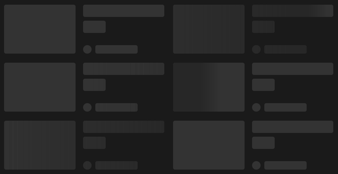
A CSS-only skeleton loader that supports syncing multiple elements' loading indicator at the same time.

TailwindCSS ReactJS SvelteJS VueJS Vanilla JS And more!


npm install sync-skeleton
The only prerequisite to using this package is the CSS file. Import it in your project via TypeScript:
// Required for usage
import 'sync-skeleton/skeleton.css'
Or via HTML:
<link rel="stylesheet" href="node_modules/sync-skeleton/skeleton.css" />
Then, add the loading-skeleton class to any element you want to have the skeleton loader applied to.
<div class="loading-skeleton" style="width: 200px; height: 20px;"></div>
:root {
 /* apply to all loader elements */
 --skeleton-radius: 4px;
}
.orange-purple-loader {
 /* apply to loaders with the 'orange-purple-loader' class only */
 --skeleton-base-color: tomato;
 --skeleton-base-color-dark: darkred;
 --skeleton-highlight-color: darkslateblue;
 --skeleton-highlight-color-dark: indigo;
 max-width: 300px;
 aspect-ratio: 4/3;
}
<div class="orange-purple-loader"></div>
See the example folder for more detailed usage with Vite.
Here's a live demo on the tailwind playground!
There's a bunch of examples in this Github Issue #2 for React, Vue, Svelte, Solid, etc. (Thanks, @hatemhosny)
These can be overridden globally (:root {}), or on a per-element basis.
| Variable | default | type | Description |
|---|---|---|---|
--skeleton-base-color |
hsl(0 0% 92% / 100%) |
<color> |
The base color of the skeleton |
--skeleton-base-color-dark |
hsl(0 0% 20% / 100%) |
<color> |
The base color of the skeleton in dark mode |
--skeleton-highlight-color |
hsl(0 0% 96% / 100%) |
<color> |
The highlight color of the skeleton |
--skeleton-highlight-color-dark |
hsl(0 0% 15% / 100%) |
<color> |
The highlight color of the skeleton in dark mode |
--skeleton-highlight-size |
clamp(100px, 50vw, 500px) |
<length> |
The width of the highlight wave gradient |
--skeleton-highlight-leading-edge-blur |
clamp(10px, 5vw, 50px) |
<length> |
How much to blur the leading edge of the highlight |
--skeleton-radius |
0px |
<length> |
The radius of the skeleton |
--skeleton-angle |
90deg |
<angle> |
The angle of the highlight |
Animation variables are only global (not per-element) and editable via the :root {} selector.
| Variable | default | type | Description |
|---|---|---|---|
--skeleton-ease |
cubic-bezier(0.45, 0.3, 0.7, 0.55) |
<easing-function> |
The ease of the animation |
--skeleton-animation-animation-speed |
400 |
<number> |
(px) - The distance the animation will travel in pixels |
--skeleton-animation-animation-time |
1 |
<number> |
(seconds) - The time of each animation loop |
--skeleton-animation-animation-scaler |
0.7 |
<number> |
(0-1) - How much to scale the animation speed up as the screen size increases, 0.7 feels good. |
We automatically apply dark mode to the skeleton when the color-scheme is set to dark or light dark and the prefers-color-scheme is set to dark,
which will then draw on the --skeleton-base-color-dark and --skeleton-highlight-color-dark variables.
Additionally, you can add the dark class to the skeleton to force dark mode.
<div class="loading-skeleton dark">...</div>
Or if your entire application is a dark theme, then you can simply change
the --skeleton-base-color to an appropriate shade of your choice.