-
-
Notifications
You must be signed in to change notification settings - Fork 489
High Contrast theme updates #1265
New issue
Have a question about this project? Sign up for a free GitHub account to open an issue and contact its maintainers and the community.
By clicking “Sign up for GitHub”, you agree to our terms of service and privacy statement. We’ll occasionally send you account related emails.
Already on GitHub? Sign in to your account
Conversation
This is an excellent quick solution, @francescospissu 👍 I will try it out in action.
@davegarthsimpson, could you please help review the effective code change? Thank you!
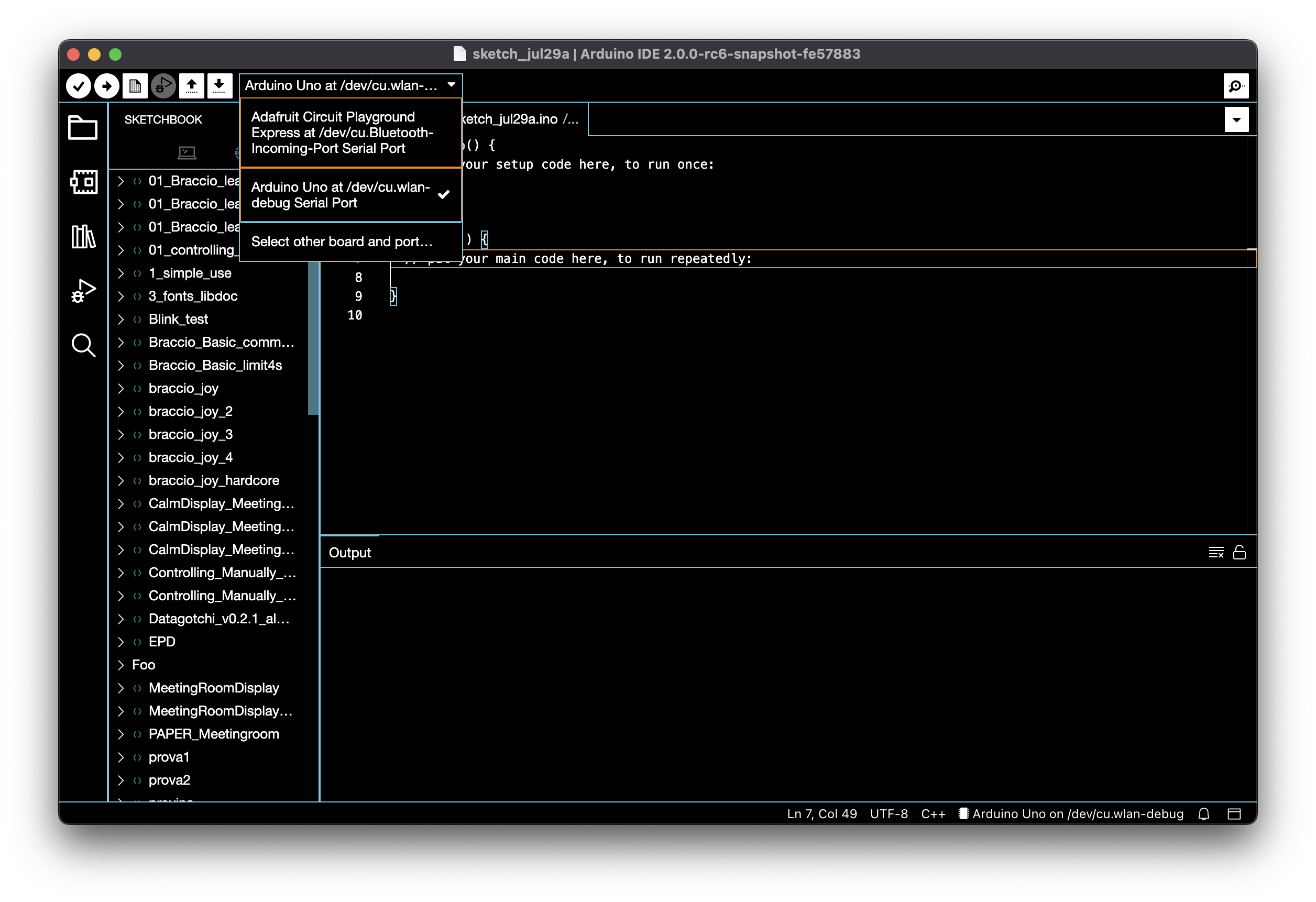
Serial Monitor drop-down menu selector hover and selected state.
✅
Screen Shot 2022年07月29日 at 08 32 55
Screen Shot 2022年07月29日 at 08 32 49
(I have noticed that the baud dropdown does not have the right border. Not critical.)
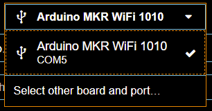
Board selector border.
✅
Screen Shot 2022年07月29日 at 08 30 16
Board selector hover and selected state.
✅
Screen Shot 2022年07月29日 at 08 30 23
Buttons hover and focus state.
✅
Screen Shot 2022年07月29日 at 08 33 21
Screen Shot 2022年07月29日 at 08 30 40
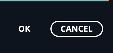
(I have noticed that the settings and 3rd party URLs dialog have different OK/Cancel buttons orders. Not critical.)
Screen Shot 2022年07月29日 at 08 30 58
Side bar elements (Sketchbook etc.) hover and selected state.
✅
Screen Shot 2022年07月29日 at 08 31 40
Toolbar buttons hover and selected state.
✅
Screen Shot 2022年07月29日 at 08 33 31
Screen Shot 2022年07月29日 at 08 36 16
Quick inputs hover and selected state.
✅
Screen Shot 2022年07月29日 at 08 33 44
I went through the list of changes, and they look good to me. I found a few places we might want to improve.
- Install/Uninstall button on hover in boards and libs manager view:
Screen Shot 2022年07月29日 at 08 39 05
- No button border in the Settings dialog
Screen Shot 2022年07月29日 at 08 43 05
- Sometimes buttons have an orange-ish focus style, sometimes a white one, and sometimes they don't have any. I could not figure out what's the difference
Screen Shot 2022年07月29日 at 08 44 48
Screen Shot 2022年07月29日 at 08 44 40
Screen Shot 2022年07月29日 at 08 44 31
Screen Shot 2022年07月29日 at 08 44 17
Thank you for testing it @kittaakos!
- Sometimes buttons have an orange-ish focus style, sometimes a white one, and sometimes they don't have any. I could not figure out what's the difference
This difference is also present in the other themes:
-
The buttons without border are the primary buttons, with the default/dark theme they have a background color but no border. Maybe for the HC theme we should add a border to highlight it.
-
Buttons with the white border are secondary buttons.
-
The orange focus style is due to the primary button already active when opening the settings dialog, it happens also with the other themes:
- Install/Uninstall button on hover in boards and libs manager view:
I'll provide a fix for this.
There was a problem hiding this comment.
Choose a reason for hiding this comment
The reason will be displayed to describe this comment to others. Learn more.
fine with me for temp. workaround, nice one @francescospissu !
91volt
commented
Jul 29, 2022
Since no one has complained in the past I was expecting to see the restore of the previous version of the adapted HC theme before the introduction of our latest Theme related PR that made us change how some variables are handled.
The previous state of HC theme in Arduino IDE
Schermata 2022年07月29日 alle 15 59 15
But even if we have gone for this approach that emulate how vscode handle the HC theme I believe the final result is usable overall, apart from minor issues highlighted by @kittaakos .
The only thing that I would change to align with the visual hierarchy of other Arduino themes is to restore the primary button entity on toolbar for verify, upload and debugger:
Schermata 2022年07月29日 alle 16 17 21
Compared to the current one of this PR:
Schermata 2022年07月29日 alle 16 17 56
Since no one has complained in the past I was expecting to see the restore of the previous version of the adapted HC theme before the introduction of our latest Theme related PR that made us change how some variables are handled.
These changes have been done taking into account what is reported in this issue:
UI is broken (missing hover status in dropdowns and in the sketchbook, primary buttons background is transparent, board selector has no border, etc...)
About
The only thing that I would change to align with the visual hierarchy of other Arduino themes is to restore the primary button entity on toolbar for verify, upload and debugger:
I'll revert this behavior.
It's looking great. All the issues I reported in #1265 (comment) were fixed. ✅
I found only this one:
notification.mp4
Thanks for testing it @kittaakos! I fixed the notification hover status by adding a dashed outline (in Theia Blueprint it works like this):
0d0c2c4 to
a53feb5
Compare
The Command Palette has no border, and it has the same background as the editor. Also, the elements' hover border is a little off.
Arduino IDE 2:
Screenshot 2022年08月01日 at 11 55 08
Hovering over an item of the board selector, three separate rectangles show up to highlight the item. I think a single rectangle enclosing the whole item would be better (and more similar to the other themes)
High Contrast
Screenshot 2022年08月01日 at 11 56 53
Thanks for testing it @AlbyIanna! I implemented your suggestions here. This is the result:
Boards selector hover:
hover drop-down
Command palette border:
quick input border
Uh oh!
There was an error while loading. Please reload this page.
Motivation
The High Contrast theme needs to be updated as hover status in drop-down menus and sketchbook is missing, board selector has no borders, and other design issues make the experience unpleasant to use.
Change description
Other information
This is a workaround until the version of Theia used is updated to 1.27.0, where the Theia High Contrast theme is updated and it's possible to use the Theia APIs to customize it.
Closes #1202.
Reviewer checklist