ProgressButton licence ProgressButton forks ProgressButton stars ProgressButton issues ProgressButton pull-requests
Progress Button is a android library for hanling different types state like active, finished, enabled, disabled and reset with a single line of code.
- One line of code to change state
- Easy configurable
- Customizable
- Set vibration on click
- Disable views in active state
repositories {
 maven { url 'https://jitpack.io' }
}

dependencies {
 implementation 'com.github.hellosagar:ProgressButton:0.1'
}
In XMl you need to define the button with your parameters to acheive the desired the design
- To use vibration on click please add the following permission in android manifest
<uses-permission android:name="android.permission.VIBRATE"/>
Here is the sample code
<dev.sagar.progress_button.ProgressButton
 android:id="@+id/button"
 android:layout_width="0dp"
 android:layout_height="54dp"
 android:layout_marginStart="20dp"
 android:layout_marginEnd="20dp"
 app:btn_elevation="12dp"
 app:corner_radius="12dp"
 app:default_text="YOOYOOYOYOYO"
 app:disabled_color="@android:color/holo_purple"
 app:finish_text="Im done"
 app:is_vibrate="false"
 app:finished_color="@color/gray_700"
 app:layout_constraintBottom_toBottomOf="parent"
 app:layout_constraintEnd_toEndOf="parent"
 app:layout_constraintStart_toStartOf="parent"
 app:layout_constraintTop_toBottomOf="@+id/user_id_input_layout_login"
 app:pressed_color="@color/black_500"
 app:stroke_color="@android:color/holo_orange_dark"
 app:stroke_width="3dp" />
| Explanation | Parameter Name | Type | Default Value |
|---|---|---|---|
| Set Default Color | default_color | color | #0052FE |
| Set Disabled Color | disabled_color | color | #537CD3 |
| Set Pressed Color | pressed_color | color | #0845D1 |
| Set Finished Color | finished_color | color | #27AE60 |
| Set Ripple Color | ripple_color | color | @android:color/transparent |
| Set Text Color | btn_text_color | color | #FFFFFF |
| Set Stroke Color | stroke_color | color | @android:color/transparent |
| Explanation | Parameter Name | Type | Default Value |
|---|---|---|---|
| Set Default Text | default_color | text | Button |
| Set Finished Text | finish_text | text | Finish |
| Set Text Size | btn_text_size | dimension | 14sp |
| Explanation | Parameter Name | Type | Default Value |
|---|---|---|---|
| Is Vibration enabled | is_vibrate | boolean | false |
| Set Vibration time in (ms) | finish_text | integer | 30 |
| Explanation | Parameter Name | Type | Default Value |
|---|---|---|---|
| Set Stroke Width | stroke_width | dimension | 0dp |
| Set Corner Radius | corner_radius | dimension | 10dp |
| Set Button Elevation | btn_elevation | dimension | 0dp |
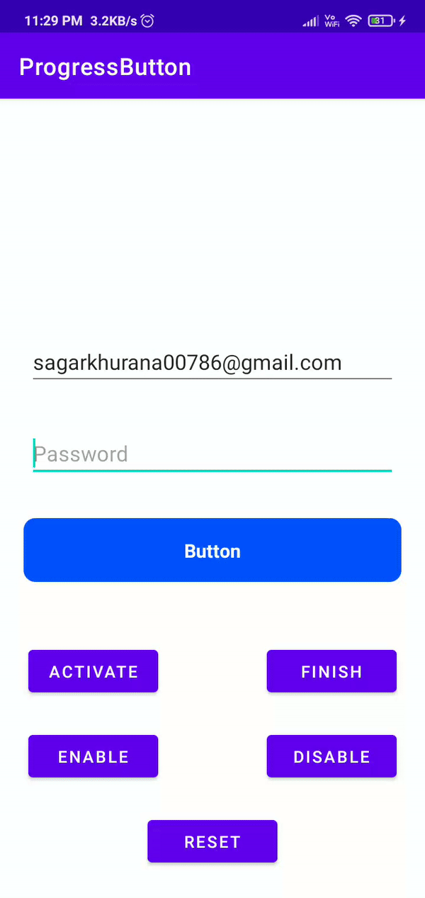
Here is the code sample to understand on how to change the button state
class MainActivity : AppCompatActivity() {
 private lateinit var binding: ActivityMainBinding
 override fun onCreate(savedInstanceState: Bundle?) {
 super.onCreate(savedInstanceState)
 binding = ActivityMainBinding.inflate(layoutInflater)
 setContentView(binding.root)
 initViews()
 initClickListeners()
 }
 private fun initViews() = binding.apply {
 // Passing list of view that we want them to be disabled during the active state
 progressButton.setDisableViews(listOf(
 editTextTextPersonName,
 editTextTextPersonName2,
 ))
 }
 private fun initClickListeners() = binding.apply {
 progressButton.setOnClickListener {
 Toast.makeText(this@MainActivity, "On click!", Toast.LENGTH_SHORT).show()
 }
 btnActivate.setOnClickListener {
 // Activate state
 progressButton.activate()
 }
 btnFinish.setOnClickListener {
 // Finish state
 progressButton.finished()
 }
 btnEnable.setOnClickListener {
 // Enable state
 progressButton.enable()
 }
 btnDisable.setOnClickListener {
 // Enable state
 progressButton.disable()
 }
 btnReset.setOnClickListener {
 // Reset state
 progressButton.reset()
 }
 }
}
🌟 You are all set!
Feel free to fork this project, to optimise the code or to add new features.
- Lottie support
This project is licensed under the MIT License - see the LICENSE file for details.
This project needs a 🌟 from you
Developed with ❤️ in India 🇮🇳