SpotlightGuidePortal is a reusable onboarding overlay for highlighting one or more widgets on a page. It supports target holes, ready-made and custom hint UI, connected bubble arrows, pointer widgets, RTL-aware anchor positions and semantic placement, automatic placement, reveal scrolling, lazy-list preparation, and multiple hints in the same step.
| Basic flow | Pointer hint | Target decoration |
|---|---|---|
| Basic spotlight guide flow | Built-in tap pointer hint | Target decoration guide scenarios |
| Same-step scroll | Lazy target reveal | Barrier dismiss |
| Same-step automatic scroll | Lazy target reveal scroll | Barrier tap dismiss modes |
- Static or runtime guide steps through
SpotlightGuidePortalController. - Ready-made text hints and a built-in tap pointer for quick onboarding.
- Multiple hints in one step, including sequential same-step scroll.
- Dynamic API-driven steps with skip/wait behavior for missing targets.
- Lazy-list targets using
onRevealbefore measurement. - Repeated target ids highlighted as a group, with optional
anchorId. - Shape-aware target hole decoration, custom anchor positions, interactive bubble arrows, barrier style, and hints.
Use spotlight_guide when a guide needs to survive real app complexity:
scrolling pages, lazy lists, optional API-driven targets, repeated list rows,
multiple highlights in one step, or custom visual treatment around the target
hole. For a tiny fixed three-step tour, start with SpotlightGuideTextHint and
only move to lower-level widgets when the design needs them.
Import the public entry:
import 'package:spotlight_guide/spotlight_guide.dart';
The implementation lives here:
lib/spotlight_guide.dart
lib/src/api/
lib/src/runtime/
lib/src/hints/
lib/src/layout/
lib/src/painting/
lib/src/utils/
Runtime files are small collaborators rather than page code. For example,
runtime/reveal_scroll_strategy.dart owns reveal scroll decisions, while
api/portal.dart keeps the Flutter widget and State orchestration together.
README.md
 Overview and common usage.
CONTRIBUTING.md
 Maintainer rules, architecture map, invariants, and required verification.
CHANGELOG.md
 Current component contract and maintenance notes.
doc/reference.md
 Public parameter relationships and built-in hint types.
doc/examples.md
 Copyable examples for saving-page style, lazy lists, and same-step targets.
doc/troubleshooting.md
 Symptom-based debugging guide.
Before changing code in this component, read CONTRIBUTING.md first.
The example app is a scenario playground. The entry stays small in
example/lib/main.dart, while each usage pattern lives in its own file:
example/lib/src/scenarios/basic_steps_scenario.dart
example/lib/src/scenarios/pointer_hint_scenario.dart
example/lib/src/scenarios/same_step_hints_scenario.dart
example/lib/src/scenarios/same_step_scroll_scenario.dart
example/lib/src/scenarios/lazy_target_reveal_scenario.dart
example/lib/src/scenarios/dynamic_steps_scenario.dart
example/lib/src/scenarios/side_anchor_scenario.dart
example/lib/src/scenarios/large_group_anchor_scenario.dart
example/lib/src/scenarios/target_decoration_scenario.dart
example/lib/src/scenarios/custom_anchor_scenario.dart
example/lib/src/scenarios/controller_usage_scenario.dart
Run it with:
cd example
flutter run -d iosSpotlightGuidePortal( enabled: shouldShowGuide, steps: <SpotlightGuideStep>[ SpotlightGuideStep.item( SpotlightGuideStepItem( targetId: 'more-button', hintBuilder: (BuildContext context, SpotlightGuideStepContext guide) { return SpotlightGuideTextHint( guide: guide, title: 'More actions', message: 'Open this menu for advanced options.', ); }, ), ), ], onFinish: markGuideSeen, child: SpotlightGuideTarget( id: 'more-button', child: IconButton( icon: const Icon(Icons.more_horiz), onPressed: openMore, ), ), )
SpotlightGuideTextHint is the quickest built-in hint. It shows progress,
Back/Next/Done actions, scrolls long content inside the bubble, and still uses
the same placement, margin, pointer, and decoration system as custom hints.
Use a pointer when the guide should visually point at a small tap target. A
pointer is any widget: the built-in tap pointer is only a shortcut, and you can
replace it with Image.asset, CustomPaint, an icon badge, or an app-specific
animation when needed.
Pointer direction follows the resolved hint placement. Use physical
left/right only for fixed layouts, semantic start/end when the side
should mirror in RTL, and horizontalAuto or auto when localization or
responsive layout can move the target. If a pointer is only decorative and the
bubble arrow should still point directly at the target, set
anchorMode: SpotlightGuidePointerAnchorMode.target.
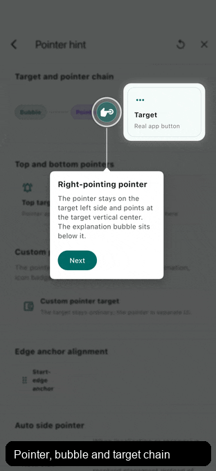
The default pointer chain keeps target, pointer, and bubble relationships separate:
pointerTargetPositionchooses the target-side point and aligns the pointer's matching start, center, or end point to it.anchorPointerPositionchooses the point on the pointer that the bubble anchor attaches to.anchorTargetPositionis used only for a direct target anchor: no pointer, oranchorMode: SpotlightGuidePointerAnchorMode.target.
anchorTargetPosition and anchorPointerPosition use
SpotlightGuideAnchorPosition. They are one-dimensional: center(),
center(20), start(8), and end(8) move the anchor point along the resolved
edge, but do not move the target or pointer widget.
pointerTargetPosition uses SpotlightGuidePointPosition because that
relationship positions the pointer widget relative to the target. Most cases
still use center(), center(20), start(8), or end(8). The optional second
value is for target-side cross-axis adjustment, such as center(-30, -8).
The first value is mainAxisOffset. For top or bottom hints, the main axis is
horizontal and positive center(20) moves toward semantic end: right in LTR and
left in RTL. Negative center offsets move toward semantic start. For left or
right hints, the main axis is vertical and positive moves down. start and
end mirror in RTL only on horizontal axes.
For start and end, positive values are insets from the referenced edge and
negative values move outward beyond that edge. For example, end(16) means
16px inward from the target or pointer end edge; end(-16) means 16px outward
beyond that end edge. With pointerTargetPosition, that number chooses the
target-side point only: SpotlightGuidePointPosition.end(16) aligns the
pointer's end edge to the target end point after the 16px inset.
For SpotlightGuidePointPosition, the second value is crossAxisOffset. For
positive values, the pointer moves away from the target in the final resolved
hint direction: down for bottom, up for top, right for right, and left for
left. Negative values move it back toward or across the target side. After
start and end resolve through Directionality, this offset is physical.
gap is the signed main-axis distance for the active anchor chain. With the
default pointer anchor mode, gap is the distance from the pointer's far edge
to the bubble anchor tip; the pointer-to-target distance belongs to
pointerTargetPosition.crossAxisOffset. If the bubble uses
SpotlightGuideNoAnchor, the hint edge is treated as that tip. Without a
pointer, or when the pointer uses
anchorMode: SpotlightGuidePointerAnchorMode.target, gap remains the target
to bubble distance.
Configure pointers on SpotlightGuideStepItem.pointer, not inside the hint
widget. The portal reads item-level pointer metadata before the hint is built,
so automatic reveal scrolling, auto placement, and safe-area checks can reserve
the pointer's target-side position and fixed size.
Use the second value of SpotlightGuidePointPosition, the
crossAxisOffset, when the pointer itself should sit away from the target.
Positive values move it away from the target in the resolved placement
direction, negative values pull it back toward the target, and zero keeps the
pointer touching the target. Custom pointer widgets can omit size to use the
child's laid-out size; provide size when an image or animation should reserve
a stable visual slot and participate in reveal-space estimation.
For image pointers, prefer a stable layout slot. This follows Flutter's image
layout guidance: an image with only one dimension may change size after decode.
Set SpotlightGuidePointer.size and make the image fill that slot, or give
the child its own tight width and height. The guide also hides transient
zero-size natural pointer frames internally, keeping the target hole and hint
hidden until they can appear together from the same stable layout.
If size is omitted, the pointer still lays out naturally, but reveal scrolling
cannot know the final pointer width or height before the hint render pass; use
size when automatic scroll-space estimation must be exact.
For large raster pointer assets, also consider cacheWidth and cacheHeight
on Image so Flutter decodes closer to the displayed size instead of keeping a
much larger bitmap in memory.
pointer: SpotlightGuidePointer(
 size: const Size(68, 103),
 child: Image.asset(
 'assets/guide_pointer.png',
 width: 68,
 height: 103,
 cacheWidth: 136,
 cacheHeight: 206,
 fit: BoxFit.contain,
 ),
)
For fully custom hints, wrap async visual content with
SpotlightGuidePaintGate when the guide should wait for that content before
showing the target hole. This is useful when an image intentionally only has a
width and the height should follow the decoded aspect ratio:
SpotlightGuidePaintGate(
 requireNonEmptySize: true,
 child: Image.asset(
 'assets/guide_pointer.png',
 width: 68,
 ),
)
For custom pointer artwork with transparent padding or an off-center painted
tip, prefer wrapping or sizing the pointer so its layout start, center, or end
point represents the intended visual contact. Use pointerTargetPosition when
the pointer itself should sit away from the target:
pointer: const SpotlightGuidePointer(
 size: Size(68, 103),
 pointerTargetPosition: SpotlightGuidePointPosition.center(-30, -8),
 child: MyPointerAsset(),
)
For directional artwork, keep the pointer child as the default asset and use
builder to wrap it with resolved layout information. The builder receives a
SpotlightGuidePointerContext; targetDirection tells you where the target is
relative to the pointer after auto, start/end, and RTL are resolved.
Use rotationToTarget() when the pointer should face the target. Pass from
when your asset's unrotated pose does not point up. up() is the default
source pose. upRight() describes a northeast-facing asset, and upRight(0) is
identical to upRight(). Direction constructors also accept a clockwise offset
from that named pose, such as right(math.pi / 2).
The returned rotation is resolved against the current target side, so the same source pose can rotate clockwise on one side and counterclockwise on the opposite side. For example, a right-side pointer and a left-side pointer mirror each other automatically.
SpotlightGuideStepItem(
 targetId: 'more-button',
 placement: SpotlightGuidePlacement.bottom,
 gap: 10,
 pointer: SpotlightGuidePointer.tap(
 anchorMode: SpotlightGuidePointerAnchorMode.pointer,
 pointerTargetPosition: const SpotlightGuidePointPosition.center(2),
 builder: (
 BuildContext context,
 SpotlightGuidePointerContext pointer,
 Widget child,
 ) {
 return Transform.rotate(
 angle: pointer.rotationToTarget(),
 child: child,
 );
 },
 ),
 decoration: const SpotlightGuideBubbleDecoration(
 anchor: SpotlightGuideNoAnchor(),
 ),
 hintBuilder: (BuildContext context, SpotlightGuideStepContext guide) {
 return SpotlightGuideTextHint(
 guide: guide,
 title: 'Tap here',
 message: 'The pointer can be any widget.',
 );
 },
)
For example, with import 'dart:math' as math;, an image whose unrotated pose
points right and is drawn another 90 degrees clockwise from that right axis can
use:
Transform.rotate(
 angle: pointer.rotationToTarget(
 from: SpotlightGuidePointerDirection.right(math.pi / 2),
 ),
 child: child,
)
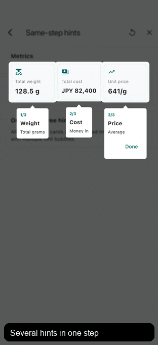
Use SpotlightGuideStep(items: ...) when several hints should appear together. A single item can also highlight several targets with targetIds.
SpotlightGuideStep(
 items: <SpotlightGuideStepItem>[
 SpotlightGuideStepItem(targetId: 'calendar', hintBuilder: buildCalendarHint),
 SpotlightGuideStepItem(targetId: 'more', hintBuilder: buildMoreHint),
 ],
)
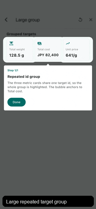
Custom anchors and repeated target groups
When several mounted SpotlightGuideTarget widgets use the same id, the
component treats them as one logical target group. All instances are highlighted
and the default placement anchor is the union of that group. The guide does not
pick the first or last mounted instance.
If the group should be highlighted but one instance should be the precise
anchor, set anchorId on that SpotlightGuideTarget and point
anchorTargetId at it. This keeps the target in the normal registration chain,
so insertion, removal, and active hint rebuilds continue to work.
SpotlightGuideTarget(
 id: 'summary-card-group',
 anchorId: 'summary-total-cost-anchor',
 child: totalCostCard,
)
SpotlightGuideStepItem(
 targetId: 'summary-card-group',
 anchorTargetId: 'summary-total-cost-anchor',
 hintBuilder: buildTotalCostHint,
)
For repeated list rows where only one row should be highlighted, use a unique id
such as order-row-${order.id} or use targetKey.
Use targetDecoration when the spotlight hole needs a specific shape, padding,
outer rings or glow. The decoration paints on the overlay only; it does not wrap
or modify the real target widget.
Target decoration guide scenarios
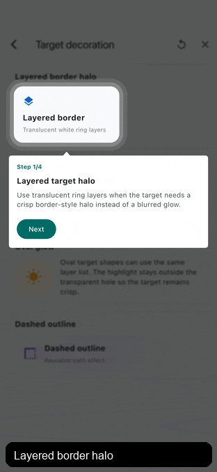
Use translucent SpotlightGuideTargetRingLayers for a crisp border-style halo,
SpotlightGuideTargetGlowLayer for a blurred soft halo, or
SpotlightGuideTargetOutlineLayer for temporary selection and review
states. Layers paint in list order and follow the resolved target shape.
SpotlightGuideStep.item(
 SpotlightGuideStepItem(
 targetId: 'price-card',
 targetDecoration: const SpotlightGuideTargetDecoration(
 padding: EdgeInsets.all(8),
 shape: SpotlightGuideRoundedRectShape(
 borderRadius: BorderRadius.all(Radius.circular(18)),
 ),
 layers: <SpotlightGuideTargetLayer>[
 SpotlightGuideTargetRingLayer(color: Color(0x1AFFFFFF), width: 16),
 SpotlightGuideTargetRingLayer(color: Color(0x33FFFFFF), width: 8),
 ],
 ),
 hintBuilder: buildPriceHint,
 ),
)
Built-in shapes include rounded rectangles and ovals. Implement
SpotlightGuideTargetShape for custom hole paths, or
SpotlightGuideTargetLayer for custom paint effects around the hole.
targetDecoration: const SpotlightGuideTargetDecoration(
 layers: <SpotlightGuideTargetLayer>[
 SpotlightGuideTargetOutlineLayer(
 color: Colors.white,
 width: 3,
 dashLength: 10,
 gapLength: 6,
 outset: 8,
 ),
 ],
)
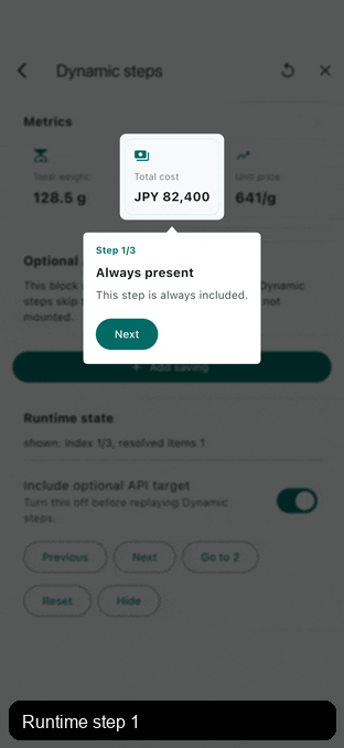
For automatic guides, rebuild steps after data loads. A portal without an
external controller starts when steps first becomes non-empty.
SpotlightGuidePortal(
 steps: guideStepsFromServer,
 child: page,
)
For user-controlled or scenario-triggered guides, keep a controller and call
showSteps. steps can be omitted on the portal when all guide content comes
from an API or another runtime decision.
final controller = SpotlightGuidePortalController();
SpotlightGuidePortal(
 controller: controller,
 autoStart: false,
 child: page,
);
final List<SpotlightGuideStep> steps = buildGuideSteps(response);
if (steps.isEmpty) {
 controller.hide();
} else {
 controller.showSteps(steps);
}
Unavailable targets are skipped by default, so stale or inapplicable target ids
do not leave a blank guide active. If one specific item is expected to appear
later without an immediate onReveal hook, override that item or portal to
SpotlightGuideMissingTargetBehavior.wait. Skipped unavailable steps are
removed from the active sequence, so
controller.total, controller.isLast, and the same values in
SpotlightGuideStepContext update as if those steps had been removed from the
list.
Use onStateChanged when external state depends on dynamic target availability
or guide progress. It fires when a step is shown, hidden, when portal steps
change while active, and when targets register or unregister.
SpotlightGuidePortal(
 onStateChanged: (SpotlightGuideStateDetails state) {
 debugPrint(
 'guide ${state.index + 1}/${state.total}, '
 'resolved=${state.resolvedItemCount}',
 );
 },
 steps: steps,
 child: page,
)
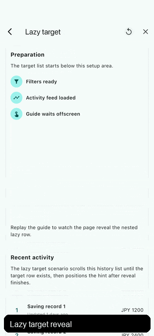
| Same-step scroll | Lazy target reveal |
|---|---|
| Same-step automatic scroll | Lazy target reveal scroll |
If a target is already built but outside a scrollable viewport, the default
SpotlightGuideRevealOptions calls Scrollable.ensureVisible. It does not
scroll when the target is already fully visible. Use
scrollPolicy: SpotlightGuideRevealScrollPolicy.always when a step should
always realign the target, or visibilityPadding when sticky headers or bottom
bars should count as unsafe space. Before the first visible hint, the default
presentation blocks page interaction without painting the guide overlay, then
shows the dim barrier, spotlight holes, and hints together after scrolling and
layout settle. After a guide has already appeared, later reveal scrolling keeps
the dim barrier visible and only hides holes and hints until the target settles.
Use SpotlightGuideBarrierReveal when a product wants the dim barrier to appear
from the very beginning, or SpotlightGuideLiveReveal when an app intentionally
wants resolved hints and holes to track animated scrolling.
When one hint highlights a large targetIds group, set anchorTargetId to the
main target. If the full group is too large to fit, default reveal prioritizes
the anchor, so an already visible anchor will not scroll the page just because
the larger highlighted area extends outside the viewport. Override
targetPolicy when a page needs different behavior.
SpotlightGuideRevealOptions(
 targetPolicy: SpotlightGuideRevealTargetPolicy.anchorTarget,
)
If a target is not built yet, such as a lazy list row, use onReveal to scroll close to it, switch tabs, expand a section, or load data. After the callback completes, the portal waits for layout and then applies the default reveal behavior.
SpotlightGuideStepItem(
 targetId: 'order-row-50',
 onReveal: (SpotlightGuideRevealContext context) async {
 await context.scrollToIndex(
 controller: listController,
 index: 50,
 itemExtent: rowHeight,
 alignment: 0.2,
 );
 },
 revealOptions: const SpotlightGuideRevealOptions(
 alignment: 0.5,
 duration: SpotlightGuideRevealOptions.defaultDuration,
 curve: SpotlightGuideRevealOptions.defaultCurve,
 ),
 hintBuilder: buildHint,
)
Reveal scroll timing follows Flutter's own scrolling APIs: use duration to
control how long the scroll takes and curve to control the easing. The default
is 320ms with Curves.easeOutCubic, which moves clearly then slows into the
final target before the hint appears. For nested lazy lists or long jumps, pass a
longer duration in revealOptions, context.ensureVisible,
context.scrollToOffset, or context.scrollToIndex; pass Duration.zero when
setup should jump instantly.
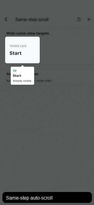
For multiple items in the same step, SpotlightGuideAutoScrollOptions can briefly scroll to hidden later targets so users understand the whole introduced area. It is enabled by default and starts when a later target is not fully visible, or when a not-yet-built later target provides an onReveal hook. During the default auto-scroll transition, the outgoing hint is hidden before scrolling starts and the next hint appears after the target settles, so hints do not detach from moving or offscreen targets. Use autoScrollOptions.onItemChanged to react when that focused item changes. The callback receives [SpotlightGuideAutoScrollDetails] with itemIndex, itemTotal, highlightTargetIds, and optional [SpotlightGuideStepItem.key]. Already visible later targets are skipped by default; set autoScrollOptions.skipVisibleItems to false when every item should receive the same timed focus callback even while already visible. Use one item with targetIds when a single hint should light several registered targets at once.
Configure the guide background with SpotlightGuideBarrierStyle. Color and
blur are clipped to the dimmed area, so highlighted targets keep their original
brightness and sharpness. Set it on SpotlightGuidePortal for a shared default;
set it on a SpotlightGuideStep to override only the fields that step needs.
Visual holes are clipped to the visible overlay before painting, so oversized
targets keep their rounded corners inside the screen.
SpotlightGuidePortal(
 barrier: const SpotlightGuideBarrierStyle(
 color: Color(0x99000000),
 blurSigma: 4,
 ),
 steps: <SpotlightGuideStep>[
 SpotlightGuideStep(
 // Keeps the portal blur, only changes the color for this step.
 barrier: const SpotlightGuideBarrierStyle(color: Color(0x66000000)),
 items: items,
 ),
 ],
 child: page,
)
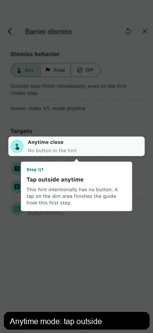
The dim barrier absorbs taps so they never reach the page behind the guide. By default, tapping empty space does not close or advance the guide.
Use barrierDismissBehavior for common close behavior:
SpotlightGuidePortal(
 barrierDismissBehavior: SpotlightGuideDismissBehavior.onComplete,
 steps: steps,
 child: page,
)
onComplete only finishes after the last step is visible and any same-step
auto-scroll sequence has reached its final item. Use anytime when the product
intentionally allows closing mid-flow.
Provide onBarrierTap for custom behavior such as tap-anywhere-to-continue.
The callback receives the active controller, so this works even without
supplying an external one.
SpotlightGuidePortal(
 onBarrierTap: (controller) => controller.next(),
 steps: steps,
 child: page,
)
The package does not depend on a persistence plugin. Keep the guide lightweight and connect it to your own local or remote state:
SpotlightGuidePortal(
 enabled: !settings.hasSeenHomeGuide,
 steps: homeGuideSteps,
 onFinish: () => settings.markHomeGuideSeen(),
 child: page,
)
Set allowTargetInteraction: true on an item to let taps inside its spotlight
hole pass through to the real widget behind the guide. This is the "tap this
button to continue" pattern. The barrier keeps absorbing taps everywhere else.
Only the target rect itself passes through; the surrounding padding from
targetDecoration.padding stays absorbed so a neighbouring control is not hit
by accident.
SpotlightGuideStep.item(
 SpotlightGuideStepItem(
 targetId: 'send-button',
 allowTargetInteraction: true,
 hintBuilder: (context, guide) => const Text('Tap send to continue'),
 ),
)
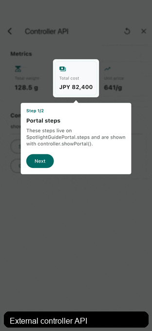
The controller can start the portal-owned sequence with showPortal() or a
runtime sequence with showSteps(steps). The controller and the guide context
inside a hintBuilder can both navigate or close the active guide with
next(), previous(), goTo(index), reset(), hide(), and finish().
previous() is a no-op on the first step, and goTo clamps the index.
hide() closes without onFinish; finish() closes and reports completion.
controller.showPortal();
controller.showSteps(steps);
controller.previous();
controller.goTo(2);
controller.hide();
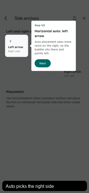
Horizontal auto placement choosing left and right arrows
Use SpotlightGuideAnchorPosition.start, center, or end for semantic alignment. start and end follow Directionality, so Arabic and other RTL layouts mirror correctly.
Custom anchors and repeated target groups
hintBuilder may return:
SpotlightGuideBubbleHintfor a common bubble that can render the step-level pointer.SpotlightGuideBubblefor a connected bubble arrow without pointer.- Any custom widget, image composition, or app-specific guide UI.
The layout data is available through SpotlightGuideStepContext.
Use guide.anchorDirection when a custom hint needs to know which physical
side the anchor is on. For example, a hint placed below a target has an
up direction because the anchor sits on the bubble's top edge and points
toward the target. Path-based custom anchors can read the same resolved side
from SpotlightGuideBubbleAnchorPathBuilder.direction inside addToPath.
Use guide.anchorTargetPoint for a resolved direct target anchor point,
guide.pointerTargetPoint for the resolved pointer-to-target point, and
guide.bubbleAnchorOffset only when a custom bubble must place its own anchor
along the bubble edge.
For the full API and built-in hint catalog, see doc/reference.md.