License NPM Version Standard Version Build Status npm
Css Star Rating is written in scss and fully customizable over variables.
Easily compose your own rating component over a rich set of css modifiers for any kind of UI state.
Demos in the KSS style guide
- Written in scss
- Customizable over variables
- Flexbox layout
- SVG icons
- Icon fonts like fontawesome, ionicon...
- Display rating over css class
- Different Numbers of stars
- Color of stars depend on rating
- Half stars
- Sizes
- Star alignments
- Static colors
- Disabled mode
- Star types
- Label
- Label positions
- Animations
- Directions
- Themes
| IE | Firefox | Chrome | Safari | Opera |
|---|---|---|---|---|
| 11 | 50 | 55 | 10 | 41 |





| Css | Angular1 (>=1.5) | Angular (>=10) |
|---|---|---|
| Css Star Rating | Angular1 Star Rating | Angular Star Rating |



Get Css Star Rating:
- clone & build this repository
- download as .zip
- via npm : by running
$ npm install css-star-ratingfrom your console
Load library
<link rel="stylesheet" href="node_modules/css-star-rating/css/star-rating.css">
Copy assets (optional)
If you want to use svg as icon type copy the
star-rating.icons.svg image form node_modules/css-star-rating/images/star-rating.css to your roots assets folder.
Usage
<div class="rating large star-icon direction-rtl value-1 half color-default label-top">
 <div class="label-value">1.5</div>
 <div class="star-container">
 <div class="star">
 <i class="star-empty"></i>
 <i class="star-half"></i>
 <i class="star-filled"></i>
 </div>
 <div class="star">
 <i class="star-empty"></i>
 <i class="star-half"></i>
 <i class="star-filled"></i>
 </div>
 <div class="star">
 <i class="star-empty"></i>
 <i class="star-half"></i>
 <i class="star-filled"></i>
 </div>
 </div>
</div>
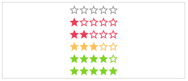
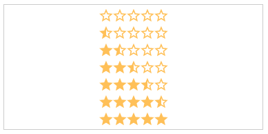
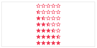
.value-[N]:
The actual star rating value. The color of the stars depends on the rating number
- .value-0
- .value-1
- .value-2
- .value-3
- .value-4
- .value-5
<div class="rating value-3">
 <div class="star-container">
 ...stars...
 </div>
</div>
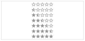
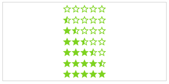
.half:
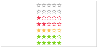
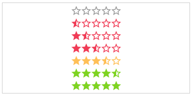
If set, every rating value will have a half star at the end.
- .half
<div class="rating value-3 half">
 <div class="star-container">
 ...stars...
 </div>
</div>
text:
The text next to the stars.
- (Just additional HTML)
<div class="rating value-3">
 <div class="label-value">My text</div>
 <div class="star-container">
 ...stars...
 </div>
</div>

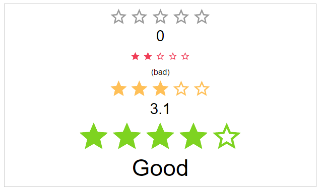
.label-[VISIBILITY]:
The position of the label.
- .label-visible
- .label-hidden
<div class="rating value-3 label-hidden">
 <div class="label-value">3.5</div>
 <div class="star-container">
 ...stars...
 </div>
</div>


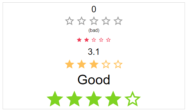
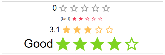
.label-[POSITION]:
The position of the label.
- .label-top
- .label-right
- .label-bottom
- .label-left
<div class="rating value-3 label-right">
 <div class="label-value">Good</div>
 <div class="star-container">
 ...stars...
 </div>
</div>

.space:
If the start use the whole space or not.
<div class="rating value-3 space-between">
 <div class="star-container">
 ...stars...
 </div>
</div>



.[SIZE]:
The height and width of the stars.
- .small
- .medium
- .large
<div class="rating value-3 large">
 <div class="star-container">
 ...stars...
 </div>
</div>



color-[COLOR_NAME]:
Static color of stars.
- .color-default
- .color-negative
- .color-ok
- .color-positive
<div class="rating value-3 color-negative">
 <div class="star-container">
 ...stars...
 </div>
</div>
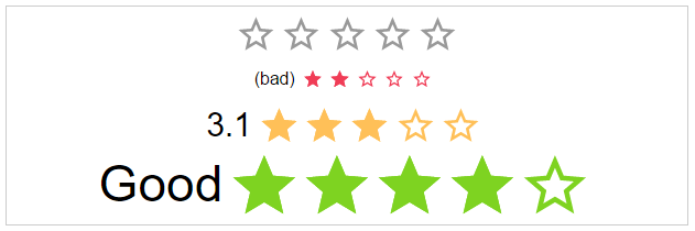
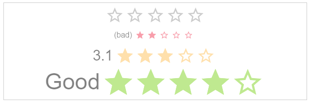
.disabled: The click callback is disabled, colors are transparent
<div class="rating value-3 disabled">
 <div class="star-container">
 ...stars...
 </div>
</div>
.direction-[DIRECTION]:
The direction of the stars and label.
- .direction-rtl
- .direction-ltr
<div class="rating value-3 direction-rtl">
 <div class="star-container">
 ...stars...
 </div>
</div>


.[ANIMATION_SPEED]:
The duration of the animation in ms.
- .immediately
- .noticeable
- .slow
<div class="rating value-3 slow">
 <div class="star-container">
 ...stars...
 </div>
</div>



starType:
The type of start resource to use.
- .star-svg
- .star-icon (star character)
- .custom-icon (i.e. font-awesome)
<div class="rating value-3 star-icon">
 <div class="star-container">
 <!-- font icons-->
 <div class="star">
 <i class="star-empty"></i>
 <i class="star-half"></i>
 <i class="star-filled"></i>
 </div>
 <!-- or svg icons-->
 <div class="star">
 <svg class="star-empty">
 <use xmlns:xlink="http://www.w3.org/1999/xlink" xlink:href="assets/images/star-rating.icons.svg#star-empty"></use>
 </svg>
 <svg class="star-half">
 <use xmlns:xlink="http://www.w3.org/1999/xlink" xlink:href="assets/images/star-rating.icons.svg#star-half"></use>
 </svg>
 <svg class="star-filled">
 <use xmlns:xlink="http://www.w3.org/1999/xlink" xlink:href="assets/images/star-rating.icons.svg#star-filled"></use>
 </svg>
 </div>
 </div>
</div>



As a bonus there are some themes as classes.
theme-[NAME]:
The type of start resource to use.
- .theme-google-places
- .theme-kununu
<div class="rating value-3 theme-google-places">
 <div class="star-container">
 ...stars...
 </div>
</div>