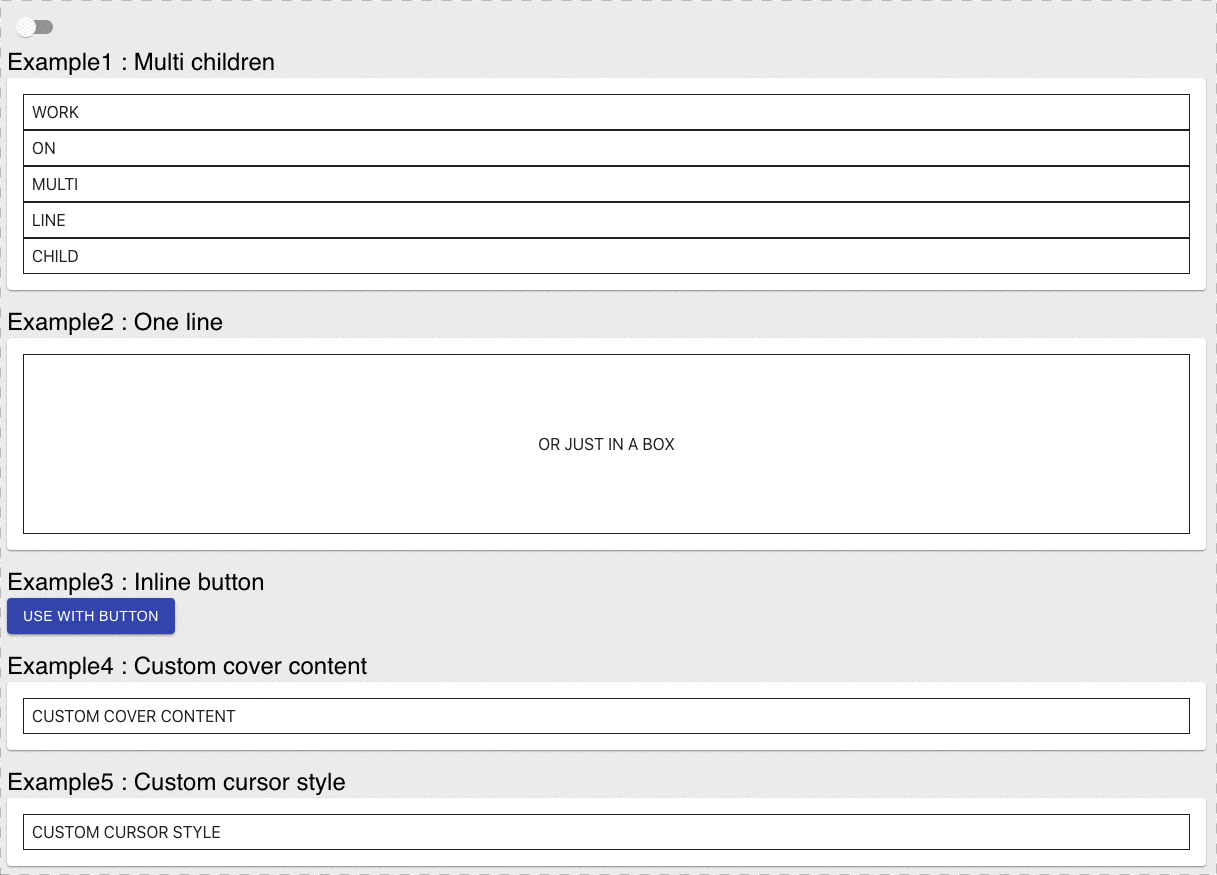
A react component that support you make a loading style when loading status. Loading component is use react-loading.
npm i react-cover
or
yarn add react-cover
Just use on props to toggle loading
import Cover from 'react-cover'
const LoadingButton = ({ on = false }) => (
 <Cover on={on}>
 <button>COVER</button>
 </Cover>
)
change style color or type
import Cover from 'react-cover'
const LoadingButton = ({ on = false }) => (
 <Cover on={on} color="red" type="balls">
 <button>COVER</button>
 </Cover>
)
if your element is in style width 100% you can use fullwidth prop
import Cover from 'react-cover'
const FullWidthComponent = ({ on = false }) => (
 <Cover on={on} fullwidth>
 <div style="width:100%;">some thine fullwidth</div>
 </Cover>
)
| Name | Type | Default | Description |
|---|---|---|---|
| on | boolean | false | switch this component active |
| opacity | string|number | 0.4 | opacity for covered element |
| color | string | '#333' | control loading color |
| type | string | 'spin' | control loading type of react-loading loading type |
| size | number | 32 | control loading size |
| loadingProps | object | {} | react-loading's props |
| coverAdornment | jsx function | - | custom your loading style replace react-loading |
| inline | boolean | false | if children is display inline add this prop |
| cursor | string | initial | control your cursor style when active |