Rock Around The Clock
Peltier Technical Services, Inc., Copyright © 2025, All rights reserved.
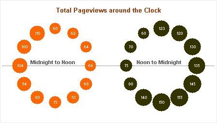
My friend Chandoo proposed a chart to show website traffic vs. time of day in Plot your data around the clock [Excel charting idea]. He thought he’d use the analogy of a 12-hour analog chart, and put a bubble at each hour, where the size of the bubble is related to the pageviews during that hour. Well there’s 24 hours in a day and 12 hours in a clockface, so he had to make a pair of charts. Here’s the result:
[画像:Chandoo's Double Bubble Chart Around the Clock]
Well, this probably seemed like a good idea at the time, and I like the fact that Chandoo keeps trying new ideas and shares them with his readers. But this dual chart has some shortcomings. The chart reminds me of a pair of Elton John glasses with jewels all around the frame, or maybe if I draw a few lines, it looks like a bicycle. And Dubble Bubble is a brand of chewing gum, not an Excel chart type.
Issues with the chart
- The data is a time series, but it’s presented nonlinearly in two separate sections, and the passage of time is only implied by the parallel to an analog clock.
- The horizontal line made me wonder at first where the jump occurred between left and right charts. Finally I downloaded the data and saw that the jumps occurred at midnight and noon.
- The bubbles do not show the relative pageviews clearly. I first looked at this goggle chart and thought it was telling be that there was a pair of peaks in the hourly pageviews, one around 9 am and another around 4 pm. This illusion was partly due to the bubbles and partly to the leap between sides of the chart.
- The colors are deceiving. The brighter color (orange) made me think of daytime and the dark color (black) made me think of night. A better break for the colors you used would be 6AM to 6PM and 6PM to 6AM. But then my confusion over point 3 would be magnified.
Remediation
At first I thought a 24 hour circular clock might work better, since it removes the jump from left to right. It could be done as either a bubble chart or a radar chart. Then I realized that nobody would understand it. “Oh, you mean 6 am is to the right? I thought it was pointing down.”
The KISS principle requires us to “Keep It Simple”, which means a simple time series, using an Excel XY chart.
The data is a simple list of pageviews vs hour of day:
Chandoo's Double Bubble Chart Data
I modified it slightly, converting to a 24-hour time format, and plotting each point in the middle of the hour (i.e., the 5 am point is plotted at 5:30 am). I came up with the following chart, a simple time series.
Jon's Alternative Chart
I probably shouldn’t have pimped the chart this way, because most people won’t get it, but I colored the daytime points (6AM to 6PM) yellow and the nighttime points (6PM to 6AM) dark brown. People would more likely get it if I used smiley suns for daytime and a happy moon for nighttime, but I’d probably lose clients over that.
As I said, I appreciate Chandoo’s effort here. Innovation is partly about trying strange new things. However, this was a case where simpler is in fact better. As any innovator would tell you, most innovations end up on the cutting room floor.
Update
Jorge Camoes has chimed in with a radar chart solution in Charting around the clock.
Jorge Camoes' Curator's Egg Chart
I have the same issue with this radar chart as I had with Chandoo’s double-trouble bubble chart. I don’t know where the day and night series cross, unless I read the fine print and point with my fingers on the screen until I locate the 8AM-8PM crossover.
In Jorge’s spirit of consensus, I’ve created my own 12-hour circular graphic, which addresses my conceptual problems with the charts shown thus far. It’s actually a combination radar-XY chart, using the radar to reproduce Jorge’s nice Roman-numeral clock face, and the XY series uses Chandoo’s trig algorithms to locate the actual data.
Jon's Alternative Chart
I show how I made this chart in Radar-XY Combination Chart
Posted: Thursday, August 14th, 2008 under Chart Types.
Tags: Chandoo, Chart Types.
Comments: 11
Comments
db says
nicely done
Jorge Camoes says
Jon, I would look at the data before the daytime/nighttime split and create a split that creates more consistent groups, instead of some kind of standard split.
I kind of merged both charts:
Charting around the clock
Chandoo says
Jon, thanks for highlighting all the problems with this chart. I was in two minds whether to share it or not as I felt the double bubble did come out looking wierd and puzzling. I went ahead and wrote it as a fun alternative though.
The alternatives suggested by both you and Jorge are fine examples. I have suggested my readers to visit both of these posts in order to know what they are getting :D
I will do a follow up later when I get on to my pc, on mac now, so everything still looks beautiful :D, good day to you
derek says
Why not just use a twenty four hour clock?
Jon Peltier says
Derek –
You answered your own question in your post. Here in the States, 24 hour clocks are uncommon and unfamiliar. We can use 24-hour format time in digital format, but I fear that using the graphical equivalent would result in more confusion than understanding.
Your version of a radial chart also seems to emphasize area, and I would be reluctant to use it to compare two series, given the confusion engendered by data which is encoded by area.
Kenny says
Extremely fascinating and benficial tips. Bookmarked …
Many thanks for the amazing read.