A component that combines antd's Table and Form to do the search, display, and operating jobs for data.
Free from:
- Handling pagination
- Handling table row selection
- Writing search field form item components
- Writing row actions components
Just focus on:
- Doing the data fetching request and return the data
- Rendering a specific data field if needed
- Writing plugin to operate one or many data object(s)
$ yarn add antd-data-table --save
import { DataTable } from 'antd-data-table'
const searchFields: SearchField[] = [
 {
 label: 'ID',
 name: 'id',
 type: 'input',
 payload: {
 props: {
 placeholder: 'placeholder'
 }
 }
 },
 {
 label: 'Select',
 name: 'select',
 type: 'select',
 payload: {
 options: [
 { key: '1', label: 'one', value: '1' },
 { key: '2', label: 'two', value: '2' },
 { key: '3', label: 'three', value: '3' }
 ]
 }
 }
]
const columns: TableColumnConfig<any>[] = [
 {
 key: 'id',
 title: 'ID',
 dataIndex: 'id'
 }, {
 key: 'title',
 title: 'Title',
 dataIndex: 'title'
 }
]
const expands: Expand[] = [
 {
 title: 'Body',
 dataIndex: 'body',
 render (value) {
 return value && `${value.substr(0, 100)} ...`
 }
 },
 {
 title: 'User ID',
 dataIndex: 'userId'
 }
]
const onSearch = async ({ page, pageSize, values }) => {
 const res = await axios.get('http://jsonplaceholder.typicode.com/posts', {
 params: {
 _page: page,
 _limit: pageSize,
 ...values
 }
 })
 return {
 dataSource: res.data,
 total: Number(res.headers['x-total-count'])
 }
}
render(
 <DataTable
 rowKey={record => record.id}
 searchFields={searchFields}
 initialColumns={columns}
 initialExpands={expands}
 onSearch={onSearch}
 />
, mountNode)
Sometimes there are many search fields, you could set a maxVisibleFieldCount to automatically have a collapsable form:
import { DataTable } from 'antd-data-table'
render(
 <DataTable
 rowKey={record => record.id}
 searchFields={searchFields}
 initialColumns={columns}
 onSearch={onSearch}
+ maxVisibleFieldCount={4}
 />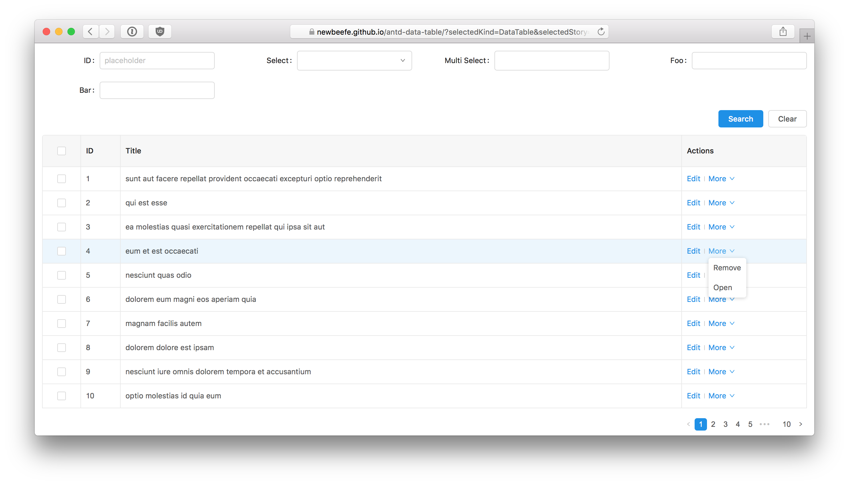
, mountNode)We usually need to write some action buttons for operating a specific record. antd-data-table made it super easy:
const actions: RowAction[] = [
 {
 label: 'Edit',
 action (record) {
 action('onClick edit')(record)
 }
 },
 {
 label: 'More',
 children: [
 {
 label: 'Remove',
 action (record) {
 action('onClick remove')(record)
 }
 },
 {
 label: 'Open',
 action (record) {
 action('onClick open')(record)
 }
 }
 ]
 }
]
render(
 <DataTable
 rowKey={record => record.id}
 searchFields={searchFields}
 initialColumns={columns}
 initialExpands={expands}
 onSearch={onSearch}
 actions={actions}
 />
, mountNode)
Plugins are for operating multiple records. Every plugin will render a component at the top of table.
Let's write a simplest plugin: A button that show current selected rows' ids:
const ShowIdsBtn = ({ selectedRows, clearSelection }) => {
 const showIds = () => {
 message.info(selectedRows.map(row => row.id).join(','))
 // clear selection after the action is done
 clearSelection()
 }
 return <Button onClick={showIds}>Show Ids</Button>
}
const plugins = [
 renderer (selectedRowKeys, selectedRows, clearSelection) {
 return <ShowIdsBtn selectedRows={selectedRows} clearSelection={clearSelection} />
 }
]
render (
 <DataTable
 rowKey={record => record.id}
 searchFields={searchFields}
 plugins={plugins}
 initialColumns={columns}
 initialExpands={expands}
 onSearch={onSearch}
 />
, mountNode)
Unique table name.
The key value of a row.
SearchField is an object that contains:
- label: string Pass to
<Form.Item>'slabelproperty. - name: string Pass to
getFieldDecoratoras the decorator name. - type?: RenderType antd-data-table comes with some common form item type. Such as
input,select. - initialValue?: any Inital form value.
- renderer?: (payload?: object) => React.ReactNode When the form item types are not statisfied, your could write your own renderer. the
ReactNodethat returned will be wrapped bygetFieldDecorator. - validationRule?: ValidateionRule[] antd validation rules. Pass to
getFieldDecorator(name, { rules }). - payload?: { props: any, [key: string]: any } Some params that pass to the renderer.
- span?: number Form Item Col span value. 6 by default.
interface payload {
 props: object // antd Input props
}
interface payload {
 props: object // antd DatePicker props
}
interface payload {
 props: object // antd TreeSelect props
}
interface payload {
 props: object, // antd Select props
 options: {
 key: string,
 label: string,
 value: string
 }[]
}
antd's TableColumnConfig. See more at https://ant.design/components/form/
type Expand = {
 /** Title of this column **/
 title: string,
 /** Display field of the data record, could be set like a.b.c **/
 dataIndex: string,
 /** Renderer of the column in the expanded. The return value should be a ReactNode **/
 render?: (text: any, record?: {}) => React.ReactNode
}
onSearch property need a function that return a Promise, which resolves an object that contains total and dataSource. This function receive a SearchInfo:
type SearchInfo = {
 /** values from `getFieldsValue()` */
 values: any,
 /** current page */
 page: number,
 /** page size */
 pageSize: number
}
Error handler that trigger when onSearch throw error.
Load list data immediately, default is false
Form validation failed handler
default is 10
If true, a list selection button will display on table title.
Be sure to pass the name props if it is enable.
Custom rowSelection.
For Affix. Specifies the scrollable area dom node
Pixels to offset from top when calculating position of scroll
Pixels to offset from bottom when calculating position of scroll
There is a public fetch method in DataTable to do this action. So you could get it from ref:
// ...
render () {
 let dataTableRef: DataTable | null = null
 const saveDataTableRef = (ref: DataTable) => {
 dataTableRef = ref
 }
 const onClickCustomSearch = () => {
 if (dataTableRef) {
 dataTableRef.fetch(1)
 }
 }
 return (
 <div style={{ padding: '1em' }}>
 <DataTable
 ref={saveDataTableRef}
 name='customSearch'
 rowKey={record => record.id}
 searchFields={searchFields}
 initialColumns={columns}
 initialExpands={expands}
 onSearch={onSearch}
 pageSize={10}
 onError={onError}
 />
 <Button onClick={onClickCustomSearch}>Custom Search</Button>
 </div>
 )
}
fetch: async (page: number, values: object = this.state.currentValues, clearPagination: boolean = false)
$ yarn
$ yarn start # start the storybook
$ yarn test # run the test
$ yarn run build # build the distribution file
$ yarn run build:storybook # build storybook
$ yarn run build:storybook # build storybook
$ npm publishMIT License