10 Design Guidelines for Reporting Errors in Forms
February 3, 2019 · Updated Dec. 12, 2024
Forms are necessary components of many applications and websites. They are used to log in, purchase items, send feedback, enter personal information, and more. When mistakes are made in forms, good error messages and thoughtful error flows can easily guide users to fixes.
In This Article:
- Principles of Designing Error-Correction Flows
- 1. Aim for Inline Validation Whenever Possible
- 2. Indicate Successful Entry for Complex Fields
- 3. Keep Error Messages Next to Fields
- 4. Use Color to Differentiate Errors from Normal Field States
- 5. Add Iconography or Subtle Animation for Easy Scanning
- 6. Use Modals or Confirmation Dialogs Sparingly
- 7. Don’t Validate Fields Before Input is Complete
- 8. Don’t Use Validation Summaries as the Only Indication of an Error
- 9. Don’t Use Tooltips to Report Errors
- 10. Provide Extra Help for Repeated Errors
- Conclusion
Principles of Designing Error-Correction Flows
An error flow should allow users to easily fix their mistakes and proceed with their tasks. Effective error design makes sure that:
- Error messages are easily noticed and understood.
- The field(s) in error are easy to locate.
- Instructions for fixing errors are visible when the error is fixed.
This article contains practical guidelines for designing error flows in forms.
1. Aim for Inline Validation Whenever Possible
Ideally, all validation should be inline; that is, as soon as the user has finished filling in a field, an indicator should appear nearby if the field contains an error. This approach reduces interaction cost for the user by allowing them to fix errors immediately, without searching or returning to a field they thought was completed correctly.
Sometimes inline validation is not possible, and data entered by the user must be sent to a server for verification. In these cases, make sure error messages are clear, actionable, and easy to locate when the form or page is reloaded.
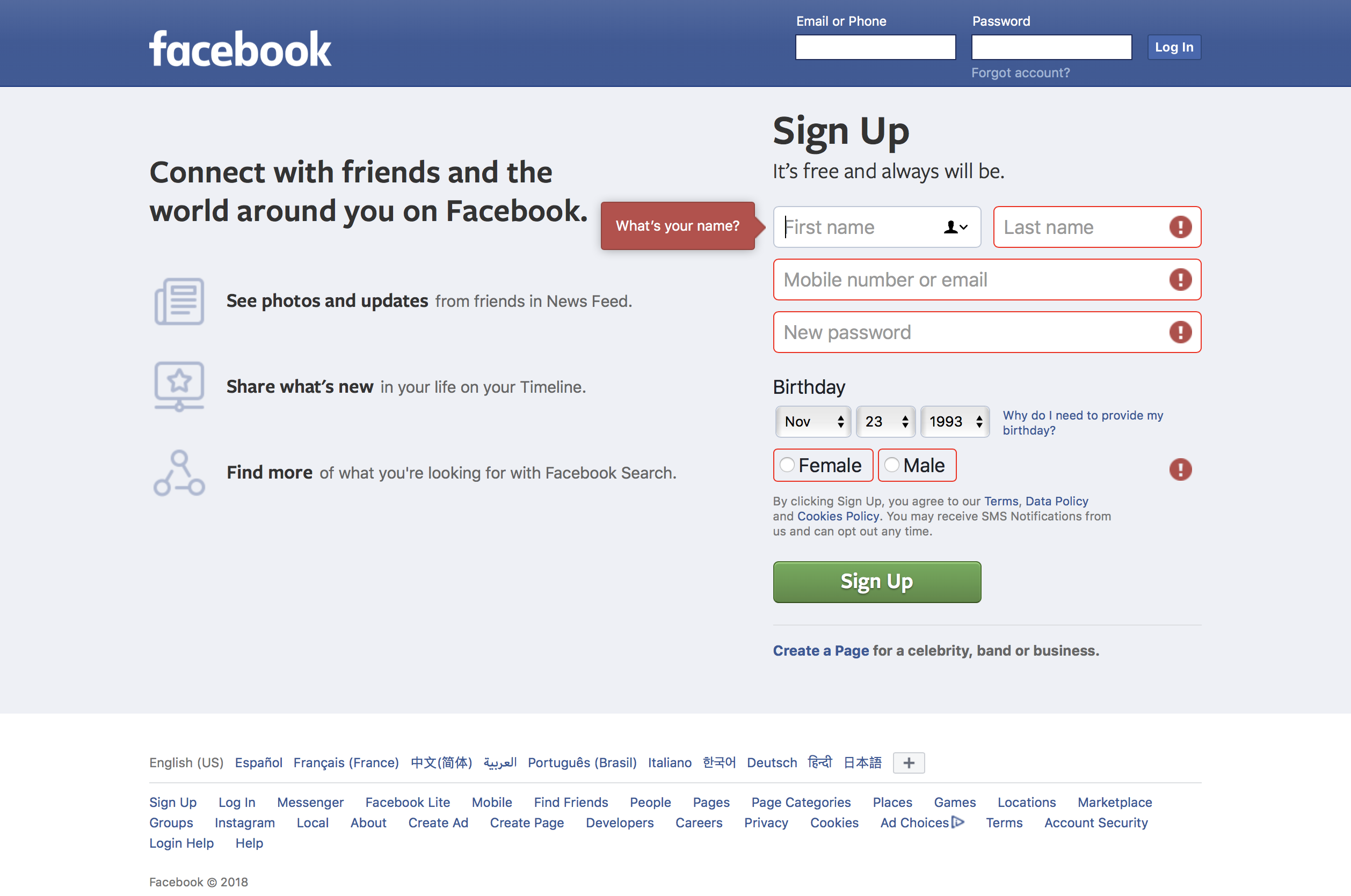
2. Indicate Successful Entry for Complex Fields
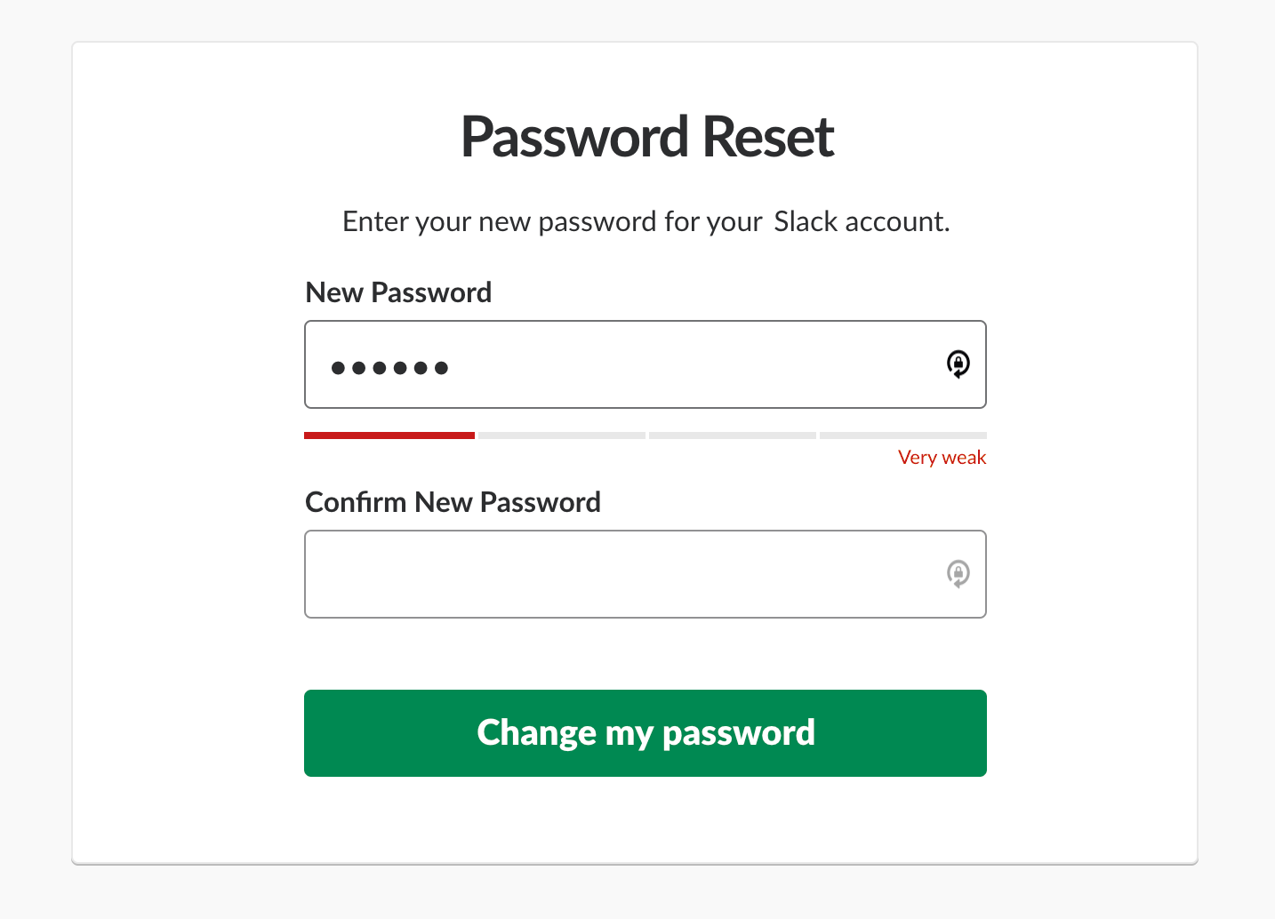
Inline validation can also be used to indicate successful completion of fields. For example, when the user creates a username, a green checkmark and a message that the username is available provide clear feedback.
For complex inputs such as new passwords, instant inline validation (which appears as the field value is being typed) will prevent users from guessing or checking multiple times if what they’ve entered meets the system's guidelines. In the example below, the password-strength indicator changes as the user types and helps the user decide if the string entered is good enough or if more characters need to be added.
However, don’t go overboard with success indicators. Success indicators shouldn’t distract users from filling out forms and should only be used when the additional context helps complete the form faster or more accurately. For example, you don’t need to show a success message when the only requirement on the field is that it is filled in, as that message won’t provide much additional context to your user.
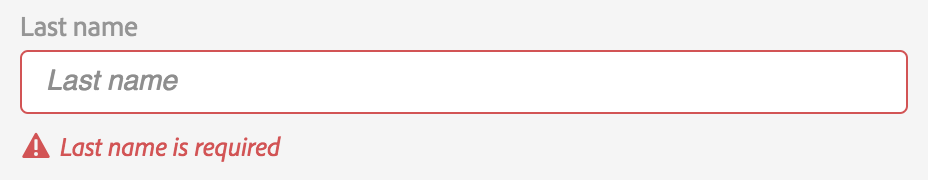
3. Keep Error Messages Next to Fields
With inline validation, error messages are naturally shown next to the field causing the error. But even when the fields are not validated inline, it’s helpful to show an actionable error message below or next to the problem field in order to help the user fix the error. The message should follow error-message guidelines: it should be explicit, human-readable, polite, precise, and give constructive advice.
Keeping error messages next to the fields in error minimizes working-memory load: users can see the error message while fixing the error instead of having to remember it.
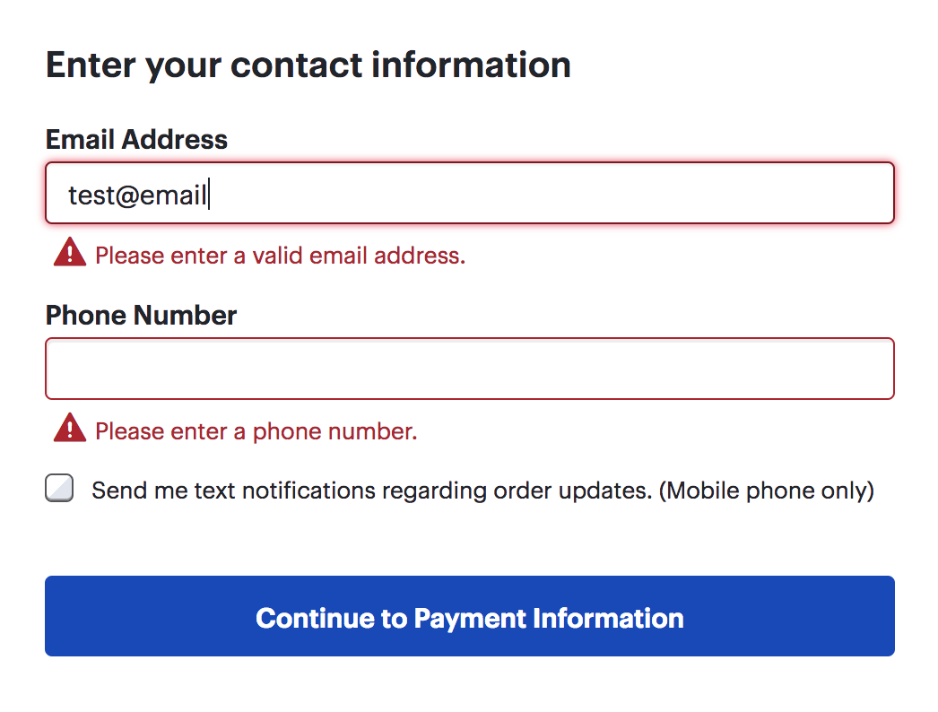
4. Use Color to Differentiate Errors from Normal Field States
Red is the color most associated with errors, along with orange or yellow for warnings and green or blue for success. Make sure that the validation text stands out from the rest of the form so the user will notice it quickly. Add a semitransparent background of the same color to the error field to make it stand out on a long page with many form fields.
5. Add Iconography or Subtle Animation for Easy Scanning
In addition to color, an icon to the left of your error message or validation summary will draw attention to the error and help users who are colorblind. When the user scans the form, the icon will stand out and draw the eye to what needs to be fixed.
A subtle pulse or bounce animation on the icon corresponding to an error can further draw users’ attention to the error. However, don’t abuse animation: several animated icons can be overwhelming if there are multiple errors. And don’t animate text — animated error messages are hard to read.
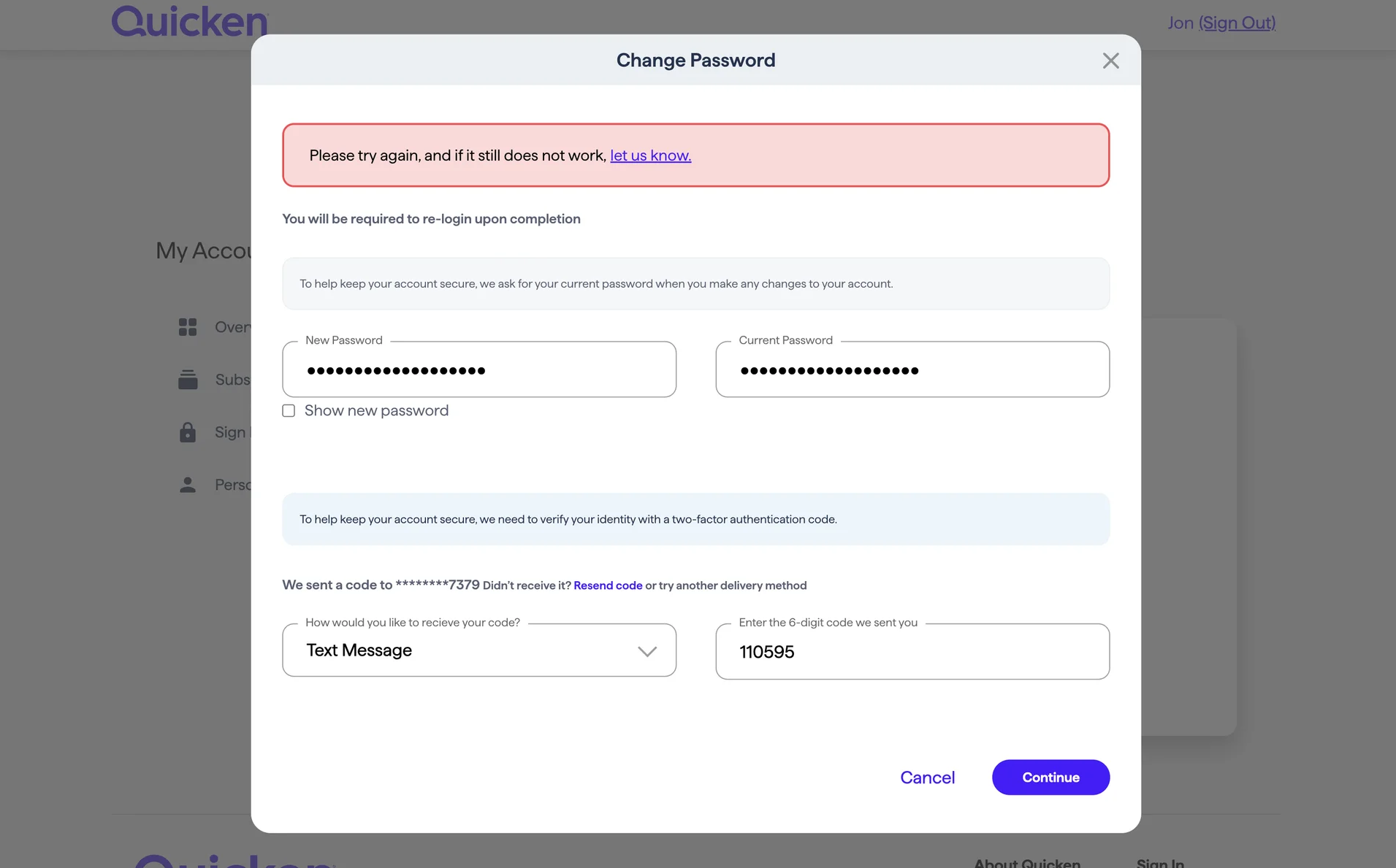
6. Use Modals or Confirmation Dialogs Sparingly
When you need to draw extra attention to a potential error, use a modal or confirmation dialog to explain details and help the user fix the issue. However, use such dialogs sparingly as they have two big disadvantages:
- They are disruptive.
- The error message appears in a window that must be dismissed before fixing the error, forcing users to remember complex instructions and increasing cognitive load.
Modal dialogs are, however, okay if the error message is simple or the form could still be submitted as it is.
7. Don’t Validate Fields Before Input is Complete
In most cases, avoid showing an error until the user has finished with the field and moved to the next field. It’s frustrating to see an error message before being given the opportunity to finish typing.
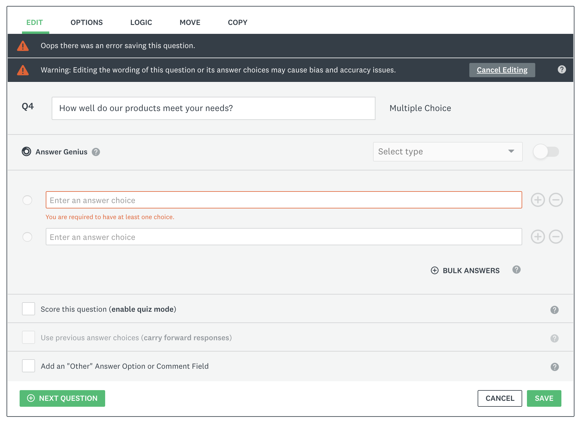
8. Don’t Use Validation Summaries as the Only Indication of an Error
A validation summary is shown at the top of a form and lets users know that there are errors that need to be fixed on the page, whether those errors are in the viewport or below the fold. A validation summary can give the user a global understanding of all the errors in a form but shouldn’t be used as the only form of error indication, as it forces the user to search for the field in error; moreover, the error message may no longer be present in the viewport when the user reaches the error field, thus forcing the user to memorize the error message while fixing the issue.
9. Don’t Use Tooltips to Report Errors
Tooltips are sometimes used to indicate errors, typically with an alert icon displayed next to the field(s) in error. When users hover over the icon or focus on the field, a tooltip or a toast containing the error message appears.
This approach is generally not recommended for a few reasons:
- Alert icons are hard to notice, especially on visually dense interfaces.
- Users may not realize that an error message is displayed and wonder what is wrong with the field without realizing that they need to hover or focus to see the message.
- It adds unnecessary effort, requiring users to take extra steps to access critical information.
10. Provide Extra Help for Repeated Errors
When users encounter the same error repeatedly (3 or more times in a single form-filling attempt), it indicates a deeper issue in the user interface — unclear error messages, a mismatch between the design and users’ needs, or overly complex requirements in the form. Remember that when users make errors, it’s not their fault. Errors highlight flaws in your design.
To address repeated errors:
- Review analytics data for error patterns to identify common scenarios where errors occur.
- Test and refine the design to uncover the root cause of errors.
- Revise error messages to provide more actionable feedback.
Conclusion
Error flows should be designed to help users fix mistakes in a form and help them avoid making more. Ensure that users can easily detect errors, understand how to fix them, and see the error message while correcting the corresponding error. Remove the guesswork and let users get on with their tasks.