A select input is a useful web app component that lets you pick a value from many options without taking up much space. But the default styling can be dull and clash with the rest of your design.
React Select provides a flexible and customizable solution to enhance the appearance and functionality of dropdown inputs.
Installing React Select
Integrating React with other libraries or technologies, like React Select, React Redux, and many more, can simplify the development process.
To get started with React Select, you need to install it in your project. To do this using npm, run this terminal command in your project directory:
npm i --save react-select
This will install and set up the library in your React project, so you can begin using it.
Creating Select Inputs With React Select
Now that you have set up the library, you can use it to create select inputs. To do this, you will use the Select component. This is a highly customizable component that lets users select options from a list.
Here's an example of how to use the Select component:
import React from "react"
import Select from "react-select"
function App() {
 const options = [
 { value: "apple", label: "Apple" },
 { value: "pineapple", label: "Pineapple" },
 { value: "watermelon", label: "Watermelon" },
 ]
 return (
 <div>
 <Select options={options} />
 </div>
 )
}
export default App
This example begins by importing the Select component from “react-select”. It defines an options array with three objects, each with a value and a label property. The value property represents the value that the form will send to the backend when you submit it. The label property is the text that the Select component will display in the dropdown.
When you render the Select component, pass the options array to it using the options prop.
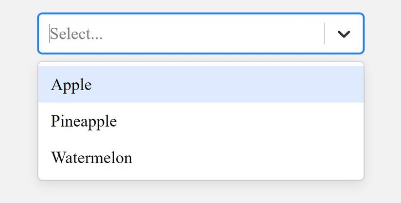
With this code block, the React Select library will generate a dropdown like this:
Customizing the Select Inputs
React Select provides various ways to customize the select inputs. You can use CSS classes or apply inline styles directly to the select inputs, according to your preferences.
Customizing With CSS Classes
The React Select library provides a className prop for the Select component. Use this className prop to apply custom Cascading Style Sheet (CSS) styles to your Select components.
For example:
import React from "react"
import Select from "react-select"
function App() {
 const options = [
 { value: "apple", label: "Apple" },
 { value: "pineapple", label: "Pineapple" },
 { value: "watermelon", label: "Watermelon" },
 ]
 return (
 <div>
 <Select options={options} className='select'/>
 </div>
 )
}
export default App
The code block above is similar to the previous one, but it uses the className prop to apply a custom CSS class to the Select component. Supply a name in the className prop and you can use it to apply CSS styles to the component:
.select {
 color: #333333;
 font-family: cursive;
 inline-size: 30%;
 font-size: 11px;
}
After defining the styles, your select input will look like this:

Customizing With Inline Styles
You can also define inline styles in an object that you pass via the styles prop of the Select component. This gives you more control over the style of individual elements.
Here's an example:
import React from "react"
import Select from "react-select"
function App() {
 const options = [
 { value: "apple", label: "Apple" },
 { value: "pineapple", label: "Pineapple" },
 { value: "watermelon", label: "Watermelon" },
 ]
 const customStyles = {
 control: (baseStyles, state) => ({
 ...baseStyles,
 backgroundColor: "#e2e2e2",
 }),
 option: (baseStyles, state) => ({
 ...baseStyles,
 backgroundColor: state.isFocused ? "#e2e2e2" : "",
 color: state.isFocused ? "#333333" : "#FFFFFF",
 }),
 menu: (baseStyles, state) => ({
 ...baseStyles,
 backgroundColor: "#333333",
 }),
 }
 return (
 <div>
 <Select options={options} styles={customStyles} />
 </div>
 )
}
export default App
The prop object, customStyles, contains style properties for the Select component's control, option, and menu parts. These properties are functions that take two arguments: baseStyles and state.
The baseStyles parameter represents the default styles provided by React Select, while the state parameter represents the element's current state. In this example, the functions use the spread operator to combine the baseStyles with extra styles for each part of the component.
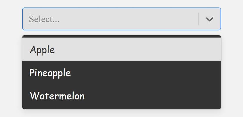
After applying these styles, your select input should look like this:
Adding Functionality to the Select Inputs
React Select provides several features to enhance the functionality of select inputs. You can enable multi-select and search functionality, and even create custom dropdown components.
Multi-Select Functionality
To enable multi-select functionality in your dropdowns, pass the isMulti prop to the Select component. This lets users select multiple options from the dropdown menu.
For example:
import React from "react"
import Select from "react-select"
function App() {
 const options = [
 { value: "apple", label: "Apple" },
 { value: "pineapple", label: "Pineapple" },
 { value: "watermelon", label: "Watermelon" },
 { value: "grapes", label: "Grapes" },
 { value: "orange", label: "Orange" },
 ]
 return (
 <div>
 <Select options={options} isMulti />
 </div>
 )
}
export default App
This example demonstrates how to use the isMulti prop to add the multi-select functionality to your select inputs.

Search Functionality
The React Select library provides built-in search functionality to filter options easily. By default, the Select component displays the search input when you open the dropdown. Users can type in the search input to filter the available options.
To enable search functionality, pass the isSearchable prop to the Select component. Like the isMulti prop, isSearchable accepts a boolean value.
Here's an example of how to use the isSearchable prop to enable search functionality:
import React from "react"
import Select from "react-select"
function App() {
 const options = [
 { value: "apple", label: "Apple" },
 { value: "apricot", label: "Apricot" },
 { value: "mango", label: "Mango" },
 { value: "mangosteens", label: "Mangosteens" },
 { value: "avocado", label: "Avocado" },
 ]
 return (
 <div>
 <Select options={options} isSearchable />
 </div>
 )
}
export default App
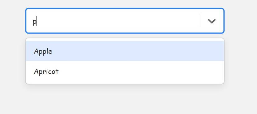
Rendering the code block above will display a select input with search functionality. It will look and function like this:
Create Custom Dropdown Components
React Select allows you to create custom dropdown components using the components prop. You can override the default components provided by React Select and customize the appearance and behavior of the dropdown to suit your taste.
For example:
import React from "react"
import Select, { components } from "react-select"
function App() {
const CustomOption = (obj) => (
<div {...obj.innerProps}>
<span>{obj.label}</span>
<span style={{ marginInlineStart: "0.2rem" }}>Fruit</span>
</div>
)
const CustomDropdownIndicator = (props) => (
<components.DropdownIndicator {...props}>
<span>↓</span>
</components.DropdownIndicator>
)
const options = [
{ value: "apple", label: "Apple" },
{ value: "pineapple", label: "Pineapple" },
{ value: "watermelon", label: "Watermelon" },
]
const customComponents = {
Option: CustomOption,
DropdownIndicator: CustomDropdownIndicator,
}
return <Select options={options} components={customComponents} />
}
export default App
This code block shows how to create custom components for a select input using the components prop of the Select component. It imports the components object which is a collection of pre-defined components you can use to customize the appearance and behavior of various elements in your select inputs.
The code defines two functional components: CustomOption and CustomDropdownIndicator. The CustomOption component takes an object as a parameter. This object contains various properties that React Select provides, like innerProps and label.
The CustomDropdownIndicator component takes props as a parameter. This component renders a custom dropdown indicator with a downward arrow symbol. The code creates a customComponents object that maps the CustomOption and CustomDropdownIndicator components to the corresponding Option and DropdownIndicator keys.
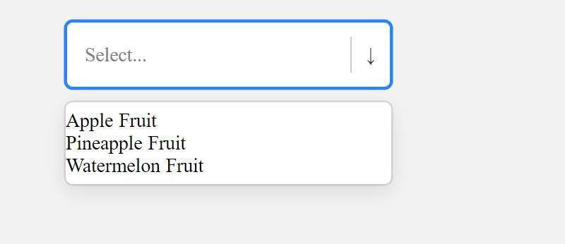
Finally, this code passes the customComponents object to the components prop of the Select component. This will render a select input with the custom components, looking like this:
Standard Components Can Be More Powerful and Attractive
React Select is a powerful library that lets you create beautiful and stylish select inputs in React. You can customize the select inputs, add functionality to them, and create custom dropdown components. Taking advantage of this library, you can enhance the appearance and user experience of your React apps.