Summary
- A powerful timeline is easy to build using CSS and JavaScript.
- Start by outlining the timeline’s HTML structure and styling the timeline elements with CSS.
- Continue to add animation to the timeline using JavaScript. You can use the Intersection Observer API to fade in timeline items on scroll.
Timelines are powerful visual tools that help users navigate and understand chronological events. Explore how to create an interactive timeline using the dynamic duo of CSS and JavaScript.
Building the Timeline Structure
You can check out the full code for this project from its GitHub repository.
To begin, outline the HTML structure in index.html. Create events and dates as separate components, laying the foundation for the interactive timeline.
<body>
 <section class="timeline-section">
 <div class="container">
 <div class="Timeline__header">
 <h2>Timeline</h2>
 <p class="heading--title">
 Here is the breakdown of the time we anticipate <br />
 using for the upcoming event.
 </p>
 </div>
 <div class="Timeline__content">
 <div class="Timeline__item">
 <div class="Timeline__text">
 <h3>Occasion 1</h3>
 <p>
 Lorem ipsum dolor sit amet consectetur adipisicing elit.
 Corporis, explicabo.
 </p>
 <span class="circle">1</span>
 </div>
 <h3 class="Timeline__date">12 Dec. 2023</h3>
 </div>
 <div class="Timeline__item">
 <div class="Timeline__text">
 <h3>Occasion 2</h3>
 <p>
 Lorem ipsum dolor sit amet consectetur adipisicing elit.
 Corporis, explicabo.
 </p>
 <span class="circle">2</span>
 </div>
 <h3 class="Timeline__date">12 Dec. 2023</h3>
 </div>
 <!-- More Items -->
 </div>
 </div>
 </section>
</body>
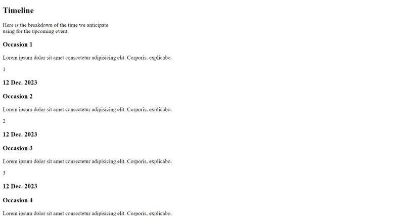
At the moment, your component looks like this:
Pick a Layout for Your Timeline: Vertical vs. Horizontal
When designing an interactive timeline, you can choose either a vertical or horizontal style. Vertical timelines are easy to use, especially on phones, as this is the typical direction that websites scroll in. If your timeline has a lot of content, this will probably be the most convenient layout.
Horizontal timelines, however, are appealing on wide screens and are great for creative sites with fewer details, that can minimize side-to-side scrolling. Each style has its perks, suitable for different types of websites and user experiences.
Style the Timeline With CSS
There are three types of visual elements you’ll style for the timeline: lines, nodes, and date markers.
-
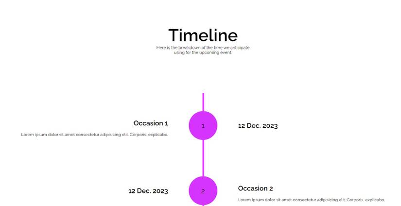
Lines: A central vertical line, created using the Timeline__content::after pseudo-element, serves as the backbone of the timeline. It's styled with a specific width and color, positioned absolutely to align with the center of the timeline items.
.Timeline__content::after { background-color: var(--clr-purple); content: ""; position: absolute; left: calc(50% - 2px); width: 0.4rem; height: 97%; z-index: -5; } -
Nodes: Circles, styled using the circle class, act as nodes on the timeline. These are absolutely positioned at the center of each timeline item and are visually distinct with a background color, forming the key points along the timeline.
.circle { position: absolute; background: var(--clr-purple); top: 50%; left: 50%; transform: translate(-50%, -50%); max-width: 6.8rem; width: 100%; aspect-ratio: 1/ 1; border-radius: 50%; display: flex; justify-content: center; align-items: center; z-index: 3; font-size: 1.6rem; } -
Date Markers: The dates, styled using the Timeline__date class, show on either side of the timeline. Their positioning alternates between left and right for each timeline item, creating a staggered, balanced look along the timeline.
.Timeline__text,
.Timeline__date { width: 50%; }
.Timeline__item:nth-child(even) { flex-direction: row-reverse;}
.Timeline_item:nth-child(even) .Timeline_date {
 text-align: right;
 padding-right: 8.3rem;
}
.Timeline_item:nth-child(even) .Timeline_text { padding-left: 8.3rem;}
.Timeline_item:nth-child(odd) .Timeline_text {
 text-align: right;
 align-items: flex-end;
 padding-right: 8.3rem;
}
.Timeline_item:nth-child(odd) .Timeline_date { padding-left: 8.3rem;}
Check out the full set of styles from the GitHub repo in style.css.
After styling, your component should look like this:
Animating With JavaScript
To animate this component, use the Intersection Observer API to animate timeline items on scroll. Add the following code to script.js.
1. Initial Setup
First, select all elements with the class Timeline__item.
const timelineItems = document.querySelectorAll(".Timeline__item");
2. Initial Styling of Timeline Items
Set the initial opacity of each item to 0 (invisible) and apply a CSS transition for smooth fading.
timelineItems.forEach((item) => {
 item.style.opacity = 0;
 item.style.transition = "opacity 0.6s ease-out";
}
You could set these styles in the style sheet, but doing so would be dangerous. If the JavaScript fails to run, that approach would leave your timeline invisible! Isolating this behavior in the JavaScript file is a good example of progressive enhancement.
3. Intersection Observer Callback
Define a fadeInOnScroll function to change the opacity of items to 1 (visible) when they intersect with the viewport.
const fadeInOnScroll = (entries, observer) => {
 entries.forEach((entry) => {
 if (entry.isIntersecting) {
 entry.target.style.opacity = 1;
 }
 });
};
4. Intersection Observer Options
Set the options for the observer, with a threshold of 0.1 indicating that the animation triggers when 10% of an item is visible.
const options = {
 root: null,
 rootMargin: "0px",
 threshold: 0.1,
}
5. Creating and Using the Intersection Observer
Finish by creating an IntersectionObserver with these options and applying it to each timeline item.
const observer = new IntersectionObserver(fadeInOnScroll, options);
timelineItems.forEach((item) => {
 observer.observe(item);
});
The final result should look like this:
Timeline Component Best Practices
Some practices to adhere to include:
- Optimize your timeline for different screen sizes. Learn responsive design techniques to ensure a seamless user experience across devices.
- Use efficient coding practices to ensure smooth animations.
- Use semantic HTML, proper contrast ratios, and ARIA labels for better accessibility.
Bringing Your Timeline to Life: A Journey in Web Design
Building an interactive timeline is not just about presenting information; it's about creating an engaging and informative experience. By combining HTML structure, CSS styling, and JavaScript animations, you can craft a timeline that captivates your audience while delivering valuable content.