Skip to content

NVIDIA – 3 years of growth

NVIDIA released their July quarterly results today.

If you look at their results from a year ago and 2 years ago, the changes have been dramatic (click to enlarge):

[画像:A Sankey diagram depicting NVIDIA's financial results for the quarter ending in July 2025. At the top is a header with the Sankeymatic logo & the title 'NVIDIA 2026 Q2 Results - Quarter ending July 2025' Highlights from the diagram: NVIDIA's total quarterly Revenue was .7 billion. On the input side, most revenue came from Data Centers (.1 billion) and Gaming (.2 billion). On the output side, the Cost of Revenue was .9 billion, leaving a Gross Profit of .8 billion. After Operating Expenses, the remaining Operating Income was .4 billion. After additional Other Income of .2 billion and Income Tax Expense of .8 billion, the bottom line is shown: NVIDIA's Net Income for the quarter was .4 billion.]
2025
[画像:A Sankey diagram depicting NVIDIA's financial results for the quarter ending in July 2024. At the top is a header with the Sankeymatic logo & the title 'NVIDIA 2025 Q2 Results - Quarter ending July 2024' Highlights from the diagram: NVIDIA's total quarterly Revenue was 30ドル billion. On the input side, most revenue came from Data Centers (26ドル.3 billion) and Gaming (2ドル.8 billion). On the output side, the Cost of Revenue was 7ドル.5 billion, leaving a Gross Profit of 22ドル.6 billion. After Operating Expenses, the remaining Operating Income was 18ドル.6 billion. After Income Tax Expense of 2ドル.6 billion, the bottom line is shown: NVIDIA's Net Income for the quarter was 16ドル.6 billion.]
2024
[画像:A Sankey diagram depicting NVIDIA's financial results for the quarter ending in July 2023. At the top is a header with the Sankeymatic logo & the title 'NVIDIA 2024 Q2 Results - Quarter ending July 2023' Highlights from the diagram: NVIDIA's total quarterly Revenue was 13ドル.5 billion. On the input side, most revenue came from Data Centers (10ドル.3 billion) and Gaming (2ドル.5 billion). On the output side, the Cost of Revenue was 4ドル billion, leaving a Gross Profit of 9ドル.5 billion. After Operating Expenses, the remaining Operating Income was 6ドル.8 billion. After Income Tax Expense of 0ドル.8 billion, the bottom line is shown: NVIDIA's Net Income for the quarter was 6ドル.2 billion. ]
2023

You can read the whole story of a financial report using a Sankey diagram, and by using the same scale across years, you can see visually exactly how the story has changed over time by flipping between the images.

For a more interactive version of these graphs, and to see their other quarters’ results from recent years, visit the NVIDIA Data page.

New Instagram & Linktree

I’ve posted the latest NYC Mayor diagram as the first post on my Instagram account.

I plan to post the various new Data diagrams there as they are updated on this site – quarterly results, etc. Consider following me over there. 🙂

As part of that effort, I’ve put together a linktree page as well, with several handy links in one place. The process was surprisingly friendly/usable for a free service.

Update: NYC Mayoral Democratic Primary figures as of 7/15

Once a week until the results are truly final, Vote NYC is posting updated counts and I am updating the graph accordingly.

The results have not changed significantly; in fact, the margin of victory for Mamdani over Cuomo has so far been slowly increasing.

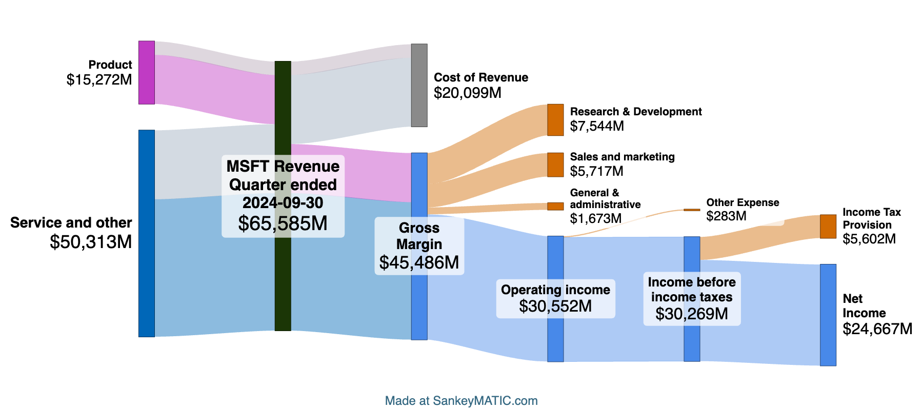
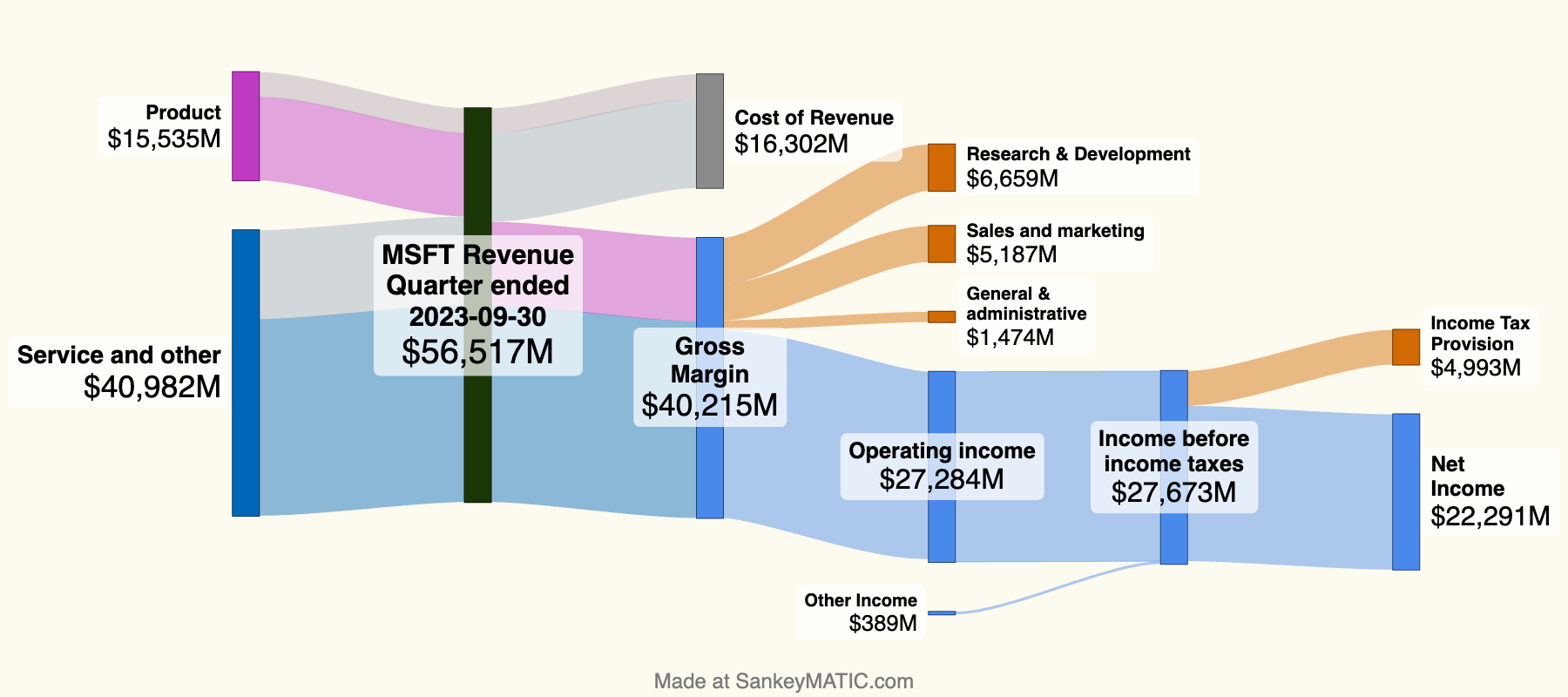
I find it interesting to graph the various editions of the data for comparison. Here is a gallery of the three graphs so far, in sequence. They use the same scale, so the visual differences should be representative of the actual magnitude of the changes.

Data Source: Vote NYC > Ranked Choice Results > Mayor/Democratic > Interim Rounds

[画像:A Sankey diagram of the 2025 New York City Democratic Mayoral primary election ranked choice results as of July 15, 2025. The top 3 vote recipients in the first round were Zohran Mamdani, Andrew Cuomo, and Brad Lander. By round 3, all candidates were eliminated except Mamdani and Cuomo. Mamdani won with 56.4% of the vote to Cuomo's 43.6%. The number of Inactive Ballots at the end was just over 55 thousand - about 5% of the total votes originally cast.]
[画像:A Sankey diagram of the 2025 New York City Democratic Mayoral primary election ranked choice results as of July 8, 2025. The top 3 vote recipients in the first round were Zohran Mamdani, Andrew Cuomo, and Brad Lander. By round 3, all candidates were eliminated except Mamdani and Cuomo. Mamdani won with 56.2% of the vote to Cuomo's 43.8%. The number of Inactive Ballots at the end was just under 55 thousand - about 5% of the total votes originally cast.]
[画像:A Sankey diagram of the 2025 New York City Democratic Mayoral primary election ranked choice results as of July 1, 2025. The top 3 vote recipients in the first round were Zohran Mamdani, Andrew Cuomo, and Brad Lander. By round 3, all candidates were eliminated except Mamdani and Cuomo. Mamdani won with 56% of the vote to Cuomo's 44%. The number of Inactive Ballots at the end was just under 53 thousand - about 5% of the total votes originally cast.]

2025 NYC Mayoral Democratic Primary

2021 NYC Mayor Primary Election

In anticipation of this year’s NYC Mayoral primaries (being held today), I’ve put together a diagram of the previous Democratic primary, from 2021.

A Sankey diagram of the 2021 New York City Democratic Mayoral primary election, which used ranked choice voting. In the first round, the top 3 vote recipients were Eric Adams, Maya Wiley and Kathryn Garcia. As candidates were eliminated and their votes flowed to other candidates, Garcia moved up to 2nd place in the 7th round. After Wiley was eliminated, Adams finally exceeded 50% of the remaining active votes. Adams' margin of victory over Garcia was 7,197 votes. The number of Inactive Ballots at the end (with none of the remaining candidates ranked) was 140,202, far exceeding the margin of victory.

Some notes:

  • Only a few labels are shown on the diagram, specifically highlighting the changes between rounds.
  • The original votes for each candidate are in gray; any votes added to a candidate keep the color of the last candidate they ‘belonged’ to.
  • On the diagram’s page, you can click the ‘Edit with Sankeymatic‘ button to import the full diagram into the editor, to see exactly how it is made.

Data: New Microsoft Diagram (Sep 2024 Results)

I’ve added diagrams for Microsoft’s recent quarterly results.

Here is the most recent quarter vs. the same one a year before (using the same scale):

[画像:A Sankey diagram summarizing Microsoft's financial results for the quarter ending on 9/30/2024. The main node shows Microsoft's total quarterly Revenue, which was just over 65ドル.5 billion. On the input side, that total is divided into Products and 'Service and other'. The Service revenue (50ドル.3 billion) was slightly over 3x the Product revenue (15ドル.2 billion). On the output side, the total Revenue is broken up to show what portion is 'Cost of Revenue' (20ドル.1 billion) vs Margin (45ドル.4 billion). More expenses are then subtracted until the bottom line is reached at the diagram's end: Microsoft's Net Income for the quarter was 24ドル.6 billion.]
[画像:A Sankey diagram summarizing Microsoft's financial results for the quarter ending on 9/30/2023. The main node shows Microsoft's total quarterly Revenue, which was just over 56ドル.5 billion. On the input side, that total is divided into Products and 'Service and other'. The Service revenue (41ドル billion) was greater than the Product revenue (15ドル.5 billion). On the output side, the total Revenue is broken up to show what portion is 'Cost of Revenue' (16ドル.3 billion) vs Margin (40ドル.2 billion). More expenses are then subtracted until the bottom line is reached at the diagram's end: Microsoft's Net Income for the quarter was 22ドル.2 billion.]

The pictures are quite consistent except for the 10ドルM increase in Service revenue and the corresponding increase in costs.

Visit the Microsoft page for more.


One other note: the buttons I mentioned below which said “use this one as a starting point” are now updated to say “Edit with SankeyMATIC“, like so:

They do the same thing as before, but I think this design gets the point across better – more like the ubiquitous Edit on CodePen buttons you see on web tutorial examples.

Data: New NVIDIA & Apple diagrams

Some new example financial diagrams are posted – the latest quarterly results for NVIDIA and for Apple.

There’s a fun new feature on each of these pages as well:

The top diagram on each page now has a ‘public link‘ that lets you use it as the starting point for a diagram of your own. Just look for this on each page:

Try out the links! You may encounter a new technique, or you may arrive at a better layout than I did. 🙂 Here are all 3: NVIDIA 2025 Q2, Apple 2024 Q3, Apple 2024 Year-to-Date.

Beyond the new make-your-own links, you’ll see some additional changes if you happened to visit those pages before:

  • The Data pages are now reorganized. Rather than having an extensive directory structure, there is now just one page for all of a company’s Quarterly diagrams and (in the case of Apple) another for its Annual ones. This should be rather less work to maintain, so hopefully it’ll be easier to keep them up to date.
  • There is now an index of thumbnails at the top of each page, to help give you a broad overview of recent history before you get into the details. (In data visualization terms, it’s a set of small multiples.)
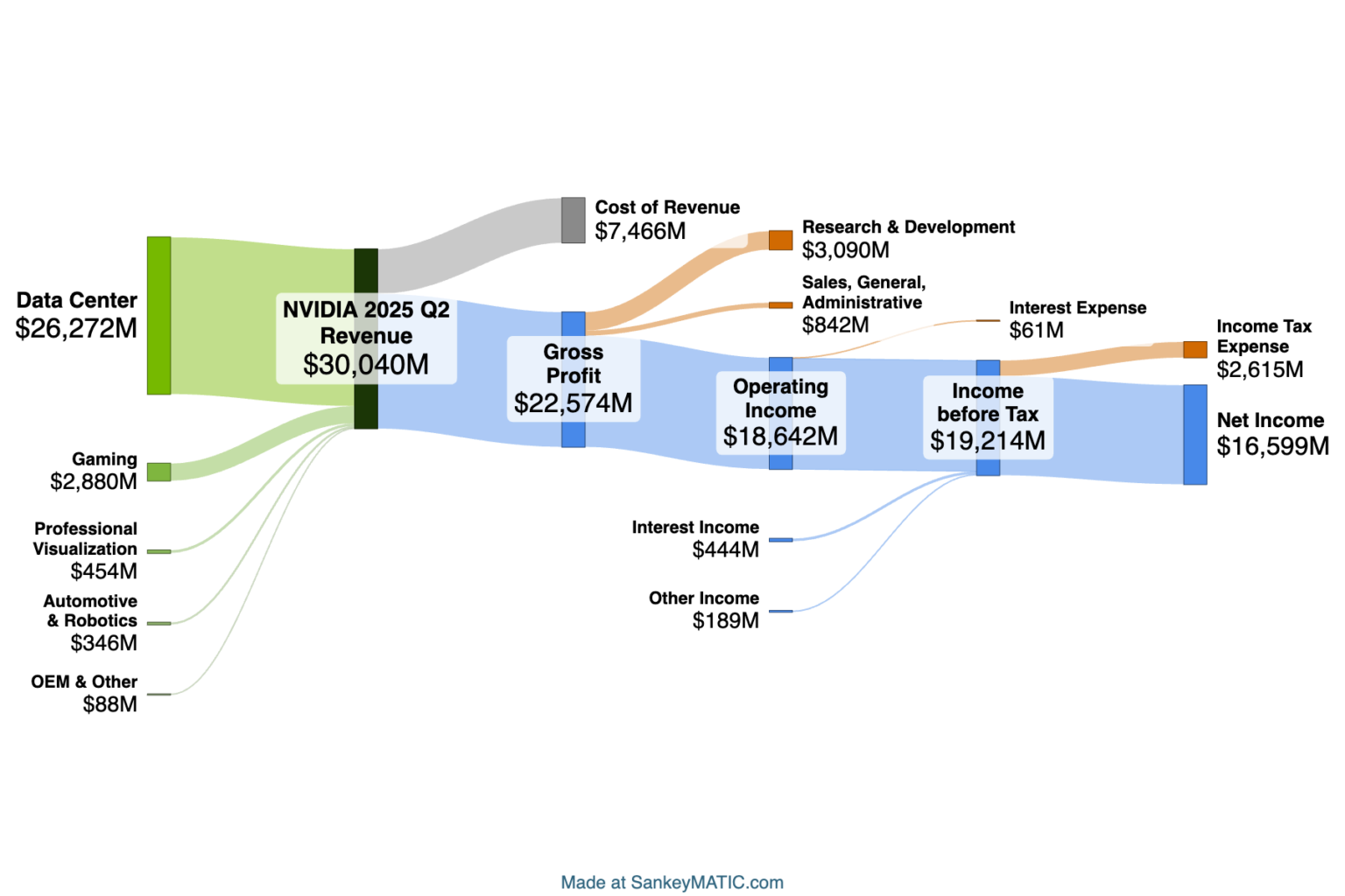
    • The quarterly results are arranged in rows of 4 so that you can scan up & down to compare the same quarter across different years. This makes it easier to see at a glance, for instance, NVIDIA’s growth over one year’s time:
  • The scale which is used for every diagram on a page is now listed at the top.

The next question you might ask is:

Why not use the same scale across all of these pages?

The short answer is, the companies are just too different in size. Considering just NVIDIA and Apple:

  • If you made NVIDIA use Apple’s scale, most of its diagrams would be pretty tiny, making it hard to arrange labels in any readable fashion. (See NVIDIA’s Q1 2024 for an example where the flows are already getting too small to comfortably label, even at the scale I chose.)
  • If you made Apple adopt NVIDIA’s scale, then Apple’s diagrams would be incredibly tall.

That’s why each page is considered independently in terms of which diagram scale will provide good readable diagrams at a reasonable size.

For fun, here’s what NVIDIA’s biggest-ever quarter would look like if it did use the same scale as Apple’s latest quarter (compare to the NVIDIA image above):

New: SankeyMATIC has a Patreon!

If you are a regular user of SankeyMATIC and would like to contribute to the continuing improvement of this site, consider joining.

There are 4 tiers of support.

Above the lowest tier, you can get a link back to your own site from the About page.

At the highest tier, you can also have your logo and a link on the home page (which averages over a thousand visitors per day).

For more details, visit patreon.com/sankeymatic

New Sample Diagram: “Journey”

There’s a new Sample Diagram to try out at the top of the Build-a-Diagram page: Journey, which demonstrates how you can produce traceable paths for multiple players across multiple stages by using a specific approach to encoding your data.

It was added in February of this year. The conditions required for this kind of diagram to work are:

  • Each flow maintains a single color from start to end.
  • All flows for a particular player must be listed together.
  • The “Arrange the Diagram” control must be set to “Using the exact input order”.

In the sample diagram, every flow for every player has the same value (1), but that condition isn’t absolutely necessary as long as the other conditions are met.

This diagram style can be used for such things as a ranking chart for team standings in a league (sometimes called a “bump chart”).


This post prompted me to go track down when each of the other sample diagram types was added, for comparison:

(追記) (追記ここまで)
state.currentImage.alt

AltStyle によって変換されたページ (->オリジナル) /