-
Notifications
You must be signed in to change notification settings - Fork 0
100个CSS Loading加载动画 #30
Open
Description
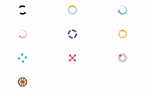
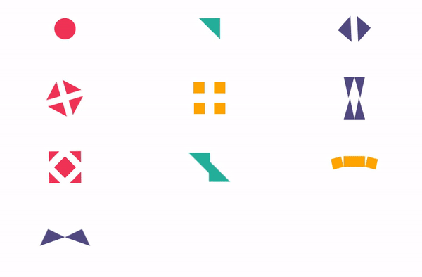
1、经典款
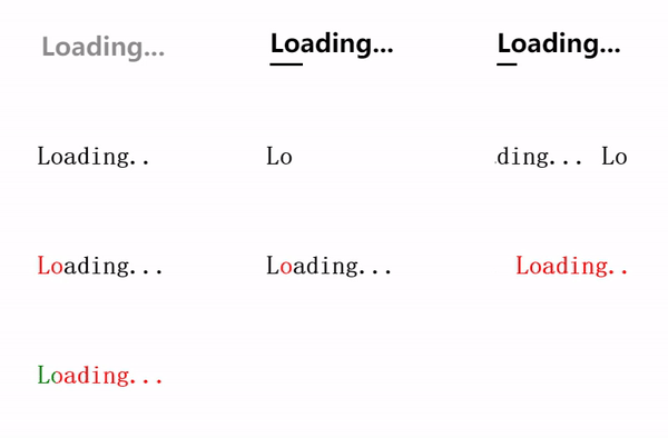
HTML代码
<div class="classic-1"></div>
<div class="classic-2"></div>
<div class="classic-3"></div>
<div class="classic-4"></div>
<div class="classic-5"></div>
<div class="classic-6"></div>
<div class="classic-7"></div>
<div class="classic-8"></div>
<div class="classic-9"></div>
<div class="classic-10"></div>
CSS代码
[class*=classic]:before {
 content:"Loading...";
}
.classic-1 {
 font-weight: bold;
 font-family: sans-serif;
 font-size: 30px;
 animation:c1 1s linear infinite alternate;
}
@keyframes c1 {to{opacity: 0}}
.classic-2 {
 font-weight: bold;
 font-family: sans-serif;
 font-size: 30px;
 padding-bottom: 8px;
 background:linear-gradient(currentColor 0 0) bottom left/0% 3px no-repeat;
 animation:c2 2s linear infinite;
}
@keyframes c2 {to{background-size: 100% 3px}}
.classic-3 {
 font-weight: bold;
 font-family: sans-serif;
 font-size: 30px;
 padding:0 5px 8px 0;
 background:repeating-linear-gradient(90deg,currentColor 0 8%,#0000 0 10%) 200% 100%/200% 3px no-repeat;
 animation:c3 2s steps(6) infinite;
}
@keyframes c3 {to{background-position: 80% 100%}}
.classic-4 {
 font-weight: bold;
 font-family: monospace;
 font-size: 30px;
 clip-path: inset(0 3ch 0 0);
 animation:c4 1s steps(4) infinite;
}
@keyframes c4 {to{clip-path: inset(0 -1ch 0 0)}}
.classic-5 {
 font-weight: bold;
 font-family: monospace;
 font-size: 30px;
 clip-path: inset(0 100% 0 0);
 animation:c5 2s steps(11) infinite;
}
@keyframes c5 {to{clip-path: inset(0 -1ch 0 0)}}
.classic-6 {
 --c:#000;
 font-weight: bold;
 font-family: monospace;
 font-size: 30px;
 color:#0000;
 overflow:hidden;
 text-shadow:0 0 var(--c),11ch 0 var(--c);
 animation:c6 2s infinite linear;
}
@keyframes c6 {to{text-shadow:-11ch 0 var(--c),0ch 0 var(--c)}}
.classic-7 {
 font-weight: bold;
 font-family: monospace;
 font-size: 30px;
 color:#0000;
 background:linear-gradient(90deg,red calc(50% + 0.5ch),#000 0) right/calc(200% + 1ch) 100%;
 -webkit-background-clip:text;
 background-clip:text;
 animation:c7 2s infinite steps(11);
}
@keyframes c7 {to{background-position: left}}
.classic-8 {
 font-weight: bold;
 font-family: monospace;
 font-size: 30px;
 color:#0000;
 background:linear-gradient(90deg,#000 calc(50% - 0.5ch),red 0 calc(50% + 0.5ch),#000 0) right/calc(200% + 1ch) 100%;
 -webkit-background-clip:text;
 background-clip:text;
 animation:c8 2s infinite steps(11);
}
@keyframes c8 {to{background-position: left}}
.classic-9 {
 font-weight: bold;
 font-family: monospace;
 font-size: 30px;
 color:#0000;
 overflow:hidden;
 text-shadow:0 0 #000,11ch 0 green,22ch 0 red,33ch 0 blue,44ch 0 #000;
 animation:c9 5s infinite cubic-bezier(0.3,1,0,1);
}
@keyframes c9 {
 25% {text-shadow:-11ch 0 #000, 0ch 0 green, 11ch 0 red, 22ch 0 blue,33ch 0 #000}
 50% {text-shadow:-22ch 0 #000,-11ch 0 green, 0ch 0 red, 11ch 0 blue,22ch 0 #000}
 75% {text-shadow:-33ch 0 #000,-22ch 0 green,-11ch 0 red, 0ch 0 blue,11ch 0 #000}
 100%{text-shadow:-44ch 0 #000,-33ch 0 green,-22ch 0 red,-11ch 0 blue, 0ch 0 #000}
}
.classic-10 {
 font-weight: bold;
 font-family: monospace;
 font-size: 30px;
 color:#0000;
 background: linear-gradient(90deg,#000 25%,green 0 50%,red 0 75%,blue 0) 0 0/400% 100%;
 -webkit-background-clip:text;
 background-clip:text;
 animation:c10 5s infinite cubic-bezier(0.3,1,0,1);
}
@keyframes c10 {
 25% {background-position: calc(1*100%/3) 0}
 50% {background-position: calc(2*100%/3) 0}
 75% {background-position: calc(3*100%/3) 0}
 100%{background-position: calc(4*100%/3) 0}
}
/**/
body {
 display: grid;
 grid-template-columns: repeat(auto-fit,minmax(250px,1fr));
 grid-auto-rows: 130px;
 place-items:center;
}
* {
 box-sizing: border-box;
}
2、无限循环款
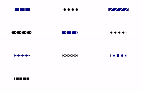
HTML代码
<div class="infinity-1"></div>
<div class="infinity-2"></div>
<div class="infinity-3"></div>
<div class="infinity-4"></div>
<div class="infinity-5"></div>
<div class="infinity-6"></div>
<div class="infinity-7"></div>
<div class="infinity-8"></div>
<div class="infinity-9"></div>
<div class="infinity-10"></div>
CSS代码
.infinity-1 {
 width:90px;
 height:14px;
 background: repeating-linear-gradient(90deg, currentColor 0 calc(25% - 5px),#0000 0 25%) left/calc(4*100%/3) 100%;
 animation:i1 0.5s infinite linear;
}
@keyframes i1 {
 100% {background-position: right}
}
.infinity-2 {
 width:90px;
 height:14px;
 background: radial-gradient(circle closest-side, currentColor 92%,#0000 ) calc(100%/3) 0/calc(100%/4) 100%;
 animation:i2 0.5s infinite linear;
}
@keyframes i2 {
 100% {background-position: 0 0}
}
.infinity-3 {
 width:calc(80px / 0.707); /* 0.707 = cos(45deg) */
 height:14px;
 background: repeating-linear-gradient(-45deg, currentColor 0 15px,#0000 0 20px) left/200% 100%;
 animation:i3 2s infinite linear;
}
@keyframes i3 {
 100% {background-position:right}
}
.infinity-4 {
 width:calc(80px / 0.707);
 height:14px;
 background:
 repeating-linear-gradient(135deg, currentColor 0 15px,#0000 0 20px) left top,
 repeating-linear-gradient( 45deg, currentColor 0 15px,#0000 0 20px) left bottom;
 background-size: 200% 50%;
 background-repeat: no-repeat;
 animation:i4 2s infinite linear;
}
@keyframes i4 {
 100% {background-position:top right,bottom right}
}
.infinity-5 {
 width:90px;
 height:14px;
 background:
 radial-gradient(circle 10px at right 7px top 50%,#0000 92%,currentColor),
 radial-gradient(circle 10px at right 0 top 50%,currentColor 92%,#0000);
 background-size: calc(100%/3) 100%;
 background-position: 50% 0%;
 animation:i5 .5s infinite linear;
}
@keyframes i5 {
 100% {background-position: 0% 0%}
}
.infinity-6 {
 width:90px;
 height:14px;
 background:
 conic-gradient(from 45deg at calc(100% - 7px) 50%,currentColor 90deg,#0000 0),
 conic-gradient(from -135deg at 7px 50%,currentColor 90deg,#0000 0);
 background-position: calc(100%/3) 0;
 background-size:calc(100%/4) 100%;
 animation:i6 0.5s infinite linear;
}
@keyframes i6 {
 100% {background-position: 0 0}
}
.infinity-7 {
 width:90px;
 height:14px;
 background:
 linear-gradient(90deg,currentColor 50%,#0000 0) repeat-x,
 conic-gradient(from 45deg at right 7px top 50%,currentColor 90deg,#0000 0);
 background-position: calc(100%/3) 50%;
 background-size:calc(100%/4) 60%,calc(100%/4) 100%;
 animation:i7 0.5s infinite linear;
}
@keyframes i7 {
 100% {background-position: 0 50%}
}
.infinity-8 {
 width:90px;
 height:12px;
 background:
 linear-gradient(90deg ,currentColor 50%,#0000 0) 0 0%,
 linear-gradient(-90deg,currentColor 50%,#0000 0) 0 50%,
 linear-gradient(90deg ,currentColor 50%,#0000 0) 0 100%;
 background-size: 8px calc(100%/3);
 background-repeat: repeat-x;
 animation:i8 .25s infinite linear;
}
@keyframes i8 {
 100% {background-position: -8px 0%,-8px 50%,-8px 100%}
}
.infinity-9 {
 width:90px;
 height:14px;
 background:
 linear-gradient(90deg,#0000 16px, currentColor 0 30px, #0000 0),
 radial-gradient(circle closest-side at 68% 50%, currentColor 92%,#0000),
 conic-gradient(from 45deg at calc(100% - 7px) 50%,currentColor 90deg,#0000 0),
 conic-gradient(from -135deg at 7px 50%,currentColor 90deg,#0000 0);
 background-position: 0 0;
 background-size:calc(3*100%/4) 100%;
 background-repeat: repeat-x;
 animation:i9 2s infinite linear;
}
@keyframes i9 {
 100% {background-position: -300% 0}
}
.infinity-10 {
 width:90px;
 height:12px;
 background:
 linear-gradient( 90deg,currentColor 50%,#0000 0) 0 0%,
 linear-gradient(-90deg,currentColor 50%,#0000 0) 0 0%;
 background-size: 20px 100%;
 background-repeat: repeat-x;
 animation:i10 1s infinite linear;
}
@keyframes i10 {
 100% {background-position: -20px 0%,20px 0%}
}
/**/
body {
 display: grid;
 grid-template-columns: repeat(auto-fit,minmax(250px,1fr));
 grid-auto-rows: 130px;
 place-items:center;
}
div[class]:nth-child(odd) {
 color:darkblue;
}
* {
 box-sizing: border-box;
}
3、多点动画款
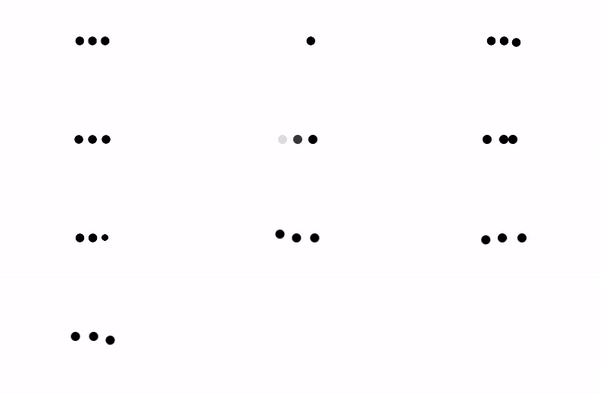
HTML代码
<div class="dots-1"></div>
<div class="dots-2"></div>
<div class="dots-3"></div>
<div class="dots-4"></div>
<div class="dots-5"></div>
<div class="dots-6"></div>
<div class="dots-7"></div>
<div class="dots-8"></div>
<div class="dots-9"></div>
<div class="dots-10"></div>
CSS代码
.dots-1 {
 width:50px;
 height:12px;
 background: radial-gradient(circle closest-side,currentColor 90%,#0000) 0 0/33% 100% space;
 clip-path: inset(0 100% 0 0);
 animation:d1 1s steps(4) infinite;
}
@keyframes d1 {to{clip-path: inset(0 -34% 0 0)}}
.dots-2 {
 width:50px;
 height:12px;
 background: radial-gradient(circle closest-side,currentColor 90%,#0000) 0 0/33% 100% no-repeat;
 animation:d2 1s steps(3) infinite;
}
@keyframes d2 {to{background-position:150% 0}}
.dots-3 {
 width:50px;
 height:24px;
 background:
 radial-gradient(circle closest-side,currentColor 90%,#0000) 0% 50%,
 radial-gradient(circle closest-side,currentColor 90%,#0000) 50% 50%,
 radial-gradient(circle closest-side,currentColor 90%,#0000) 100% 50%;
 background-size:calc(100%/3) 12px;
 background-repeat: no-repeat;
 animation:d3 1s infinite linear;
}
@keyframes d3 {
 20%{background-position:0% 0%, 50% 50%,100% 50%}
 40%{background-position:0% 100%, 50% 0%,100% 50%}
 60%{background-position:0% 50%, 50% 100%,100% 0%}
 80%{background-position:0% 50%, 50% 50%,100% 100%}
}
.dots-4 {
 width:50px;
 height:12px;
 background:
 radial-gradient(circle closest-side at left 6px top 50%,currentColor 90%,#0000),
 radial-gradient(circle closest-side ,currentColor 90%,#0000),
 radial-gradient(circle closest-side at right 6px top 50%,currentColor 90%,#0000);
 background-size:100% 100%;
 background-repeat: no-repeat;
 animation:d4 1s infinite alternate;
}
@keyframes d4 {
 to{width:20px;height:24px}
}
.dots-5 {
 width:12px;
 height:12px;
 background: #000000;
 border-radius: 50%;
 box-shadow: 20px 0 #00000022,-20px 0 #000000;
 animation:d5 1s infinite linear alternate;
}
@keyframes d5 {
 0% {box-shadow: 20px 0 #000000,-20px 0 #00000022;background: #000000}
 33%{box-shadow: 20px 0 #000000,-20px 0 #00000022;background: #00000022}
 66%{box-shadow: 20px 0 #00000022,-20px 0 #000000;background: #00000022}
}
.dots-6 {
 width:12px;
 height:12px;
 background: currentColor;
 border-radius: 50%;
 box-shadow: 12px 0 currentColor,-24px 0 currentColor;
 animation:d6 1s infinite linear alternate;
}
@keyframes d6 {
 50% {box-shadow: 12px 0 currentColor,-12px 0 currentColor}
 100%{box-shadow: 24px 0 currentColor,-12px 0 currentColor}
}
.dots-7 {
 width:50px;
 height:12px;
 background:
 radial-gradient(circle closest-side,currentColor 90%,#0000) 0% 50%,
 radial-gradient(circle closest-side,currentColor 90%,#0000) 50% 50%,
 radial-gradient(circle closest-side,currentColor 90%,#0000) 100% 50%;
 background-size:calc(100%/3) 100%;
 background-repeat: no-repeat;
 animation:d7 1s infinite linear;
}
@keyframes d7 {
 33%{background-size:calc(100%/3) 0% ,calc(100%/3) 100%,calc(100%/3) 100%}
 50%{background-size:calc(100%/3) 100%,calc(100%/3) 0% ,calc(100%/3) 100%}
 66%{background-size:calc(100%/3) 100%,calc(100%/3) 100%,calc(100%/3) 0% }
}
.dots-8 {
 width:12px;
 height:12px;
 position: relative;
}
.dots-8::before,
.dots-8::after {
 content:"";
 position: absolute;
 inset:0;
 border-radius:50%;
 background:currentColor;
}
.dots-8::before {
 box-shadow: -24px 0 currentColor;
 animation:d8-1 1s infinite linear;
}
.dots-8::after {
 transform: rotate(0deg) translateX(24px);
 animation:d8-2 1s infinite linear;
}
@keyframes d8-1 {
 100%{transform:translateX(24px)}
}
@keyframes d8-2 {
 100%{transform:rotate(-180deg) translateX(24px)}
}
.dots-9 {
 width:12px;
 height:12px;
 position: relative;
 animation:d9-0 2s infinite steps(2);
}
.dots-9::before,
.dots-9::after {
 content:"";
 position: absolute;
 inset:0;
 border-radius:50%;
 background:currentColor;
}
.dots-9::before {
 box-shadow: 24px 0 currentColor;
 transform:translateX(-24px);
 animation:d9-1 1s infinite linear alternate;
}
.dots-9::after {
 transform:translateX(12px) rotate(0deg) translateX(12px);
 animation:d9-2 1s infinite linear alternate;
}
@keyframes d9-0 {
 0% ,49.9% {transform:scale(1)}
 50%,100%{transform:scale(-1)}
}
@keyframes d9-1 {
 100%{box-shadow: 48px 0 currentColor}
}
@keyframes d9-2 {
 100%{transform:translateX(12px) rotate(-180deg) translateX(12px)}
}
.dots-10 {
 width:12px;
 height:12px;
 position: relative;
}
.dots-10::before,
.dots-10::after {
 content:"";
 position: absolute;
 inset:0;
 border-radius:50%;
 background:currentColor;
}
.dots-10::before {
 box-shadow: -24px 0 currentColor;
 animation:d10-1 2s infinite linear;
}
.dots-10::after {
 transform: rotate(0deg) translateX(24px);
 animation:d10-2 2s infinite linear;
}
@keyframes d10-1 {
 50%{transform:translateX(24px)}
}
@keyframes d10-2 {
 100%{transform:rotate(-360deg) translateX(24px)}
}
/**/
body {
 display: grid;
 grid-template-columns: repeat(auto-fit,minmax(250px,1fr));
 grid-auto-rows: 130px;
 place-items:center;
}
* {
 box-sizing: border-box;
}
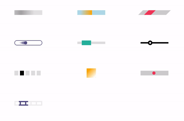
4、条形款
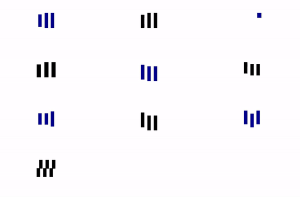
HTML代码
<div class="bars-1"></div>
<div class="bars-2"></div>
<div class="bars-3"></div>
<div class="bars-4"></div>
<div class="bars-5"></div>
<div class="bars-6"></div>
<div class="bars-7"></div>
<div class="bars-8"></div>
<div class="bars-9"></div>
<div class="bars-10"></div>
CSS代码
.bars-1 {
 width:50px;
 height:40px;
 --c:linear-gradient(90deg, #0000 4px,currentColor 0 calc(100% - 4px),#0000 0);
 background:
 var(--c) 0% 50%,
 var(--c) 50% 50%,
 var(--c) 100% 50%;
 background-size:calc(100%/3) 100%;
 background-repeat: no-repeat;
 animation:b1 1s infinite linear;
}
@keyframes b1 {
 33%{background-size:calc(100%/3) 10% ,calc(100%/3) 100%,calc(100%/3) 100%}
 50%{background-size:calc(100%/3) 100%,calc(100%/3) 10% ,calc(100%/3) 100%}
 66%{background-size:calc(100%/3) 100%,calc(100%/3) 100%,calc(100%/3) 10% }
}
.bars-2 {
 width:50px;
 height:40px;
 --c:linear-gradient(90deg, #0000 4px,currentColor 0 calc(100% - 4px),#0000 0);
 background:
 var(--c) 0% 100%,
 var(--c) 50% 100%,
 var(--c) 100% 100%;
 background-size:calc(100%/3) 100%;
 background-repeat: no-repeat;
 animation:b2 1s infinite linear;
}
@keyframes b2 {
 20% {background-size:calc(100%/3) 60% ,calc(100%/3) 100%,calc(100%/3) 100%}
 40% {background-size:calc(100%/3) 80% ,calc(100%/3) 60% ,calc(100%/3) 100%}
 60% {background-size:calc(100%/3) 100%,calc(100%/3) 80% ,calc(100%/3) 60% }
 80% {background-size:calc(100%/3) 100%,calc(100%/3) 100%,calc(100%/3) 80% }
}
.bars-3 {
 width:50px;
 height:40px;
 background:
 linear-gradient(#0000 calc(1*100%/6),currentColor 0 calc(3*100%/6),#0000 0) left bottom,
 linear-gradient(#0000 calc(2*100%/6),currentColor 0 calc(4*100%/6),#0000 0) center bottom,
 linear-gradient(#0000 calc(3*100%/6),currentColor 0 calc(5*100%/6),#0000 0) right bottom;
 background-size:calc(100%/3 - 6px) 600%;
 background-repeat: no-repeat;
 animation:b3 1s infinite linear;
}
@keyframes b3 {
 100% {background-position: left top,center top,right top }
}
.bars-4 {
 width:50px;
 height:40px;
 --c:linear-gradient(#000 calc(50% - 10px),#0000 0 calc(50% + 10px),currentColor 0);
 background:
 var(--c) 0% 100%,
 var(--c) 50% 100%,
 var(--c) 100% 100%;
 background-size:calc(100%/3 - 6px) calc(200% + 20px);
 background-repeat: no-repeat;
 animation:b4 1s infinite linear;
}
@keyframes b4 {
 33% {background-position: 0% 50%,50% 100%,100% 100%}
 50% {background-position: 0% 0%,50% 50%,100% 100%}
 66% {background-position: 0% 0%,50% 0%,100% 50%}
 100% {background-position: 0% 0%,50% 0%,100% 0%}
}
.bars-5 {
 width:50px;
 height:60px;
 --c:linear-gradient(90deg, #0000 4px,currentColor 0 calc(100% - 4px),#0000 0);
 background:
 var(--c) 0% 100%,
 var(--c) 50% 100%,
 var(--c) 100% 100%;
 background-size:calc(100%/3) 65%;
 background-repeat: no-repeat;
 animation:b5 1s infinite linear;
}
@keyframes b5 {
 20% {background-position:0% 50% ,50% 100%,100% 100%}
 40% {background-position:0% 0% ,50% 50% ,100% 100%}
 60% {background-position:0% 100%,50% 0% ,100% 50% }
 80% {background-position:0% 100%,50% 100%,100% 0% }
}
.bars-6 {
 width:50px;
 height:60px;
 --c:linear-gradient(90deg, #0000 4px,currentColor 0 calc(100% - 4px),#0000 0);
 background:
 var(--c) 0% 50%,
 var(--c) 50% 50%,
 var(--c) 100% 50%;
 background-size:calc(100%/3) 50%;
 background-repeat: no-repeat;
 animation:b6 1s infinite linear;
}
@keyframes b6 {
 20% {background-position:0% 0% ,50% 50% ,100% 50% }
 40% {background-position:0% 100%,50% 0% ,100% 50% }
 60% {background-position:0% 50% ,50% 100%,100% 0% }
 80% {background-position:0% 50% ,50% 50% ,100% 100%}
}
.bars-7 {
 width:50px;
 height:60px;
 --c:linear-gradient(90deg, #0000 4px,currentColor 0 calc(100% - 4px),#0000 0);
 background:
 var(--c) 0% 50%,
 var(--c) 50% 50%,
 var(--c) 100% 50%;
 background-size:calc(100%/3) 50%;
 background-repeat: no-repeat;
 animation:b7 1s infinite linear alternate;
}
@keyframes b7 {
 20% {background-size:calc(100%/3) 20% ,calc(100%/3) 50% ,calc(100%/3) 50% }
 40% {background-size:calc(100%/3) 100%,calc(100%/3) 20% ,calc(100%/3) 50% }
 60% {background-size:calc(100%/3) 50% ,calc(100%/3) 100%,calc(100%/3) 20% }
 80% {background-size:calc(100%/3) 50% ,calc(100%/3) 50% ,calc(100%/3) 100%}
}
.bars-8 {
 width:50px;
 height:60px;
 --c:linear-gradient(90deg, #0000 4px,currentColor 0 calc(100% - 4px),#0000 0);
 background:
 var(--c) 0% 100%,
 var(--c) 50% 100%,
 var(--c) 100% 100%;
 background-size:calc(100%/3) 65%;
 background-repeat: no-repeat;
 animation:b8 1s infinite linear;
}
@keyframes b8 {
 16.67% {background-position:0% 0% ,50% 100%,100% 100%}
 33.33% {background-position:0% 0% ,50% 0% ,100% 100%}
 50% {background-position:0% 0% ,50% 0% ,100% 0% }
 66.67% {background-position:0% 100%,50% 0% ,100% 0% }
 83.33% {background-position:0% 100%,50% 100%,100% 0% }
}
.bars-9 {
 width:50px;
 height:60px;
 --c:linear-gradient(90deg, #0000 4px,currentColor 0 calc(100% - 4px),#0000 0);
 background:
 var(--c) 0% 50%,
 var(--c) 50% 50%,
 var(--c) 100% 50%;
 background-size:calc(100%/3) 60%;
 background-repeat: no-repeat;
 animation:b9 1s infinite;
}
@keyframes b9 {
 33% {background-position:0% 0% ,50% 100%,100% 0% }
 66% {background-position:0% 100%,50% 0% ,100% 100%}
}
.bars-10 {
 width:51px;
 height:45px;
 background:
 linear-gradient(90deg, #0000 4px,currentColor 0 calc(100% - 4px),#0000 0) 50% 0,
 linear-gradient(90deg, #0000 4px,currentColor 0 calc(100% - 4px),#0000 0) 50% 100%;
 background-size:calc(100%/3) 50%;
 background-repeat: repeat-x;
 animation:b10 1.5s infinite;
}
@keyframes b10 {
 33% {background-position: calc(50% - 4px) 0% ,calc(50% + 4px) 100%}
 66% {background-position: calc(50% - 4px) 100%,calc(50% + 4px) 0% }
 100% {background-position: 50% 100% ,50% 0% }
}
/**/
body {
 display: grid;
 grid-template-columns: repeat(auto-fit,minmax(250px,1fr));
 grid-auto-rows: 130px;
 place-items:center;
}
div[class]:nth-child(odd) {
 color:darkblue;
}
* {
 box-sizing: border-box;
}
5、旋转动画款
HTML代码
<div class="spinner-1"></div>
<div class="spinner-2"></div>
<div class="spinner-3"></div>
<div class="spinner-4"></div>
<div class="spinner-5"></div>
<div class="spinner-6"></div>
<div class="spinner-7"></div>
<div class="spinner-8"></div>
<div class="spinner-9"></div>
<div class="spinner-10"></div>
CSS代码
.spinner-1 {
 width:50px;
 height:50px;
 border-radius:50%;
 border:8px solid;
 border-color:#000 #0000;
 animation:s1 1s infinite;
}
@keyframes s1 {to{transform: rotate(.5turn)}}
.spinner-2 {
 width:50px;
 height:50px;
 border-radius:50%;
 border:8px solid;
 border-color:lightblue;
 border-right-color: orange;
 animation:s2 1s infinite linear;
}
@keyframes s2 {to{transform: rotate(1turn)}}
.spinner-3 {
 width:50px;
 height:50px;
 border-radius:50%;
 background:conic-gradient(#0000 10%,#25b09b);
 -webkit-mask:radial-gradient(farthest-side,#0000 calc(100% - 8px),#000 0);
 animation:s3 1s infinite linear;
}
@keyframes s3 {to{transform: rotate(1turn)}}
.spinner-4 {
 width:50px;
 height:50px;
 border-radius:50%;
 padding:1px;
 background:conic-gradient(#0000 10%,#f03355) content-box;
 -webkit-mask:
 repeating-conic-gradient(#0000 0deg,#000 1deg 20deg,#0000 21deg 36deg),
 radial-gradient(farthest-side,#0000 calc(100% - 9px),#000 calc(100% - 8px));
 -webkit-mask-composite: destination-in;
 mask-composite: intersect;
 animation:s4 1s infinite steps(10);
}
@keyframes s4 {to{transform: rotate(1turn)}}
.spinner-5 {
 width:50px;
 height:50px;
 border-radius:50%;
 background:#514b82;
 -webkit-mask:
 repeating-conic-gradient(#0000 0deg,#000 1deg 70deg,#0000 71deg 90deg),
 radial-gradient(farthest-side,#0000 calc(100% - 9px),#000 calc(100% - 8px));
 -webkit-mask-composite: destination-in;
 mask-composite: intersect;
 animation:s5 1s infinite ;
}
@keyframes s5 {to{transform: rotate(.5turn)}}
.spinner-6 {
 width:50px;
 height:50px;
 border-radius:50%;
 padding:3px;
 background:
 radial-gradient(farthest-side,#ffa516 95%,#0000) 50% 0/12px 12px no-repeat,
 radial-gradient(farthest-side,#0000 calc(100% - 5px),#ffa516 calc(100% - 4px)) content-box;
 animation:s6 2s infinite ;
}
@keyframes s6 {to{transform: rotate(1turn)}}
.spinner-7 {
 width:50px;
 height:50px;
 --c:radial-gradient(farthest-side,#25b09b 92%,#0000);
 background:
 var(--c) 50% 0,
 var(--c) 50% 100%,
 var(--c) 100% 50%,
 var(--c) 0 50%;
 background-size:12px 12px;
 background-repeat:no-repeat;
 animation:s7 1s infinite;
}
@keyframes s7 {to{transform: rotate(.5turn)}}
.spinner-8 {
 width:50px;
 height:50px;
 color:#f03355;
 --c:radial-gradient(farthest-side,currentColor 92%,#0000);
 background:
 var(--c) 50% 0 /12px 12px,
 var(--c) 50% 100%/12px 12px,
 var(--c) 100% 50%/12px 12px,
 var(--c) 0 50%/12px 12px,
 var(--c) 50% 50%/12px 12px,
 linear-gradient(currentColor 0 0) 50% 50%/4px 100%,
 linear-gradient(currentColor 0 0) 50% 50%/100% 4px;
 background-repeat:no-repeat;
 animation:s8 1s infinite linear;
}
@keyframes s8 {to{transform: rotate(.5turn)}}
.spinner-9 {
 width:50px;
 height:50px;
 border-radius:50%;
 background:
 radial-gradient(farthest-side,#f03355 95%,#0000) 50% 1px/12px 12px no-repeat,
 radial-gradient(farthest-side,#0000 calc(100% - 14px),#ccc 0);
 animation:s9 2s infinite linear;
}
@keyframes s9 {to{transform: rotate(1turn)}}
.spinner-10 {
 width:50px;
 height:50px;
 border-radius:50%;
 color:#854f1d;
 background:
 linear-gradient(currentColor 0 0) center/100% 4px,
 linear-gradient(currentColor 0 0) center/4px 100%,
 radial-gradient(farthest-side,#0000 calc(100% - 6px),currentColor calc(100% - 5px)),
 radial-gradient(circle 6px,currentColor 94%,#0000 0);
 background-repeat: no-repeat;
 animation:s10 2s infinite linear;
 position: relative;
}
.spinner-10:before {
 content: "";
 position: absolute;
 inset:0;
 border-radius: inherit;
 background:inherit;
 transform:rotate(45deg);
}
@keyframes s10 {to{transform: rotate(.5turn)}}
/**/
body {
 display: grid;
 grid-template-columns: repeat(auto-fit,minmax(250px,1fr));
 grid-auto-rows: 130px;
 place-items:center;
}
* {
 box-sizing: border-box;
}
6、连续款
HTML代码
<div class="continuous-1"></div>
<div class="continuous-2"></div>
<div class="continuous-3"></div>
<div class="continuous-4"></div>
<div class="continuous-5"></div>
<div class="continuous-6"></div>
<div class="continuous-7"></div>
<div class="continuous-8"></div>
<div class="continuous-9"></div>
<div class="continuous-10"></div>
CSS代码
.continuous-1 {
 width: 120px;
 height:20px;
 background:
 linear-gradient(90deg,#0001 33%,#0005 50%,#0001 66%)
 #f2f2f2;
 background-size:300% 100%;
 animation: ct1 1s infinite linear;
}
@keyframes ct1 {
 0% {background-position: right}
}
.continuous-2 {
 width: 120px;
 height: 20px;
 background:
 linear-gradient(90deg, #0000 ,orange) left -50px top 0/50px 20px no-repeat
 lightblue;
 animation: ct2 1s infinite linear;
}
@keyframes ct2 {
 100% {background-position: right -50px top 0}
}
.continuous-3 {
 width: 120px;
 height: 20px;
 transform: skewX(-45deg);
 background:
 linear-gradient(#f03355 0 0) left -30px top 0/30px 20px no-repeat
 #ccc;
 animation: ct3 1s infinite linear;
}
@keyframes ct3 {
 100% {background-position: right -30px top 0}
}
.continuous-4 {
 width: 120px;
 height: 22px;
 border-radius: 40px;
 color: #514b82;
 border: 2px solid;
 position: relative;
 overflow: hidden;
}
.continuous-4::before {
 content: "";
 position: absolute;
 margin: 2px;
 width: 14px;
 top: 0;
 bottom: 0;
 left: -20px;
 border-radius: inherit;
 background: currentColor;
 box-shadow: -10px 0 12px 3px currentColor;
 clip-path: polygon(0 5%, 100% 0,100% 100%,0 95%,-30px 50%);
 animation: ct4 1s infinite linear;
}
@keyframes ct4 {
 100% {left: calc(100% + 20px)}
}
.continuous-5 {
 width: 120px;
 height: 20px;
 background:
 linear-gradient(#25b09b 0 0) left -40px top 0/40px 20px,
 linear-gradient(#ddd 0 0) center/100% 50%;
 background-repeat: no-repeat;
 animation: ct5 1s infinite linear;
}
@keyframes ct5 {
 100% {background-position: right -40px top 0,center}
}
.continuous-6 {
 width: 120px;
 height: 20px;
 background:
 radial-gradient(circle 10px,#000 95%,#0000 ) right /calc(200% + 20px) 100%,
 linear-gradient(#000 0 0) center/100% 6px;
 background-repeat: no-repeat;
 -webkit-mask: radial-gradient(circle 4px,#0000 93%,#000 ) right/calc(200% + 20px) 100%;
 animation: ct6 1s infinite linear;
}
@keyframes ct6 {
 100% {background-position: left;-webkit-mask-position:left}
}
.continuous-7 {
 width:120px;
 height:20px;
 -webkit-mask:linear-gradient(90deg,#000 70%,#0000 0) left/20% 100%;
 background:
 linear-gradient(#000 0 0) left -25% top 0 /20% 100% no-repeat
 #ddd;
 animation:ct7 1s infinite steps(6);
}
@keyframes ct7 {
 100% {background-position: right -25% top 0}
}
.continuous-8 {
 width: 40px;
 height: 40px;
 background:
 linear-gradient(to bottom right,#0000 calc(50% - 40px),#fff 50%,#0000 calc(50% + 40px))
 bottom right/calc(200% + 80px) calc(200% + 80px)
 orange;
 animation: ct8 1s infinite ;
}
@keyframes ct8 {
 100% {background-position: top left}
}
.continuous-9 {
 width: 120px;
 height: 20px;
 background:
 radial-gradient(circle closest-side,#f03355 94%,#0000) 50% 50%/calc(50% + 10px) 70% repeat-x
 #ccc;
 animation: ct9 1s infinite cubic-bezier(0.3,1,0,1);
}
@keyframes ct9 {
 100% {background-position: calc(200% - 5px)}
}
.continuous-10 {
 width: 120px;
 height: 20px;
 background: linear-gradient(#514b82 0 0) left -40px top 0/40px 100% no-repeat #eee;
 -webkit-mask:
 linear-gradient(#000 0 0) top /100% 5px no-repeat,
 linear-gradient(#000 0 0) bottom/100% 5px no-repeat,
 repeating-linear-gradient(90deg,#000 0 5px, #0000 0 20%) left/calc(100% - 5px) 100%;
 animation: ct10 1s infinite linear;
}
@keyframes ct10 {
 100% {background-position: right -40px top 0}
}
/**/
body {
 display: grid;
 grid-template-columns: repeat(auto-fit,minmax(250px,1fr));
 grid-auto-rows: 130px;
 place-items:center;
}
* {
 box-sizing: border-box;
}
7、进度条款
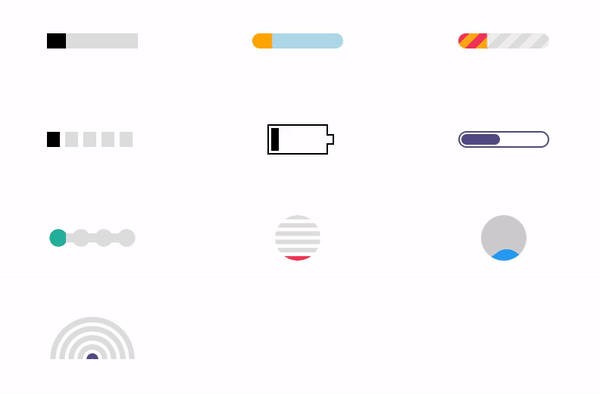
HTML代码
<div class="progress-1"></div>
<div class="progress-2"></div>
<div class="progress-3"></div>
<div class="progress-4"></div>
<div class="progress-5"></div>
<div class="progress-6"></div>
<div class="progress-7"></div>
<div class="progress-8"></div>
<div class="progress-9"></div>
<div class="progress-10"></div>
CSS代码
.progress-1 {
 width:120px;
 height:20px;
 background:
 linear-gradient(#000 0 0) left/0% 100% no-repeat
 #ddd;
 animation:p1 2s infinite linear;
}
@keyframes p1 {
 100% {background-size:100% 100%}
}
.progress-2 {
 width:120px;
 height:20px;
 border-radius: 20px;
 background:
 linear-gradient(orange 0 0) left/0% 100% no-repeat
 lightblue;
 animation:p2 2s infinite steps(10);
}
@keyframes p2 {
 100% {background-size:110% 100%}
}
.progress-3 {
 width:120px;
 height:20px;
 border-radius: 20px;
 background:
 repeating-linear-gradient(135deg,#f03355 0 10px,#ffa516 0 20px) left/0% 100% no-repeat,
 repeating-linear-gradient(135deg,#ddd 0 10px,#eee 0 20px) left/100% 100%;
 animation:p3 2s infinite;
}
@keyframes p3 {
 100% {background-size:100% 100%}
}
.progress-4 {
 width:120px;
 height:20px;
 -webkit-mask:linear-gradient(90deg,#000 70%,#0000 0) left/20% 100%;
 background:
 linear-gradient(#000 0 0) left/0% 100% no-repeat
 #ddd;
 animation:p4 2s infinite steps(6);
}
@keyframes p4 {
 100% {background-size:120% 100% }
}
.progress-5 {
 width:80px;
 height:40px;
 border:2px solid currentColor;
 border-right-color: transparent;
 padding:3px;
 background: repeating-linear-gradient(90deg,currentColor 0 10px,#0000 0 15px) left/0% 100% no-repeat content-box content-box;
 position: relative;
 animation:p4 2s infinite steps(6);
}
.progress-5::before {
 content:"";
 position: absolute;
 top:-2px;
 bottom:-2px;
 left:100%;
 width:10px;
 background:
 linear-gradient(
 #0000 calc(50% - 7px),currentColor 0 calc(50% - 5px),
 #0000 0 calc(50% + 5px),currentColor 0 calc(50% + 7px),#0000 0) left /100% 100%,
 linear-gradient(currentColor calc(50% - 5px),#0000 0 calc(50% + 5px),currentColor 0) left /2px 100%,
 linear-gradient(#0000 calc(50% - 5px),currentColor 0 calc(50% + 5px),#0000 0) right/2px 100%;
 background-repeat:no-repeat;
}
@keyframes p5 {
 100% {background-size:120% 100%}
}
.progress-6 {
 width:120px;
 height:22px;
 border-radius: 20px;
 color:#514b82;
 border:2px solid;
 position: relative;
}
.progress-6::before {
 content:"";
 position: absolute;
 margin:2px;
 inset:0 100% 0 0;
 border-radius: inherit;
 background:currentColor;
 animation:p6 1.5s infinite;
}
@keyframes p6 {
 100% {inset:0}
}
.progress-7 {
 width:120px;
 height:24px;
 -webkit-mask:
 radial-gradient(circle closest-side,#000 94%,#0000) 0 0/25% 100%,
 linear-gradient(#000 0 0) center/calc(100% - 12px) calc(100% - 12px) no-repeat;
 background:
 linear-gradient(#25b09b 0 0) left/0% 100% no-repeat
 #ddd;
 animation:p7 2s infinite linear;
}
@keyframes p7 {
 100% {background-size:100% 100%}
}
.progress-8 {
 width:60px;
 height:60px;
 border-radius: 50%;
 -webkit-mask:linear-gradient(0deg,#000 55%,#0000 0) bottom/100% 18.18%;
 background:
 linear-gradient(#f03355 0 0) bottom/100% 0% no-repeat
 #ddd;
 animation:p8 2s infinite steps(7);
}
@keyframes p8 {
 100% {background-size:100% 115%}
}
.progress-9 {
 --r1: 154%;
 --r2: 68.5%;
 width:60px;
 height:60px;
 border-radius: 50%;
 background:
 radial-gradient(var(--r1) var(--r2) at top ,#0000 79.5%,#269af2 80%) center left,
 radial-gradient(var(--r1) var(--r2) at bottom,#269af2 79.5%,#0000 80%) center center,
 radial-gradient(var(--r1) var(--r2) at top ,#0000 79.5%,#269af2 80%) center right,
 #ccc;
 background-size: 50.5% 220%;
 background-position: -100% 0%,0% 0%,100% 0%;
 background-repeat:no-repeat;
 animation:p9 2s infinite linear;
}
@keyframes p9 {
 33% {background-position: 0% 33% ,100% 33% ,200% 33% }
 66% {background-position: -100% 66%,0% 66% ,100% 66% }
 100% {background-position: 0% 100%,100% 100%,200% 100%}
}
.progress-10 {
 width:120px;
 height:60px;
 border-radius:200px 200px 0 0;
 -webkit-mask:repeating-radial-gradient(farthest-side at bottom ,#0000 0,#000 1px 12%,#0000 calc(12% + 1px) 20%);
 background:
 radial-gradient(farthest-side at bottom,#514b82 0 95%,#0000 0) bottom/0% 0% no-repeat
 #ddd;
 animation:p10 2s infinite steps(6);
}
@keyframes p10 {
 100% {background-size:120% 120%}
}
/**/
body {
 display: grid;
 grid-template-columns: repeat(auto-fit,minmax(250px,1fr));
 grid-auto-rows: 130px;
 place-items:center;
}
* {
 box-sizing: border-box;
}
8、晃动款
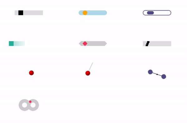
HTML代码
<div class="wobbling-1"></div>
<div class="wobbling-2"></div>
<div class="wobbling-3"></div>
<div class="wobbling-4"></div>
<div class="wobbling-5"></div>
<div class="wobbling-6"></div>
<div class="wobbling-7"></div>
<div class="wobbling-8"></div>
<div class="wobbling-9"></div>
<div class="wobbling-10"></div>
CSS代码
.wobbling-1 {
 width:120px;
 height:20px;
 background:
 linear-gradient(#000 0 0) left/20px 20px no-repeat
 #ddd;
 animation:w1 1s infinite linear;
}
@keyframes w1 {
 50% {background-position: right }
}
.wobbling-2 {
 width:120px;
 height:20px;
 border-radius: 20px;
 background:
 radial-gradient(farthest-side,orange 94%,#0000 ) left/20px 20px no-repeat
 lightblue;
 animation:w2 1s infinite linear;
}
@keyframes w2 {
 50% {background-position:right }
}
.wobbling-3 {
 width:120px;
 height:22px;
 border-radius: 40px;
 color:#514b82 ;
 border:2px solid;
 position: relative;
}
.wobbling-3::before {
 content:"";
 position: absolute;
 margin:2px;
 width:25%;
 top:0;
 bottom:0;
 left:0;
 border-radius: inherit;
 background:currentColor;
 animation:w3 1s infinite linear;
}
@keyframes w3 {
 50% {left:100%;transform: translateX(calc(-100% - 4px))}
}
.wobbling-4 {
 width:20px;
 height:20px;
 background:#25b09b;
 box-shadow:0 0 60px 15px #25b09b;
 transform: translate(-80px);
 clip-path:inset(0);
 animation:
 w4-1 0.5s ease-in-out infinite alternate,
 w4-2 1s ease-in-out infinite;
}
@keyframes w4-1 {
 100% {transform:translateX(80px)}
}
@keyframes w4-2 {
 33% {clip-path:inset(0 0 0 -100px)}
 50% {clip-path:inset(0 0 0 0) }
 83% {clip-path:inset(0 -100px 0 0)}
}
.wobbling-5 {
 width:120px;
 height:20px;
 clip-path: polygon(10px 0,calc(100% - 10px) 0,100% 50%,calc(100% - 10px) 100%,10px 100%,0 50%);
 background:
 conic-gradient(from 135deg at top ,#f03355 90deg,#0000 0) top left,
 conic-gradient(from -45deg at bottom,#f03355 90deg,#0000 0) bottom left,
 #ccc;
 background-size: 20px 50%;
 background-repeat: no-repeat;
 animation:w5 1s infinite linear;
}
@keyframes w5 {
 50% {background-position:top right,bottom right }
}
.wobbling-6 {
 width:120px;
 height:21px;
 background:
 linear-gradient(#000 0 0) left/10px 100% no-repeat
 #ddd;
 animation:w6 1s infinite cubic-bezier(0,0.2,1,1);
 position: relative;
}
.wobbling-6:before,
.wobbling-6:after {
 content: "";
 position: absolute;
 left:0;
 right:0;
 height:7px;
 background:
 linear-gradient(#000 0 0) left/10px 100% no-repeat
 #ddd;
 animation: inherit;
}
.wobbling-6:before {
 top:0;
 animation-timing-function: cubic-bezier(0,0,1,1);
}
.wobbling-6:after {
 bottom:0;
 animation-timing-function: cubic-bezier(0,0.4,1,1);
}
@keyframes w6 {
 50% {background-position: right }
}
.wobbling-7{
 width:20px;
 height:20px;
 border-radius:50%;
 background:radial-gradient(at 30% 30%,#0000,#000a) red;
 position: relative;
 left:0px;
 top: 0px;
 animation:
 w7-1 0.6s,
 w7-2 0.3s;
 animation-timing-function:cubic-bezier(.5,-200,.5,200);
 animation-iteration-count:infinite;
}
@keyframes w7-1 {
 100% { left:1px; }
}
@keyframes w7-2 {
 100% { top :0.3px; }
}
.wobbling-8{
 width:20px;
 height:20px;
 border-radius:50%;
 position: relative;
 transform-origin:50% -200%;
 background:radial-gradient(at 30% 30%,#0000,#000a) red;
 animation: w8 1s cubic-bezier(.5,-200,.5,200) infinite;
}
.wobbling-8:before {
 content: "";
 position: absolute;
 inset:-200% 8px 100%;
 background:#ddd;
}
@keyframes w8 {
 100% { transform:rotate(1deg)}
}
.wobbling-9{
 width:80px;
 height:20px;
 color:#514b82;
 background:
 radial-gradient(farthest-side,currentColor 98%,#0000) left /20px 20px,
 radial-gradient(farthest-side,currentColor 98%,#0000) right /20px 20px,
 radial-gradient(farthest-side,#000 98%,#0000) center/5px 5px,
 linear-gradient(currentColor 0 0) center/100% 2px;
 background-repeat: no-repeat;
 animation: w8 1s cubic-bezier(.5,-150,.5,150) infinite;
}
@keyframes w9 {
 100% { transform:rotate(1deg)}
}
.wobbling-10 {
 width: calc(100px - 14px);
 height: 50px;
 border-radius: 50px;
 background:
 radial-gradient(farthest-side,#0000 calc(100% - 15px),#ccc calc(100% - 14px) 99%,#0000) left,
 radial-gradient(farthest-side,#0000 calc(100% - 15px),#ccc calc(100% - 14px) 99%,#0000) right;
 background-size: calc(50% + 7px) 100%;
 background-repeat: no-repeat;
 position: relative;
 animation: w10-0 1s infinite linear;
}
.wobbling-10:before {
 content: "";
 position: absolute;
 inset:0;
 margin:auto;
 width:10px;
 height: 10px;
 border-radius: 50%;
 background:#f03355;
 transform-origin: -14px 50%;
 animation: w10-1 0.5s infinite linear;
}
@keyframes w10-0 {
 0%,49.99% { transform:scaleX(1)}
 50%,100% { transform:scaleX(-1)}
}
@keyframes w10-1 {
 100% { transform:rotate(1turn)}
}
/**/
body {
 display: grid;
 grid-template-columns: repeat(auto-fit,minmax(250px,1fr));
 grid-auto-rows: 130px;
 place-items:center;
}
* {
 box-sizing: border-box;
}
9、几何变形款
HTML代码
<div class="shapes-1"></div>
<div class="shapes-2"></div>
<div class="shapes-3"></div>
<div class="shapes-4"></div>
<div class="shapes-5"></div>
<div class="shapes-6"></div>
<div class="shapes-7"></div>
<div class="shapes-8"></div>
<div class="shapes-9"></div>
<div class="shapes-10"></div>
CSS代码
.shapes-1 {
 width: 40px;
 height: 40px;
 border-radius: 50%;
 background:#f03355;
 clip-path: polygon(0 0,100% 0,100% 100%,0 100%);
 animation: sh1 2s infinite cubic-bezier(0.3,1,0,1);
}
@keyframes sh1 {
 33% {border-radius: 0;background:#514b82 ;clip-path: polygon(0 0,100% 0,100% 100%,0 100%)}
 66% {border-radius: 0;background:#ffa516 ;clip-path: polygon(50% 0,50% 0,100% 100%,0 100%)}
}
.shapes-2 {
 width: 40px;
 height: 40px;
 background:#25b09b;
 clip-path: polygon(0 0,100% 0,100% 100%);
 animation: sh2 2s infinite cubic-bezier(0.3,1,0,1);
}
@keyframes sh2 {
 25% {clip-path: polygon(0 0,100% 0 ,0 100%)}
 50% {clip-path: polygon(0 0,100% 100%,0 100%)}
 75% {clip-path: polygon(100% 0,100% 100%,0 100%)}
 100% {clip-path: polygon(100% 0,100% 100%,0 0 )}
}
.shapes-3 {
 width: 50px;
 height: 50px;
 display: flex;
 transform:rotate(45deg);
 animation: sh3-0 1.5s infinite linear;
}
.shapes-3:before,
.shapes-3:after {
 content: "";
 width:50%;
 background:#514b82;
 clip-path: polygon(0 50%,100% 0,100% 100%);
 animation: inherit;
 animation-name: sh3-1;
}
.shapes-3:after {
 clip-path: polygon(0 0,100% 50%,0% 100%);
 animation-name: sh3-2;
}
@keyframes sh3-0 {
 25% {width:50px;height:50px;transform:rotate(0)}
 50% {width:50px;height:50px}
 75% {width:70.70px;height:35.35px}
 100%{width:70.70px;height:35.35px;transform:rotate(0)}
}
@keyframes sh3-1 {
 0%,25% {clip-path: polygon(0 50% ,100% 0,100% 100%);transform:translate(0.3px)}
 50% {clip-path: polygon(0 50% ,100% 0,100% 100%);transform:translate(-5px)}
 75% {clip-path: polygon(0 100%,0 0,100% 100%);transform:translate(-5px)}
 100% {clip-path: polygon(0 100%,0 0,100% 100%);transform:translate(17.7px)}
}
@keyframes sh3-2 {
 0%,25% {clip-path: polygon(0 0,100% 50%,0 100%);transform:translate(-0.3px) }
 50% {clip-path: polygon(0 0,100% 50%,0 100%);transform:translate(5px) }
 75% {clip-path: polygon(0 0,100% 0 ,100% 100%);transform:translate(5px)}
 100% {clip-path: polygon(0 0,100% 0 ,100% 100%);transform:translate(-17.7px) }
}
.shapes-4 {
 width: 40px;
 height: 40px;
 color:#f03355;
 background:
 conic-gradient(from -45deg at top 20px left 50% ,#0000 ,currentColor 1deg 90deg,#0000 91deg),
 conic-gradient(from 45deg at right 20px top 50% ,#0000 ,currentColor 1deg 90deg,#0000 91deg),
 conic-gradient(from 135deg at bottom 20px left 50% ,#0000 ,currentColor 1deg 90deg,#0000 91deg),
 conic-gradient(from -135deg at left 20px top 50% ,#0000 ,currentColor 1deg 90deg,#0000 91deg);
 animation: sh4 1.5s infinite cubic-bezier(0.3,1,0,1);
}
@keyframes sh4 {
 50% {width:60px;height: 60px;transform: rotate(180deg)}
 100% {transform: rotate(360deg)}
}
.shapes-5 {
 width: 40px;
 height: 40px;
 color:orange;
 background:
 linear-gradient(currentColor 0 0),
 linear-gradient(currentColor 0 0),
 linear-gradient(currentColor 0 0),
 linear-gradient(currentColor 0 0);
 background-size: 21px 21px;
 background-repeat:no-repeat;
 animation: sh5 1.5s infinite cubic-bezier(0.3,1,0,1);
}
@keyframes sh5 {
 0% {background-position: 0 0,100% 0 ,100% 100%,0 100%}
 33% {background-position: 0 0,100% 0 ,100% 100%,0 100%;width:60px;height: 60px}
 66% {background-position: 100% 0,100% 100%,0 100%,0 0 ;width:60px;height: 60px}
 100% {background-position: 100% 0,100% 100%,0 100%,0 0 }
}
.shapes-6 {
 width: 40px;
 height: 40px;
 display: grid;
 animation: sh6-0 1.5s infinite linear;
}
.shapes-6:before,
.shapes-6:after {
 content: "";
 grid-area: 1/1;
 background:#514b82;
 animation:
 sh6-1 1.5s infinite linear,
 sh6-2 1.5s infinite linear;
}
.shapes-6:after {
 --s:-1;
 animation-direction: reverse;
}
@keyframes sh6-0 {
 0%,9%,91%,100% {background:#514b82}
 10%,90% {background:#0000}
}
@keyframes sh6-1 {
 0%,33% {clip-path: polygon(0 0,50% 100%,100% 0,100% 100%,0 100%)}
 66%,100% {clip-path: polygon(50% 0,50% 100%,50% 0,100% 100%,0 100%)}
}
@keyframes sh6-2 {
 0%,10%,90%,100% {transform: scale(var(--s,1)) translateY(0)}
 33%,66% {transform: scale(var(--s,1)) translateY(50%)}
}
.shapes-7 {
 width: 40px;
 height: 40px;
 color:#f03355;
 position: relative;
 background:
 conic-gradient(from 134deg at top ,currentColor 92deg,#0000 0) top,
 conic-gradient(from -46deg at bottom,currentColor 92deg,#0000 0) bottom;
 background-size:100% 50%;
 background-repeat: no-repeat;
}
.shapes-7:before {
 content:'';
 position: absolute;
 inset:0;
 background:
 conic-gradient(from -135deg at top 0 left 22px ,#0000 ,currentColor 1deg 90deg,#0000 0),
 conic-gradient(from -45deg at right 0 top 22px ,#0000 ,currentColor 1deg 90deg,#0000 0),
 conic-gradient(from 45deg at bottom 0 right 22px ,#0000 ,currentColor 1deg 90deg,#0000 0),
 conic-gradient(from 135deg at left 0 bottom 20px ,#0000 ,currentColor 1deg 90deg,#0000 0);
 animation: sh7 1.5s infinite cubic-bezier(0.3,1,0,1);
}
@keyframes sh7 {
 33% {inset:-10px;transform: rotate(0deg)}
 66% {inset:-10px;transform: rotate(90deg)}
 100% {inset:0 ;transform: rotate(90deg)}
}
.shapes-8 {
 width: 40px;
 height: 40px;
 display: grid;
 animation: sh8-0 1.5s infinite linear;
}
.shapes-8:before,
.shapes-8:after {
 content: "";
 grid-area: 1/1;
 background:#25b09b;
 clip-path: polygon(0 0%,100% 0,100% 100%);
 animation: inherit;
 animation-name: sh8-1;
}
.shapes-8:after {
 --s:-1;
}
@keyframes sh8-0 {
 66% {transform: skewX(0deg)}
 80%,100% {transform: skewX(-45deg)}
}
@keyframes sh8-1 {
 0% {transform:scale(var(--s,1)) translate(-0.5px,0)}
 33% {transform:scale(var(--s,1)) translate(calc(1px - 50%),calc(1px - 50%))}
 66% {transform:scale(var(--s,1)) translate(calc(1px - 50%),0%)}
 100% {transform:scale(var(--s,1)) translate(calc(0.5px - 50%),0%)}
}
.shapes-9 {
 width: 40px;
 height: 20px;
 background:orange;
 position: relative;
 animation: sh9-0 1.5s infinite linear;
}
.shapes-9:before,
.shapes-9:after {
 content:"";
 position: absolute;
 background:inherit;
 bottom: 100%;
 width: 50%;
 height: 100%;
 animation: inherit;
 animation-name: sh9-1;
}
.shapes-9:before {
 left:0;
 transform-origin: bottom left;
 --s:-1;
}
.shapes-9:after {
 right:0;
 transform-origin: bottom right;
}
@keyframes sh9-0 {
 0%,10% {transform:translateY(0%) scaleY(1)}
 49.99% {transform:translateY(-50%) scaleY(1)}
 50% {transform:translateY(-50%) scaleY(-1)}
 90%,100% {transform:translateY(-100%) scaleY(-1)}
}
@keyframes sh9-1 {
 10%,90% {transform: rotate(0deg)}
 50% {transform: rotate(calc(var(--s,1)*180deg))}
}
.shapes-10 {
 display: flex;
 width:50px;
 height:50px;
 animation: sh10-0 1.5s infinite linear;
}
.shapes-10:before,
.shapes-10:after {
 content: "";
 width:50%;
 background:#514b82;
 clip-path: polygon(0 0,100% 50%,0% 100%);
 animation: inherit;
 animation-name: sh10-1;
 transform-origin: bottom left;
}
.shapes-10:before {
 clip-path: polygon(0 50%,100% 0,100% 100%);
 transform-origin: bottom right;
 --s:-1;
}
@keyframes sh10-0 {
 0%,34.99% {transform: scaley(1)}
 35%,70% {transform: scaley(-1)}
 90%,100% {transform: scaley(-1) rotate(180deg)}
}
@keyframes sh10-1 {
 0%,10%,70%,100%{transform:translateY(-100%) rotate(calc(var(--s,1)*135deg))}
 35% {transform:translateY(0%) rotate(0deg)}
}
/**/
body {
 display: grid;
 grid-template-columns: repeat(auto-fit,minmax(250px,1fr));
 grid-auto-rows: 130px;
 place-items:center;
}
* {
 box-sizing: border-box;
}
10、脉动款
HTML代码
<div class="pulsing-1"></div>
<div class="pulsing-2"></div>
<div class="pulsing-3"></div>
<div class="pulsing-4"></div>
<div class="pulsing-5"></div>
<div class="pulsing-6"></div>
<div class="pulsing-7"></div>
<div class="pulsing-8"></div>
<div class="pulsing-9"></div>
<div class="pulsing-10" data-c="💯"></div>
CSS代码
.pulsing-1 {
 width:20px;
 height:20px;
 border-radius: 50%;
 background:#000;
 box-shadow: 0 0 0 0 #0004;
 animation:pl1 1s infinite;
}
@keyframes pl1 {
 100% {box-shadow: 0 0 0 30px #0000}
}
.pulsing-2 {
 width:20px;
 height:20px;
 border-radius: 50%;
 background:#000;
 box-shadow: 0 0 0 0 #0004;
 animation:pl2 1.5s infinite linear;
 position: relative;
}
.pulsing-2:before,
.pulsing-2:after {
 content:"";
 position: absolute;
 inset:0;
 border-radius: inherit;
 box-shadow: 0 0 0 0 #0004;
 animation: inherit;
 animation-delay: -0.5s;
}
.pulsing-2:after {
 animation-delay: -1s;
}
@keyframes pl2 {
 100% {box-shadow: 0 0 0 40px #0000}
}
.pulsing-3 {
 width:50px;
 height:50px;
 color:#dc1818;
 background:
 radial-gradient(circle at 60% 65%, currentColor 62%, #0000 65%) top left,
 radial-gradient(circle at 40% 65%, currentColor 62%, #0000 65%) top right,
 linear-gradient(to bottom left, currentColor 42%,#0000 43%) bottom left ,
 linear-gradient(to bottom right,currentColor 42%,#0000 43%) bottom right;
 background-size:50% 50%;
 background-repeat:no-repeat;
 position:relative;
}
.pulsing-3:after {
 content:"";
 position:absolute;
 inset:0;
 background:inherit;
 opacity:0.4;
 animation:pl3 1s infinite;
}
@keyframes pl3 {
 to {transform:scale(1.8);opacity:0}
}
.pulsing-4 {
 width:60px;
 height:60px;
 position:relative;
}
.pulsing-4:before,
.pulsing-4:after {
 content:"";
 position:absolute;
 border-radius: 50%;
 inset:0;
 background:
 radial-gradient(circle 10px,#f85c00 94%,#0000),
 repeating-conic-gradient(from -30deg,#0000 0 60deg,#f85c00 61deg 120deg);
 -webkit-mask:radial-gradient(circle 15px,#000 calc(100% - 6px),#0000 calc(100% - 5px) 94%,#000);
}
.pulsing-4:after {
 animation:pl4 1s infinite;
 transform: perspective(300px) translateZ(0px)
}
@keyframes pl4 {
 to {transform:perspective(300px) translateZ(150px);opacity:0}
}
.pulsing-5 {
 width:80px;
 height:80px;
 position:relative;
}
.pulsing-5:before,
.pulsing-5:after {
 content:"";
 position:absolute;
 inset:0;
 background:#ffb940;
 box-shadow: 0 0 0 50px;
 clip-path: polygon(50% 0%, 61% 35%, 98% 35%, 68% 57%, 79% 91%, 50% 70%, 21% 91%, 32% 57%, 2% 35%, 39% 35%);
}
.pulsing-5:after {
 animation:pl5 1s infinite;
 transform:perspective(300px) translateZ(0px)
}
@keyframes pl5 {
 to {transform:perspective(300px) translateZ(150px);opacity:0}
}
.pulsing-6 {
 width:40px;
 height:40px;
 position:relative;
 transform:rotate(45deg);
}
.pulsing-6:before,
.pulsing-6:after {
 content:"";
 position:absolute;
 inset:0;
 border-radius: 50% 50% 0 50%;
 background:#514b82;
 -webkit-mask:radial-gradient(circle 10px at 50% 50%,#0000 94%,#000);
}
.pulsing-6:after {
 animation:pl6 1s infinite;
 transform: perspective(300px) translateZ(0px)
}
@keyframes pl6 {
 to {transform:perspective(300px) translateZ(150px);opacity:0}
}
.pulsing-7 {
 width: 108px;
 height: 60px;
 color:#269af2;
 --c:radial-gradient(farthest-side,currentColor 96%,#0000);
 background:
 var(--c) 100% 100% /30% 60%,
 var(--c) 70% 0 /50% 100%,
 var(--c) 0 100% /36% 68%,
 var(--c) 27% 18% /26% 40%,
 linear-gradient(currentColor 0 0) bottom/67% 58%;
 background-repeat: no-repeat;
 position: relative;
}
.pulsing-7:after {
 content:"";
 position:absolute;
 inset:0;
 background:inherit;
 opacity:0.4;
 animation:pl7 1s infinite;
}
@keyframes pl7 {
 to {transform:scale(1.8);opacity:0}
}
.pulsing-8 {
 width:65px;
 height:117px;
 position:relative;
}
.pulsing-8:before,
.pulsing-8:after {
 content:"";
 position:absolute;
 inset:0;
 background:#ff8001;
 box-shadow: 0 0 0 50px;
 clip-path: polygon(100% 0, 23% 46%, 46% 44%, 15% 69%, 38% 67%, 0 100%, 76% 57%, 53% 58%, 88% 33%, 60% 37%);;
}
.pulsing-8:after {
 animation:pl8 1s infinite;
 transform:perspective(300px) translateZ(0px)
}
@keyframes pl8 {
 to {transform:perspective(300px) translateZ(180px);opacity:0}
}
.pulsing-9 {
 width:100px;
 height:45px;
 position:relative;
}
.pulsing-9:before,
.pulsing-9:after {
 content:"";
 position:absolute;
 inset:0;
 background:#000;
 box-shadow: 0 0 0 50px;
 clip-path: polygon(-50px -20px,10% -12px,20% 0,calc(50% - 15px) 0,calc(50% - 10px) -20px,calc(50% - 8px) -15px,calc(50% + 8px) -15px,calc(50% + 10px) -20px,calc(50% + 15px) 0,80% 0,90% -12px,calc(100% + 50px) -20px,100% 80%,calc(100% + 10px) calc(100% + 10px),60% 100%,50% calc(100% + 15px),40% 100%,-10px calc(100% + 10px),0 80%);
}
.pulsing-9:after {
 animation:pl9 1s infinite;
 transform:perspective(300px) translateZ(0px)
}
@keyframes pl9 {
 to {transform:perspective(300px) translateZ(100px);opacity:0}
}
.pulsing-10 {
 display: grid;
 font-size: 50px;
}
.pulsing-10:before,
.pulsing-10:after {
 content:attr(data-c);
 grid-area: 1/1;
}
.pulsing-10:after {
 animation:pl10 1s infinite;
}
@keyframes pl10 {
 to {transform:scale(1.8);opacity:0}
}
/**/
body {
 display: grid;
 grid-template-columns: repeat(auto-fit,minmax(250px,1fr));
 grid-auto-rows: 130px;
 place-items:center;
}
* {
 box-sizing: border-box;
}
Metadata
Metadata
Assignees
Labels
No labels