Idle Words> Talks> Website Obesity
This is the text version of a talk I gave on October 29, 2015, at the Web Directions conference in Sydney. [53 minute video].
Let me start by saying that beautiful websites come in all sizes and page weights. I love big websites packed with images. I love high-resolution video. I love sprawling Javascript experiments or well-designed web apps.
This talk isn't about any of those. It's about mostly-text sites that, for unfathomable reasons, are growing bigger with every passing year.
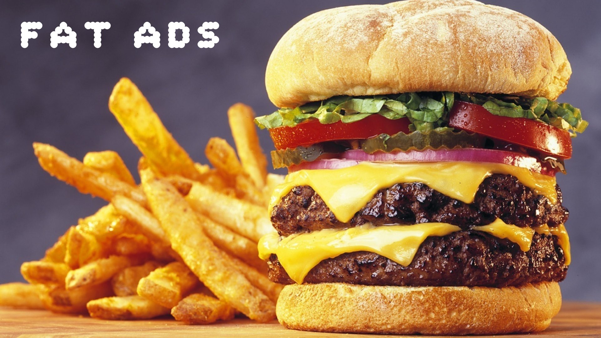
While I'll be using examples to keep the talk from getting too abstract, I’m not here to shame anyone, except some companies (Medium) that should know better and are intentionally breaking the web.
What do I mean by a website obesity crisis?
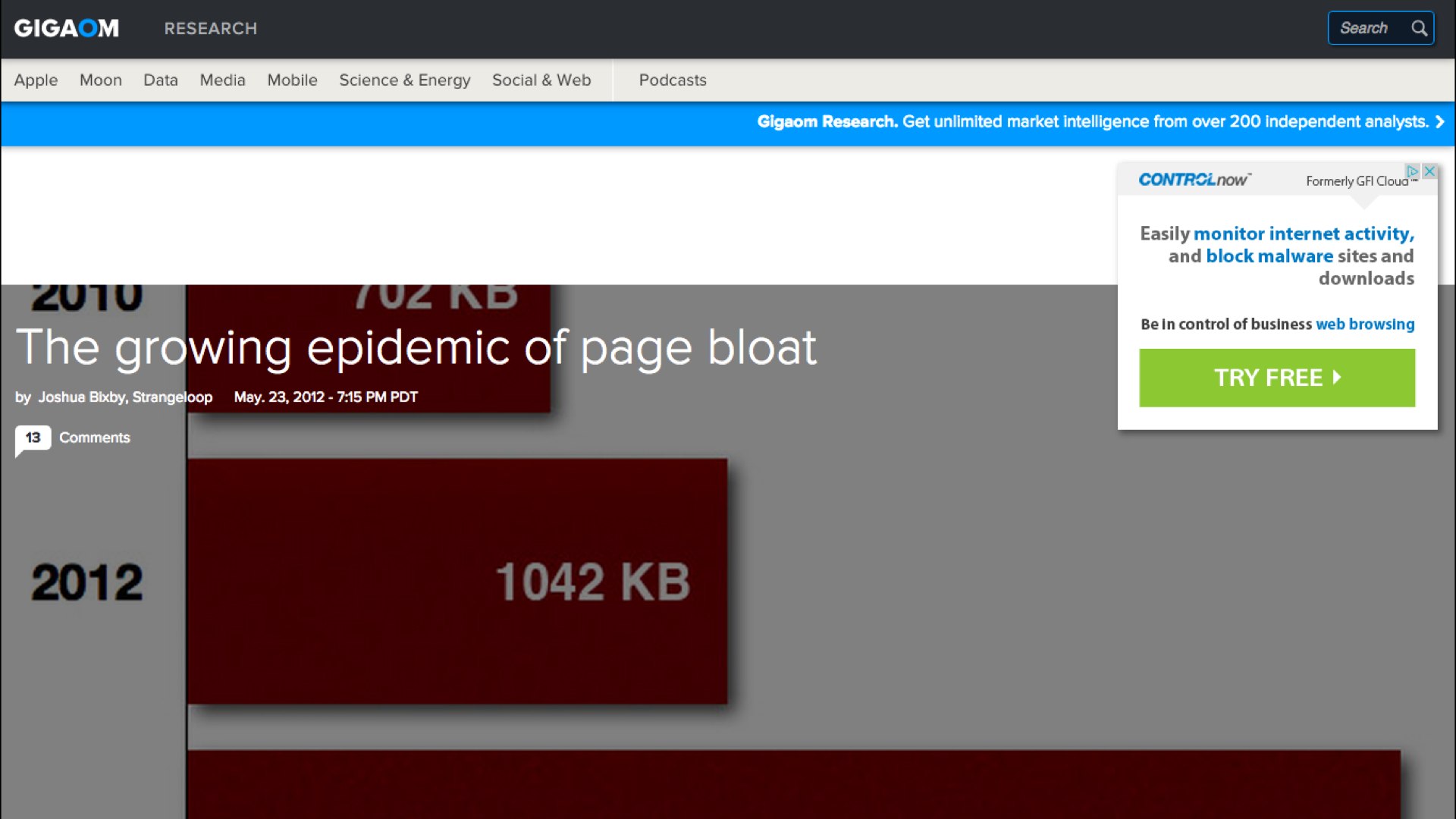
Here’s an article on GigaOm from 2012 titled "The Growing Epidemic of Page Bloat". It warns that the average web page is over a megabyte in size.
The article itself is 1.8 megabytes long.
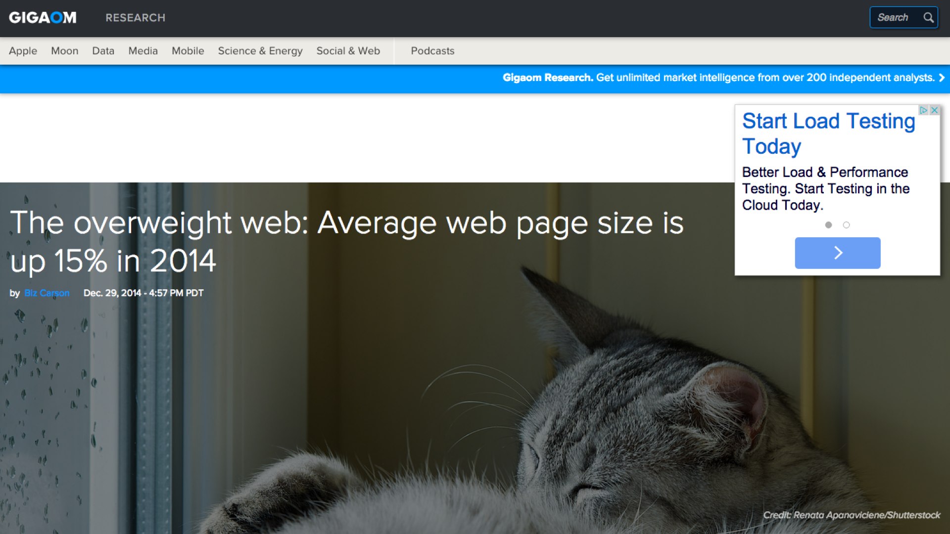
Here's an almost identical article from the same website two years later, called "The Overweight Web". This article warns that average page size is approaching 2 megabytes.
That article is 3 megabytes long.
If present trends continue, there is the real chance that articles warning about page bloat could exceed 5 megabytes in size by 2020.
The problem with picking any particular size as a threshold is that it encourages us to define deviancy down. Today’s egregiously bloated site becomes tomorrow’s typical page, and next year’s elegantly slim design.
I would like to anchor the discussion in something more timeless.
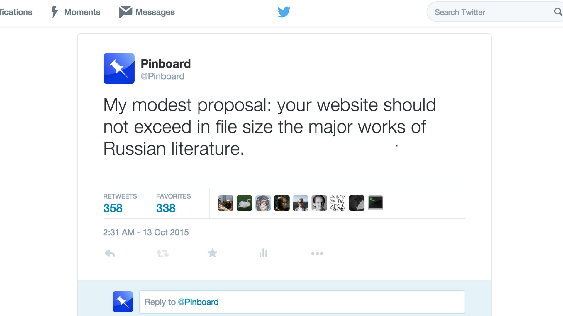
To repeat a suggestion I made on Twitter, I contend that text-based websites should not exceed in size the major works of Russian literature.
This is a generous yardstick. I could have picked French literature, full of slim little books, but I intentionally went with Russian novels and their reputation for ponderousness.
In Goncharov's Oblomov, for example, the title character spends the first hundred pages just getting out of bed.
That's almost 100 KB more than the full text of The Master and Margarita, Bulgakov’s funny and enigmatic novel about the Devil visiting Moscow with his retinue (complete with a giant cat!) during the Great Purge of 1937, intercut with an odd vision of the life of Pontius Pilate, Jesus Christ, and the devoted but unreliable apostle Matthew.
For a single tweet.
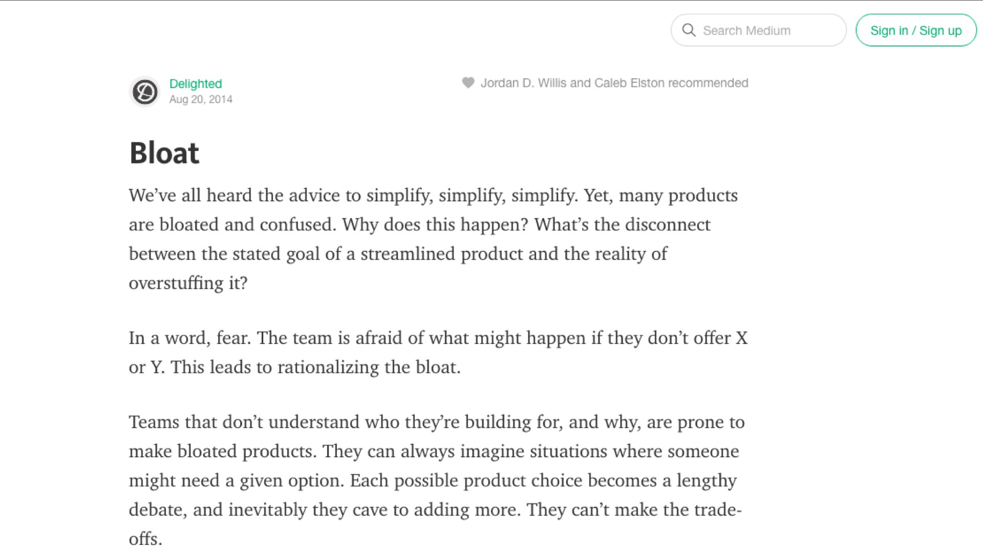
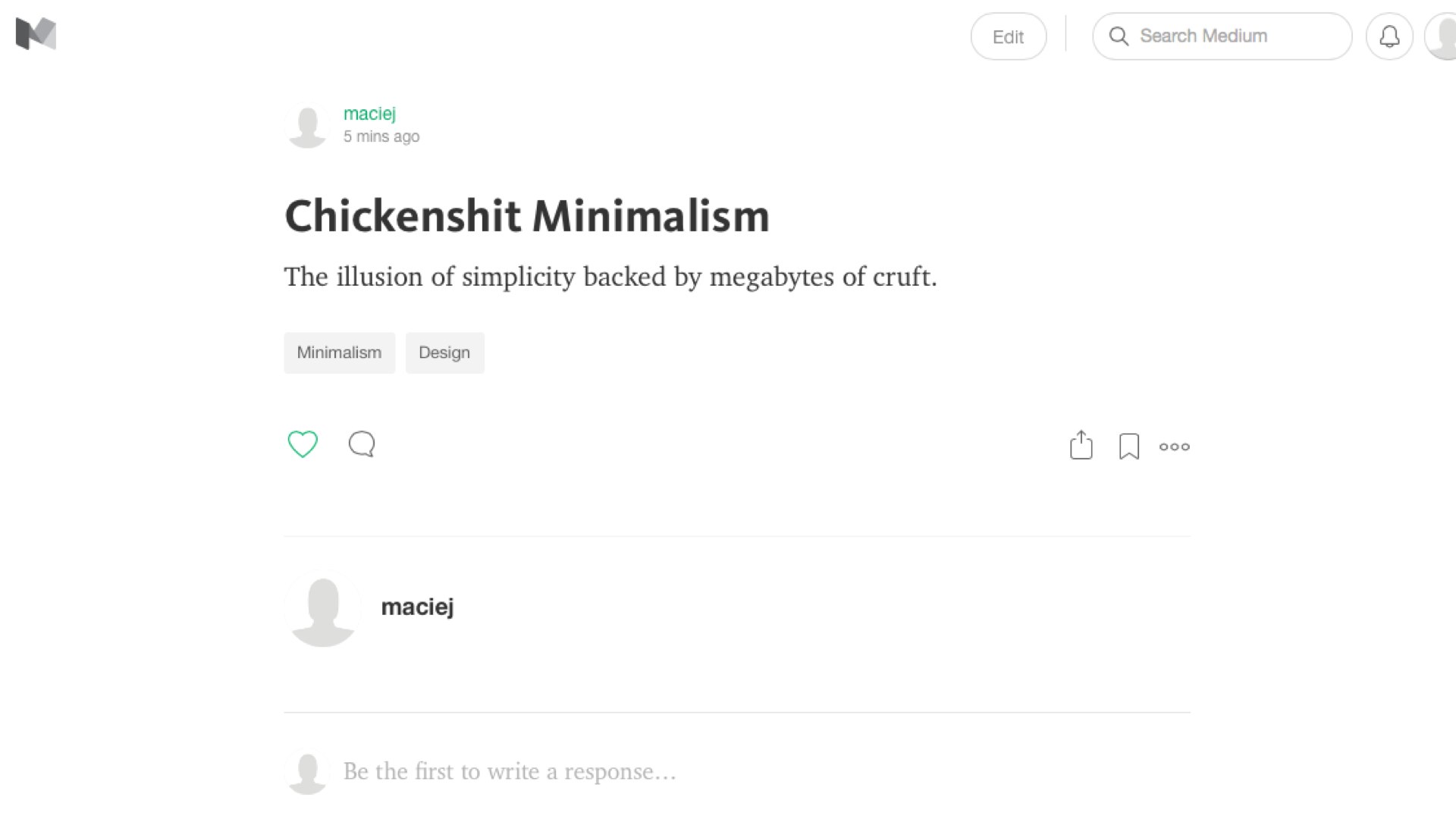
Or consider this 400-word-long Medium article on bloat, which includes the sentence:
"Teams that don’t understand who they’re building for, and why, are prone to make bloated products."
The Medium team has somehow made this nugget of thought require 1.2 megabytes.
Racked by guilt, so rattled by his crime that he even forgets to grab the money, Raskolnikov finds himself pursued in a cat-and-mouse game by a clever prosecutor and finds redemption in the unlikely love of a saintly prostitute.
Dostoevski wrote this all by hand, by candlelight, with a goddamned feather.
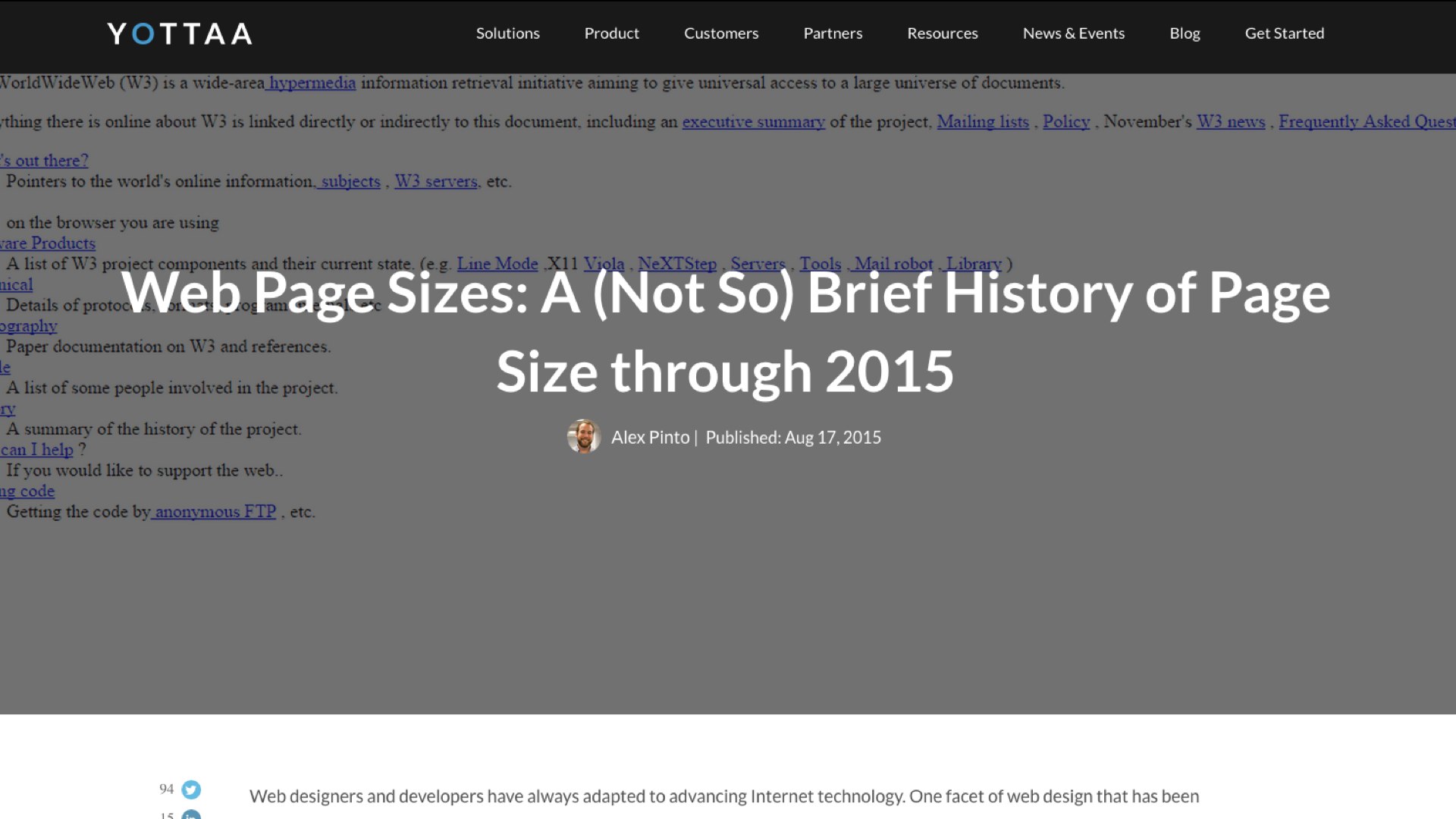
Here's a recent article called "A (Not So) Brief History of Page Bloat.
Rehearsing the usual reasons why bloat is bad, it includes the sentence "heavy pages tend to be slow pages, and slow pages mean unhappy users."
That sentence might put you in mind of the famous opening line to Anna Karenina:
In fact, it's longer than War and Peace, Tolstoi’s exploration of whether individual men and women can be said to determine the great events of history, or whether we are simply swept along by an irresistible current of historical inevitability.
"Leeds Hospital Bosses Apologise After Curry and Crumble On The Same Plate".
The javascript alone in "Leeds Hospital Bosses Apologise after Curry and Crumble On The Same Plate" is longer than Remembrance of Things Past.
I could go on in this vein. And I will, because it's fun!
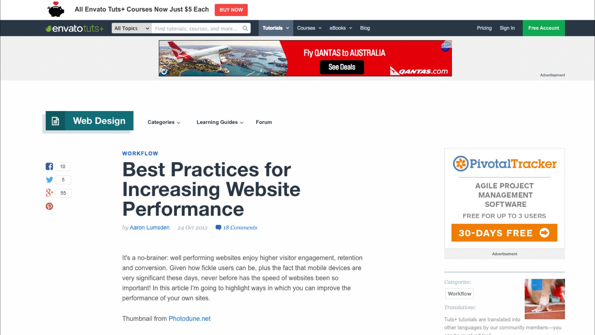
Here is an instructional article on Best Practices for Increasing Online performance that is 3.1 MB long.
The article mentions that Google was able to boost user engagement in Google Maps by reducing the page weight from 100KB to 80KB.
Remember when Google Maps, the most sophisticated web app of its day, was thirty-five times smaller than a modern news article?
Web obesity can strike in the most surprising places.
Tim Kadlec, for example, is an excellent writer on the topic of performance. His personal site is a model of parsimony. He is full of wisdom on the topic of reducing bloat.
But the slides from his recent talk on performance are only available as a 9 megabyte web page, or a 14 megabyte PDF.
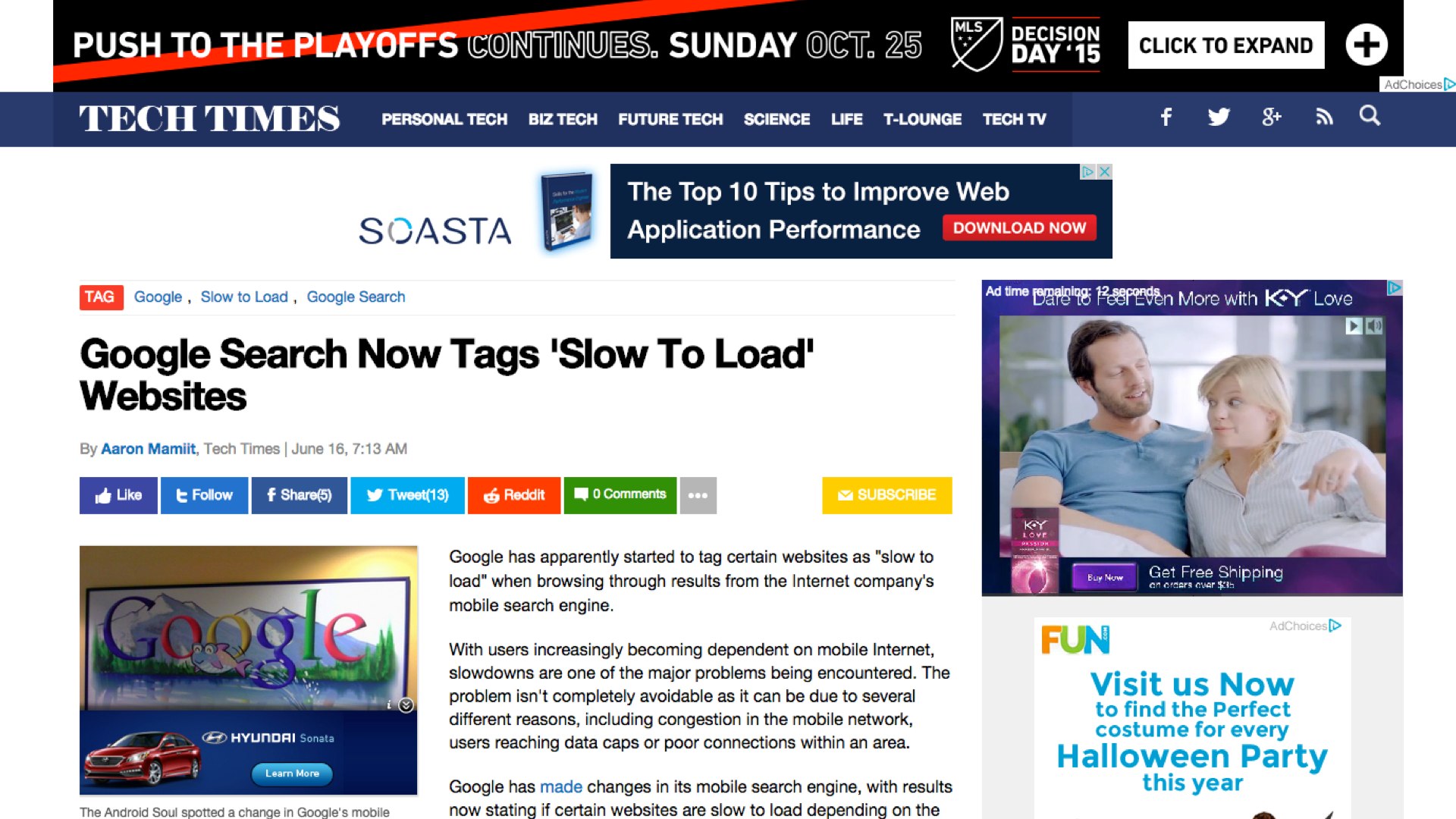
Let me close with a lovely TechTimes article warning that Google is going to start labeling huge pages with a special ‘slow’ mark in its mobile search interface.
The article somehow contrives to be 18 megabytes long, including (in the page view I measured) a 3 megabyte video for K-Y jelly, an "intimate lubricant".
It takes a lot of intimate lubricant to surf the unfiltered Web these days.
What the hell is up?
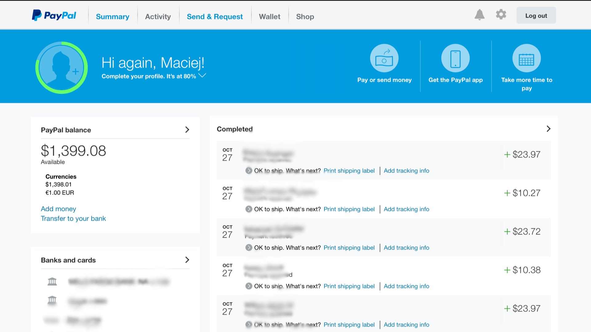
Everyone admits there’s a problem. These pages are bad enough on a laptop (my fan spun for the entire three weeks I was preparing this talk), but they are hell on mobile devices. So publishers are taking action.
In May 2015, Facebook introduced ‘Instant Articles’, a special format for news stories designed to appear within the Facebook site, and to load nearly instantly.
Facebook made the announcement on a 6.8 megabyte webpage dominated by a giant headshot of some dude. He doesn’t even work for Facebook, he’s just the National Geographic photo editor.
Further down the page, you'll find a 41 megabyte video, the only way to find out more about the project. In the video, this editor rhapsodizes about exciting misfeatures of the new instant format like tilt-to-pan images, which means if you don't hold your phone steady, the photos will drift around like a Ken Burns documentary.
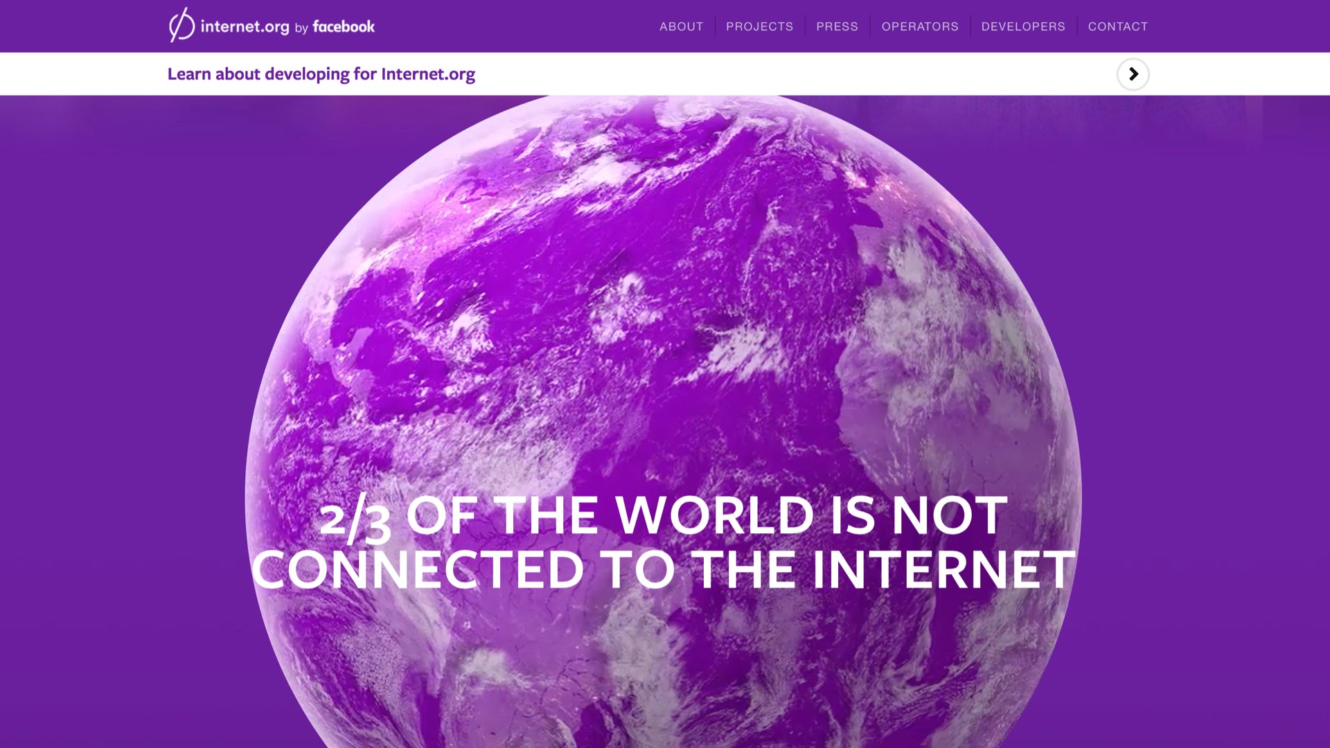
You know what’s coming next. When I left the internet.org homepage open in Chrome over lunch, I came back to find it had transferred over a quarter gigabyte of data.
Surely, you'll say, there's no way the globe in the background of a page about providing universal web access could be a giant video file?
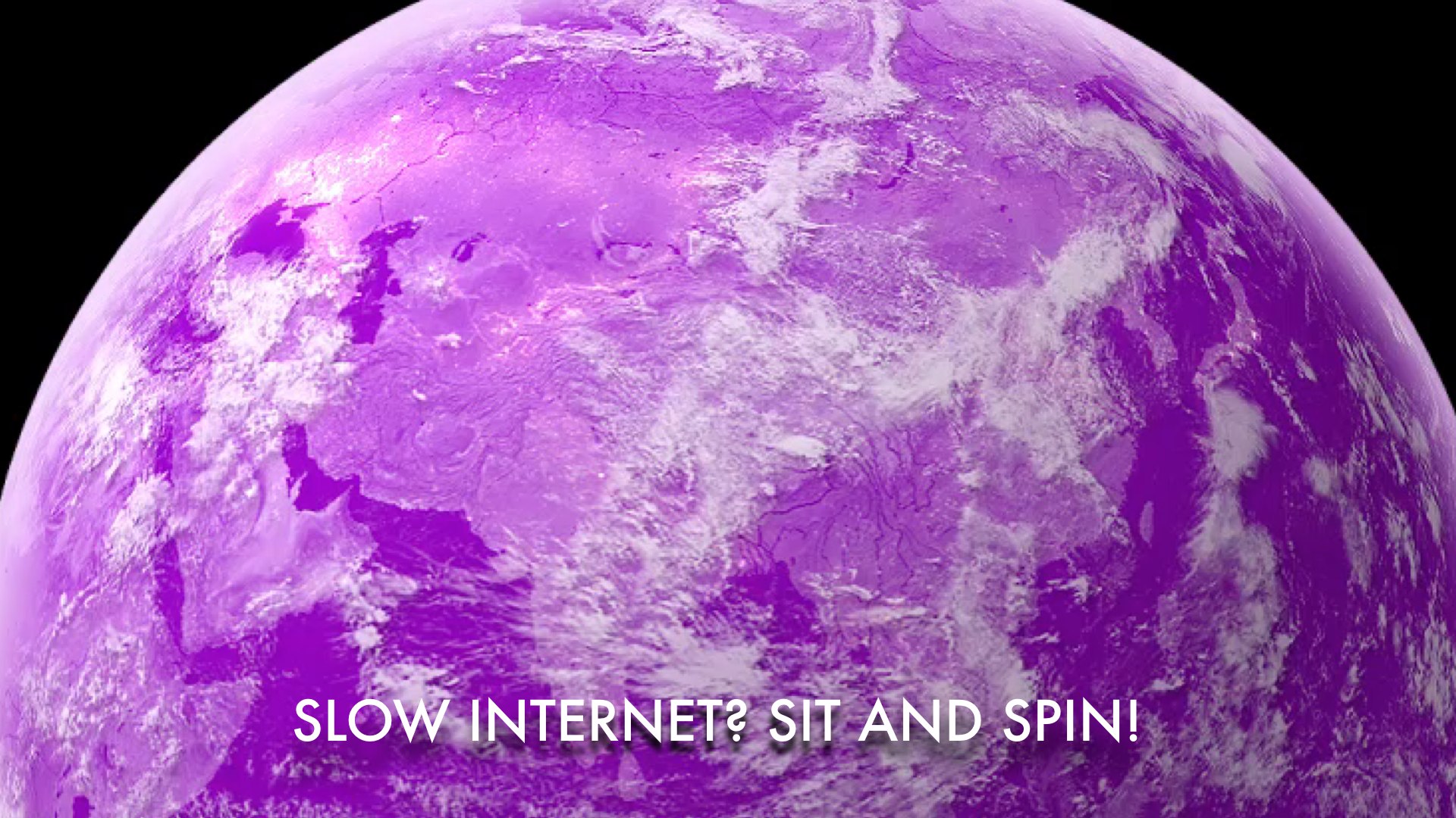
But I am here to tell you, oh yes it is. They load a huge movie just so the globe can spin.
This is Facebook's message to the world: "The internet is slow. Sit and spin."
And it's not like bad connectivity is a problem unique to the Third World! I've traveled enough here in Australia to know that in rural places in Tasmania and Queensland, vendors treat WiFi like hundred-year-old brandy.
You're welcome to buy as much of it as you want, but it costs a fortune and comes in tiny portions. And after the third or fourth purchase, people start to look at you funny.
Even in well-connected places like Sydney, we've all had the experience of having a poor connection, and almost no battery, while waiting for some huge production of a site to load so we can extract a morsel of information like a restaurant address.
They should be forced to use the Apple hockey puck mouse for the remainder of their professional lives. [shouts of horror from the audience]
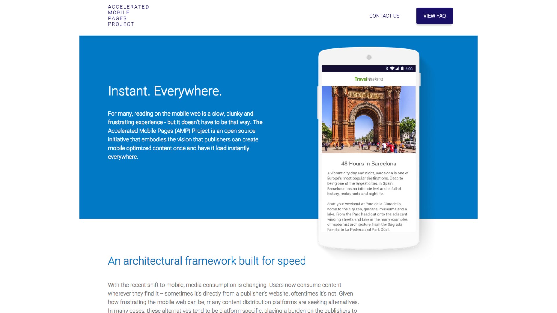
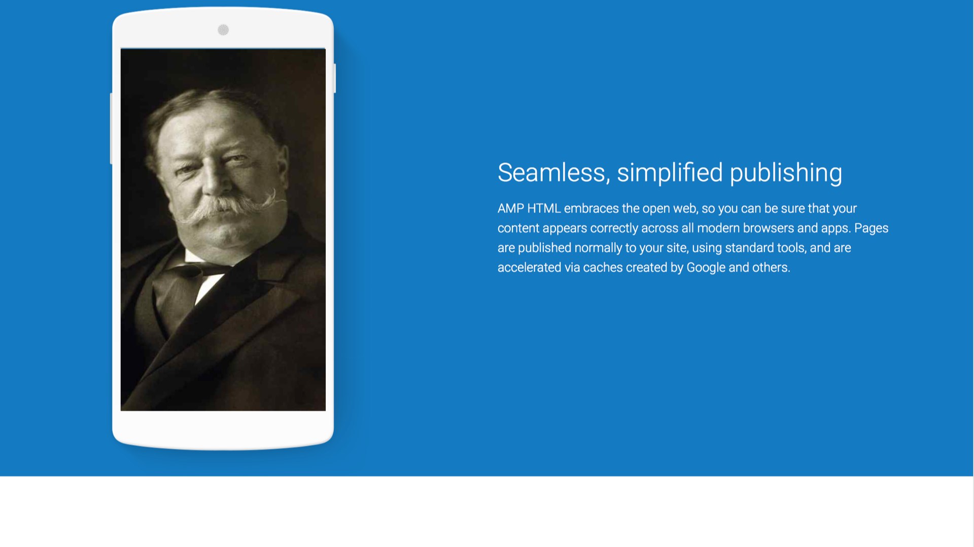
Google has rolled out a competitor to Instant Articles, which it calls Accelerated Mobile Pages. AMP is a special subset of HTML designed to be fast on mobile devices.
Why not just serve regular HTML without stuffing it full of useless crap? The question is left unanswered.
The AMP project is ostentatiously open source, and all kinds of publishers have signed on. Out of an abundance of love for the mobile web, Google has volunteered to run the infrastructure, especially the user tracking parts of it.
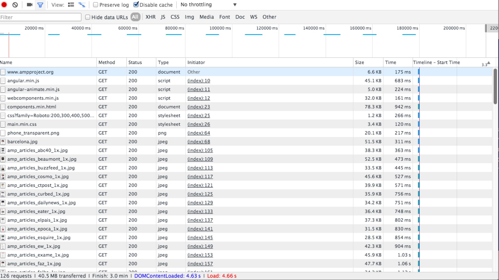
If you open it in Safari, where the carousel is broken, the page still manages to fill 4 megabytes.
These comically huge homepages for projects designed to make the web faster are the equivalent of watching a fitness video where the presenter is just standing there, eating pizza and cookies.
The world's greatest tech companies can't even make these tiny text sites, describing their flagship projects to reduce page bloat, lightweight and fast on mobile.
I can't think of a more complete admission of defeat.
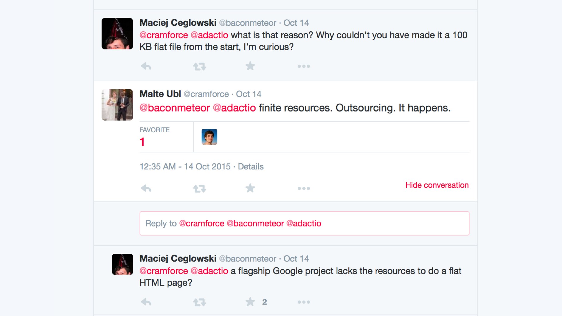
The tech lead for Google's AMP project was nice enough to engage us on Twitter. He acknowledged the bloat, but explained that Google was "resource constrained" and had had to outsource this project.
This admission moved me deeply, because I had no idea Google was in a tight spot. So I spent a couple of hours of my own time making a static version of the AMP website.
I think this made a marked improvement from the gratuitous animations on the original page.
By cutting out cruft, I was able to get the page weight down to half a megabyte in one afternoon of work. This is eight times smaller than the original page.
I offered my changes to Google free of charge, but they are evidently too resource constrained to even find the time to copy it over.
Does your page design improve when you replace every image with William Howard Taft?
If so, then, maybe all those images aren’t adding a lot to your article. At the very least, leave Taft there! You just admitted it looks better.
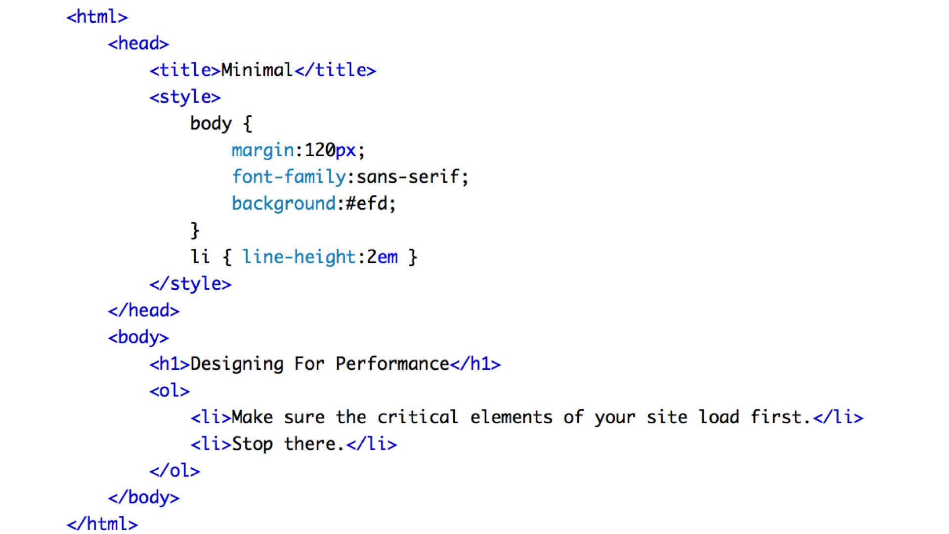
I want to share with you my simple two-step secret to improving the performance of any website.
Make sure that the most important elements of the page download and render first.
Stop there.
You don't need all that other crap. Have courage in your minimalism.
To channel a famous motivational speaker, I could go out there tonight, with the materials you’ve got, and rewrite the sites I showed you at the start of this talk to make them load in under a second. In two hours.
Can you? Can you?
Of course you can! It’s not hard! We knew how to make small websites in 2002. It’s not like the secret has been lost to history, like Greek fire or Damascus steel.
But we face pressure to make these sites bloated.
I bet if you went to a client and presented a 200 kilobyte site template, you’d be fired. Even if it looked great and somehow included all the tracking and ads and social media crap they insisted on putting in. It’s just so far out of the realm of the imaginable at this point.
If you've ever struggled to lose weight, you know there are tricks people use to fool themselves into thinking they're thinner. You suck in your gut, wear a tight shirt, stand on a certain part of the scale.
The same situation obtains with performance testing. People have invented creative metrics to persuade themselves that their molasses-like websites load fast.
Google has a popular one called SpeedIndex. (You know it's from Google because they casually throw an integral sign into the definition.)
SpeedIndex is based on the idea that what counts is how fast the visible part of the website renders. It doesn't matter what's happening elsewhere on the page. It doesn't matter if the network is saturated and your phone is hot to the touch. It doesn't matter if the battery is visibly draining. Everything is OK as long as the part of the site in the viewport appears to pop into view right away.
Of course, it doesn’t matter how fast the site appears to load if the first thing the completed page does is serve an interstitial ad. Or, if like many mobile users, you start scrolling immediately and catch the 'unoptimized' part of the page with its pants down.
There is only one honest measure of web performance: the time from when you click a link to when you've finished skipping the last ad.
Everything else is bullshit.
In conversations with web performance advocates, I sometimes feel like a hippie talking to SUV owners about fuel economy.
They have all kinds of weirdly specific tricks to improve mileage. Deflate the front left tire a little bit. Put a magnet on the gas cap. Fold in the side mirrors.
Most of the talk about web performance is similarly technical, involving compression, asynchronous loading, sequencing assets, batching HTTP requests, pipelining, and minification.
All of it obscures a simpler solution.
If you're only going to the corner store, ride a bicycle.
If you're only displaying five sentences of text, use vanilla HTML. Hell, serve a textfile! Then you won't need compression hacks, integral signs, or elaborate Gantt charts of what assets load in what order.
Browsers are really, really good at rendering vanilla HTML.
We have the technology.
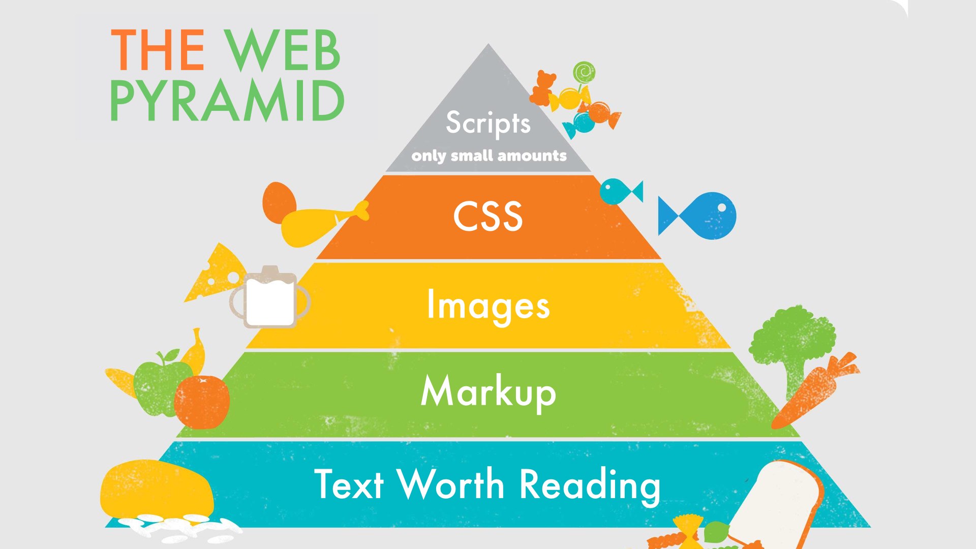
Nutritionists used to be big on this concept of a food pyramid. I think we need one for the web, to remind ourselves of what a healthy site should look like.
Here is what I recommend for a balanced website in 2015:
A solid base of text worth reading, formatted with a healthy dose of markup.
Some images, in moderation, to illustrate and punch up the visual design.
A dollop of CSS.
And then, very sparingly and only if you need it, JavaScript.
A base layer of HTML
A huge pile of crap
On top of it all, a whole mess of surveillance scripts.
Web designers! It's not all your fault.
You work your heart out to create a nice site, optimized for performance. You spend the design process trying to anticipate the user’s needs and line their path with rose petals.
Then, after all this work is done, your client makes you shit all over your hard work by adding tracking scripts and ads that you have no control over, whose origin and content will be decided at the moment the page loads in the user’s browser, and whose entire purpose is to break your design and distract the user from whatever they came to the site to do.
The user's experience of your site is dominated by hostile elements out of your control.
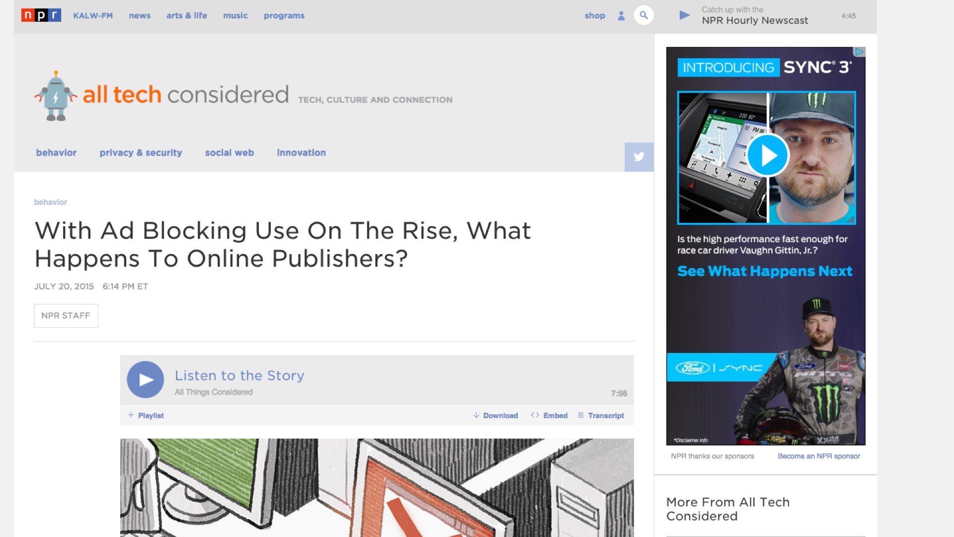
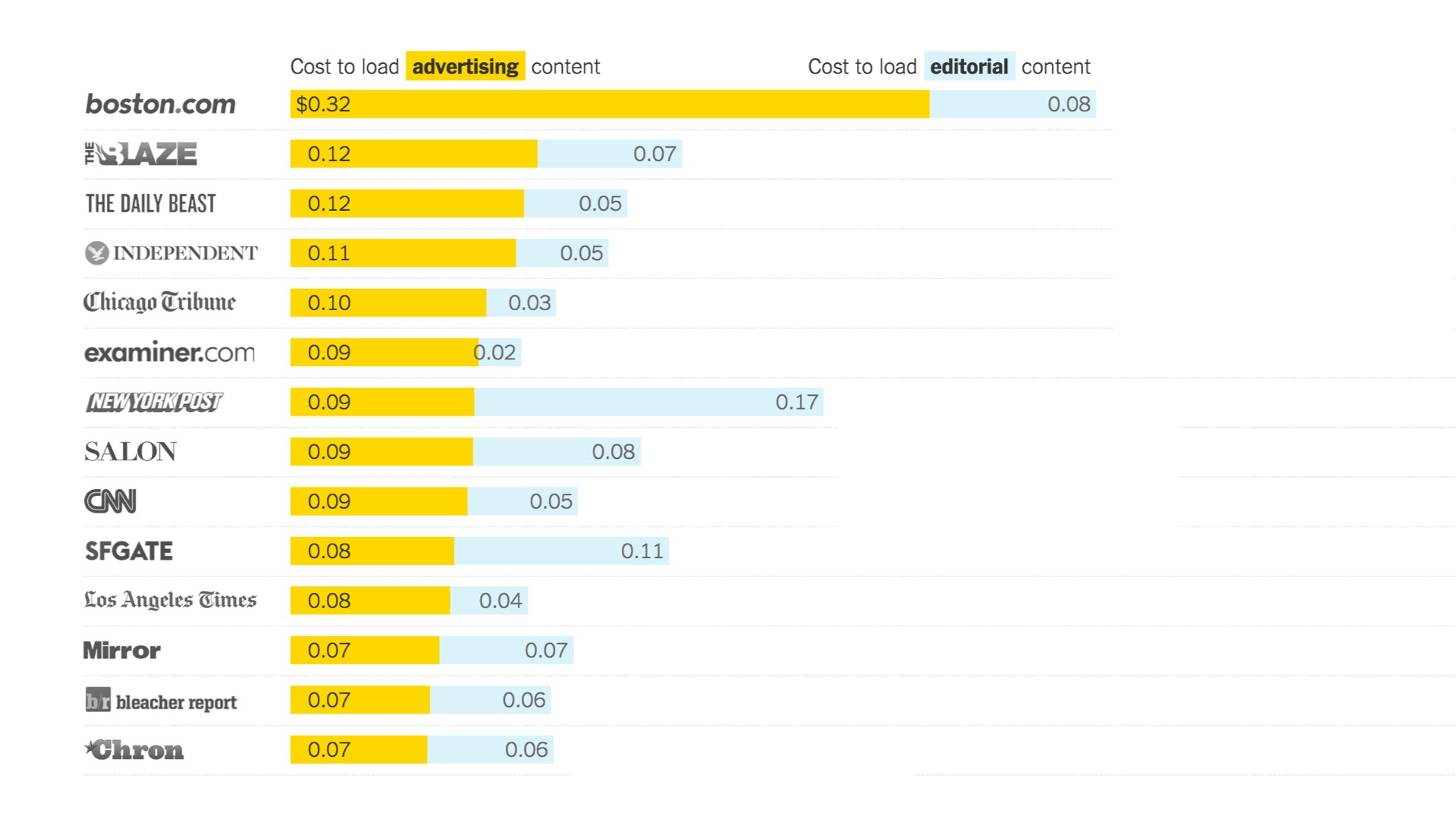
This is a screenshot from an NPR article discussing the rising use of ad blockers. The page is 12 megabytes in size in a stock web browser.
The same article with basic ad blocking turned on is one megabyte. It’s no model of parsimony, but still, what a difference a plugin makes.
If you look at what the unblocked version pulls in, it’s not just videos and banner ads, but file after file of javascript. Every beacon, tracker and sharing button has its own collection of scripts that it needs to fetch from a third-party server. Each request comes packed with cookies.
More cookies are the last thing your overweight website needs.
These scripts get served from God knows where and are the perfect vector for malware.
Advertisers will tell you it has to be this way, but in dealing with advertisers you must remember they are professional liars.
I don’t mean this to offend. I mean it as a job description. An advertiser's job is to convince you to do stuff you would not otherwise do. Their task in talking to web designers is to persuade them that the only way to show ads is by including mountains of third-party cruft and tracking.
The bloat, performance, and security awfulness, they argue, is the price readers pay for free content.
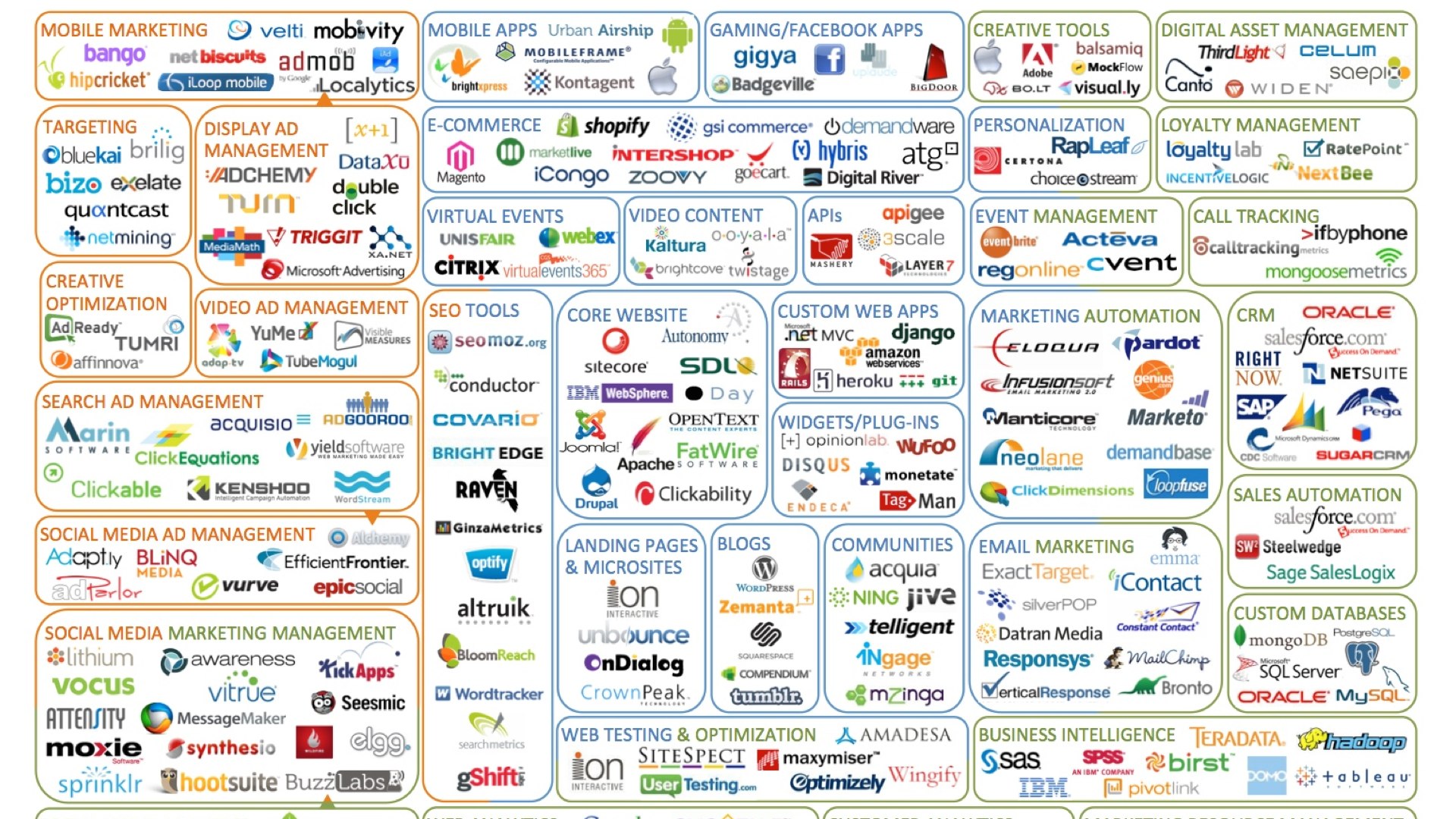
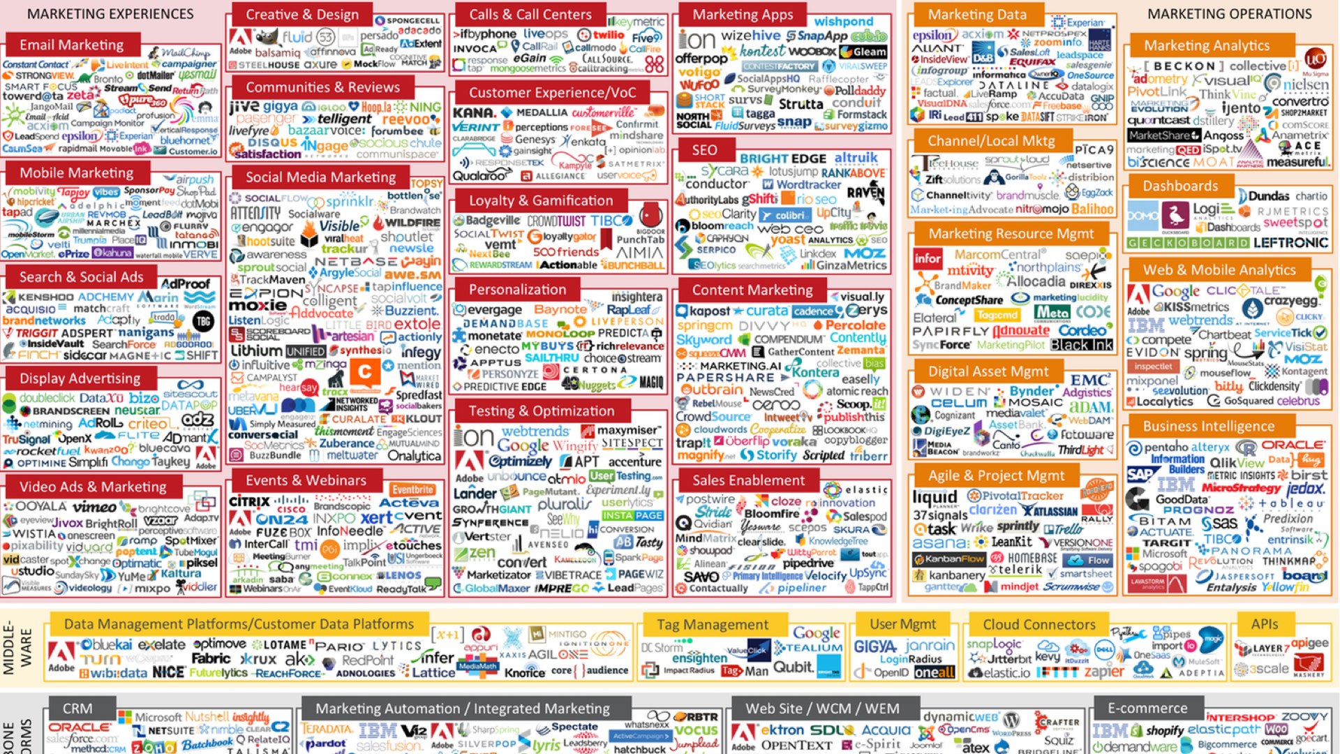
I've come across these diagrams of the "adtech ecosystem", which I love. They communicate the sordidness of advertising in the way simple numbers never could.
Here is a view of the adtech ecosystem in 2011, when there were 100 ‘adtech’ companies.
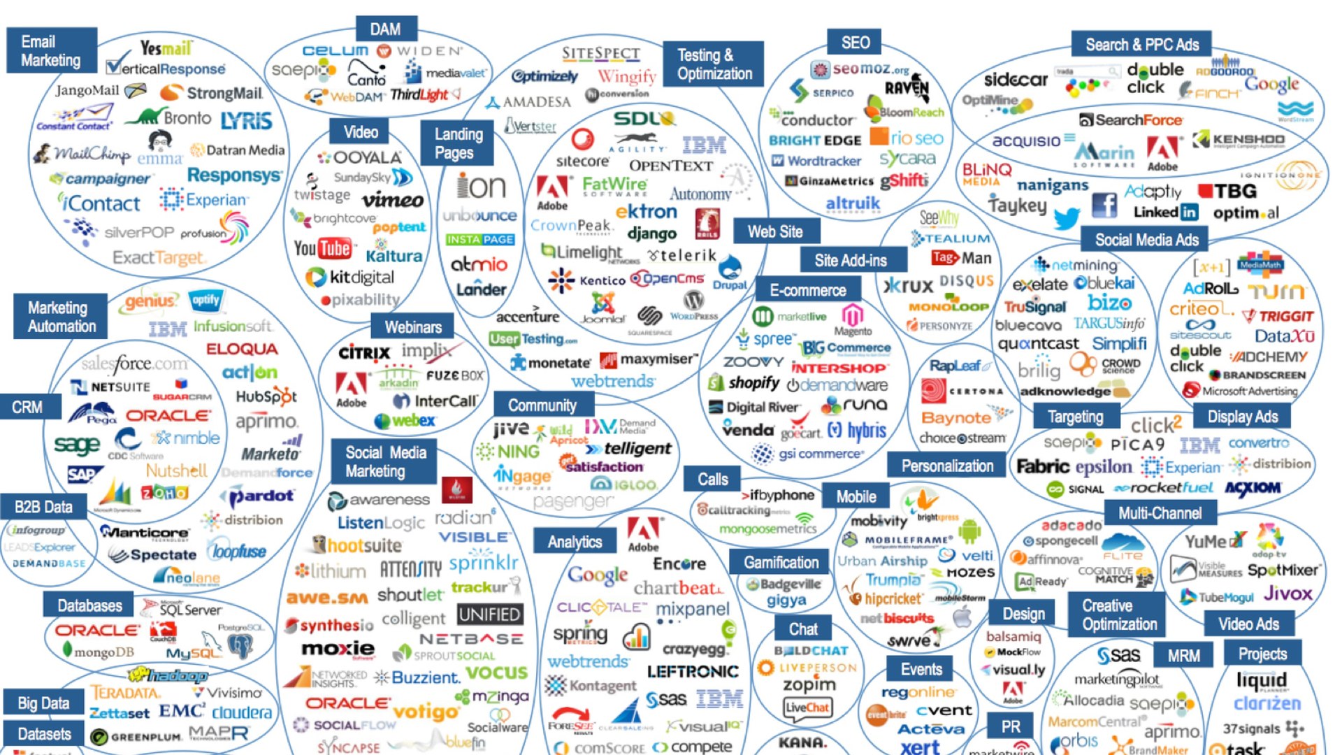
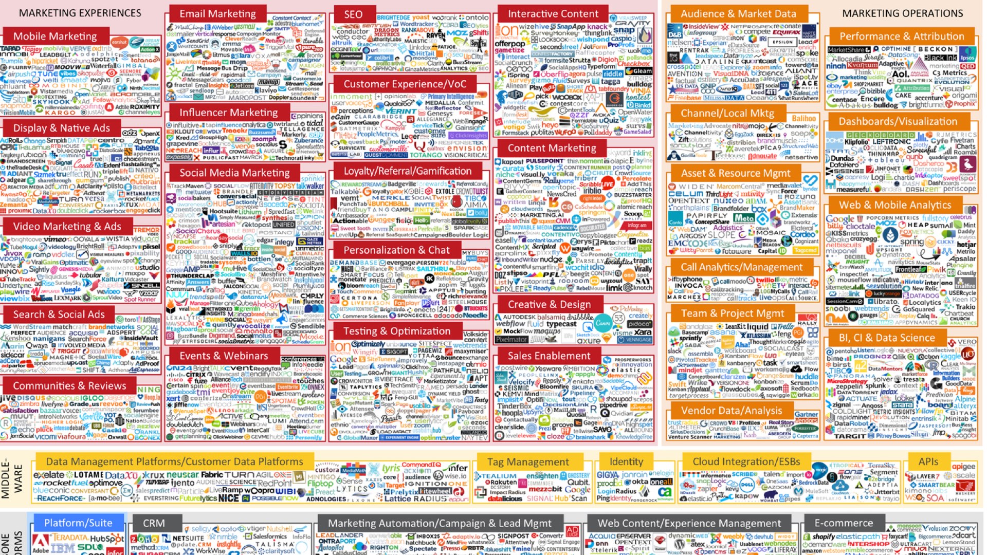
And in 2015 we have 1876 of these things. They are all competing for the same little slice of your online spending.
This booming industry is very complex—I believe intentionally so.
When you're trying to understand a complex system, it can be helpful to zoom out and look at the overall flow of things.
For example, here's a German diagram showing the energy budget of the Earth.
All kinds of complicated things happen to sunlight when it shines on plants or water, but you can ignore them completely and just measure the total energy that comes in and out.
In the same spirit, let me sketch the way money is flowing in to the advertising bubble.
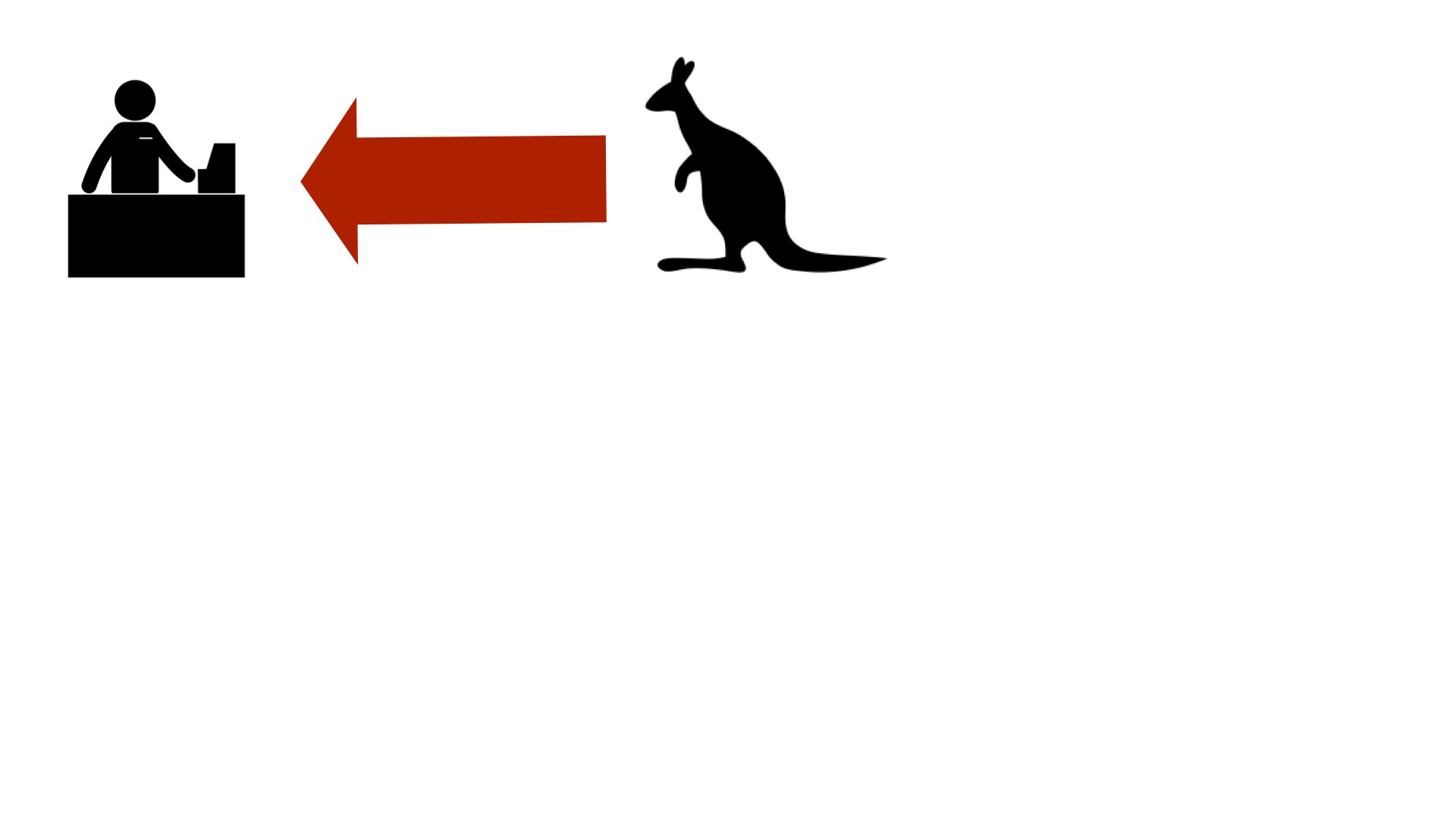
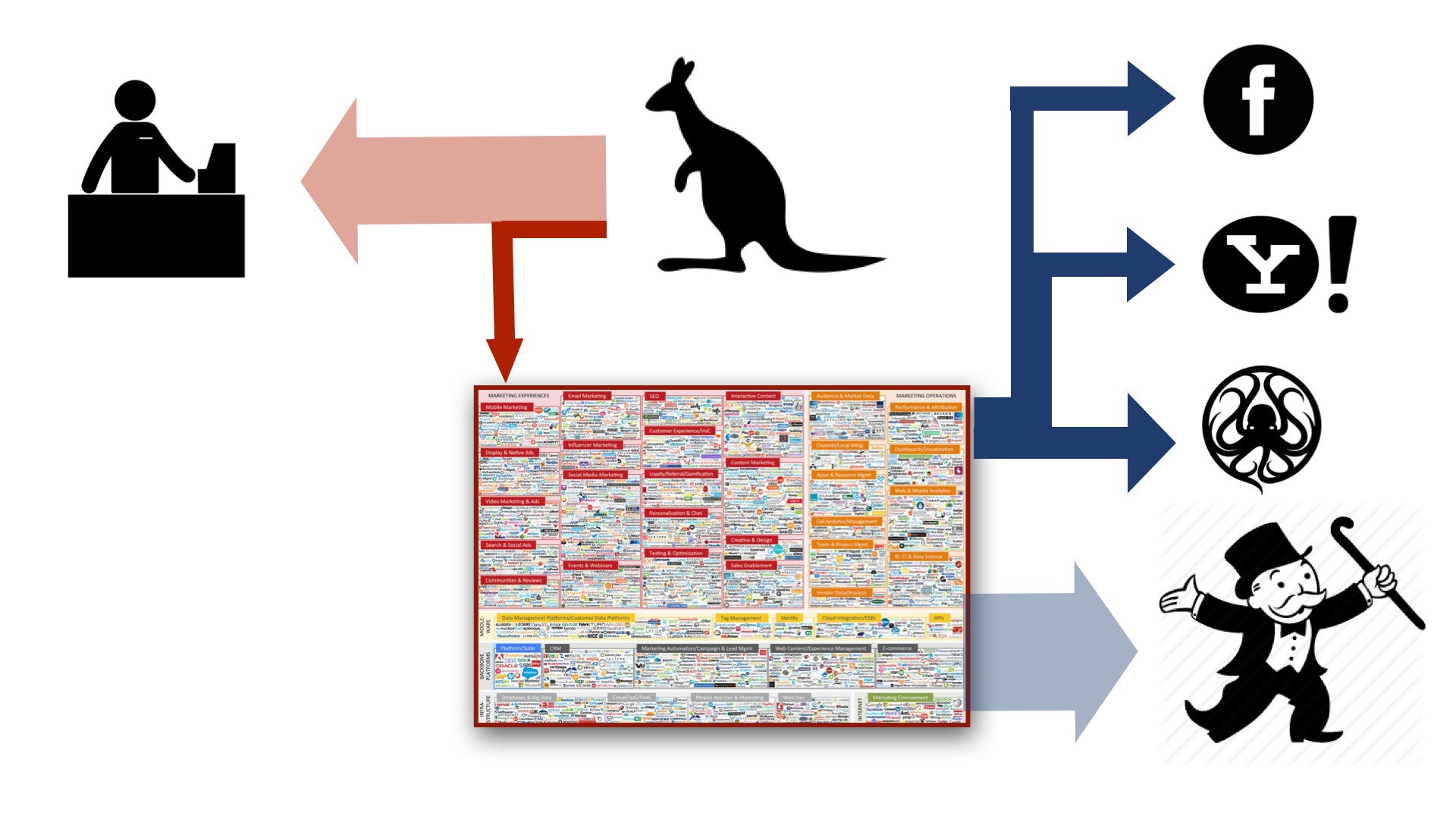
In the beginning, you have the consumer. In a misguided attempt at cultural sensitivity, I have chosen to represent the consumer with a kangaroo.
Consumers give money to merchants in exchange for goods and services. Here the red arrow represents money flowing to the merchant, or as you say in Australia, "dollars".
A portion of this money is diverted to pay for ads. Think of it as a little consumption tax on everything you buy.
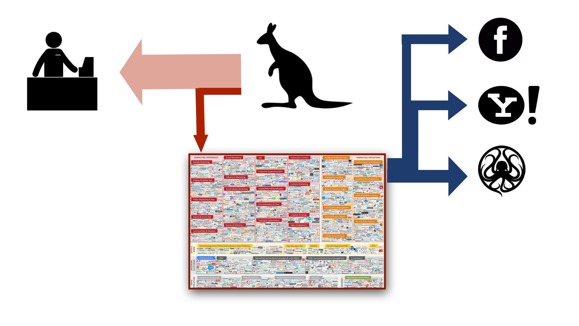
This money bounces around in the world of advertising middlemen until it ultimately flows out somewhere into someone's pocket.
Right now it's ending up in the pockets of successful ad network operators like Facebook, Yahoo!, and Google.
You’ll notice that there’s more money flowing out of this system than into it.
There’s a limit to how much money is available to ad companies from just consumers. Think of how many ads you are shown in a given day, compared to the number of purchases you actually make.
So thank God for investors! Right now they are filling the gap by pouring funding into this white-hot market. Their hope is that they will pick one of the few companies that ends up a winner.
However, at some point the investors who are pouring money in will want to move to the right-hand side of this diagram. And they'll want to get back even more money than they invested.
When this happens, and I believe it is happening right now, something will have to give.
Either we start buying more stuff, or a much bigger portion of our purchases goes to pay for ads...
Or the bubble is going to burst.
We’ll see a wave of consolidation, mergers, aggressive new forms of tracking, and the complete destruction of what remains of online privacy.
This why I've proposed we regulate the hell out of them now.
I think we need to ban third-party tracking, and third party ad targeting.
Ads would become dumb again, and be served from the website they appear on.